

AI-generated interior concept using product reference photography; setting, scale and framing are illustrative.
Introducing a saturated sculpture into a restrained architectural space creates immediate aesthetic friction. When a vinyl figure relies on a single vibrant hue, it shifts from being a mere decorative object to an active spatial element. High-saturation sculptures disrupt calm sightlines and challenge quiet material palettes. Instead of blending seamlessly into millwork or plaster, an intense silhouette forces a deliberate dialogue between architectural structure and pop imagery.
The vinyl form serves as a focal point, drawing the eye directly through its distinct volume and unyielding surface finish. Achieving balance in interior curation requires treating color as a sculptural tool rather than a quick surface accent. A singular object can anchor a room when placed with purpose, grounding architectural lines while introducing personality. The spatial impact depends on light, shadow, and surrounding textures.
Understanding how a monochrome form interacts with interior surfaces allows designers to curate intentional tension without overwhelming the home environment. Integrating pop iconography into sophisticated residential settings requires balance and structural awareness. By considering scale, shadow play, and material contrast, designers can incorporate vibrant art objects into minimalist spaces seamlessly.
The specific visual weight of the out-of-stock KAWS What Party Pink Companion Figure 11” Medicom Toy 2020 w/ Original Box comes from its complete monochromatic application, serving as a design reference. Because the hot-pink finish wraps entirely across the inflated, rounded limbs and signature crossed-out eyes, the object lacks internal color hierarchy. In architectural design, a multi-tone object allows the viewer's eye to process individual sub-assemblies sequentially. A single-hue form presents its entire silhouette instantly. This creates a immediate visual footprint that can easily overpower muted lime-wash plaster, open-grain white oak, or honed travertine if the surrounding spatial envelope is not planned specifically to accommodate a saturated accent. The Pink edition serves as a pure design reference for how intense, unvaried color behaves within disciplined spaces.
To evaluate how this color dynamic functions in practice, consider a hypothetical residential library measuring 14 feet by 18 feet with a 10-foot ceiling. The room features dark-stained walnut millwork, matte black metal accents, and low-voltage 2700K recessed spotlighting focused on key display niches. The designer faces a choice between deploying a vivid, single-tone form or a multi-toned neutral figure like the KAWS Companion Flayed Open Edition Grey Medicom Toy Dissected Sealed New Figure.
Selecting the grey dissected figure provides internal visual complexity through its exposed internal anatomy and split neutral palette. The variation between grey tones and exposed structural details absorbs light and invites close-up inspection, functioning like a traditional desktop bronze or classic stone study. It integrates smoothly into architectural millwork without altering the perceived color temperature of the surrounding walnut shelves. The tradeoff with the dissected grey figure is that it acts as a passive, harmonious detail rather than a dynamic focal driver. It stabilizes the shelf rather than challenging the architecture.
Conversely, introducing a vivid hot-pink figure into the same hypothetical walnut niche completely alters the spatial hierarchy. The high-chroma pink reflects ambient light back onto adjacent wood veneers, creating a subtle warm glow within the recessed millwork. Instead of blending into the background joinery, the figure projects forward visually. The primary tradeoff of this approach is the risk of visual fatigue and color bleed; if surrounded by conflicting warm tones or overly busy textiles, the vivid pink loses its sharp graphic isolation and creates visual clutter. To make the high-chroma choice succeed, the designer must reduce ambient decorative accessories within a three-foot radius, allowing the smooth vinyl silhouette to contrast cleanly against the organic grain of the wood.
Lighting selection further dictates the success of a saturated sculpture. Under cool 4000K light, a hot-pink surface can appear synthetic and harsh against natural building materials. Under warm 2700K lighting, the yellow spectrum softens the pink, integrating the figure more comfortably into residential interiors without sacrificing its pop character. Designers must also balance material sheen. The smooth, semi-matte finish of cast vinyl reflects light differently than porous stone or woven wool drapery. Positioning a high-saturation figure near a natural light source produces soft ambient highlights along its rounded forms, transforming a mass-produced pop silhouette into an architectural light-modulator.
The Chromatic Tension of Saturating the Silhouette
Color behaves differently when wrapped across a three-dimensional form than when applied flat to a wall. The continuous magenta hue of the KAWS What Party Pink Companion Figure 11” Medicom Toy 2020 w/ Original Box demonstrates how a single tone transforms a cast vinyl surface into a visual anchor. Note that this specific pink release is currently out of stock and serves as a design reference only for studying chromatic balance in architectural settings. The uniformity of the shade eliminates subtle gradients, forcing the eye to read the object through silhouette and light reflection alone.
When positioned against natural wood grain, matte plaster, or stone, high-saturation pink generates immediate visual friction. The artificial purity of the vinyl surface contrasts against the organic variations of architectural finishes. The matte texture absorbs ambient light across its rounded segments, while the sharp contours cast precise shadows. This visual tension prevents a neutral interior from feeling overly muted, introducing an uncompromising pop element.
Placing an intense monochrome piece requires analyzing room contrast. Surrounding a vibrant figure with complementary muted tones prevents color clash while maintaining focus. The flat finish prevents unwanted glare, allowing the sculpture to retain crisp definition under both artificial spotlights and natural daylight.
The physical geometry of the figure intensifies this light behavior. Because the torso and limbs feature exaggerated, rounded volumes rather than flat planes, light travels across the vinyl in a smooth, continuous gradient. Under a single directional spotlight, the highest point of the curved shoulder reflects a soft highlight, while the recessed areas beneath the segmented arms drop into clean, dark shadows. The uniform pink pigment holds its chromatic identity across both the lit and shaded regions, rather than washing out or shifting hue. This consistency allows the form to remain legible from acute viewing angles across a room.
Introducing a hot pink sculptural element into a tailored environment introduces distinct spatial tradeoffs. A high-chroma object absorbs visual priority instantly, which can overwhelm delicate architectural details like subtle shadow gaps, fine-line cabinetry joints, or understated wall textiles. If a room relies on a muted, low-contrast palette to feel expansive, placing an intense pink accent in the center of a sightline draws the eye so forcefully that the surrounding volume shrinks perceptually. Conversely, relying on neutral grey tones without a vivid anchor can leave a sharp architectural scheme feeling sterile. For comparison, a piece like the KAWS Companion Flayed Open Edition Grey Medicom Toy Dissected Sealed New Figure integrates into grey plaster or concrete walls through tonal harmony, using anatomical detail rather than color intensity to create visual interest. The pink figure relies purely on chromatic contrast, making its placement far less forgiving.
Consider a hypothetical decision-making process for a residential library reading nook measuring a hypothetical 12 feet by 14 feet. The space features matte white oak shelving, dark slate floor tiles, and deep charcoal velvet upholstery. The objective is to select a single focal object for a centered shelf niche at eye level, measuring 18 inches high, 24 inches wide, and 14 inches deep.
The first option evaluated is a neutral stone vessel. While the limestone texture complements the slate floor, the lack of color contrast causes the object to blend entirely into the light oak casework, failing to establish a clear focal point from the main seating area 10 feet away. The second option is a glossy yellow lacquer sculpture. The high-gloss finish creates harsh specular reflections from the overhead recessed downlights, distracting from the surrounding architectural woodwork and distorting the object's profile.
The final selection uses the hot-pink vinyl profile as the design benchmark. Positioned within the oak niche, the matte pink surface absorbs ambient light without producing specular glare, maintaining a clean outline against the timber background. The intense pigment creates a precise focal point that draws light into the recessed shelving unit, balancing the heavy charcoal tones of the adjacent upholstery. The warm undertones of the natural white oak soften the artificial edge of the pink vinyl, creating a controlled equilibrium between organic warmth and synthetic saturation.
Segmented Form and Light Interaction in Cast Vinyl
The bulbous, ridged construction of the Michelin-inspired suit creates a repeating rhythm of highlights and soft shadows. Each rounded horizontal band catches overhead illumination differently, dividing the uniform pink tone into subtle light and dark values. The downward head tilt and limp hands add emotional depth, contrasting the cheerful implications of its bright hue.
The figure stands upright, its soft shoulders and domed head contrasting against rectilinear joinery or linear shelving. This juxtaposition softens harsh architectural edges while asserting its own geometric presence. The smooth vinyl material absorbs room reflections, maintaining visual clarity from every angle without distraction.
Under warm residential lighting, the saturated pink gains depth as shadows pool beneath the segmented horizontal ridges. Cool LED illumination sharpens the figure's outer silhouette, highlighting its clean manufacturing lines. Designers can adjust lighting direction to emphasize either the object's playful contour or its underlying melancholy stance.
Balancing Pop Art Outlines Against Precision Architectural Millwork
Integrating pop iconography into custom cabinetry requires careful scale management and spatial breathing room. Placing a bright sculpture inside a tight niche compresses its visual impact, making the installation feel cluttered. Setting the figure on an open shelf surrounded by clear space lets its silhouette expand naturally into the room.
Dark cabinetry backgrounds, such as stained oak or charcoal paint, frame the bright pink surface sharply. Light surfaces, like travertine or whitewashed ash, offer a softer backdrop that diffuses the figure's edges. The choice depends on whether the design brief calls for bold contrast or harmonious integration.
Avoid placing competing pop art collectibles directly beside a high-saturation figure. Giving the piece room to breathe ensures it acts as a primary focal point rather than contributing to visual noise. Surrounding the object with understated design elements creates a refined balance between art and architecture.
Juxtaposing Saturated Surfaces with Monochromatic Anatomical Figures
Comparing the uniform pink sculpture with an anatomical variant reveals how color choices dictate room atmosphere. While the pink figure relies on pure hue and smooth segmentation to command attention, the KAWS Companion Flayed Open Edition Grey Medicom Toy Dissected Sealed New Figure relies on exposed interior detail and neutral grayscale tones. Availability for active items like the grey figure can change, making layout planning essential before purchasing. Beyond simple availability, the interior designer must evaluate how the structural characteristics of each vinyl form interact with surrounding material assemblies, architectural lighting profiles, and spatial program requirements.
The grey flayed figure presents a neutral palette that merges effortlessly into industrial steel, concrete, or raw plaster interiors. Its exposed internal organs introduce complex shadow patterns and fine lines. In contrast, the pink sculpture relies on solid, uninterrupted mass to make its statement. This difference in surface complexity fundamentally alters how light interacts with each object. The dissected grey figure features intricate recessions, organic cavities, and cross-sectional cutouts that capture tight, localized cast shadows under directional lighting. These shadows highlight the internal anatomy, creating high graphic contrast that reads as a detailed technical illustration within three-dimensional space. To optimize this effect, a low-glare surface-mounted spot or an adjustable narrow-beam recessed downlight with a high color rendering index is necessary. Conversely, the continuous monochromatic finish of the hot-pink sculpture reflects ambient room light across its rounded segments, diffusing color outward onto adjacent matte architectural surfaces. Bright overhead illumination can wash out its soft volumetric curves, so low-angle lighting or diffuse side illumination works better to preserve the legibility of its inflated silhouette.
Placing these contrasting styles in different zones of a residence creates a thoughtful dialogue between structural form and graphic color. The flayed figure suits quiet, analytical spaces like home offices or libraries. The vibrant pink edition excels in entryways or living areas where a bold visual statement is desired. However, placing both figures within the same residence introduces specific trade-offs regarding visual hierarchy and balance. Introducing an intense, non-natural magenta-pink focal point risks drawing the human eye so aggressively that secondary design elements, such as custom wood cabinetry, textured upholstery, or secondary artwork, become completely overlooked. The trade-off for utilizing such a saturated figure is the strict discipline required throughout the rest of the room's material palette. The surrounding architecture must remain restrained, utilizing subdued neutral finishes or desaturated tertiary tones to prevent visual chaos. On the other hand, selecting a dissective anatomical figure in neutral grey poses the opposite risk: its delicate internal shadows can easily disintegrate into a cluttered background if placed against textured stone, heavily figured wood grain, or busy wallpaper patterns. The grey figure requires a clean, low-contrast backdrop, such as smooth micro-cement or flat matte paint, to maintain its crisp architectural profile.
Consider a hypothetical worked decision within a residential project featuring an open-plan study measuring a hypothetical 14 feet by 18 feet with a hypothetical 10-foot ceiling height. The space contains custom millwork crafted from dark stained walnut, honed basalt floor tiles, and a minimalist steel-frame desk. The client requests a prominent display location for a contemporary sculptural artwork. The designer evaluates two distinct options: incorporating the high-saturation pink silhouette on an open walnut shelf or specifying the grey anatomical figure directly on the desk surface adjacent to an adjustable desk lamp. If the saturated pink figure is selected for the walnut shelving unit, the high visual weight of the magenta finish creates an intense focal point against the deep wood grain. However, this creates an imbalance in the room's lighting scheme: the bright pink hue absorbs and reflects ambient room light in a way that distracts from the warm, low-key atmosphere established by the dark walnut and dark stone flooring. The high saturation pulls the eye away from the main seating zone, disrupting the room's functional hierarchy.
Evaluating the light behavior further, placing the pink figure on the dark walnut shelf under a 2700K warm LED downlight shifts the vibrant hot-pink finish toward a muddied violet, destroying the clean pop art saturation that defines the sculpture. The smooth vinyl surface reflects a harsh specular highlight under direct downlighting, creating glare spots on the rounded head and shoulders that obscure the soft sculptural modeling. Conversely, attempting to counter this with cooler 4000K ambient illumination ruins the intimacy of the dark walnut study, making the residential library feel like an uninviting commercial display case. The chromatic trade-off of the pink figure requires either total architectural surrender to its high-vibrancy palette or deliberate isolation in a dedicated neutral niche.
Instead, the designer opts for the grey anatomical figure, placing it on the matte steel desk surface under a 3000K LED task light with an asymmetrical optic. The desaturated grey tone matches the cooler undertones of the steel and basalt, while the directional task light casts sharp shadows into the exposed internal structure of the figure. The matte finish of the grey vinyl absorbs direct beam intensity without glare, allowing the dissected internal organs to create crisp linear shadows. This placement reinforces the quiet, contemplative atmosphere required for a study without overwhelming the dark walnut millwork. The pink sculptural reference is then redirected to a high-contrast transitional zone outside the study, such as an entry foyer featuring white plaster walls and minimalist architectural trim, where its unbroken volumetric mass and intense monochromatic surface act as an energetic spatial threshold. Through this disciplined spatial distribution, each figure communicates clearly with its immediate architectural environment without competing for visual dominance or compromising the room's functional purpose.
Hypothetical Case Study: Curation in a Walnut and Lime-Wash Residence
Consider a hypothetical residential lounge featuring dark walnut paneling, soft lime-wash plaster walls, and low-profile modular seating. The goal is introducing a single contemporary sculpture to break up the linear woodwork without disrupting the refined atmosphere of the space.
Placing the pink figure on a low, floating walnut ledge creates a striking contrast between natural wood grain and synthetic vinyl. The dark walnut grounds the bright pink hue, preventing it from overpowering the room. Sunlight passing through sheer linen drapery casts soft shadows across the figure's ridged torso, highlighting its unique construction.
An alternative placement on a central stone coffee table offers multi-angle visibility, bringing a playful element into the primary seating layout. However, placing the sculpture on a recessed shelf framed by lime-wash plaster yields a cleaner result, highlighting the figure's outline against the textured background without obstructing sightlines across the lounge.
Subtle Display Strategies: Pedestals, Shelving, and Sightlines
Display height significantly influences how a figure is perceived within a residential space. Mounting the sculpture at eye level emphasizes its downcast expression and subtle head angle. Placing it lower down on a credenza forces viewers to look downward, accentuating the rounded top surfaces and shoulder form.
Pedestal Materials and Finishes
Custom pedestals offer control over visual context. A matte black steel pedestal provides sharp contrast, isolating the pink silhouette cleanly against the room. A natural concrete pedestal introduces tactile texture that offsets the smooth vinyl finish.
Shelving Depth and Lighting Integration
Ensure display shelves provide ample depth to avoid overhang, preserving clean spatial lines. Recessed downlighting placed directly above the sculpture highlights the top curves, casting downward shadows across the segmented suit. Avoid harsh direct spotlights that wash out the subtle tonal variations created by the figure's form.
Environmental Considerations and Material Preservation
Maintaining the visual integrity of vinyl collectibles requires careful environmental planning during interior layout design. Direct sunlight exposure causes color fading over time, altering vibrant pink tones. Heat sources can soften vinyl components, leading to structural sagging or surface damage.
Keep vinyl sculptures away from direct sunlight, radiators, fireplace mantels, and areas prone to steam or moisture buildup. Placing art objects in climate-controlled environments preserves original surface finishes and structural stability over years of display.
Selecting stable display zones away from exterior windows or HVAC vents protects the artwork while maintaining interior aesthetics. Proper placement ensures the piece remains a crisp visual anchor without requiring frequent repositioning or maintenance.
Structuring the Next Design Decision for Your Collection
Curating contemporary art objects within a home requires balancing personal style with architectural context. Choosing between vibrant pop accents and subtle monochromatic figures depends on room lighting, wall finishes, and surrounding furniture choices. Each piece brings a distinct mood and visual weight to an interior layout.
To explore available options for your next residential project, review current inventory like the KAWS Companion Flayed Open Edition Grey Medicom Toy Dissected Sealed New Figure. Analyzing material finishes, color saturation, and physical dimensions before installation ensures a cohesive presentation that enhances your living space effectively.
Shop KAWS
Explore current pieces available from the gallery.
-
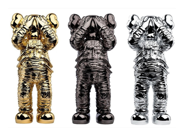
KAWS Holiday Space Set of 3 Gold Black Silver Companion Astronaut Figure Rare
$2,900.00 USD
-
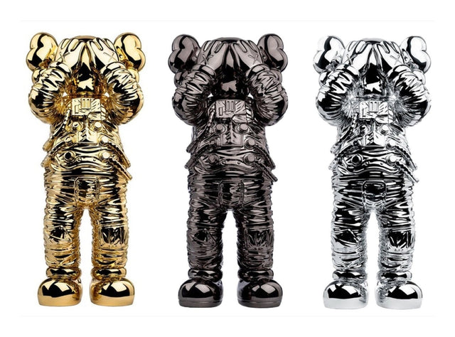
KAWS Holiday Space Set of 3 Gold Black Silver Companion Astronaut Figure
$2,900.00 USD
-
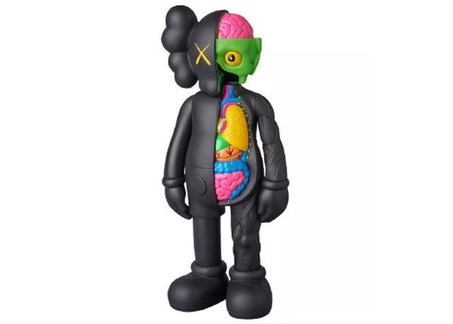
KAWS Companion Flayed Open Edition Black Medicom Toy Dissected Sealed New Figure
$599.00 USD
-
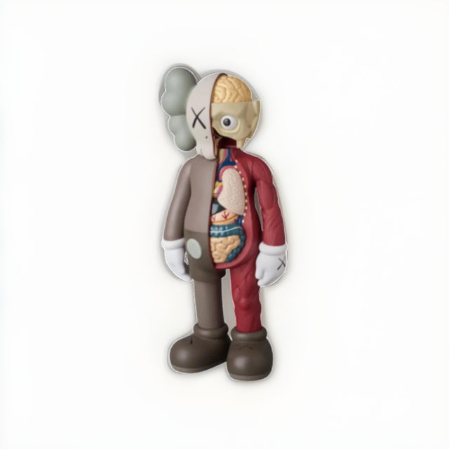
KAWS Companion Flayed Open Edition Brown Medicom Toy Dissected Sealed New Figure
$349.00 USD
-
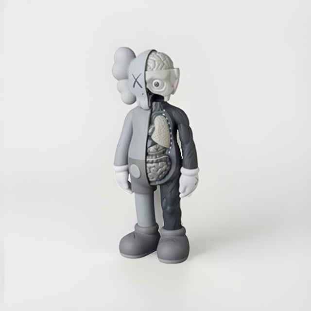
KAWS Companion Flayed Open Edition Grey Medicom Toy Dissected Sealed New Figure
$349.00 USD
Browse the collection for current listings.