

AI-generated interior concept using product reference photography; setting, scale and framing are illustrative.
Integrating three-dimensional art into architectural shelving requires a precise understanding of scale, physical rhythm, and visual density. Within residential interiors, open joinery often risks becoming either an overcrowded display of domestic ephemera or a series of sterile, isolated voids. Placed deliberately within custom millwork, the BE@RBRICK Keith Haring 400% + 100% Set Medicom Toy Bearbrick Foundation Art New establishes a sophisticated dynamic through its paired format. Rather than functioning as a singular static object, the larger 400% scale form and its accompanying 100% companion operate as a dual-point visual anchor. Their glossy surface treatment and dense, calligraphic line work interact directly with light, surrounding timber grains, and nearby bound volumes. By examining how this specific set occupies vertical and horizontal space, designers can resolve the recurring challenge of balancing sculptural weight against architectural joinery, creating curated compositions that respect both the art object and the surrounding room architecture.
The Dual-Scale Dynamic: 400% and 100% in Spatial Proportion
The structural relationship between the 400% and 100% figures in the Keith Haring set introduces an immediate hierarchy that disrupts the monotony of standard shelf arrangements. In interior spatial design, placing two identical forms of differing scales side by side creates a rhythmic tension. The 400% figure commands primary attention through its substantial volume and presence, while the 100% figure acts as a deliberate accent, drawing the eye downward or outward depending on its exact placement. When staged together on an open oak or walnut shelf, the pair prevents the display from feeling top-heavy or floating without context. The smaller figure provides an immediate visual scale reference, allowing the viewer to process the three-dimensional geometry of the larger bear figure with greater clarity. Placing the 100% figure slightly forward or to the side of the 400% model establishes a diagonal depth vector across the shelf plane, transforming a flat horizontal surface into an active spatial field.
Surface Graphics and the Mechanics of Visual Density
Grounding our analysis in the physical characteristics of the object, the Keith Haring BE@RBRICK features a continuous water-transfer print composed of crisp, high-contrast black line work interspersed with distinct red heart motifs over a clean white torso, head, and limbs. Because this pattern wraps seamlessly across rounded shoulders, ears, and cylindrical legs, the visual weight of the object shifts as the viewer moves past the shelf. Unlike a flat canvas or a solid-colored ceramic vessel, this graphic distribution creates an intricate surface tension. The dense black squiggles and rhythmic linework read as a unified texture from a distance, but reveal distinct iconography upon closer inspection. Within an open joinery system, this dual reading is invaluable. The light base plastic reflects ambient natural light, keeping the shadow line behind the figure clean, while the repeating black lines and punchy red accents lock the eye into the shelf bay, preventing the object from dissolving into the dark recesses of deep casework.
When planning a custom joinery wall, the distribution of graphic density across adjacent bays dictates whether an interior feels structured or cluttered. Placing a high-contrast object like the BE@RBRICK Keith Haring 400% + 100% Set Medicom Toy Bearbrick Foundation Art New next to uniform cloth-bound books provides an instant visual anchor. The primary design challenge is managing scale offset: the larger 400% figure commands immediate attention, whereas the smaller 100% companion risks being swallowed if flanked by heavy, dark volumes. Establishing clear horizontal breathing room, leaving at least three to four inches of clear shelf space around the smaller figure, allows the eye to process its micro-scale without losing the rhythm of the larger pattern across the wider joinery expanse.
Consider a hypothetical living room wall featuring a white oak open shelving system measuring twelve feet wide by eight feet high, divided into nine uniform rectangular bays. In this hypothetical setup, a designer might place the 400% Haring figure on an eye-level shelf within a central bay, offset by a curated stack of horizontal art monographs on the lower left. The smaller 100% figure sits on the adjacent upper shelf, positioned precisely where a key sight line terminates near a reading chair. By keeping the immediate surrounding shelf surfaces sparse, the high-contrast line art of the figures draws the eye through the open millwork without requiring intense task lighting. The trade-off in this arrangement is reduced storage volume for general books; dedicating a full bay to a small figure sacrificing functional shelf space for graphic balance. However, this trade-off prevents the visual heavy-handedness that occurs when every inch of joinery is packed with physical media.
Comparing this graphic balance to another Pop art landmark highlights the difference between line-based patterns and commercial typography. The hydro-dipped surface of the Bearbrick BE@RBRICK Andy Warhol Brillo 400% 100% Set Original 2020 Medicom New utilizes bold block lettering and geometric color blocks rather than hand-drawn contours. While Haring's motifs read as an organic continuous field, the Brillo graphics act as hard-edged architectural signage within a shelf bay. Introducing the Brillo set into an adjacent joinery section creates a stark dialogue between Haring's street-derived line work and Warhol's industrial pop iconography. Designers must ensure that the saturated reds and blues of the Brillo typography do not overpower the delicate black linework of the Haring figures. Maintaining clear negative space between the two sets preserves the distinct spatial identity of each bay while celebrating their shared Pop art heritage.
Shelf Rhythm, Sight Lines, and Sightline Calibration
Calculating the correct elevation for three-dimensional art within built-in joinery depends entirely on human sightlines. Positioned too high, the intricate line work on the top of the head and ears is lost to shadows; positioned too low, the smaller 100% figure becomes visually buried behind shelf lips or furniture fore-grounds. The ideal placement for the Keith Haring 400% and 100% pair is at approximate eye-level when seated or standing in key circulation zones. Within a living room or primary study, setting the figures on a mid-height floating shelf allows light to catch the glossy finish of the head and shoulders, casting clean, soft shadows on the back panel of the cabinet. The dual-scale format allows designers to establish asymmetrical sightlines: the eye strikes the torso of the 400% figure first, follows the curve of the ear up toward top lighting, and then drops naturally to the compact, miniature detail of the 100% figure resting nearby.
How Not to Crowd Books: Spatial Negative Space
A frequent error in residential styling is jamming sculptural art directly against rows of hardbound books. When three-dimensional objects are squeezed between bookends or tight stacks, both the books and the sculpture lose their formal clarity. To allow the Keith Haring BE@RBRICK set to breathe, designers must enforce dedicated negative space around the pair. On a long horizontal shelf bay, position bound volumes exclusively on one side, terminating them with a heavy stone or timber bookend. Leave a generous gap equal to at least the width of the primary 400% figure before introducing the BE@RBRICK set. This breathing room isolates the smooth, injection-molded silhouette against the interior wall of the joinery. By keeping the immediate surrounding area clear of busy spines and competing text, the graphic black-and-red line art on the bear surface stands out as a clear, deliberate sculptural choice rather than shelf clutter.
A Distinct Graphic Comparison: The Brillo Set Format
A Study in Graphic Formats
To understand the unique visual personality of the Haring graphics, it is useful to compare them with another landmark graphic presentation in the same dual-scale format. The Bearbrick BE@RBRICK Andy Warhol Brillo 400% 100% Set Original 2020 Medicom New presents a totally different visual language across the identical molded plastic form. Note that availability for specific gallery editions can change over time. Where the Haring pattern relies on continuous fluid linework and small spot-color hearts, the Brillo edition utilizes bold commercial block typography, crisp blue-and-red lettering, and simulated cardboard box iconography spread across a off-white background.
This is a graphic comparison between two independent licensed releases, not an artist collaboration or joint venture between the Haring and Warhol estates. Examining these two separate releases side-by-side demonstrates how distinct surface applications recontextualize the exact same physical mold. The Haring surface uses gestures rooted in his signature line drawings, maintaining an organic rhythm even after being digitized for water-transfer printing. The Brillo surface, by contrast, imports explicit commercial packaging design into the domestic sphere, utilizing dense block typography and hard-edged geometric boundaries that mimic corrugated cardboard containers.
Comparing Graphic Weight on Architectural Shelving
This comparison highlights how different graphic treatments alter an object's spatial weight. The Brillo edition reads as a structured, planar grid of commercial branding wrapped onto a organic form, creating a pop-art juxtaposition that feels architectural and rigid. In contrast, the Haring edition feels kinetic, hand-drawn, and rhythmic. Placing the Haring set on a raw plaster or light wood shelf yields a soft, organic graphic energy. Placing a Brillo set in a similar space introduces an abrupt industrial graphic contrast. Recognizing these differences allows designers to select the specific graphic energy required to balance neighboring materials in a room.
The structural layout of open joinery directly interacts with these competing graphic energies. Linear shelves made of clear-grade Douglas fir or oiled white oak present strong horizontal grain lines. When populated with the BE@RBRICK Keith Haring 400% + 100% Set Medicom Toy Bearbrick Foundation Art New, the continuous black linework absorbs and breaks up those horizontal timber lines, creating a visual weave between the wood grain and the hand-drawn pattern. The red hearts act as scattered focal points that draw the eye smoothly across the shelving bay without stopping it abruptly.
Conversely, introducing the Brillo edition onto the same timber shelving introduces hard vertical and diagonal text elements that slice against the wood grain. The commercial block lettering establishes a strict grid that demands immediate visual priority. In a room dominated by soft textiles, lime wash, or honed limestone, the Brillo edition acts as an intentional graphic disruption, whereas the Haring set acts as a unifying artistic texture. Designers must evaluate whether a millwork niche requires a graphic stabilizer or a energetic focal point before selecting between these two surface treatments.
Tradeoffs in Surface Energy and Material Palettes
Integrating high-contrast graphic figures into custom joinery requires balancing visual noise against surrounding finishes. The primary tradeoff when specifying the Haring set lies in its active surface density. Because the black-line figures cover the entire silhouette, placing the figures directly adjacent to complex book spines or patterned ceramics can produce visual clutter. The Haring figures require dedicated negative space on a shelf, ideally flanked by low-texture items like matte ceramic vessels, solid-bound monographs, or unadorned plaster bookends.
The tradeoff with the Brillo set involves its intense commercial color scheme. The stark primary blues and bright reds against a pale backdrop can overpower subtle, natural material palettes. While the Haring set uses red selectively as an accent heart against a white field, the Brillo set distributes red and blue across entire graphic blocks. In spaces featuring natural linen upholstery, raw concrete, or muted earth tones, the Brillo set can feel jarring if not intentionally grounded by adjacent charcoal or navy accent elements. The Haring set offers greater flexibility across neutral, Scandinavian, or organic modern interiors due to its dominant monochrome field punctuated by small crimson accents.
Hypothetical Worked Decision: Millwork Specifications for a Residential Library
Consider a hypothetical residential library bay measuring 8 feet wide by 9 feet tall, constructed from rift-sawn white oak with matte black steel uprights. The hypothetical millwork features six open horizontal shelves arranged in a symmetrical vertical rhythm. The design objective is to display art monographs, small sculptural objects, and a two-figure collectible set on the third shelf from the floor, which sits directly at standing eye level.
The initial specification considered placing the Brillo set on the central oak shelf, flanked by collections of design history books. Upon evaluating the spatial rendering, the rigid commercial typography of the Brillo set fought against the natural vertical grain of the rift-sawn oak and cladded the center of the shelving unit in heavy primary colors. The graphic weight pulled the visual center of gravity too far inward, making the surrounding open bays feel sparse by comparison.
The final specification substituted the BE@RBRICK Keith Haring 400% + 100% Set Medicom Toy Bearbrick Foundation Art New. The 400% figure was positioned 14 inches from the left steel upright, with its body angled at 15 degrees toward the center of the room to catch ambient light from an adjacent window. The 100% figure was set 4 inches to the right and 2 inches forward, creating a staggered foreground relationship. A cluster of matte white porcelain vases was arranged on the far right side of the same shelf, providing a quiet neutral buffer. The fluid black linework of the Haring figures echoed the thin profile of the matte black steel uprights, while the scattered red hearts established a subtle color connection with a crimson cloth-bound monograph positioned two shelves below. This arrangement balanced graphic interest with structural clarity across the entire timber joinery system.
Material Harmony: Resin, Plastics, and Timber Joinery
Combining synthetic high-gloss plastics with natural architectural materials requires conscious material balancing. Built-in cabinetry typically features tactile finishes like wire-brushed oak, stained walnut, matte paint, or honed limestone trim. The smooth, non-porous, glossy finish of the Medicom Toy plastic acts as a sharp material foil to these textured surfaces. When natural light washes across a matte timber shelf, the BE@RBRICK reflects subtle highlights along its rounded shoulders and curved skull, introducing a crisp, modern sheen into a warm wood recess. To maintain balance, pair the plastic figures with neighboring elements that echo its clean finish, such as polished glass vessels, matte black iron hardware, or smooth lacquered trays. Avoid placing soft textiles or fragile paper ephemera directly adjacent to the figures, as these can dilute the clean, industrial precision of the molded plastic form.
Hypothetical Case Study: A Custom Walnut Library Wall
Consider a detailed hypothetical design scenario: a modern residential library featuring floor-to-ceiling dark-stained American walnut joinery. The hypothetical room dimensions measure sixteen feet long by twelve feet wide with a ten-foot ceiling height. The millwork is designed with deep shadow-line reveal detailing and integrated linear 2700K LED strip lighting concealed in the underside of each shelf shelf-lip. The central bay of the millwork features an open display niche measuring four feet wide by eighteen inches tall, flanked on both sides by tight vertical rows of architectural monographs bound in grey cloth.
In an early layout attempt, the client placed a collection of small ceramic pots and stacked paperback novels alongside the Haring set, resulting in a visually congested central bay where the soft LED light created harsh shadows across competing textures. The high visual frequency of the varied book spines combined with textured ceramics absorbed the directional lighting, obscuring the graphic clarity of Haring's line work. To resolve this clutter, the designer cleared the central niche entirely, leaving only the dark walnut backdrop to act as an unadorned framing plane.
The BE@RBRICK Keith Haring 400% + 100% Set Medicom Toy Bearbrick Foundation Art New was positioned off-center to the right, with the 400% figure turned at a subtle fifteen-degree angle toward the room entrance and the 100% figure placed three inches to its left and slightly forward. The warm LED overhead lighting caught the top curves of the ears and shoulders, highlighting the crisp black line art and bright red hearts against the rich brown timber background. The remaining three feet of horizontal shelf space remained completely empty, allowing the dark walnut grain to frame the graphic duo as the focal point of the entire wall.
Evaluating this composition requires balancing scale, surface contrast, and spatial cadence. Positioning the smaller figure forward breaks the horizontal plane of the shelf, creating depth without physical clutter. The contrast between the matte walnut wood and the glossy white hydro-printed shell of the figures forces the eye directly to the artwork. However, specifying a high-contrast graphic object within a dark, linear millwork system introduces visual trade-offs. The high-key white ground of the Haring figures draws primary attention, which can overwhelm adjacent shelf bays if those bays house delicate or low-contrast objects. To maintain balance across the wider library wall, neighboring shelves require careful grouping of uniform book spines or saturated, solid-toned objects that do not fight the active linework of the central niche.
In a secondary iteration within the same hypothetical project, the designer evaluated substituting the Haring pair with the Bearbrick BE@RBRICK Andy Warhol Brillo 400% 100% Set Original 2020 Medicom New to test how a different graphic motif interacted with the walnut backdrop. While the Haring set relies on fluid, figurative black lines and saturated red accents that pop against the dark wood, the Brillo set introduces a rigid grid of bold blue and red commercial typography. Against the deep brown walnut, the Brillo set reads as a sharp pop-art motif, creating a cooler, more industrial graphic presence. The trade-off becomes a choice between organic movement and structured commercial branding: the Haring figures offer gestural warmth that complements the organic grain of the walnut, whereas the Brillo set provides an uncompromising rectangular text layout that contrasts sharply with the architecture of the joinery.
Sight lines from primary seating locations within the room further dictate figure rotation and spacing. When viewed from an armchair positioned eight feet away at a forty-five-degree angle, the fifteen-degree turn on the 400% figure exposes the lateral wrap of the print design across the torso and arm, preventing the object from appearing flat. The three-inch spacing between the 100% and 400% figures ensures that their silhouettes remain distinct from that vantage point, preventing the smaller silhouette from merging into the shadow cast by the larger body. By reserving thirty-six inches of negative space to the left of the pair, the eye registers the architectural millwork first as a grounding framework, then settles immediately on the curated figures without spatial distraction.
Designing the Next Spatial Layer in Residential Interiors
Successfully integrating graphic art objects into architectural millwork is only one step in curating a cohesive interior scheme. Once shelf proportions, sightlines, and spatial clearance have been resolved for sculptural pieces, attention naturally shifts to adjacent vertical surfaces and alternative graphic traditions. Designers looking to establish a complementary visual dialogue across an open-plan room can explore contrasting pop art iconographies on neighboring walls or console tables. Evaluating how distinct graphic idioms anchor different functional zones ensures that the interior feels thoughtfully composed rather than randomly assembled. For projects seeking a bolder commercial graphic presence on an opposing display shelf or adjoining media cabinet, incorporating the structured typography of the Bearbrick BE@RBRICK Andy Warhol Brillo 400% 100% Set Original 2020 Medicom New offers an option to anchor your broader spatial layout.
Shop BE@RBRICK
Explore current pieces available from the gallery.
-

BE@RBRICK NASA Space Shuttle 40th Anniversary 1000% Medicom Toy Bearbrick
$600.00 USD
-
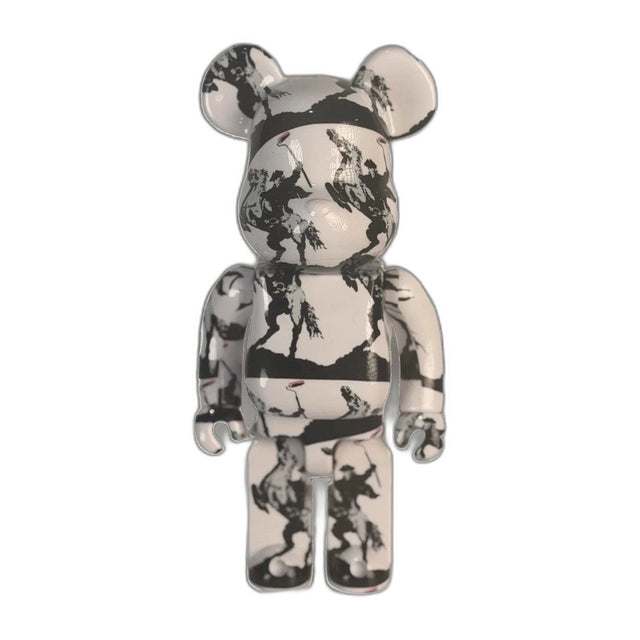
BE@RBRICK Brandalism Sync Banksy Medicom Toy Art Figure du-al.io Authenticated
$199.00 USD
-
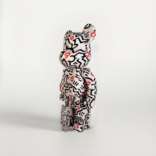
BE@RBRICK Keith Haring 400% + 100% Set Medicom Toy Bearbrick Foundation Art New
$199.00 USD
-

Bearbrick BE@RBRICK Mercury Astronaut 400% 100% Set NASA Medicom Toy Sealed New
$225.00 USD
-
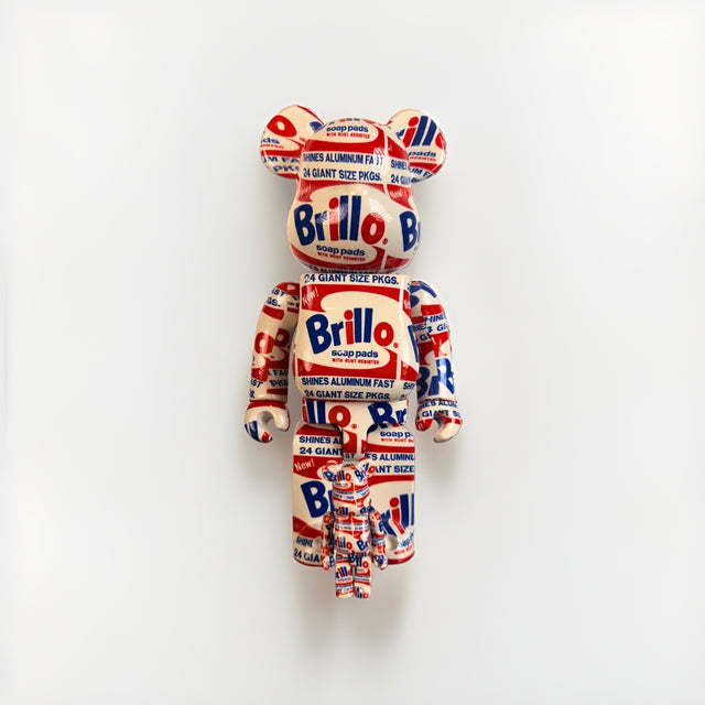
Bearbrick BE@RBRICK Andy Warhol Brillo 400% 100% Set Original 2020 Medicom New
$275.00 USD
Browse the collection for current listings.