

AI-generated interior concept using product reference photography; setting, scale and framing are illustrative.
When placing three-dimensional figurative art near domestic prep zones, interior designers face a subtle spatial balance between utilitarian iconography and practical room layout. The placement of high-contrast graphic figures requires careful thought regarding light, scale, and surface material. In contemporary residential plans, transition zones, such as dry kitchen alcoves, butler pantries, and sideboards adjacent to dining spaces, offer unique opportunities to display pop art motifs without exposing delicate surfaces to the harsh realities of active cooking environments. The Bearbrick BE@RBRICK Andy Warhol Brillo 400% 100% Set Original 2020 Medicom New brings commercial packaging imagery directly into dialogue with modern cabinetry, architectural hardware, and interior finishes.
By translating familiar commercial graphics onto stylized ursine forms, these figures transform familiar household packaging typography into distinct sculptural objects. Placed thoughtfully within a dry kitchen-adjacent niche, the two distinct scales establish an immediate visual dialogue. Rather than overwhelming a room, their crisp primary colors and repeating text blocks anchored by bright white gloss finishes establish a clear visual resting point against neutral millwork or stone surfaces. Understanding how to integrate these high-visibility graphic objects involves evaluating spatial scale, physical safety from environmental hazards, surface finishes, and the surrounding visual architecture.
Analyzing the Visual Structure of the Brillo Graphic Pattern
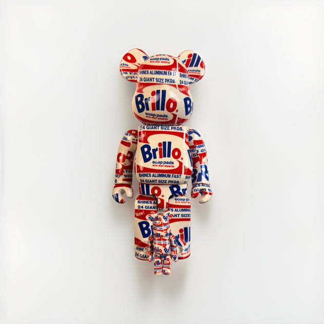
A direct examination of the Bearbrick BE@RBRICK Andy Warhol Brillo 400% 100% Set Original 2020 Medicom New reveals a sophisticated application of commercial typography across curved plastic forms. The primary figure stands in a rounded bear silhouette, completely wrapped in a hydro-dipped water transfer print that replicates classic soap pad box graphics. Bright red wavy banners house the bold blue Brillo logo, flanked by secondary lettering reading soap pads, SHINES ALUMINUM FAST, and 24 GIANT SIZE PKGS. Because the pattern is applied across complex contours, the typography bends, fragments, and wraps over the ears, chest, legs, and back, creating an intriguing dynamic from every angle.
The companion 100% figure repeats this exact graphic identity at a smaller scale, nestling beside the larger figure's leg in display configurations. The background color of both figures is a bright white, which provides a crisp backdrop for the saturated primary red and royal blue lettering. The surface finish carries a smooth gloss, reflecting ambient room light across the rounded shoulders, belly, and ears. This high-gloss coating keeps the sharp graphic edges crisp and legible even when viewed from several feet away across a open-plan room.
When positioning these graphic objects within a dry kitchen-adjacent niche, designers must weigh the balance between spatial exposure and functional safety. Kitchen environments introduce airborne grease, humidity from steam, and heat fluctuations that dull glossy synthetic coatings over time. Placing the pair inside a recessed dry wall alcove positioned eight feet away from cooktops isolates the ABS plastic from vaporized oils while preserving line of sight from the main kitchen island. This placement trades the immediate intimacy of a countertop display for long-term material stability and lower maintenance demands.
Consider a hypothetical decision for a kitchen-adjacent dining passage measuring twelve feet wide by nine feet high. The back wall features matte charcoal cabinetry framing a marble coffee bar with light gray veining. Placing the glossy primary colors directly against highly figured marble creates visual confusion, as the thin gray veins collide with the hydro-dipped typography. The chosen solution mounts an inset matte white quartz shelf six inches above the coffee bar surface within a dedicated ten-inch dry niche. The matte backdrop absorbs surrounding ambient reflections, allowing the gloss finish of the 400% figure to catch overhead recessed spotlights without blinding glare. The red banners pick up subtle warm undertones in adjacent timber millwork, establishing a quiet color echo across the transition zone.
The small 100% figure acts as an anchor for scale variation within the niche. Rather than aligning both figures along a centered axis, offset the smaller figure three inches forward and two inches to the left of the main figure's torso. This asymmetrical grouping breaks the rigid geometry of square cabinetry and offers a moment of visual rest between heavy architectural elements. Nearby art choices, such as the monochrome linework in the BE@RBRICK Keith Haring 400% + 100% Set Medicom Toy Bearbrick Foundation Art New, show how bold primary palettes contrast against black-and-white graphics in contiguous living spaces.
Spatial Scale and Visual Weight in Kitchen-Adjacent Niches
Integrating three-dimensional art objects near dining or food prep zones requires evaluating spatial scale rather than relying solely on floor space. The 400% figure provides substantial vertical presence without requiring an oversized footprint, while the 100% figure offers an intimate counterpoint. When positioned together on a recessed shelf, shallow console, or built-in dry pantry counter, the contrast between the larger and smaller figures creates a sense of depth within a narrow space.
Visual weight is dictated heavily by color contrast and graphic density. Because the Brillo text is densely packed and uses high-contrast red and blue, the 400% figure visually anchors its immediate surroundings. It commands attention despite its compact footprint. Placing the pair inside an architectural niche, such as a framed drywall cutout or an open millwork bay, confines the high-energy graphic print, allowing it to function as a focal point without cluttering the broader room's sightlines.
Protecting Art Objects from Environmental Kitchen Hazards
While placing artwork near a kitchen creates an engaging dialogue with food culture and domestic design, environmental controls are essential. Artworks constructed from molded plastic and applied printed films are sensitive to heat, steam, airborne grease, and direct sunlight. Active cooking zones produce micro-fine oil vapor and moisture that settle on nearby surfaces, attracting dust and dulling glossy plastic finishes over time. Furthermore, exposure to high temperatures or direct thermal radiation from stovetops can soften plastic or cause surface wraps to yellow and peel.
For these reasons, the Bearbrick BE@RBRICK Andy Warhol Brillo 400% 100% Set Original 2020 Medicom New must be positioned in a dry, low-traffic niche strictly isolated from active cooking zones. Butler pantries, bar credenzas, sideboards in adjoining dining alcoves, or recessed shelving along pass-through hallways provide ideal ambient conditions. These areas offer the visual connection to culinary and domestic themes while shielding the figures from steam, splatter, and excessive handling. Additionally, keeping paper-backed works, cardboard box art, or unsealed plastic figures away from direct sunlight, heat, steam, and damp environments prevents premature fading and material degradation.
Color Echoes: Balancing Primary Hues with Interior Materials
The primary red and blue palette of the Brillo graphics provides a striking counterpoint to modern residential materials. In contemporary kitchens and dining areas dominated by white oak, polished concrete, honed marble, or matte black cabinetry, the introduction of crisp primary red and royal blue introduces a controlled pop of energy. Rather than overwhelming the space, these colors can echo minor architectural accents throughout the room.
For instance, a matte white plaster niche provides a stark, clean backdrop that accentuates the off-white base tone of the 400% figure. A nearby blue ceramic vase, red stitching on leather dining upholstery, or warm copper lighting fixtures subtlely draw out the secondary details in the Brillo typography. Because the figures are predominantly white with red and blue accents, they harmonize easily with cool grey quartz counters, stainless steel hardware, and light-toned wood joinery without clashing against underlying neutral palettes.
Establishing Visual Rest Around High-Density Graphic Objects
Because the Brillo graphic pattern features repeating text, logos, and contrasting bands, visual rest is essential to maintain design integrity. Placing highly patterned objects among small decorative items, cookbooks, or intricate ceramics creates visual clutter. To maximize impact, the area surrounding the figures should remain sparse and uncluttered.
Negative Space and Shelf Clearance
Allow generous negative space around both the 400% and 100% figures. A clean perimeter of several inches on either side lets the iconic bear silhouette stand out clearly against the back wall. If placed on an open shelf, ensure sufficient vertical clearance so the ears do not feel cramped against the shelf above.
Lighting Selection
Lighting plays a critical role in highlighting the glossy finish of the figures. Avoid direct, harsh spotlights that create blinding reflections on the curved head and chest. Instead, opt for indirect, diffuse lighting, such as concealed LED strip lighting recessed into the top of a niche, or a soft ambient wall sconce. Diffuse light evenly illuminates the red and blue typography without obscuring the text under intense glare.
Hypothetical Room Application: The Dry Butler's Pantry Alcove
To illustrate how these principles apply in a practical interior setting, consider a hypothetical residential project featuring a transitional butler's pantry located between a main kitchen and a formal dining room. The room features dark navy painted cabinetry, polished nickel hardware, and grey-veined white marble countertops. The wall opposite the wet sink contains a dedicated dry display niche framed in custom cabinetry, lined with a smooth, unadorned light oak back panel. Because this zone sits entirely clear of active cooking ranges, boiling liquid steam, and oil splatter, it preserves the integrity of hydro-dipped finishes over time while retaining proximity to domestic food culture.
In this hypothetical setup, the Bearbrick BE@RBRICK Andy Warhol Brillo 400% 100% Set Original 2020 Medicom New is positioned centrally on the light oak shelf within the dry alcove. The warm oak back panel softens the high-contrast red and blue graphics, while the navy cabinetry below echoes the royal blue Brillo text. The 400% figure stands slightly off-center, with the smaller 100% figure positioned forward and to its left, creating asymmetrical balance and depth. An overhead LED channel concealed within the upper cabinetry provides a soft, warm glow that highlights the gloss finish without casting harsh reflections.
Positioning graphic figures within a culinary transition zone relies on calculated spatial relationships. A dry alcove in a pantry acts as a visual palate cleanser between the operational intensity of a kitchen and the formal composure of a dining space. Commercial packaging iconography feels native to the culinary sphere, yet the translation of Andy Warhol's 1964 Brillo motif onto a three-dimensional bear form elevates the object into deliberate art commentary. When integrated alongside timber and stone, the bright primary tones of the packaging graphics break the uniformity of traditional millwork without clashing against architectural finishes.
As an alternative design direction, the designer considered placing a framed two-dimensional pop art print within the same niche. However, a flat print would lack the physical depth required to balance the heavy navy cabinetry. Another alternative considered was a single large monochromatic ceramic vessel. While elegant, the ceramic vessel failed to provide the subtle color bridge between the dark blue millwork and the surrounding white plaster walls. The dual-scale Brillo bear figures offer both physical volume and a rich color palette, successfully grounding the dry pantry transition space.
Designing for a dry pantry niche involves balancing reflective qualities, ambient lighting, and scale. A primary tradeoff exists between high-contrast graphic art and quiet architectural materials. Highly saturated graphics risk overpowering soft natural stone or neutral wood species if introduced without an anchoring element. In this niche, the navy millwork anchors the visual weight, allowing the bright red and blue graphics to function as intended accents rather than disruptive focal points. Another material consideration involves lighting choice. Direct spotlighting on hydro-dipped finishes causes harsh hot spots and glare. Utilizing a recessed indirect LED linear fixture diffused at 2700K casts a gentle wash over the oak backboard, illuminating the figures cleanly while preserving detail across the contours of the plastic form.
For projects requiring an alternative narrative tone or dynamic line work, a designer might evaluate the BE@RBRICK Keith Haring 400% + 100% Set Medicom Toy Bearbrick Foundation Art New for a similar dry alcove. The Keith Haring set relies on crisp black linework and bold red accents over a neutral white ground, providing a energetic alternative to commercial packaging graphics. While the Warhol Brillo set connects directly to kitchen culture through its soap box origins, the Haring set introduces rhythmic movement that works effectively in minimalist or modern plaster niches where raw graphical line energy is preferred over industrial brand motifs.
In a hypothetical decision framework, a designer working with a 36-inch wide by 24-inch high dry niche must select between a single large sculpture or a layered two-figure grouping. Choosing a single 1000% scale figure in a niche of these proportions creates spatial crowding, leaving less than two inches of vertical clearance and generating a cramped, compressed profile. Conversely, placing only a 100% figure leaves vast empty voids that make the display appear unfinished. The pairing of a 400% figure with a 100% figure solves this spatial equation. The taller figure establishes a vertical anchor that occupies roughly half the niche height, while the smaller figure adds a secondary layer of perspective. This staggered placement creates a diagonal visual path across the alcove, pulling the eye smoothly from the dark cabinetry frame toward the illuminated wood interior.
Comparative Analysis with Alternative Graphic Figures
When selecting figurative graphic art for residential spaces, comparing tone, graphic density, and color structure helps determine the best fit for a specific environment. While the Brillo figures rely on bright primary colors and dense commercial typography, other art figures offer starkly different visual energies.
For instance, design references like the BE@RBRICK Keith Haring 400% + 100% Set Medicom Toy Bearbrick Foundation Art New present an entirely different aesthetic dynamic. The Haring figures feature flowing, hand-drawn black squiggles, energetic figure outlines, and isolated red heart motifs over a smooth white background. Viewed side-by-side, the Haring figure exhibits a fluid, organic motion across its surface, whereas the Brillo set delivers structured, rectangular commercial typography and bold graphic block lettering.
In a room characterized by minimalist architectural lines, smooth slab cabinet fronts, and geometric stone tiles, the linear structure of the Brillo graphics provides a natural alignment with the room's geometry. Conversely, in spaces dominated by strict architectural grids where an organic, hand-rendered balance is needed, the fluid linework of a figure like the Haring set offers a contrasting, playful rhythm. Evaluating these structural differences allows interior designers to match the artwork's line language to the architectural details of the home.
When assessing graphic density, the Brillo print covers the ABS plastic form with stacked corporate logos, registration marks, and contrasting red and blue block elements. This dense surface pattern alters how light interacts with the sculpture. Light skimming across the hydro-dipped shell highlights the repeating typographic rhythm rather than the underlying bear silhouette. In contrast, figures with generous negative space prioritize the silhouette, using light to outline the smooth form. Designers must decide whether the artwork should function as a solid graphic block that holds visual weight against heavy architectural materials or as a floating outline that softens surrounding surfaces.
Color structure introduces another layer of design logic. The Brillo set relies on a high-contrast palette of bright white, vibrant red, and deep blue. This color triadic scheme interacts strongly with natural wood tones, cold-rolled steel, and honed concrete. When placed near warm white oak cabinetry, the cool white substrate of the figure creates a crisp visual step, while the red typography draws out warm undertones in natural timber. Placing a warmer, black-and-cream figure like the Haring set in the same position produces a lower-contrast visual effect that blends into neutral surroundings rather than creating an energetic focal point. The trade-off centers on visual friction. High-contrast commercial lettering creates an intentional pause in a residential corridor, whereas low-contrast line art allows the eye to slide past toward architectural viewlines.
Consider a hypothetical worked decision involving a transitional gallery alcove located adjacent to a open-plan kitchen and dining area. The hypothetical space measures twelve feet wide by nine feet high, featuring custom walnut millwork, matte white plaster walls, and a recessed display niche framed in dark patinated bronze. The designer must choose between a heavily patterned commercial packaging graphic and a fine-line gestural art figure to anchor the niche shelf.
Option A introduces the hydro-dipped packaging motif into the recessed niche. The crisp red and blue block lettering provides immediate visual structure against the dark bronze frame. Because the hydro-dipping process distributes the logo wrapping differently across every unit, light bouncing from overhead micro-spotlights highlights unexpected edges of the lettering on the ears, snout, and limbs. The primary colors establish an energetic dialogue with the nearby kitchen island, echoing small primary accents in cookware or bar seating. However, the density of the printed text requires neutral surrounding wall surfaces. If paired with patterned wallpaper or veined marble slabs, the visual noise of the commercial graphics would compete with the stone, creating an overstimulated composition.
Option B integrates a gestural line-art figure into the same bronze-framed niche. The fluid black lines and negative space offer a softer visual transition, allowing the rich grain of the surrounding walnut millwork to remain the dominant texture. The isolated red heart motifs add controlled pops of color without overwhelming the quiet atmosphere of the gallery alcove. The compromise with this choice is a potential loss of graphic impact. From across the adjacent dining space, the fine lines compress visually, reducing the sculpture to a muted white shape rather than a bold graphic anchor.
In this hypothetical scenario, the design rationale favors the structured packaging graphics of the Brillo figures. The crisp, rectangular typography balances the organic walnut wood grain and reinforces the clean geometry of the bronze framing. By placing the high-density figure inside a clean plaster niche, the designer contains the visual energy while using the bright primary colors to bridge the functional kitchen zone and the quiet gallery space. Matching the graphic rhythm of the object to the surrounding architectural materials ensures the piece reads as an intentional installation rather than an isolated accessory.
Integrating Figurative Pop Art into Long-Term Residential Design
Selecting and arranging pop art sculptures in high-end residential interiors requires thoughtful planning around sightlines, material harmony, and functional boundaries. Placing iconic graphic forms near transition zones introduces personality and cultural context to areas that might otherwise remain purely utilitarian. By treating figures like the Brillo set as key sculptural components rather than mere novelties, designers can craft sophisticated spaces that celebrate mid-century graphic culture.
When planning your next display layout, consider how alternative graphic motifs and color palettes might suit adjacent rooms or secondary niches. Exploring dynamic line art, such as the fluid iconography found on the BE@RBRICK Keith Haring 400% + 100% Set Medicom Toy Bearbrick Foundation Art New, provides an excellent contrast when evaluating options for living areas, study alcoves, or gallery hallways.
Shop BE@RBRICK
Explore current pieces available from the gallery.
-
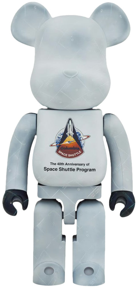
BE@RBRICK NASA Space Shuttle 40th Anniversary 1000% Medicom Toy Bearbrick
$600.00 USD
-
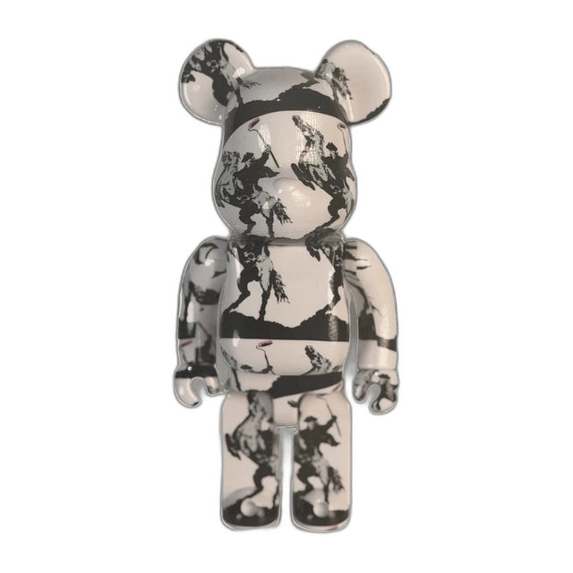
BE@RBRICK Brandalism Sync Banksy Medicom Toy Art Figure du-al.io Authenticated
$199.00 USD
-
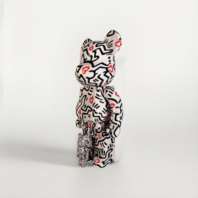
BE@RBRICK Keith Haring 400% + 100% Set Medicom Toy Bearbrick Foundation Art New
$199.00 USD
-
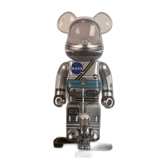
Bearbrick BE@RBRICK Mercury Astronaut 400% 100% Set NASA Medicom Toy Sealed New
$225.00 USD
-
Bearbrick BE@RBRICK Andy Warhol Brillo 400% 100% Set Original 2020 Medicom New
$275.00 USD
Browse the collection for current listings.