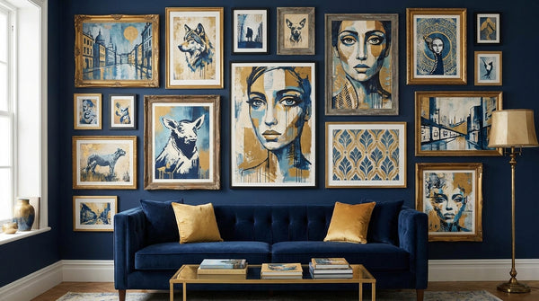
Direct answer: To decorate a small space or apartment with art, choose scale deliberately, commit to either one bold focal piece or a tight curated cluster on each wall, use vertical space and picture ledges to add height and flexibility, favor renter-friendly hanging methods, and choose works with depth or open composition to make the room feel larger. Accessible, authenticated prints and editions are among the smartest small-space choices because they deliver real artistic weight in apartment-friendly sizes without demanding a collector's budget.
Small rooms are not a design problem to overcome; they are a design discipline. When every square foot is visible, the wrong artwork looks like clutter and the right artwork looks like intent. The goal in an apartment is not to fill walls but to compose them. This guide walks through the practical decisions—scale, arrangement, height, hanging method, and buying strategy—that turn a cramped rental into a considered, gallery-quiet space.
Start with scale, not with the wall
The most common small-space mistake is choosing art that is too small. A row of tiny 8x10 frames on a big wall reads as busy and accidental, and it visually chops the wall into fragments, which makes a room feel smaller. One properly scaled piece does the opposite: it gives the eye a single place to land and lets the surrounding wall breathe.
Scale art to the furniture beneath it, not to the room's footprint. Over a sofa, bed, console, or dining table, aim for a piece—or a grouping treated as one unit—that spans roughly two-thirds of the furniture's width. On an empty wall, a single work occupying 60 to 75 percent of the usable wall area almost always looks more intentional than several small works trying to cover the same span.
Counterintuitively, larger art often makes a small room feel bigger, not smaller. A single generous piece implies confidence and calm; a scatter of small frames implies indecision. If your budget or wall size rules out one very large work, treat a cluster as a single rectangle (more on that below) so it still reads as one deliberate mass rather than visual noise.
One bold piece vs. a curated cluster
Every wall in a small home asks the same question: statement or story? Both are valid; they simply do different work.
When to use one bold piece
A single statement work is usually the best choice for your most-seen wall—the one you face when you enter, or the wall above the sofa or bed. One bold piece creates an instant focal point, keeps the room feeling uncluttered, and gives the eye somewhere to rest in a space that is already full of function. Bold does not have to mean loud: a large, quiet, tonal abstract can anchor a room as powerfully as a saturated pop print. What matters is that it is scaled up and allowed to stand alone.
Graphic, high-contrast work tends to punch above its size in small rooms, which is one reason pop art and street-art editions are so effective in apartments. If you are drawn to that language, browse Gauntlet Gallery's Pop Art collection for bold, wall-anchoring pieces that hold a room without overwhelming it.
When to use a curated cluster
A gallery cluster earns its place where you want personality, density, and a sense of collected life—hallways, stairwells, a home-office wall, or a nook you want to feel intimate rather than open. Clusters are also the honest answer for people who already own several smaller works and want them to look intentional together.
The discipline that separates a curated cluster from a cluttered one is treating the whole group as a single shape. Before you put a nail in the wall, lay the frames on the floor and arrange them inside an imaginary rectangle or square. Keep a consistent gap between frames—two to three inches is a reliable default—so the negative space reads as rhythm, not gaps. Anchor the arrangement to a center line (often aligned with the furniture below), and let frame styles vary only if the mats or spacing stay consistent. A cluster that respects an outer boundary looks curated; one that drifts across the wall looks like an afterthought.
A simple rule for small apartments: one statement wall, and no more than one busy cluster wall per room. If both walls compete, the room loses its calm.
Use vertical space to add height
Small apartments are usually short on floor area but not on wall height, and vertical space is the most underused asset in a cramped room. Drawing the eye upward makes ceilings feel taller and rooms feel less boxed-in.
Three practical moves: choose vertical (portrait-orientation) compositions for narrow walls and the spaces beside doorways and windows; stack two or three works in a column to lead the eye up rather than spreading them horizontally; and hang a single piece a little higher on a tall, narrow wall to emphasize the vertical. In tight entryways and galley kitchens, a slim vertical work or a stacked pair does far more than a squat horizontal piece that only underlines how low the room feels.
Bookshelves, the tops of door frames, and the wall above a headboard are all vertical opportunities most people ignore. The instinct in a small room is to keep everything low and out of the way; the better instinct is to lift the eye.
Leaning and picture ledges vs. traditional hanging
Not every piece needs a nail. In a small, evolving space, leaning and ledges are often smarter than committing to a fixed hanging layout.
Leaning art
Leaning framed work on a console, mantel, desk, dresser, or even the floor gives a relaxed, layered look and lets you rearrange in seconds. It is ideal for renters, for anyone who buys frequently, and for oversized pieces that would be awkward to hang. You can overlap two pieces—a larger work behind a smaller one—to create depth on a single surface. The one rule: secure anything tall or heavy so it cannot slide or tip, using a bit of museum putty or a discreet wall hook as a backstop, especially in homes with pets or children.
Picture ledges
A picture ledge (a slim shelf with a lip) is the small-space power tool. A single line of ledges lets you display a rotating, overlapping arrangement of framed prints using only a handful of holes, and you can restyle the whole wall without touching the wall again. Ledges suit collectors who like to swap seasonally, and they turn a growing print collection into a flexible, editable display rather than a permanent commitment.
When to hang
Traditional hanging still wins when you want a clean, floating, gallery look, when a piece is your permanent focal point, or when a work is valuable enough that you want it fixed and secure. For those pieces, hang at gallery height—centered roughly 57 to 60 inches from the floor to the center of the work—so it meets the eye naturally. In a small room, you can drop that center slightly (toward 54 to 57 inches) when the art sits above low furniture, so the piece relates to the sofa or bed rather than floating too high.
Renter-friendly hanging that protects your deposit
You do not have to choose between good walls and your security deposit. The options, from least to most permanent:
- Adhesive strips and hooks: The renter default. Buy strips rated well above your frame's actual weight, press firmly, and let them cure before hanging. Remove slowly and straight down to avoid pulling paint. Best for light and medium frames on clean, painted drywall.
- Picture ledges: Anchor one shelf and display many works, minimizing holes. The ledge itself patches easily at move-out.
- Leaning and floor arrangements: Zero holes, maximum flexibility, and a designed-in reason to keep rearranging.
- Rail and rod systems: A single mounting line supports adjustable hanging cords, so you can move art up, down, and sideways without new holes. Great for hallways and gallery walls you expect to change.
- A few small nails: For heavy or valuable pieces, one or two thin picture-hook nails are often safer and more secure than adhesive—and a small hole is trivially patchable with spackle and touch-up paint. Check your lease first, then patch on the way out.
Match the method to the value. Adhesive is fine for a poster; a signed, framed edition deserves a proper hook or hanger rated for its weight. The goal is art that stays exactly where you put it and walls that survive move-out.
Use art to expand a space visually
Beyond arrangement, the content and framing of the work itself can make a room feel larger. A few reliable levers:
- Choose depth and open space. Works with a horizon line, atmospheric perspective, or generous negative space imply distance and give a small room a "window" that the eye reads as more room. Busy, edge-to-edge compositions can feel like they are pressing in.
- Keep frames and mats light and consistent. Slim frames and wide mats add air around each piece. Consistent framing across a wall lets the eye glide instead of stopping at every border, which makes the whole wall feel calmer and more expansive.
- Let one piece dominate. A clear hierarchy—one large work, minimal supporting pieces—reads as spacious. Equal-weight everything and the room feels congested.
- Use verticals for height, horizontals for width. A wide horizontal piece can stretch a short wall; a tall vertical piece can lift a low room. Match the orientation to the dimension you want to exaggerate.
- Mind the palette. Art that echoes or gently lifts your existing colors integrates into the room and expands it; a clashing palette fragments the space. This is where curation, not just decoration, pays off.
If you want a framework for choosing pieces with intent rather than filling walls at random, Gauntlet Gallery's buyer's guides break down how to evaluate a work's composition, condition, and fit before you commit—useful discipline whether you are buying your first print or your fiftieth.
Why authenticated prints and editions are the smart small-space choice
For apartments, prints and editions are not a compromise—they are frequently the best possible choice. Here is why they fit small-space living so well:
- Accessible price. Signed, numbered editions let you own work by significant artists at a fraction of the cost of a unique canvas, which means you can afford the scale a room actually needs.
- Apartment-friendly sizes. Editions come in a range of formats, so you can find the exact dimensions your wall and furniture call for instead of forcing a room to accommodate the art.
- Light and mobile. Framed prints are easy to move, rehang, lean, and rotate—ideal when you might move again in a year, or simply like to restyle.
- Real cultural and collectible weight. A well-chosen edition carries the artist's language and, when documented, can hold or grow its value over time.
The one non-negotiable is authenticity. An edition's value—both its meaning and its market—rests on provenance: a hand signature, an edition number, and a clear chain of custody or certificate. Buy from sellers who document what they sell. Gauntlet Gallery's full catalog is organized around authenticated works with transparent provenance, and the collector resources hub lays out how to read editions, verify authenticity, and buy with confidence rather than guesswork.
Collecting for a small space is also a natural on-ramp to collecting seriously. Because editions are accessible, they let you build a considered wall over time—learning what you respond to, how a piece lives in daily light, and which artists you want to keep following. If you care about the long arc of value alongside the daily pleasure of the work, Gauntlet Gallery's market and financial insights track how editions from established street and pop artists have performed, so your small-space choices can be smart aesthetically and financially. For a broader primer on building a collection deliberately, start with the gallery's art collecting overview and the guide on how to start a street-art collection on a budget, which pairs naturally with a small-space, edition-first approach.
A room-by-room quick plan
Living room: One bold, scaled-up piece above the sofa, at roughly two-thirds the sofa's width, its center dropped slightly so it relates to the seating. Keep the opposite walls quiet.
Bedroom: A single calm, tonal work above the headboard, or a symmetrical pair. Soften rather than energize. Reserve any busy cluster for a side wall.
Entry and hallway: Prime cluster territory—a tight gallery wall or a run of picture ledges gives narrow transitional space a sense of collected personality without eating floor area.
Home office and nook: Stacked verticals to lift the eye, or a ledge you can restyle as your taste evolves. This is the low-stakes wall where rotation and experimentation belong.
Kitchen and dining: Small, durable framed prints away from splashes and heat; a slim vertical beside a doorway makes a galley feel taller.
A repeatable small-space checklist
- Pick the wall's job first: statement or story.
- Scale to the furniture (about two-thirds its width), not the room.
- Favor one bold piece on your most-seen wall; save clusters for hallways and nooks.
- Treat any cluster as a single rectangle with consistent gaps.
- Use vertical compositions and stacking to add height.
- Consider ledges and leaning before you commit to nails.
- Match the hanging method to the piece's weight and value.
- Choose art with depth, light framing, and a palette that agrees with the room.
- Buy accessible, authenticated editions with documented provenance.
- Leave breathing room—empty wall is part of the composition.
Decorating a small space with art is ultimately an exercise in editing. The apartment that feels considered is rarely the one with the most art; it is the one where every piece was chosen at the right scale, placed with intent, and allowed enough space to be seen. Start with one wall, one well-scaled piece, and one clear decision—statement or story—and let the room grow from there.
Frequently asked questions
What size art should I choose for a small room?
Scale art to the wall and the furniture, not to the square footage of the room. Over a sofa or bed, aim for a piece (or arrangement) roughly two-thirds the width of the furniture below it. In a small room, one appropriately large piece almost always reads as more intentional—and more spacious—than several tiny frames scattered across the wall.
Is one big piece or a gallery cluster better for a small apartment?
Both work; they solve different problems. One bold statement piece gives a small room a clear focal point and a calm, uncluttered feel. A curated cluster adds personality and lets you mix smaller works you already own. As a rule, use a single large piece on your most-seen wall and reserve clusters for a hallway, stairwell, or a wall you want to feel intimate.
How can art make a small space feel bigger?
Choose works with depth, open space, or a horizon line to imply distance; hang a large piece slightly lower so it relates to the furniture; keep frames and mats light and consistent so the eye moves smoothly; and use vertical compositions to draw the eye upward and emphasize height.
How do I hang art in a rental without damaging the walls?
Use adhesive strips rated above your frame's weight, picture-ledge shelves anchored to a single line of holes, leaning arrangements on furniture or the floor, or a slim rail system. For anything heavy or valuable, one or two small, patchable nail holes are often safer and more secure than adhesive—check your lease, then spackle and touch up on the way out.
Are prints and editions a smart choice for small spaces?
Yes. Authenticated prints and editions let you own work by serious artists at accessible prices, in sizes that suit apartments, and they are light and easy to move. Prioritize signed, numbered editions with clear provenance and a certificate or documented chain of custody so the piece holds both its meaning and its value.
This guide is educational and reflects general interior and collecting principles, not an appraisal or investment advice. Measure your own walls and furniture, check your lease before hanging, and verify authenticity and provenance before buying.