Minimalism is not the absence of art — it is the discipline of choosing one thing worth looking at. In a room stripped back to clean lines, soft light and open floor, a single bold work of contemporary or street art does the job of a dozen accessories. It gives the eye a destination, sets the emotional temperature and tells a visitor who lives here in one glance. This is a practical guide to doing that well: choosing high-impact art without clutter, using negative space and restraint on purpose, holding a strict palette, and treating an authenticated edition as the intentional centerpiece it deserves to be.
What art works in a minimalist interior?
The short answer: one large, graphically confident piece with a clear focal point, hung with generous space around it, in a restrained frame, tied to a single accent color the rest of the room already whispers. Minimalist rooms fail with art in two opposite ways — either they stay so bare they feel like a showroom, or they get crowded with small pieces that fight each other. The fix is the same for both: subtract until you are left with a single anchor, then make that anchor count.
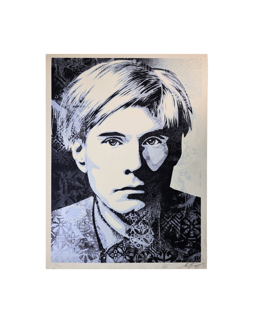
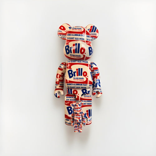
Bold street and pop art is unusually well suited to this. Artists working in that tradition — Shepard Fairey, KAWS, Invader, Andy Warhol, D*Face, Mr. Brainwash — build images out of flat color, strong silhouette and instantly readable composition. Those are exactly the qualities that survive across a wide, quiet wall. A pared-back room asks a piece to hold attention from across the space; a graphic, high-contrast image answers. You can browse a curated cross-section of this work in the Pop Art collection, and use the art index to see how individual artists and editions are organized.
Rule of thumb for a minimalist wall: if you would need a caption to explain the piece from six feet away, it is probably too busy for the room. Choose the image your eye finishes reading before your brain does.
The anchor principle: let one piece do the heavy lifting
Every well-composed minimalist room has a center of gravity. In a maximalist space that role is shared across textures, objects and pattern; in a minimalist one it is concentrated. When you commit to a single anchor artwork, three things happen at once. The wall stops being a blank pause and becomes the reason the seating faces the way it does. The rest of the room can relax into its supporting role — the sofa, the console, the lamp no longer have to be interesting, because they are the frame around the frame. And the piece itself reads as a decision rather than a decoration, which is the difference between a home that looks styled and one that looks curated.
Scale up, not out
The most common mistake is buying art that is too small for the wall it lives on. In a busy room a modest print gets lost; in a minimalist room it looks stranded. A single large work — or one generously sized print that occupies roughly two-thirds of the visual width of the furniture beneath it — will always outperform a scatter of little ones. If your budget favors one bold statement over a gallery wall of six, minimalism is on your side: you were only ever meant to hang the one.
Give it a job
Decide what the piece is for before you hang it. Is it the thing you want to see first when you walk in? The focal point above the sofa that the room is arranged around? The quiet punctuation at the end of a hallway? Naming the job tells you the scale, the height and the wall. A minimalist interior rewards intention, and intention starts with a role, not a nail.
Choosing high-impact art without clutter
High impact and low clutter are not opposites — a single strong image is the least cluttered thing you can put on a wall. The clutter comes from indecision: three medium pieces because you could not choose one, a shelf of framed prints leaning three-deep, a wall that reads as a mood board instead of a statement. Editing is the whole discipline. Here is how to choose the one.
- Silhouette first. Squint at the image. If the main shape still reads when the detail blurs, it will hold a big quiet wall. Fairey's stenciled icons, KAWS's cartoon forms and Invader's pixel mosaics all pass this test instantly.
- One idea, not five. The best minimalist anchor makes a single, clear move — one figure, one word, one gesture. Save the dense, layered, all-over compositions for a room that has more going on around them.
- Contrast carries distance. A room seen from across an open floor needs contrast to register. High-contrast graphic prints stay legible where soft, tonal work can disappear into a pale wall.
- Let the room set the mood, let the art break it. If the space is calm and neutral, the art is allowed to be loud. A single hit of saturated color in an otherwise restrained room is the entire point — not a risk to manage but the effect you are buying.
Character-driven work is especially forgiving here because it arrives pre-composed for impact. The KAWS collection is a good place to study this: the forms are bold, the palettes are decisive, and a single figure fills a wall without a second object nearby. If you want to widen the search before you commit, the full catalog lets you compare scale, palette and subject across artists in one place.
Negative space is the material, not the leftover
In minimalist design, empty space is not what is left over after you place things — it is a material you compose with, as deliberately as the objects themselves. Around a single artwork, negative space does three jobs. It isolates the piece so the eye has nothing to compete with. It signals confidence — a room comfortable enough not to fill every inch reads as considered rather than unfinished. And it creates the pause that makes a bold image feel calm instead of aggressive.
Practically, that means resisting the urge to flank your anchor with sconces, plants and floating shelves. Let the wall breathe. A large print centered on a generous run of bare wall, with clear space above and to the sides, will feel more expensive and more intentional than the same print boxed in by accessories. The emptiness is doing work; do not fill it just because you can.
The quiet around a piece is part of the piece. In a minimalist room, what you leave off the wall matters as much as what you hang on it.
Restrained framing: the frame should disappear
Framing is where a bold piece is most easily undermined. An ornate or heavy frame competes with the art and drags the whole wall toward fussiness — the opposite of what a minimalist room is trying to say. The goal is a frame that presents the work and then gets out of the way.
- Thin profiles. A slim, simple molding — matte black, raw or bleached natural wood, or a fine metal — keeps the emphasis on the image.
- Generous mat, or none at all. A wide white mat adds a built-in halo of negative space and lends a gallery formality. Alternatively, a frameless float or a flush frame gives a cleaner, more contemporary edge. Match the choice to the work: graphic prints often look sharpest with minimal or no mat; works on paper with a signature or edition mark benefit from a mat that lets the margins show.
- Consistent, not decorative. If you ever do hang more than one piece, repeat the same frame. Uniform framing reads as a system; mixed framing reads as clutter.
- Museum glass where it counts. Anti-reflective, UV-filtering glazing protects the paper and removes the glare that would otherwise interrupt a clean wall. On an anchor piece, it is worth it.
Palette discipline: earn exactly one accent
The fastest way to make a bold artwork look intentional rather than accidental is palette discipline. A minimalist room typically runs on a tight neutral base — warm whites, soft greys, pale wood, black. Against that base, your anchor artwork is allowed to introduce one accent color, and that accent should either already exist somewhere quiet in the room or become the single thread you pull through it.
The discipline is the restraint. If the print's dominant color is a warm vermilion, let a single cushion or the spine of a stack of books echo it — and stop there. Do not answer a red painting with a red rug, red throw, red vase and red lampshade; that turns an accent into a theme and the art stops being the event. One accent, echoed once or twice at most, keeps the artwork as the loudest thing in the room, which is exactly where you want it.
| Move | Do | Avoid |
|---|---|---|
| Base palette | Warm neutrals: white, greige, pale oak, black | Multiple competing wall colors |
| Accent | One color, drawn from the artwork | Three or four accent colors at once |
| Echo | Repeat the accent once or twice, small | Matching every textile to the art |
| Metal / wood | Pick one metal, one wood tone | Mixing every finish in the room |
| Pattern | Let the art be the only pattern | Patterned rug + pillows + art |
Placement, height and light
Even the right piece fails if it is hung wrong. A few reliable rules keep an anchor artwork looking effortless:
- Center height at eye level. Aim for the artwork's center around 57–60 inches from the floor. Over a sofa, hang so the bottom edge sits roughly 6–10 inches above the back.
- Relate to the furniture, not the wall. Center the piece on the sofa or console beneath it, not on the full width of the wall. The relationship the eye reads is art-to-furniture.
- Let it stand alone. In a minimalist scheme, one large piece over a key surface beats a symmetrical pair or a grid. Solo placement is the more confident choice.
- Light it deliberately. Soft, even daylight or a single discreet picture light makes the color sing. Avoid harsh downlights that throw frame shadows across the image.
The authenticated edition as a minimalist statement
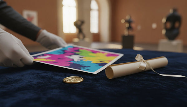
Here is where minimalism and collecting meet. If a room is going to hang its whole identity on one piece, that piece should be real, documented and worth committing to. An authenticated edition — a signed and numbered print, or a work carrying a verifiable certificate and provenance — is the most minimalist decision of all: instead of filling a wall with many disposable objects, you invest in one that holds its meaning and its value.
This is the quiet argument for buying from a specialist rather than a poster shop. A verified edition brings three things a decorative print cannot: confidence that the work is what it claims to be, a paper trail that travels with the piece, and a market value grounded in real sales rather than a frame-store markup. At Gauntlet Gallery, eligible works ship with documented provenance and, where the artist's market supports it, third-party or blockchain-backed certificates — and pricing is benchmarked against a database of more than 300,000 comparable-sales records, so the anchor of your room is also an anchor of value.
Treating art this way changes how it feels on the wall. A framed, authenticated edition reads as a decision you made and can stand behind — the collector's version of minimalism, where the point was never to own less for its own sake, but to own only what earns its place. For a deeper look at how documentation protects both the look and the long-term value of the piece, our companion guide on authenticated art as home decor walks through styling that protects value. New buyers can start with the collector's hub for how authentication and provenance work in practice, and see how pieces are valued against real market data on the financial insights page.
Putting it together: a one-piece room, step by step
- Pick the wall. Choose the surface the room is already oriented toward — usually above the main seating or facing the entry.
- Choose one bold, well-scaled piece. Graphic silhouette, single clear idea, sized to about two-thirds the furniture width. Browse the Pop Art and KAWS collections for anchors that read from across a room.
- Strip the wall around it. Remove competing objects. Let negative space isolate the work.
- Frame to disappear. Thin profile, restrained mat or none, museum glass on the anchor.
- Set one accent. Pull a single color from the artwork and echo it once, small.
- Hang at eye level, related to the furniture. Center around 57–60 inches; light it softly.
- Buy it authenticated. Choose a documented edition so your anchor holds meaning and value — see the collector's hub and the wider art index.
Do this and the room resolves. The eye lands where you want it. The space feels considered rather than empty, bold rather than busy. And the single piece on the wall stops being decoration and becomes the thing the whole room was built to hold — which is exactly what minimalism, done well, was always about.
Frequently asked questions
What art works best in a minimalist interior?
One large, graphically confident piece with a clear focal point — bold contemporary, pop or street art reads well because flat color and strong silhouette hold a wide, quiet wall. Hang it with generous negative space, in a restrained thin frame, and tie it to a single accent color the room already carries.
How many pieces of art should a minimalist room have?
Usually one anchor per key wall. A single well-scaled work outperforms a scatter of small pieces, which read as clutter in a pared-back space. If you add more, repeat the same frame so the grouping reads as a system, not a mood board.
How big should the artwork be over a sofa?
Aim for the piece to span roughly two-thirds the width of the furniture beneath it, with the bottom edge about 6–10 inches above the sofa back and the center around 57–60 inches from the floor. In minimalist rooms, err larger — small art looks stranded on an open wall.
What frame suits bold art in a minimalist home?
A thin, simple profile in matte black, natural wood or fine metal, with a wide white mat or no mat at all. The frame should present the work and disappear; ornate or heavy frames pull the room toward fussiness. Use anti-reflective, UV-filtering museum glass on an anchor piece.
How do I use color when the art is the boldest thing in the room?
Keep a tight neutral base and let the artwork introduce exactly one accent color. Echo that accent once or twice in something small — a cushion, a book spine — and stop. Matching every textile to the art turns an accent into a theme and the piece stops being the event.
Why buy an authenticated edition instead of a decorative print?
If a room hangs its identity on one piece, that piece should be real and documented. An authenticated edition brings provenance, a certificate you can verify, and a value grounded in real sales — so your minimalist centerpiece holds both its meaning and its worth. Gauntlet Gallery benchmarks pricing against more than 300,000 comparable-sales records and ships eligible works with documented provenance and blockchain-backed certificates.