Authenticated Art as Home Decor: Styling Original Street Art That Protects Its Value
How do you use original street art as home decor? Hang authenticated screenprints and framed works where people naturally gather — above a sofa, console, or bed — at a center height of roughly 57–60 inches, and pair a few pieces into a wall grouping or salon wall so they read as a curated collection rather than scattered posters. The single most important move is to buy authenticated originals (not open-edition posters), frame them under UV-filtering glazing, and keep them out of direct sun, high humidity, and heat. That combination gives you the aspirational look you want and preserves the long-term value of what you own.
Below is a practical, gallery-tested playbook for styling original street art at home — placement, wall groupings, scale, pairing artists, and rotation — balanced against the preservation basics every collector should know. The goal is a home that looks collected, not decorated, without quietly damaging the work on your walls.
Why authenticated originals beat posters — for both look and value
There is a real, visible difference between a genuine limited-edition screenprint and a mass-produced poster of the same image. Original prints are typically pulled in a defined edition, often signed and numbered, on heavier archival paper with richer ink density and cleaner registration. On a wall, that shows up as depth, crisp edges, and a physical presence that a thin poster simply cannot fake. Guests may not know why a room feels elevated, but the eye registers quality.
Value is the second half of the story. A poster is decor; an authenticated original is a decor object that can hold or grow in worth over time. When you buy an authenticated piece, you are buying provenance — a documented, credible chain of where the work came from — which is exactly what protects resale value later. You can browse how a curated, authenticated inventory is organized on our art index and across the full collection, and see how market context is tracked in Financial Insights.
What “authenticated” actually means (it varies by artist)
Authentication is not one universal certificate — different artists and makers have different, legitimate standards. Buying into the right chain for the right artist is what keeps a piece both credible and valuable:
- Shepard Fairey / OBEY: works are typically bought on provenance and dealer trust — there is no artist-issued certificate for most prints, so a reputable source and clean history matter most.
- DEATH NYC: pieces generally come with a certificate of authenticity and a gold seal.
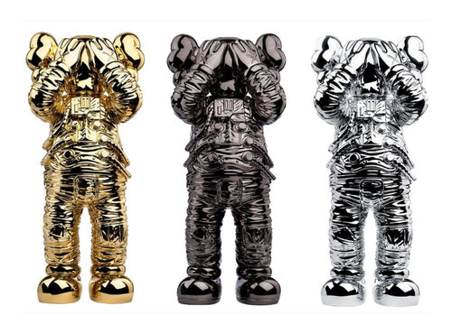
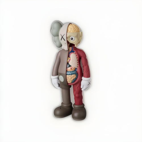
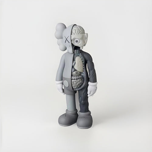
- KAWS and BE@RBRICK / Medicom: collectibles are commonly verified through third-party COA services (such as TrueCOA), blockchain certificates any future owner can verify online.
- Andy Warhol works: verified through recognized third-party authentication (such as TrueCOA in our chain).
- Signed music memorabilia: authenticated by established autograph specialists like Beckett, JSA, or PSA.
- Apollo / space memorabilia: rests on documented provenance and recognized specialists.
The takeaway for a decorator-collector: the “look” you hang should sit on a real authentication foundation. When in doubt, our buyer’s guides break down each artist’s standard, and the Collector’s Hub walks through provenance step by step.
Placement: where original art belongs in a room
Great placement is mostly about eye level, breathing room, and anchoring furniture. A few reliable rules cover most situations.
Get the height right
Hang a single work or the visual center of a grouping so the midpoint lands around 57–60 inches from the floor — standard gallery eye level. In a dining room or over seating, you can go slightly lower so the art relates to seated sightlines. The most common home-decor mistake is hanging too high; art floating near the ceiling disconnects from the room.
Relate art to the furniture below it
- Over a sofa or console, a piece (or grouping) should span roughly two-thirds the width of the furniture for a balanced, intentional look.
- Leave about 6–10 inches of wall between the top of the furniture and the bottom of the frame so they read as related, not colliding.
- Give a strong piece room to breathe — negative space around a work makes it feel more important, not less.
Mind the light and traffic
Choose walls that get flattering, indirect light and low physical contact. Avoid hanging valuable originals in narrow hallways where frames get bumped, directly above heat sources, or on a wall that bakes in afternoon sun (more on that in the preservation section). A beautiful placement that slowly damages the work is not a good placement.
Wall groupings and salon walls
One authenticated print can carry a wall. But grouping several pieces — a gallery wall or a denser salon wall — is how collectors turn individual works into a collection that tells a story.
Gallery wall vs. salon wall
| Style | Look | Best for |
|---|---|---|
| Grid / gallery wall | Even spacing, aligned edges, often matching frames | Calm, modern, editioned prints of similar size |
| Salon wall | Dense, floor-to-eye clustering, mixed sizes and frames | Eclectic collections mixing prints, figures on shelves, and objects |
| Single statement piece | One large work with generous negative space | A hero print or your most valuable work |
How to build a grouping without holes everywhere
- Lay it out on the floor first. Arrange the pieces on the ground until the composition feels balanced, then translate that to the wall.
- Keep consistent gaps. A uniform 2–3 inches between frames reads as intentional; uneven gaps read as accidental.
- Anchor from a center line. Build outward from one shared horizontal axis so the cluster has a spine.
- Trace and template. Cut paper templates of each frame and tape them up before drilling — fewer nail holes, better result.
- Balance visual weight, not just size. A dark, dense image carries more weight than a light, airy one of the same dimensions.
Scale: matching the work to the wall
Scale is where rooms most often go wrong. A small print marooned on a large wall looks lost; an oversized piece in a tight nook feels cramped.
- Big walls want scale. Either one large statement work or a grouping that reads as one big shape.
- Match frame weight to the room. Slim frames suit modern, minimal interiors; wider or more ornate frames suit traditional rooms.
- Use matting to add presence. A generous white mat makes a modest-sized print feel gallery-grade and gives the image room to breathe — while also keeping the artwork off the glazing (a preservation win).
- Consider viewing distance. Detailed, intricate works reward close viewing in intimate spaces; bold graphic pieces read well from across a large room.
Pairing artists and mixing prints with designer figures
The most compelling collector homes mix media — framed prints alongside designer art figures and objects — without feeling like a gift shop. The trick is a unifying thread.
Find a common thread
Group by a shared palette, a shared era, or a shared sensibility. Street-art and pop-influenced work — think the graphic language of a Shepard Fairey print next to a KAWS or BE@RBRICK figure — often shares bold color and clean line, so the pieces converse naturally. You can explore how these sit together across Shepard Fairey, KAWS, and BE@RBRICK collections.
Style prints and figures together, tastefully
- Give figures a stage. Place a designer figure on a console, shelf, or low plinth beneath or beside related prints so they read as a set.
- Vary height, not chaos. Cluster objects in odd numbers at varied heights, but keep the palette disciplined.
- Let one thing win. In any vignette, choose a single hero and let the rest support it.
- Protect figures too. Keep vinyl and painted figures out of direct sun; UV fades and yellows them just as it does paper.
If you’re building a figure-forward display, our KAWS buyer’s guide and BE@RBRICK buyer’s guide cover editions, formats, and what to look for before you buy.
Rotating your collection like a gallery
You don’t have to display everything at once. Real galleries rotate — and so should a living collection. Rotation keeps a home feeling fresh, reduces cumulative light exposure on any single piece, and lets you enjoy more of what you own.
- Rotate seasonally. Swap a few pieces every few months to change the mood of a room without buying anything new.
- Rest light-sensitive works. Give works on paper time out of the light; rotation is preservation in disguise.
- Store the rest properly. Keep unhung works flat or vertical in a cool, dry, dark place — not a hot attic or damp basement.
- Keep your paperwork with the work. Store COAs, receipts, and provenance documents together so a piece stays “sellable” whenever you rotate it out.
The decor-vs-preservation balance
Here is the core tension: the places that look best for art — sunny walls, cozy spots near a fireplace, a steamy statement bathroom — are often the worst for it. Protecting value means managing four enemies: light, humidity, heat, and physical handling.
Light and UV
- Avoid direct sunlight. Never hang originals on a wall that receives hours of direct sun; UV fades inks and yellows paper permanently.
- Use UV-filtering glazing. Museum or conservation-grade acrylic or glass blocks most UV and dramatically slows fading. It is the single best upgrade for a work you care about.
- Prefer indirect and controllable light. Diffused daylight and adjustable artificial lighting are kinder than a raw sunbeam.
Humidity and heat
- Aim for stable, moderate conditions. Roughly 40–55% relative humidity and comfortable room temperature; avoid big swings.
- Skip high-moisture rooms. Bathrooms and unconditioned spaces invite mold, cockling, and foxing on paper.
- Keep art off heat sources. Don’t hang directly above radiators, vents, or a working fireplace; heat and soot are cumulative.
Framing and handling
- Use archival, acid-free materials. Acid-free mats and backing prevent the brown burn lines that ruin value.
- Keep the artwork off the glazing. A mat or spacer prevents the image from sticking to glass, which can cause irreversible damage.
- Handle by the edges. Clean hands or cotton gloves; oils and fingerprints are a slow form of damage.
- Frame professionally for important works. Good framing is cheap insurance relative to the value it protects.
Lighting art for display — beautifully and safely
Lighting can make a good print look like a museum piece — or slowly cook it. The goal is flattering, even illumination that reveals detail without pumping heat and UV into the paper.
Choose the right fixtures
- Prefer LEDs. Quality LEDs run cool and emit little to no UV, unlike halogen or incandescent spots that add heat and fading risk. They are the safest choice for original works.
- Aim for even wash, not hot spots. Picture lights, adjustable track heads, or wall-washers angled at roughly 30 degrees reduce glare on glazing and light the whole piece evenly.
- Mind color temperature. A warm-neutral range (around 2700–3500K) flatters most street-art palettes; very cool light can make warm inks look flat.
- Keep fixtures at a distance. Even cool lights add some heat up close; give the fixture breathing room from the frame.
Let daylight help, within limits
Soft, indirect daylight is one of the most flattering ways to view art — it just needs managing. Sheer shades, UV-filtering window film, and simply choosing walls that never catch a direct beam let you enjoy natural light without the fading penalty. Pair that with UV glazing and you get the aspirational, sunlit-gallery feel while still protecting the work.
Where to start: building a decor-driven collection
You don’t need a large budget to decorate with authenticated art — you need a plan and a reputable source. Many collectors start with one signed, editioned print they love, frame it properly, and let it anchor a room before adding more.
A sensible starting sequence
- Pick a hero piece. Choose one authenticated work that sets the tone — a graphic Fairey print, a bold pop image — and build the room around it.
- Add a supporting cast. Bring in one or two smaller prints or a designer figure that share the hero’s palette or spirit.
- Frame consistently. A shared framing language (same frame finish, similar mat width) instantly makes mixed works feel like a collection.
- Grow with intent. Add pieces that deepen a theme rather than chasing every new release; a focused collection reads as more sophisticated and often holds value better.
Because prices vary widely by artist, edition, and condition, treat any figure as a range and lean on real market context rather than guesswork. Our Financial Insights hub tracks how categories move, and the buyer’s guides help you judge which editions and formats fit both your wall and your budget.
A quick styling-and-preservation checklist
- Buy authenticated originals from a reputable source — confirm the right authentication chain for the artist.
- Frame under UV-filtering glazing with acid-free mats and backing.
- Hang at ~57–60” center, spanning about two-thirds of the furniture below.
- Group pieces with consistent gaps; template on paper before drilling.
- Avoid direct sun, high humidity, and heat sources.
- Mix prints and designer figures with a unifying palette or theme.
- Rotate seasonally to refresh the room and rest sensitive works.
- Store COAs and provenance with each piece so it stays sellable.
Frequently asked questions
How do I use original street art as home decor without hurting its value?
Hang authenticated originals at gallery eye level (about 57–60 inches to center), sized to roughly two-thirds of the furniture below, and frame them under UV-filtering glazing with acid-free mats. Keep them off walls that get direct sun and away from humidity and heat. That protects both the look and the long-term value while letting the art anchor your room.
Is authenticated original art really better than a poster for decorating?
Yes, on both fronts. Original limited-edition prints have richer ink, heavier archival paper, and often a signature and edition number, so they simply look better on a wall. And because an authenticated original carries documented provenance, it can hold or grow in value — a poster cannot. Authentication standards vary by artist, so buy into the right chain for the work.
What’s the best way to arrange a wall grouping or salon wall?
Lay the pieces out on the floor first, keep consistent 2–3 inch gaps, and build from a shared center line. Balance visual weight rather than just size, and tape paper templates to the wall before drilling to minimize holes. A grid suits calm modern rooms; a dense salon wall suits eclectic collections that mix prints, shelves, and figures.
How do I mix prints with KAWS or BE@RBRICK figures without it looking cluttered?
Use a unifying thread — a shared palette, era, or graphic sensibility — and give figures a defined stage on a console or shelf near related prints. Cluster objects in odd numbers at varied heights, let one hero piece win each vignette, and keep the palette disciplined. Protect figures from sun too, since UV fades vinyl just like paper.
What conditions damage art at home, and how do I prevent it?
The main enemies are UV light, high or fluctuating humidity, heat, and handling. Prevent damage by avoiding direct sun, using conservation-grade UV glazing, keeping relative humidity around 40–55%, staying out of bathrooms and off heat sources, using acid-free framing, and handling works by the edges. Rotating pieces also limits cumulative light exposure.
Should I rotate my collection, and how do I store what’s not on display?
Yes — rotating like a gallery keeps rooms fresh and rests light-sensitive works. Store unhung pieces flat or vertical in a cool, dry, dark place (never a hot attic or damp basement), and keep each work’s COA, receipt, and provenance documents together so it stays ready to display or sell.
Buy & authenticate with confidence
Styling original street art at home is where good taste and good stewardship meet: hang it beautifully, protect it properly, and keep its paperwork intact. Start by exploring authenticated pieces across the full collection and the curated art index, learn each artist’s authentication standard in our buyer’s guides, walk through provenance step by step at the Collector’s Hub, and ground your decisions in market context via Financial Insights. Decorate with work that looks extraordinary today and protects its value for years to come.