Building a Street-Art Wall: Mixing Fairey, Invader, DEATH NYC & KAWS
To buy original street art for home decor, work with a curated dealer that authenticates every piece rather than a generic marketplace where provenance is murky. A specialist gallery like Gauntlet Gallery stocks signed, numbered editions from Shepard Fairey, Invader, DEATH NYC and KAWS with documented authentication, so the art you hang is both stylistically coherent and genuinely resellable. That combination — verified pieces plus a plan for how they sit together on the wall — is what separates a considered gallery wall from a pile of posters.
This guide is about the second half of that equation: how to combine four very different street-art voices into one wall that reads as intentional design, not clutter. We will cover cohesion strategy, scale and proportion, framing decisions, spacing and hanging math, and how each artist's format behaves in a mixed grouping. Throughout, we tie the styling back to the buying decision, because the pieces that look best on a wall over the long run are the ones you bought correctly in the first place.
Why a Mixed-Artist Wall Works — and Where It Fails
A single-artist wall is easy: shared palette, shared hand, shared scale. A mixed-artist wall is harder because you are asking four distinct visual languages to share a plane. Fairey's Obey work is dense, propaganda-poster red-and-cream with heavy linework. Invader's mosaics and prints are pixel-grid, primary-color, playful. DEATH NYC's collage editions are small, saturated, luxury-logo mash-ups. KAWS spans flat pop prints and sculptural figures. Thrown together without a plan, they fight. Curated with one unifying constraint, they sing.
The failure mode is almost always the same: too many competing focal points at too many different scales with no visual thread. The fix is to pick one unifying element and hold it ruthlessly across every piece. That element can be palette, frame, scale rhythm, or subject — but you commit to exactly one and let the artists' differences become the interest rather than the noise. Below we break down each lever.
The Four Artists at a Glance
Before styling, understand what you are hanging. Each of these artists lives in a Gauntlet collection with authenticated inventory, and each behaves differently on a wall.
| Artist | Typical format | Palette character | Wall role | Authentication basis |
|---|---|---|---|---|
| Shepard Fairey | Screenprints, offset editions, HPM | Red, cream, black, gold | Anchor / focal piece | Provenance, signature, numbering, paper |
| Invader | Prints, Rubikcubist works, aliases | Bright primaries, pixel grid | Playful counterpoint | Provenance, dealer, edition details |
| DEATH NYC | Small signed collage editions | Saturated pop, luxury logos | Filler / rhythm pieces | Hand-signed, numbered, COA + gold seal |
| KAWS | Flat prints and sculptural figures | Grey, pink, black, muted pop | Bridge between 2D and 3D | Medicom markings, backed by TrueCOA |
Notice the authentication column changes per artist — this matters when you shop. Fairey has no artist certificate program, so you verify through provenance, signature, edition numbering, paper and a reputable dealer. DEATH NYC pieces come hand-signed and numbered with a COA and gold seal. KAWS and BE@RBRICK are verified through Medicom packaging and markings, and Gauntlet backs them with TrueCOA blockchain certificates. Never assume one artist's paperwork looks like another's. If you want the full framework for shopping across artists, the Collector's trust hub is the place to start.
Lever One: Cohesion — Pick a Single Unifying Thread
The most common mistake on a mixed wall is trying to unify on everything at once. You cannot match palette AND scale AND frame AND subject across four artists whose whole appeal is that they are different. Choose one thread and let it carry the room.
Option A: Unify on palette
Pick two or three colors and select only pieces that live inside that range. A red-forward wall might pull a Fairey OBEY red-and-cream anchor, a DEATH NYC edition heavy on reds and golds, an Invader print with a red-dominant pixel field, and a KAWS print in a complementary grey. The artists differ wildly in style, but because the eye reads color first, the wall feels curated. This is the most forgiving approach for beginners because color harmony hides a multitude of scale and format sins.
Option B: Unify on frame
Put every piece in the identical frame — same profile, same finish, same mat width — and let the frame become the grammar of the wall. Black box frames with a generous white mat are the street-art default because they read gallery-clean and let saturated work breathe. When the frames match, your eye stops comparing frames and starts appreciating the art. This is the approach professional installers reach for most often because it is nearly foolproof.
Option C: Unify on scale rhythm
Instead of matching size, you orchestrate size. One large anchor, two mid-size supporting pieces, and a cluster of small works creates a rhythm the eye can follow. The Fairey typically anchors; DEATH NYC's small editions become the small-scale rhythm notes; Invader and KAWS fill the middle. The differences in artist voice become secondary to the satisfying visual cadence.
You can combine two threads for a more sophisticated result — matched frames and a controlled palette, for instance — but never zero. A wall with no unifying thread is the one guests describe as "busy" without knowing why.
Lever Two: Scale and Proportion
Scale is where mixed walls most often go wrong, because street-art editions come in radically different sizes. A DEATH NYC collage might be 12 by 16 inches; a Fairey HPM might be 30 by 40 or larger; KAWS figures are three-dimensional objects that occupy shelf depth, not wall plane. Managing that range is the real craft.
Start with the anchor. The single largest piece — usually the Fairey — sets the gravitational center. Everything else orbits it. As a rule of thumb, your anchor should be roughly 40 to 60 percent of the total visual weight of the grouping, and it should sit slightly off-center rather than dead-middle, which reads more dynamic and less like a hotel corridor.
For the supporting cast, avoid pairing pieces that are almost-but-not-quite the same size — that near-match reads as a mistake. Either match sizes deliberately (two identical DEATH NYC editions flanking the anchor) or contrast them clearly (a small piece next to a large one). The uncanny valley of framing is the 10 percent size difference; the eye reads it as an error rather than a choice.
Bringing KAWS figures into a 2D wall
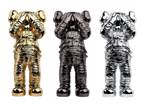
KAWS is unusual because much of the catalog is sculptural. A KAWS Companion or BFF figure does not hang; it sits on a floating shelf, a console, or a plinth in front of the wall. Used well, this adds a layer of physical depth that flat prints cannot. Place the figure on a narrow shelf integrated into the lower third of the grouping so it reads as part of the composition rather than a stray object. If you prefer to keep KAWS on the wall, the flat pop prints in the KAWS collection integrate seamlessly with the other framed editions.
Lever Three: Framing Decisions
Framing is both a design choice and a conservation choice, and street-art prints deserve real framing. The three decisions that matter most are frame profile, mat, and glazing.
- Frame profile: For a mixed street-art wall, a thin black or natural-wood box profile is the safest unifier. Ornate or gilded frames fight the contemporary energy of the work. Consistency across pieces matters more than the specific profile you choose.
- Mat: A wide white or off-white mat (2.5 to 4 inches) gives saturated work room to breathe and makes disparate pieces feel like a family. Use acid-free, conservation-grade matboard so it never yellows or burns the paper edge.
- Glazing: UV-filtering acrylic or museum glass protects against fading — a real risk for the bright inks street artists favor. Anti-glare museum glass is worth the premium on your anchor piece.
DEATH NYC editions and other small collage works can be float-mounted so the deckle or paper edge shows, which suits their handmade character. Fairey screenprints and HPMs generally look best with a clean mat and matched frame. Because framing decisions interact with long-term condition, they deserve their own deep dive — see the sibling guide on framing and protecting street-art prints in a real home before you commit to glazing and hanging hardware.
Lever Four: Spacing, Layout and the Hanging Math
Once pieces are framed, layout is geometry. There are two dominant approaches for a mixed-artist wall: the grid and the salon.
The grid
A grid aligns frames on shared horizontal and vertical lines with equal gaps. It reads calm, architectural and modern. Grids work best when your pieces are close in size or when matched framing creates the illusion of uniformity. The grid suits minimalist interiors and lets the art, not the arrangement, do the talking.
The salon (petersburg hang)
A salon hang packs pieces of varying sizes into a dense, organic cluster with tighter, more uniform gaps between frames. It reads collected, curated and gallery-like — exactly the register a mixed street-art wall wants. The salon is more forgiving of size variation, which is why it pairs so well with a Fairey-anchored grouping that also includes small DEATH NYC editions.
Whichever you choose, the physics are the same. Use this checklist and spacing table when you install.
| Decision | Rule of thumb | Why |
|---|---|---|
| Center height | Hang so the group's visual center sits ~57–60 inches from the floor | Standard gallery eye level; keeps the wall readable |
| Gap between frames | 2–3 inches, kept consistent across the grouping | Uniform gaps read as one composition, not scattered pieces |
| Anchor placement | Slightly off-center, not dead-middle | Dynamic and gallery-like rather than symmetrical/corporate |
| Furniture relationship | Group width ~2/3 of the sofa/console below it | Ties the art to the room instead of floating |
| Bottom clearance | 6–10 inches above a sofa back or console top | Connects art and furniture without crowding |
| Hardware | Two D-rings + wall anchors per framed piece | Keeps heavy glazed frames level and secure long-term |
Layout checklist before you drill a hole:
- Lay every framed piece on the floor and arrange the composition there first.
- Trace each frame onto kraft paper, mark the hanging point, and tape the paper templates to the wall.
- Step back six to eight feet and photograph it — the camera flattens the arrangement and reveals imbalance the eye misses.
- Adjust templates until the negative space feels even and the anchor sits off-center.
- Only then hang, starting with the anchor and working outward.
Putting It Together: A Worked Example
Say you want a salon-hung wall behind a mid-century sofa. You might build it around a Fairey OBEY screenprint anchor in red and cream, slightly off-center and high. Flanking and below it: two Invader pixel prints whose primary colors echo the Fairey's red; a cluster of three small DEATH NYC editions that pick up the gold and red notes and provide the small-scale rhythm; and a flat KAWS print in muted grey that cools the palette and keeps the wall from vibrating. Every frame is thin black with a 3-inch white mat. Gaps are a consistent 2.5 inches. The unifying thread is palette-plus-frame; the artists' stylistic differences supply all the interest you need.
If you would rather lead with your room than with a specific artist, the sibling guide on how to buy street art that fits your interior walks through a style-first selection process. And if budget is the organizing constraint, street-art price tiers shows what a wall costs to assemble at different levels — useful when you are deciding which piece to make the anchor and which to keep as small rhythm notes.
Buy Right So the Wall Holds Up
Styling and buying are the same decision viewed from two angles. A gallery wall is only as good as its pieces, and pieces are only worth hanging — and re-hanging in your next home — if they are authentic and documented. That is why we route every styling choice back to a verified purchase.
When you shop the artists in this guide, buy from collections where each piece carries the right authentication for that artist. Shepard Fairey work should come with clear provenance, a genuine signature, correct edition numbering and the right paper — browse the authenticated Shepard Fairey collection. Invader pieces should carry edition details and reputable-dealer provenance; the Invader collection is organized around that. DEATH NYC editions arrive hand-signed and numbered with a COA and gold seal — see the DEATH NYC collection. KAWS and designer-toy pieces are backed by TrueCOA on applicable items. For the broadest starting point across every street-art voice, the full catalog lets you filter by artist and price as you build the wall.
The payoff of buying authenticated is twofold. First, you never worry that a repro is hanging in your living room. Second, the wall you assemble carries real, defensible resale value, because documented provenance is what the secondary market pays for. Style the wall for the room you have today; buy it authenticated for the collection it becomes tomorrow.
Common Mistakes to Avoid
- No unifying thread. Four artists with nothing in common reads as chaos. Commit to palette, frame, or scale rhythm.
- Near-match sizes. Pieces that are almost the same size look like an error. Match deliberately or contrast clearly.
- Mismatched frames. Random frames turn a curated wall into a bulletin board. Matched framing is the fastest cohesion win.
- Hanging too high. Center the group around 57–60 inches, not wherever the nail already is.
- Cheap glazing. Non-UV glass lets bright street-art inks fade. Protect the anchor at minimum.
- Buying unauthenticated for the "look." A cheap unverified print undermines the whole wall's value and your confidence in it. Buy documented pieces from a dealer that stands behind them.
Do these six things and a mixed Fairey-Invader-DEATH NYC-KAWS wall becomes one of the most personal, high-impact design moves in a home — a genuine collection, not a mood board.