

Featured image: AI-generated interior concept using product reference photography. Scale, setting, framing, and placement are illustrative.
One of the most common dilemmas facing interior designers and their clients is how to begin an art collection. The blank wall can feel intimidating, particularly when the budget for a complete, curated display is not immediately available. The instinct might be to fill the space with placeholder pieces, or worse, to leave it empty, awaiting a perfect, fully funded vision. Neither approach serves the client's long-term aesthetic or financial interests. A more strategic path involves starting small, with a single impactful piece, and then planning for a gradual, intentional expansion. This method allows for thoughtful acquisition, flexible design adjustments, and the organic development of a truly personal collection. It is a growth plan, not a static installation.
Consider a large, empty wall in a living room or a spacious hallway. Instead of conceptualizing it as a void to be filled instantly, view it as a canvas for a developing narrative. The initial piece sets the tone, but it does not dictate every subsequent choice. The goal is to create a dynamic display that feels cohesive yet permits evolution. This approach respects the budget, allows for discovery of new artists and styles, and ensures that each addition is a considered choice rather than a hasty purchase to complete a grid. gallery/products/death-nyc-alice-white-rabbit-watch-framed-pop-art-print-signed-32-100">Death NYC Alice White Rabbit Watch Framed Pop Art Print, and then strategically build around it, incorporating diverse elements like the Shepard Fairey Deco Floral Pattern (Blue), while maintaining design integrity and future flexibility.
Selecting the initial anchor piece for your collected wall
The first print on a collected wall carries significant weight. It is not merely an object; it is the foundation upon which the entire narrative will be built. This inaugural piece should possess enough visual interest, personality, and scale to hold its own, even when displayed in isolation on a large wall. It must be able to stand alone confidently before any companions join it. For instance, the Death NYC Alice White Rabbit Watch Framed Pop Art Print is an excellent candidate for such a role. Its vibrant colors, distinct pop art style, and whimsical subject matter featuring Alice and the White Rabbit with an oversized watch-themed graphic immediately draw the eye. The print's composition, with its playful luggage-inspired details and bold lines, ensures it commands attention without being overwhelming.
When selecting this anchor, consider its framed dimensions. A pre-framed piece like the Death NYC print simplifies the initial installation and offers a clear starting point for scale. While exact dimensions should always be confirmed, a piece of this nature typically presents a substantial presence. Its gold-tone frame and black mat add a layer of sophistication that elevates the pop art imagery, making it suitable for a variety of interior styles, from modern eclectic to more traditional spaces seeking a contemporary edge. The black mat provides a visual breathing room around the artwork, enhancing its impact and making it appear more substantial. The gold frame, while classic, also introduces a metallic accent that can be echoed or contrasted with other elements in the room or future additions to the wall. This initial choice is about establishing a compelling focal point that can inspire subsequent selections, not about finding a piece that perfectly matches everything else from the outset. Note the subtle texture visible on the gold frame in the product image; this adds character and can inform choices for other metallic elements in the room or on the wall.
Planning the wall: templates, spacing, and future growth
Once the anchor piece is selected and its framed dimensions are known, the next crucial step is planning the wall's evolution. Resist the urge to immediately acquire multiple pieces to fill the space. Instead, use templates and careful spacing to visualize the future layout. Cut out paper or craft board templates that match the exact framed dimensions of your initial print. For the Death NYC Alice print, measure the outer edges of the gold frame. Place this template on your wall, experimenting with its height and horizontal placement. A good rule of thumb for a single piece is to center it at eye level, which typically means the center of the artwork is around 57-60 inches from the floor, but this can adjust based on ceiling height and surrounding furniture.
Now, consider the future. Even if you only have one piece now, allocate imaginary spaces for future additions. Create additional templates, perhaps in varying sizes, to represent potential future acquisitions. These can be simple rectangles or squares. The key is to leave generous, intentional spacing around your anchor piece. A common mistake is to cram pieces too closely together, which can make a collected wall feel cluttered rather than curated. Aim for at least 4-6 inches of clear wall space between templates. This negative space is vital; it allows each artwork to breathe and prevents visual competition. By mapping out these potential zones, you create a flexible framework. You are not committing to specific artworks, but rather to a spatial arrangement that can accommodate different sizes and styles as your collection grows. This approach ensures that when new pieces, such as the Shepard Fairey Deco Floral Pattern, are acquired, they have a pre-considered, harmonious place within the evolving composition. This foresight prevents impulsive purchases that might not fit the overall scheme, saving both time and budget.
Framing consistency versus eclectic expression
The framing strategy for a collected wall is a delicate balance between cohesion and individuality. While a uniform framing style can create a sense of order and sophistication, an overly rigid approach can stifle the eclectic charm that defines many successful collected walls. The Death NYC Alice print arrives in a gold-tone frame with a black mat. This combination offers a strong starting point. The gold provides a classic accent, while the black mat grounds the vibrant pop art. When planning for future additions, you have several options.
One approach is to echo the gold frame in some, but not all, subsequent pieces. This creates a subtle visual thread without demanding strict uniformity. For instance, if you acquire the Shepard Fairey Deco Floral Pattern (Blue) print, you might consider framing it in a complementary, perhaps slightly distressed, gold frame or even a simple black frame to pick up on the mat color of the Death NYC piece. Alternatively, you could introduce different frame materials or finishes, such as natural wood, polished chrome, or even a contrasting color, to add visual texture and depth. The key is to ensure that while frames may vary, they do not clash. Aim for a palette of two to three complementary frame styles or finishes across the entire wall. The matting choice also plays a role. While the black mat on the Death NYC print is effective, future pieces might benefit from white or off-white mats to brighten the composition, or even no mat at all for a more contemporary, edge-to-edge presentation. The goal is to allow each artwork to shine while contributing to the overall harmony of the wall, rather than forcing every piece into an identical aesthetic box. A skilled framer can also advise on glazing options, such as UV-filtering acrylic or glass, to protect paper-based artworks from light exposure, which is particularly important for signed and numbered editions like the Fairey print.
A hypothetical three-stage growth plan for a collected wall
Let us consider a hypothetical project: a client with a spacious, bare wall in their home office, approximately 12 feet wide by 9 feet high. They appreciate contemporary art but are starting their collection from scratch. Our goal is to develop a three-stage growth plan that begins with a single impactful piece and gradually builds into a curated collected wall, using planning assumptions for dimensions.
Stage 1: The Anchor Piece (Initial Investment)
We begin with the Death NYC Alice White Rabbit Watch Framed Pop Art Print. Assuming a framed size of approximately 20x24 inches, this piece, with its vibrant imagery and gold frame, provides an immediate focal point. We will install it centrally on the wall, ensuring its center is at the client's eye level when seated at their desk, or around 60 inches from the floor if standing. Around this piece, we will place paper templates for four additional, smaller pieces, leaving generous 6-inch margins. These templates serve as placeholders, visually reserving space and demonstrating the future potential of the wall without requiring immediate purchase. The immediate cost category here is for the framed print itself, plus professional installation to ensure it is perfectly level and securely hung. This initial step establishes a clear visual identity for the wall.
Stage 2: Expanding the Narrative (Mid-Term Additions)
Six months later, the client is ready to expand. We introduce two additional pieces that complement the Death NYC print without directly competing. A strong candidate would be the Shepard Fairey Deco Floral Pattern (Blue). Assuming an unframed size of approximately 18x24 inches, we might frame it to a finished size of 22x28 inches. Its graphic quality and blue tones offer a sophisticated contrast to the pop art's whimsy and bright primary colors. We might frame the Fairey print in a simple, thin black frame, picking up on the black mat of the Alice print, to create a subtle visual link. We also source a smaller, abstract print, perhaps 12x16 inches framed, with a muted color palette to introduce textural variety. These two pieces are placed strategically around the Alice print, using the pre-planned template locations. The cost category for this stage includes the acquisition of two new prints, custom framing for each (if not pre-framed), and a second installation visit. The wall begins to take on a more collected feel, but still with ample negative space.
Stage 3: Curated Completion (Long-Term Vision)
After another year, the client is ready for the final additions to complete the wall. We fill the remaining two template spaces with pieces that add further depth and personal resonance. Perhaps a black and white photographic print, framed to 16x20 inches, to introduce a different medium and tonal range, and a small, framed textile art piece, approximately 10x10 inches, to add tactile interest. The choice of frames for these final pieces might vary further, perhaps a natural wood for the photograph and a simple white box frame for the textile, to contribute to the collected, eclectic feel. The arrangement is carefully balanced, ensuring a harmonious flow across the entire wall, with varying sizes and styles contributing to a cohesive whole. This stage's cost category includes the acquisition of the final two pieces, their custom framing, and the final installation, which might involve minor adjustments to the positioning of earlier pieces to optimize the overall composition. This phased approach allows the client to spread the financial commitment, thoughtfully consider each addition, and witness the wall evolve into a truly personal statement. The 12x9 foot wall now feels complete and curated, but not overcrowded.
The importance of stopping points and negative space
A common misconception when creating a collected wall is that every available inch must be filled. This leads to visual clutter, where individual pieces lose their impact and the overall effect becomes overwhelming rather than engaging. Just as important as what you include on a collected wall is what you deliberately choose to omit. Establishing stopping points and preserving negative space is crucial for visual harmony and allowing each artwork to breathe.
Think of negative space as the silent partner in your composition. It provides visual rest for the eye, allowing the viewer to appreciate each piece individually before taking in the entire arrangement. Without it, the wall becomes a cacophony of images, and the impact of even the most striking artworks diminishes. When planning your wall, consider the natural boundaries of the space – the edges of a window, the height of a doorway, or the top of a piece of furniture. These can serve as logical stopping points. Instead of extending the collection to the very edges of the wall or ceiling, aim for a more contained, intentional grouping that feels complete without being exhaustive.
For example, if the Death NYC Alice print is part of a larger arrangement above a console table, the top of the console provides a natural base for the collection. The upper boundary might be determined by the ceiling height, but leaving a significant margin of clear wall space above the highest piece prevents the room from feeling top-heavy. Similarly, lateral stopping points prevent the collection from sprawling indefinitely. A well-designed collected wall feels thoughtfully curated, not haphazardly accumulated. It invites closer inspection of individual pieces while also offering a satisfying overall aesthetic, a balance achieved through the judicious use of both art and empty space. This deliberate restraint is what elevates a mere assortment of items into a genuine collection.
Integrating diverse styles: pop art, graphic design, and beyond
A truly compelling collected wall thrives on diversity. Limiting oneself to a single style or medium can result in a monotonous display, lacking the visual interest that makes a collection dynamic. The challenge lies in integrating diverse styles harmoniously, ensuring that each piece contributes to a cohesive narrative rather than creating visual discord. Starting with a vibrant pop art piece like the Death NYC Alice White Rabbit Watch print provides an excellent foundation for this exploration. Its playful nature and bold colors can act as a bridge to other contemporary styles.
Consider introducing a piece with a different aesthetic, such as the Shepard Fairey Deco Floral Pattern (Blue). Fairey's work, rooted in street art and graphic design, offers a distinct visual language. The Deco Floral pattern, with its intricate details and often muted yet impactful color schemes, contrasts beautifully with the more illustrative and overtly commercial imagery of pop art. When placed near the Death NYC print, the Fairey piece introduces a layer of sophisticated graphic design. The key is to find commonalities, however subtle. Perhaps it is a shared color tone, a graphic sensibility, or even an underlying cultural reference. The blue in the Fairey print could pick up on a subtle blue in the Alice character's dress, for instance, creating an unexpected connection. Beyond prints, consider incorporating other mediums: a small abstract painting to introduce texture and brushwork, a black and white photograph for tonal contrast, or even a framed textile art piece for tactile warmth. The goal is to build a conversation between disparate elements, allowing each piece to tell its own story while contributing to the larger narrative of the collected wall. This approach allows for a richer, more nuanced visual experience than a homogenous display could ever achieve.
Practical tradeoffs: cost, flexibility, and long-term vision
Designing a collected wall over time inherently involves practical tradeoffs, primarily concerning cost, flexibility, and the long-term vision. The phased approach, while aesthetically beneficial, means that the wall will not be “finished” immediately. This can be a challenge for clients who prefer instant gratification. However, the advantage of spreading the cost over several months or even years is significant. It allows for budget allocation without a single, large outlay, making the acquisition of higher-quality pieces more feasible over time. Instead of compromising on quality to fill a wall quickly, each piece can be a considered investment.
Flexibility is another key benefit. An evolving wall allows for adjustments as tastes change or as new, compelling artworks are discovered. If a client initially leans towards pop art but later develops an appreciation for minimalist photography, the framework of a collected wall can accommodate this shift. Pieces can be rearranged, new ones introduced, and older ones rotated or relocated to other areas of the home. This adaptability is far superior to a fixed, pre-designed installation that offers little room for change. The long-term vision, therefore, is not about a static endpoint, but about a living, breathing display that reflects the client's evolving aesthetic journey. It requires patience and a willingness to embrace the process of curation. The tradeoff is immediate completion versus sustained relevance and personal connection. For designers, this means educating clients on the value of this gradual approach, emphasizing the richness and depth that a thoughtfully collected wall offers over a quickly assembled one. It also means managing expectations regarding the timeline, ensuring clients understand that quality takes time to acquire and arrange effectively.
Maintenance and preservation of a growing collection
As a collected wall grows, so does the responsibility for its maintenance and preservation. Each addition, whether a framed print like the Death NYC Alice or an unframed work like the Shepard Fairey print, requires consideration for its longevity. Paper-based artworks are particularly susceptible to environmental factors. Direct sunlight, even through windows, can cause fading and degradation over time. Therefore, placement should ideally avoid walls that receive intense, unfiltered sun for prolonged periods. If such placement is unavoidable, consider window treatments that offer UV protection, or specify glazing for frames that filters a significant portion of UV light. While UV-filtering glass or acrylic reduces risk, it does not eliminate it entirely, so prudent placement remains paramount.
Humidity and temperature fluctuations are also detrimental. Avoid hanging valuable paper artworks in bathrooms, kitchens, or directly above heat sources like radiators or fireplaces. Stable environments are key. Dust accumulation is another factor; regular, gentle dusting of frames and glazing helps keep the collection looking its best. For prints that are not yet framed, proper archival storage is essential. This means storing them flat in acid-free sleeves or portfolios, away from light and fluctuating conditions. As the collection expands, maintaining a simple record of each piece – artist, title, edition number, and acquisition date – can be invaluable for insurance purposes and future reference. This diligent approach ensures that the aesthetic investment made in building a collected wall is protected for years to come, preserving the visual integrity and potential historical value of each artwork.
Bringing it all together: a dynamic and personal statement
The journey from a single print to a thoughtfully collected wall is a testament to mindful design and a client's evolving taste. It is a process that prioritizes intention over immediacy, allowing each piece to be a considered choice rather than a hasty acquisition. By starting with a strong anchor, like the Death NYC Alice White Rabbit Watch Framed Pop Art Print, and systematically planning for future additions with templates and reserved negative space, designers can guide clients toward a truly unique and personal display. This method embraces flexibility in framing, allowing for a harmonious blend of styles – from the playful pop art of Death NYC to the graphic sophistication of a Shepard Fairey Deco Floral Pattern (Blue) – without sacrificing cohesion. The practical tradeoffs of a phased approach, while requiring patience, ultimately lead to a more financially manageable and aesthetically rich outcome. The wall becomes a curated narrative, reflecting not just a collection of objects, but a journey of discovery and appreciation. It’s a living installation that can grow and change with the homeowner, always offering new details and perspectives. This strategic approach ensures that the collected wall remains a dynamic focal point, a constant source of visual interest and personal connection, rather than a static backdrop. It also ensures that the maintenance and preservation of these valuable artworks are considered from the outset, protecting the collection for the long term. Ultimately, a collected wall is more than decoration; it is a visual biography, an ongoing dialogue between art, space, and individual expression.
For your next project, consider how a phased approach to art acquisition could benefit your clients. Begin with a single, compelling piece and build a flexible plan for future additions. Explore the possibilities and discover pieces that can anchor and grow your next collected wall. Confirm final framed dimensions, current availability, and condition before specifying any artwork.
Shop Pop art
Explore current pieces available from the gallery.
-

Andy Warhol The Beatles 1980 Vintage Poster Framed Pop Art Times Books Stokes
$349.00 USD
-

After Roy Lichtenstein I Love Liberty Framed Pop Art Print
$75.00 USD
-

Shepard Fairey Warhol Collages (Silver)
$225.00 USD
-

Shepard Fairey Keith Haring Signed Numbered Screen Print OBEY Portrait /450
$699.00 USD
-

Shepard Fairey Keith Haring Signed Numbered FRAMED Print 2020 Obey Giant 23/450
$395.00 USD
-
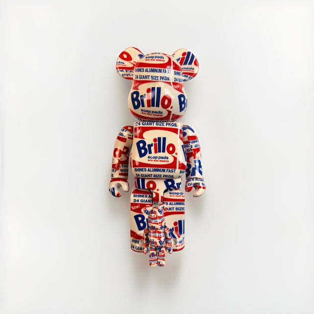
Bearbrick BE@RBRICK Andy Warhol Brillo 400% 100% Set Original 2020 Medicom New
$275.00 USD


Browse the collection for current listings.