

Featured image: AI-generated interior concept using product reference photography. Scale, setting, framing, and placement are illustrative.
Orchestrating Visual Dialogue: Sculpture and Print in Concert
The impulse to adorn every available surface and wall with art is a natural one, particularly when a client possesses an extensive collection or desires a visually rich environment. However, true sophistication in interior design often manifests through restraint and deliberate intention. The real challenge isn't merely acquiring beautiful objects, but rather orchestrating their display to forge a harmonious and impactful setting. A common pitfall is to treat every piece as equally significant, which invariably leads to visual noise instead of curated elegance. This essay delves into how to integrate diverse art forms, specifically freestanding sculptures and wall-mounted prints, into a space without succumbing to clutter. We will focus on establishing visual priority, understanding the interplay of depth and dimension, and making precise choices about what to include and, critically, what to omit. The aim is to foster a dialogue between pieces, allowing each to resonate and contribute meaningfully to the overarching design narrative, rather than simply occupying space. We will examine two distinct pieces: the Cleon Peterson POWER sculpture and the Shepard Fairey Deco Floral Pattern (Blue) print, to illustrate how a meticulous approach to placement, scale, and visual weight can elevate a room from merely decorated to genuinely designed.
Establishing Visual Priority: Designating the Focal Point
Every thoughtfully designed room requires a focal point, or perhaps a series of carefully considered focal points, to guide the eye and establish a visual hierarchy. When combining sculptures and prints, it is essential to decide which piece will command primary attention and how other elements will support or complement it, rather than compete. A frequent error is to position two equally strong pieces in direct competition, generating visual tension that diminishes both. Instead, consider the inherent visual weight of each piece. A three-dimensional sculpture, by its very nature, often demands more immediate attention than a two-dimensional print, simply because it occupies physical space and can be appreciated from multiple angles. The Cleon Peterson POWER sculpture, with its stark matte white resin and powerful, simplified form, possesses a significant visual presence. Its angular, muscular figure holding a weapon-like object is inherently dramatic and makes a strong statement. This piece is likely to be a primary focal point wherever it is placed. In contrast, the Shepard Fairey Deco Floral Pattern (Blue) print, while visually engaging with its intricate patterns and graphic style, functions differently. As a print, it lies flat against a wall, offering a distinct kind of engagement. Its detailed design invites closer inspection but typically does not project the same immediate three-dimensional impact as a sculpture. Therefore, when designing a space, one might designate the sculpture as the anchor, allowing the print to serve as a complementary element, perhaps providing pattern, color, or thematic reinforcement without overshadowing the sculpture. This strategic designation of visual priority ensures that each piece can be fully appreciated without overwhelming the viewer. The key is to avoid a cacophony of equally loud voices and instead orchestrate a harmonious conversation, where each piece has a designated role in the overall visual narrative.
Understanding Wall Versus Surface Relationships for Art Placement
The fundamental distinction between a wall-mounted print and a freestanding sculpture dictates much of their interaction within an interior. Prints, by nature, are flat and extend the plane of the wall. Their impact is primarily visual, relying on color, line, and composition. They define a specific area on a vertical surface. Sculptures, however, inhabit the three-dimensional world of the room itself. They possess mass, volume, and cast shadows, creating a sense of depth and presence that a print cannot replicate. This difference is crucial for effective placement. A print, like the Shepard Fairey Deco Floral Pattern (Blue), might be best positioned on a feature wall, perhaps above a console or sofa, where its graphic qualities can be appreciated from a distance. Its two-dimensional nature means it does not interrupt circulation or require clear space around it for viewing from multiple angles. The Cleon Peterson POWER sculpture, on the other hand, demands space. Its stated dimensions of 11.61" x 7.09" x 2.83", while not massive, are substantial enough to require a dedicated surface: a pedestal, a robust side table, or a deep shelf. Placing it too close to a wall, or on a shallow surface, diminishes its three-dimensionality and can make it feel confined. The relationship between wall and surface also influences how light interacts with the art. A print benefits from even, diffused light that illuminates its surface without creating glare. A sculpture, however, thrives on directional light that highlights its contours, creates dramatic shadows, and reveals its form from different perspectives. Consider a room where a large print anchors a wall, and a sculpture sits on a table in front of it. The print defines the backdrop, while the sculpture commands the foreground, creating a layered visual experience. This interplay of flat and volumetric forms is what gives a room its dynamic character and prevents a monotonous arrangement. Effectively managing this relationship ensures that each piece can perform its intended visual function without compromise.
Navigating Overlapping Depth and Competing Scale in Design
When combining sculptures and prints, the concepts of overlapping depth and competing scale become critical considerations. Overlapping depth refers to how objects at different distances from the viewer interact visually. A sculpture placed in front of a print creates a physical layering, adding complexity and interest. However, this layering must be intentional. If the sculpture is too large or positioned too close to the print, it can obscure important elements of the two-dimensional work, or vice versa. The Cleon Peterson POWER sculpture, being a solid, opaque form, would significantly block any print placed directly behind it. Therefore, careful consideration of sightlines and viewing angles is paramount. Competing scale, on the other hand, arises when two pieces, regardless of their form, vie for dominance due to their relative sizes or perceived visual weight. If a small, delicate sculpture is paired with an enormous, brightly colored print, the print might completely overwhelm the sculpture. Conversely, a very large, imposing sculpture might diminish the impact of a more subtly scaled print. The Shepard Fairey Deco Floral Pattern (Blue) print, while not having specified dimensions in its description, is likely a standard size for a print edition, perhaps 18x24 inches or larger. The Cleon Peterson sculpture, at nearly a foot tall, has a commanding presence for a tabletop piece. To avoid competition, one might consider a print that is significantly larger than the sculpture if it is to serve as a backdrop, providing a broad field of pattern or color against which the sculpture can stand out. Alternatively, a print of similar scale might be placed on an adjacent wall, creating a visual connection without direct competition. The goal is to create a balanced composition where each piece enhances the other, rather than detracting from it. This often means choosing pieces with complementary, rather than identical, visual intensities. The success lies in understanding that not every piece needs to be the star; some are meant to play a supporting role, creating a richer, more nuanced overall scene, allowing the viewer's eye to move fluidly between them.
The Critical Act of Removing Lesser Accessories for Clarity
One of the most effective strategies for integrating sculptures and prints successfully is the ruthless removal of extraneous accessories. A common mistake in interior design is the tendency to accumulate small, unrelated decorative objects that, while perhaps individually appealing, collectively create visual clutter. These lesser accessories often dilute the impact of significant art pieces by competing for visual attention. When a powerful sculpture like the Cleon Peterson POWER piece is placed amidst a collection of small trinkets, its inherent drama is diminished. The matte white resin of the sculpture, with its simplified yet forceful lines, relies on clear space to assert its presence. Similarly, a striking print can lose its focal power if surrounded by too many busy patterns or competing wall hangings. The intricate details and graphic boldness of the Shepard Fairey Deco Floral Pattern (Blue) print, for example, are best appreciated when given room to breathe, rather than being forced to contend with a multitude of smaller, less significant items. The principle here is subtraction: by removing anything that does not actively contribute to the desired aesthetic or narrative, you create space for the chosen art to breathe and assert its presence. This isn't about minimalism for its own sake, but about intentionality. Each object should earn its place. Consider the visual weight and purpose of every item on a console table or shelf. If an item doesn't enhance the sculpture or complement the print, it should be relocated or removed. This editing process can be challenging, especially when clients are attached to various sentimental items. However, guiding them through the process of curating a select few, rather than displaying everything, often leads to a more sophisticated and impactful result. A clean, uncluttered surface allows the eye to immediately register the form and detail of a sculpture, while an uncluttered wall ensures a print can be fully appreciated without distractions. The absence of visual noise enhances the perceived value and artistic merit of the chosen pieces, transforming a busy display into a thoughtful arrangement.
Hypothetical Project: Integrating Art in a Modern Living Room
Consider a modern living room, approximately 18 feet long by 14 feet wide, with a neutral palette of warm greys and muted blues. The primary seating area features a low-slung, charcoal-grey sofa against the longest wall, facing a media console. To the left of the sofa, a tall, narrow window allows natural light, while to the right, an open doorway leads to the dining area. Our goal is to integrate the Cleon Peterson POWER sculpture and the Shepard Fairey Deco Floral Pattern (Blue) print without overwhelming the space.
Initial Placement Strategy and Visual Priorities
We will designate the Cleon Peterson POWER sculpture as a primary focal point, given its robust three-dimensional presence. Its matte white resin finish will stand out against the room's muted tones. The sculpture, at nearly a foot tall, needs a sturdy, dedicated surface. A solid, dark walnut side table (planning assumption: 20 inches high, 18 inches square) placed at the far end of the sofa, closer to the open doorway, provides an ideal perch. This position allows the sculpture to be viewed from multiple angles – from the sofa, the doorway, and even partially from the dining area – highlighting its sculptural qualities. The table's dark tone provides a strong contrast to the white resin, making the form pop. We will ensure there is ample clear space around the table for visual access, emphasizing its status as a standalone object.
For the Shepard Fairey Deco Floral Pattern (Blue) print, we need a location where its graphic detail can be appreciated without competing directly with the sculpture. Placing it on the wall directly opposite the sofa, above the media console, could introduce too much visual activity in the main viewing axis. Instead, we opt for the wall adjacent to the window, to the left of the sofa. This wall is less dominant but still receives good ambient light. Assuming the print is a standard 24x36 inches, we would frame it simply in a thin, matte black frame to complement its graphic nature and the charcoal sofa. Hanging it with its center point approximately 60 inches from the floor, it aligns visually with the top of the window frame, creating a cohesive horizontal line. This placement allows the print to be a secondary focal point, drawing attention without vying for dominance with the sculpture.
Considering Overlapping Depth and Competing Scale
From the sofa, the Cleon Peterson sculpture is to the viewer's right, a strong, contained form that draws the eye. The Shepard Fairey print is to the left, offering a different visual experience – a field of blue pattern and intricate lines that invites a more sustained gaze. Neither piece directly overlaps the other from the primary seating position. The sculpture, with its bold, simplified form, holds its own without needing a backdrop, while the print provides a moment of detailed visual interest on a secondary wall. This separation ensures each piece contributes uniquely without visual conflict. The scale difference is also managed: the sculpture's compact, commanding presence on its table is balanced by the print's broader, two-dimensional expanse on the wall. The blue tones of the print subtly echo the muted blues in the room's palette, creating a sense of cohesion without being overtly matchy.
Editing the Space for Clarity and Impact
To ensure these two pieces truly shine, we would rigorously edit the surrounding area. On the dark walnut side table, besides the Cleon Peterson sculpture, we might place a single, minimalist book or a simple ceramic coaster. No other small objects or busy patterns would compete for attention. The media console beneath the Shepard Fairey print would be kept clear, perhaps with only the television and a single, low-profile soundbar. Any existing decorative vases, stacks of magazines, or small framed photos that do not directly contribute to the overall aesthetic would be removed. The goal is to create visual breathing room, allowing the art to be the undisputed focus. This strategic placement and thoughtful editing ensure both the sculpture and the print contribute distinctively to the room's character without creating visual overload. The result is a sophisticated and uncluttered environment where each chosen piece makes a deliberate and impactful statement.
Refining the Edit: Viewing Positions and Practical Tradeoffs
The true test of an art installation comes not just from a single, idealized vantage point, but from how it performs across all viewing positions within a space. A design that looks perfect from the entrance might fall flat, or even create obstruction, when viewed from a seated position on a sofa. This necessitates a practical edit, often involving tradeoffs, based on how a room is actually used.
Let's revisit our hypothetical living room project to illustrate this.
Initial Assessment from Key Viewing Positions:
- From the Room Entrance (Standing): The sculpture is visible as a strong, three-dimensional form on the side table. The print is also visible on the adjacent wall, offering a splash of color and pattern. The overall impression is balanced, with neither piece overwhelming the other.
- From the Sofa (Seated): The sculpture is now closer, perhaps at eye level or slightly below, depending on the sofa height. Its details are more apparent, and the viewer can appreciate its form and texture. The print is still visible to the left, but its scale might feel slightly different from this closer, lower perspective, perhaps more expansive.
- From the Dining Area (Distant): Both pieces are seen as part of the broader room composition. The sculpture becomes a distinct white accent, creating a visual anchor, while the print contributes to the overall wall texture and color scheme, adding depth without demanding singular focus.
Identifying Potential Issues and Tradeoffs:
Upon review, we might identify a few areas for refinement:
- Sculpture's Impact: While the Cleon Peterson POWER sculpture is impactful, its specific placement on the side table might mean that from certain seated positions on the sofa, part of its form is obscured by an armrest or the corner of the sofa itself. The solution isn't to move the sofa, which is often a fixed element, but perhaps to slightly adjust the table's position, shifting it an inch or two further from the sofa to ensure a clearer sightline. Alternatively, if the table is too low, a slightly taller custom pedestal could elevate the sculpture for better visibility, ensuring its powerful form is always fully appreciated. This is a tradeoff between surface height and the desired eye-level interaction, aiming for optimal visibility without disrupting the flow.
- Print's Scale and Proximity: The Shepard Fairey Deco Floral Pattern (Blue) print, while not directly competing, might feel a little isolated on its wall if the overall room aesthetic leaned towards more layered design. If the room felt too sparse, we might consider a very subtle, complementary wall hanging or a small, framed textual piece to the right of the print, creating a mini-gallery effect without drawing focus away from the main print. However, the initial brief was to avoid filling every surface, so this would be a careful addition, not a default. A bolder option might be to swap the print's location with a larger, more impactful piece on the main sofa wall, but that would necessitate re-evaluating the entire focal point strategy. The current placement allows the print to be appreciated without demanding primary attention, which aligns with its designated role as a complementary element, providing visual texture and color.
- Light Interaction: The window near the print provides natural light, which is generally good. However, direct, intense sunlight can be detrimental to prints over time, even with UV-filtering glass. A practical tradeoff here might involve adding sheer curtains or a subtle window film to diffuse harsh light, protecting the art while maintaining natural illumination. For the sculpture, ensuring a small, focused spotlight could enhance its three-dimensionality in the evenings, but this would add an electrical element to consider, weighing the aesthetic benefit against installation complexity.
The process of refining an art installation is iterative. It involves stepping back, observing from multiple angles, and being willing to make small adjustments or even significant re-evaluations. The goal is always to enhance the art's presence and integrate it seamlessly into the living environment, making practical tradeoffs that prioritize both aesthetics and the longevity of the pieces. This careful consideration prevents the room from feeling merely decorated and instead imbues it with a sense of deliberate curation. It is about creating a dialogue between the art and the architecture, rather than simply filling voids. The art should feel like an organic extension of the space, not an afterthought. Ultimately, the most successful designs are those that allow key pieces to breathe, to be seen, and to be appreciated without visual competition. This often means making difficult choices about what to keep and what to let go, ensuring that every element present contributes meaningfully to the overall composition. It is a continuous process of observation, adjustment, and refinement, always with the aim of creating an environment that is both beautiful and functional. To begin your own curated journey, consider the impactful forms and graphic statements available through contemporary art. Explore the powerful presence of the Cleon Peterson POWER sculpture or the intricate patterns of the Shepard Fairey Deco Floral Pattern (Blue) print to inspire your next design project.
Available at Gauntlet Gallery
Explore current pieces available from the gallery.
-

1963 Farquhar Earth in Space Transparent Celestial Globe 16" Compass VTG
$699.00 USD
-

1967 Beatles Richard Avedon STERN Original Posters Set of 4 Linen Backed Copy
$999.00 USD
-
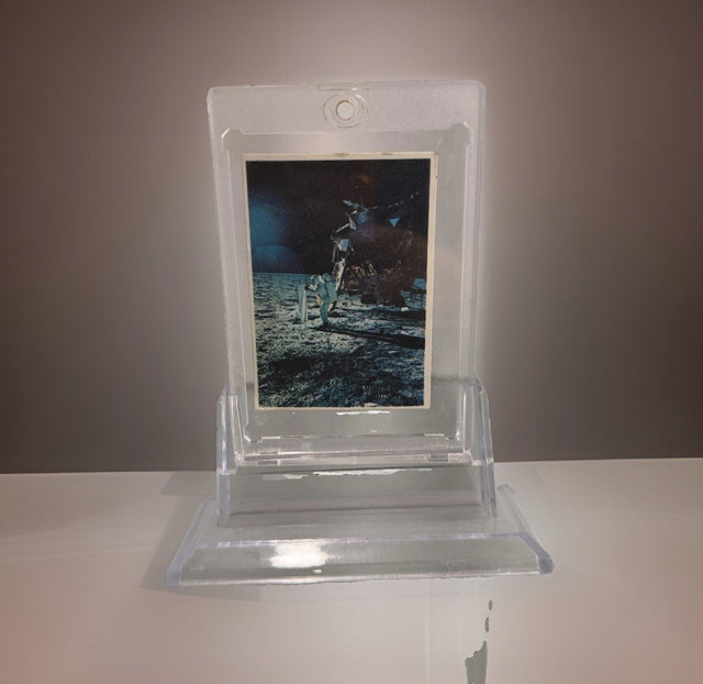
1969 Space Candy Buzz Aldrin Apollo 11 On The Moon Card #19 Taylor-Reed Display
$59.00 USD
-

1980 Polo Player Green Pink Chalk Pastel Bears Andy Warhol Signature AS-IS
$399.00 USD
-

After Andy Warhol Moon Landing Line Drawing 5/50 w/ Astronaut Autographs As-Is
$175.00 USD
-

After John Lennon "I Do" Framed Print, Marked A/P Unverified
$99.00 USD


Browse the collection for current listings.