

Featured image: AI-generated interior concept using product reference photography. Scale, setting, framing, and placement are illustrative.
Residential interior design frequently emphasizes grand gestures: expansive living rooms, dramatic entryways, and feature walls demanding broad attention. Yet, some of the most intricate and rewarding design challenges involve the overlooked, smaller walls. These are the interstitial spaces, the narrow panels between windows, the compact sections adjacent to doorways, the vertical strips in a powder room, or the end of a corridor. They might seem insignificant, but their cumulative effect on a home's aesthetic and flow is substantial. A small wall, when addressed thoughtfully, can become a crucial pause point, a visual anchor, or a delightful surprise that enriches the overall narrative of a space. Ignoring them, however, leaves a void that can make even the most meticulously designed larger areas feel incomplete or disjointed. The key is to select art that not only fits the physical constraints but also offers enough visual interest to reward a closer look.
Choosing art for these tight spots requires a different approach than selecting a monumental piece for a main wall. Scale is paramount, but so is the complexity of the artwork. A piece that is too simple might disappear, while one that is too busy could overwhelm. The goal is to find art that invites intimacy, encouraging viewers to step closer and discover its nuances. This is where artists like Death NYC shine, often presenting familiar cultural icons in unexpected contexts, rich with detail and vibrant color. Their work, frequently featuring well-known characters or symbols, can create instant recognition while also prompting a deeper engagement with the artist's unique interpretation. The challenge, then, is not merely to fill a blank space, but to transform it into a moment of intentional design, using art to guide the eye and add character where it's least expected, turning a constraint into an opportunity for focused artistry.
The distinct viewing experience of a small wall dictates art selection
A small wall is more than just a reduced surface area; it dictates a particular viewing experience fundamentally different from a large expanse. Unlike a grand wall where art might be appreciated from across a room, a piece on a small wall is almost always viewed up close. This proximity demands attention to detail that might be lost on a larger scale. Consider a narrow wall in a hallway or a small niche in a study. The viewer walks past it, pauses, and often leans in. The artwork needs to withstand this scrutiny, revealing layers of meaning or intricate design elements that reward the focused gaze. This makes prints with fine lines, subtle textures, or layered compositions particularly effective, as their subtleties are readily accessible and appreciated from inches away.
The physical constraints of a small wall also influence framing choices. A heavy, ornate frame on a diminutive piece can be overpowering, making the artwork feel cramped within its confined space. Conversely, a frame that is too thin might lack sufficient presence to hold its own. The matting, too, plays a critical role. A wide mat can give a smaller print more visual weight and presence, creating a sense of expansiveness around the central image. It can also act as a deliberate buffer, separating the art from a potentially busy wall texture or color. The overall effect should be one of considered proportion, where the art, mat, and frame work in harmony to define the space, rather than compete with it. A well-chosen piece on a small wall doesn't just occupy space; it defines it, creating a visual anchor that draws the eye and encourages a moment of contemplation, thereby elevating the entire area. The intimacy of these spaces allows for a deeper connection between the viewer and the art, a connection that larger installations often cannot achieve.
The power of intricate detail in close-view art for intimate spaces
When an artwork is intended for close viewing, the richness of its detail becomes its primary asset. This is a fundamental distinction from art designed for impact at a distance, where broad strokes and simplified forms often prevail. For a small wall, the artwork should invite a viewer to step closer, to discover nuances, and to engage with the composition on an intimate level. This means considering prints that offer more than just a superficial image. Look for intricate patterns, subtle textures, layered imagery, or narrative elements that unfold upon closer inspection. These elements ensure the piece retains interest and depth over repeated viewings, preventing it from becoming a mere backdrop.
Death NYC's work often excels in this regard. Their prints frequently juxtapose iconic figures with unexpected backdrops or incorporate hidden elements that reveal themselves only to the attentive observer. This layered approach ensures that even a relatively small print can hold a viewer's attention for an extended period, making it a powerful tool for creating visual interest in confined spaces. The Death NYC Alice White Rabbit Watch Framed Pop Art Print, for instance, features not only the recognizable characters of Alice and the White Rabbit but also an oversized gold-toned watch, and a background patterned with colorful polka dots and luggage straps. These details add depth and a sense of discovery, transforming a simple illustration into a more complex visual statement. For a small wall, such a piece acts as a miniature world, drawing the viewer in and rewarding their curiosity with a wealth of visual information that keeps the piece fresh and engaging, making it a constant source of visual delight rather than a static fixture.
Strategic mat-to-art ratio for enhanced visual presence
The mat-to-art ratio is a critical, yet often underestimated, element in framing, especially for smaller prints destined for small walls. A well-proportioned mat can dramatically enhance an artwork's presence, providing a visual buffer that allows the eye to focus on the print itself without distraction. For small pieces, a generous mat can significantly increase the overall framed size, giving the artwork more gravitas and preventing it from appearing lost or insignificant on the wall. Conversely, a mat that is too narrow can make the art feel cramped, suffocating its visual impact and diminishing its perceived value. The goal is to create a harmonious balance that elevates the artwork without overwhelming it or the limited wall space.
Consider the Death NYC Alice White Rabbit Watch Framed Pop Art Print. It is presented with a black mat. While the exact dimensions of the print and mat are not specified, the visual evidence suggests a thoughtful proportion. The black mat provides a strong, contrasting border to the colorful imagery, making the print pop. If this piece were to be reframed for a particularly narrow wall, one might consider increasing the mat width, especially on the top and bottom, to elongate the perceived size of the artwork and create a more substantial presence. This technique is particularly effective in vertical spaces, drawing the eye upwards and adding a sense of height. For horizontal spaces, widening the side mats can achieve a similar effect of broadening the visual field. Experimenting with mat width and color can dramatically alter how a small piece of art interacts with its surrounding environment, transforming it from a mere decoration into a carefully considered design element that truly anchors the space. Always confirm final framed dimensions with the gallery before specifying for a project, as these subtle adjustments can make a significant difference in the final presentation and impact.
Framing choices for a focused and protected display in intimate settings
The frame itself is more than just a protective border; it is an integral part of the artwork's presentation, especially when the piece is meant for close viewing on a small wall. For these intimate spaces, where every detail counts, the frame's material, finish, and profile can either enhance or detract from the artwork's impact. A frame should complement the art and the room's aesthetic without drawing undue attention away from the print. In the case of the Death NYC Alice White Rabbit Watch Framed Pop Art Print, the gold-tone frame offers a classic yet playful touch, echoing the whimsical nature of the subject while adding a touch of traditional elegance. Its gold-tone frame gives the image a clear edge against the wall; inspect the listing photographs and condition details before specifying the finish alongside other metals.
When selecting a frame for a small wall, consider the interplay of textures and finishes. A smooth, minimalist frame might suit a contemporary space, while a more textured or ornate frame could work in a transitional or eclectic setting. The depth of the frame is also important; a very deep profile might cast undesirable shadows in a narrow space, while a shallow profile might feel insubstantial. Ultimately, the frame should act as a window into the artwork, inviting the viewer to engage with the piece. For paper-based artworks, the inclusion of glazing is crucial for protection against dust, humidity, and minor physical damage. While no glazing can completely prevent fading from prolonged exposure to direct sunlight, a good quality UV-filtering acrylic or glass can significantly reduce the risk, preserving the vibrancy of the colors over time. Always ensure the glazing is clean and free of reflections that could obscure the artwork when viewed up close, maintaining clarity for the intimate viewing experience. The choice of frame and glazing should be a deliberate design decision, reinforcing the artwork's presence and ensuring its longevity.
Exploring alternative small-scale art: the dollar bill series for unique texture
Beyond traditional framed prints, small-scale art can take many forms, offering diverse textures and visual experiences for compact spaces. One compelling alternative is artwork created directly on currency, such as the Death NYC Andy Warhol Basquiat Dollar Bill Art. This piece features black-and-white portraits of Warhol and Basquiat layered over a U.S. one-dollar bill, with red Campbell’s soup-inspired spray cans adding a pop of color. The original currency design remains visible throughout, creating a fascinating interplay between the art, celebrity culture, and the inherent symbolism of money.
This type of artwork is inherently intimate. Its small scale, the size of a standard dollar bill, necessitates close viewing, making it perfectly suited for small walls, display cases, or even as part of a curated collection on a shelf. The tactile nature of the currency, combined with the superimposed imagery, creates a unique sensory experience. It is a conversation starter, inviting viewers to examine the details of the portraits, the spray cans, and the underlying dollar bill. For a designer seeking to introduce an unexpected, edgy element into a space, this piece offers a blend of pop art irreverence and conceptual depth. It challenges perceptions of value and authenticity, making it more than just a decorative item; it is a miniature installation that provokes thought. When specifying such a piece, consider its presentation, perhaps a custom acrylic block or a shadow box frame that allows both sides of the currency to be appreciated, further enhancing its narrative impact and ensuring its unique qualities are fully displayed. Confirm current availability and condition with the gallery before specifying. This approach offers a departure from conventional art, providing a distinctive focal point that is both visually stimulating and intellectually engaging.
Hypothetical project: the powder room niche as a design opportunity
Imagine a powder room with a recessed niche, approximately 24 inches wide and 36 inches high, directly above the toilet. This is a classic small wall scenario: limited space, close viewing distance, and an opportunity for a distinctive design element. The existing palette is a soft gray on the walls, with white fixtures and dark bronze hardware. The goal is to introduce a playful, unexpected element that sparks conversation without overwhelming the small space. A large, abstract piece would feel out of place, and a minimalist print might get lost. This niche calls for something with character and narrative, a piece that can hold its own in an intimate setting.
For this space, the Death NYC Alice White Rabbit Watch Framed Pop Art Print is an ideal candidate. The print features Alice and the White Rabbit with an oversized watch, set against a background of colorful polka dots and luggage-inspired details. The artwork itself is vibrant and detailed, with a clear narrative that rewards a close look. The existing gold-tone frame and black mat provide a sophisticated contrast to the whimsical subject matter. Assuming the framed dimensions are approximately 18 inches wide by 24 inches high (planning assumption), it would fit comfortably within the 24x36 inch niche, leaving ample breathing room on all sides. The black mat would provide a strong border, making the colorful print pop against the light gray walls, while the gold frame would echo the bronze hardware. The subject matter, a familiar story given a modern, pop art twist, offers a delightful unexpected detail in a functional space, turning a utilitarian area into a moment of artistic discovery. Guests would be drawn in by the recognizable characters and then linger to appreciate the intricate details of the watch face and luggage patterns. This choice transforms an otherwise overlooked corner into a focal point, demonstrating how a small wall can carry significant design weight and contribute to a memorable interior. For paper artworks, avoid direct sunlight, steam, heat, or unstable environments to preserve their integrity.
Curating a collection for a compact area: verticality and cohesion
Small walls do not always demand a single, solitary piece. Sometimes, a thoughtfully curated collection of smaller artworks can create an even more dynamic and engaging display. This approach allows for a narrative to unfold across multiple pieces, or for a diversity of styles and subjects to coexist harmoniously. The key to successful curation in a compact area is cohesion, whether through a shared theme, color palette, artist, or framing style. Without a unifying element, a collection can quickly devolve into visual clutter, which is particularly detrimental in a small space where visual economy is paramount. A deliberate choice of alignment and spacing is crucial to making multiple pieces work in a confined area.
Consider a narrow wall in a home office, perhaps 30 inches wide, adjacent to a built-in bookshelf. Instead of one large piece, one could create a vertical gallery of three smaller Death NYC prints. The Alice White Rabbit Watch print could be the central anchor, with its vibrant colors and narrative appeal. Above and below it, two smaller, complementary pieces could be placed. Perhaps another Death NYC print featuring a different pop culture icon, or even a framed piece of the Andy Warhol Basquiat Dollar Bill Art, if framed appropriately to match the aesthetic. The common thread here would be the artist, Death NYC, and their distinct pop art sensibility. Maintaining consistent framing (e.g., all gold-tone frames with black mats, or all minimalist black frames) would ensure visual continuity. The spacing between the pieces would be crucial, allowing each artwork enough breathing room while still reading as a cohesive unit. This vertical arrangement would draw the eye upwards, adding perceived height to the wall and creating a compelling visual journey for anyone pausing in the office, transforming a functional space into an engaging gallery. Always confirm final framed dimensions and current availability before specifying a collection. This careful orchestration of multiple pieces can turn a simple wall into a rich, layered visual experience.
The enduring impact of thoughtful small-wall design: elevating the everyday
The decisions made for small walls contribute significantly to the overall feel and sophistication of a residential interior. A well-designed small wall acts as a micro-environment, a moment of focused attention within a larger space. It demonstrates an acute awareness of detail in every corner of a home. Over time, these thoughtful interventions accumulate, creating a cohesive, intentional, and deeply personal environment. Neglecting these areas can leave a sense of incompleteness, a lingering feeling that something is missing, even if the larger design elements are impeccable.
The choice of art for these spaces, particularly pieces rich in detail and narrative like those by Death NYC, ensures that these small moments remain engaging. They offer repeated discoveries, preventing visual fatigue. The Death NYC Alice White Rabbit Watch Framed Pop Art Print, with its pop imagery, or the Death NYC Andy Warhol Basquiat Dollar Bill Art, with its layered motif over currency, are not merely decorative. They invite direct interaction and contemplation, suggesting that every surface has been considered with purpose. Depicted iconic figures and motifs in these prints reflect popular art references rather than formal brand partnerships, giving them a distinct street-art vernacular.
Consider a hypothetical 36-inch wide hallway niche that serves as a transitional pause point between a living room and a primary suite. The spatial challenge involves placing artwork that commands attention at a close viewing distance of two to three feet without physically or visually overwhelming the narrow passage. Selecting a large-scale canvas in this context creates uncomfortable proximity, forcing the viewer to retreat backward to parse the composition. Conversely, a tiny unframed print gets lost on the drywall plane, appearing untethered.
A practical designer tradeoff lies between selecting a pre-framed edition with set proportions or sourcing unframed currency-based art that requires custom matting. The pre-framed Alice White Rabbit print arrives ready to install with a gold-tone frame, black mat, and glazing. The dark mat creates a strong visual boundary that contains the vibrant graphics, holding the composition tightly within the gold frame on a light neutral wall. The structural tradeoff is fixed geometry: the pre-set mat width dictates the outer boundary, leaving no room to adjust the border-to-art ratio for non-standard alcoves.
In contrast, specifying the Warhol Basquiat dollar-bill print demands a custom framing strategy. Because the artwork uses an actual U.S. one-dollar bill as its canvas, its absolute dimensions are compact. Placing this piece directly into a minimal frame creates a tiny footprint that fails to ground a 36-inch wall section. The tactical solution is an oversized, four-inch white or off-white conservation mat inside a slender black metal frame. This high mat-to-art ratio expands the visual presence of the miniature work to roughly 10 by 14 inches overall. The wide mat provides visual breathing room, drawing the eye inward toward the intricate red spray-can graphics and fine portrait lines without crowding the surrounding wall space. However, this custom route increases fabrication timelines and total framing costs compared to a complete factory-framed unit.
When selecting art for small walls, balance close-up legibility with proportional framing. Do not let these spaces be an afterthought; view them as opportunities to inject focal interest. Explore how a smaller piece can make a balanced statement in your next layout. Review all listing photographs for physical details, paper edges, signatures, and frame conditions before finalizing client specifications.
Shop Death NYC
Explore current pieces available from the gallery.
-
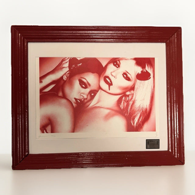
Death NYC — Kate Moss Rihanna Red Drip 2020 A/P Artist Proof Framed
$91.88 USD
-

Death NYC Snoopy Woodstock Telescope LV Dollar Bill Art Signed Numbered COA
$55.00 USD
-
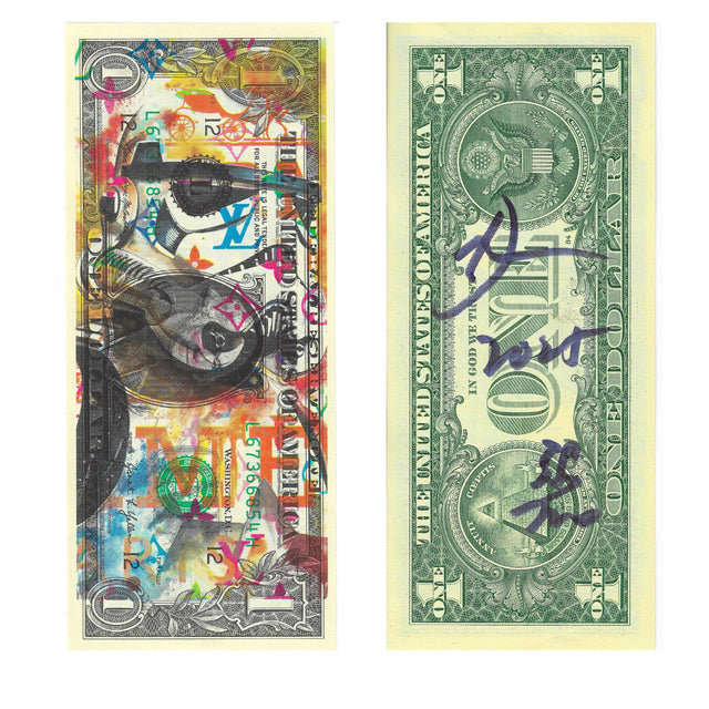
Death NYC Star Wars Stormtrooper LV Dollar Bill Art Signed Numbered COA
$55.00 USD
-
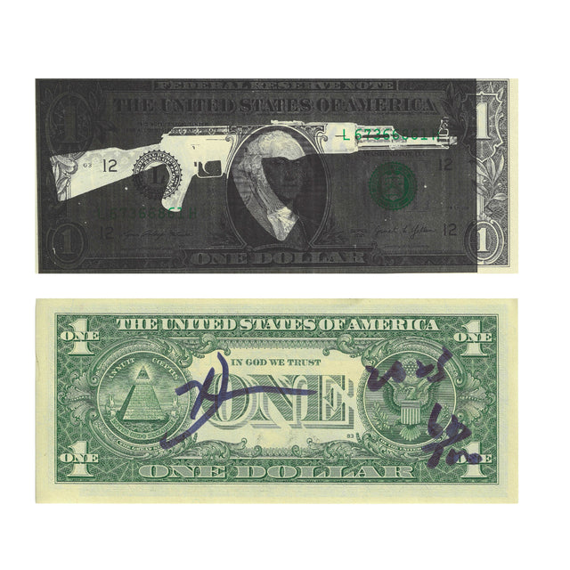
Death NYC Gun Dollar Bill Art Signed Numbered COA Black White Pop Street Art
$50.00 USD
-
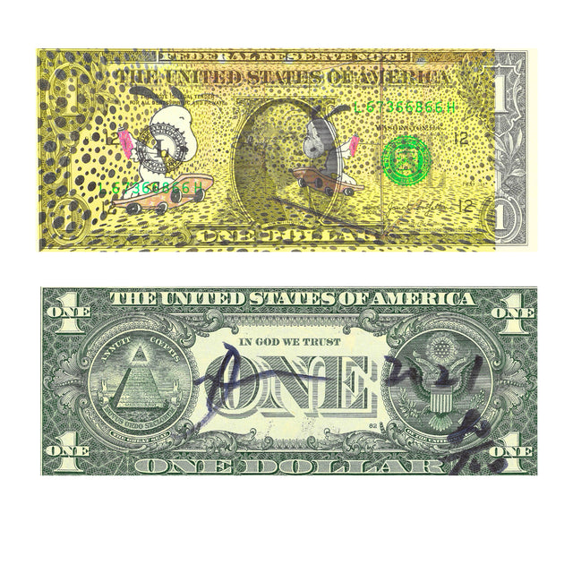
Death NYC Snoopy Skateboard Dollar Bill Art Signed Numbered COA Pop Street Art
$75.00 USD
-
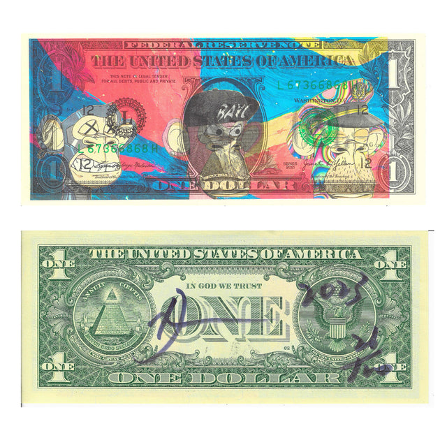
Death NYC Bored Ape Dollar Bill Art Signed Numbered COA Pop Street Art
$40.00 USD
Browse the collection for current listings.