

Featured image: AI-generated interior concept using product reference photography. Scale, setting, framing, and placement are illustrative.
The deliberate choice of pixelated art in a minimalist setting
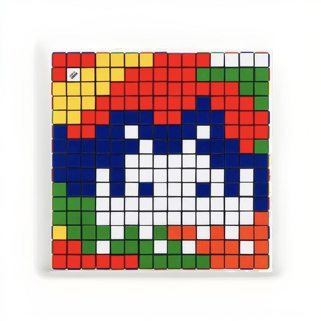
The challenge of integrating bold, pixelated artwork into a precise, architecturally driven interior often begins with a single question: how does a piece with such overt graphic qualities avoid feeling like an anomaly? The goal is not merely to hang art but to weave it into the very fabric of the room, allowing it to resonate with the existing material palette and spatial rhythm. Consider the Invader Rubik Camouflage giclee panel, a compelling piece that presents a vibrant, grid-based image of the artist's iconic space invader rendered in a camouflage colorway. This is not a mosaic built from actual Rubik's Cubes, nor is it a framed print on paper. Instead, it is a Diasec-mounted giclée on an aluminum composite panel, offering a clean, contemporary presence with a subtle depth. Its square format, with the outer dimensions to be confirmed and the inherent grid of its design make it a natural fit for spaces that already celebrate geometry, order, and refined surfaces. The visual language of the panel, with its distinct squares of red, blue, green, yellow, orange, and white, invites a dialogue with the rectilinear forms and material junctions common in modern architecture. The key lies in understanding how its pixel-like color rhythm can either complement or compete with the surrounding elements. This requires a considered approach to placement, lighting, and the interplay of color and texture, ensuring the artwork feels both intentional and integrated rather than merely appended. The precision of the panel's construction, with its sharp edges and flat surface, aligns well with the exacting standards of architectural design, demanding an equally precise installation to truly shine. This piece, signed and numbered by Invader, is a specific artistic statement that merits careful consideration in any design scheme.
Understanding the material and visual qualities of the giclee panel
The Invader Rubik Camouflage giclee panel is a specific object: a Diasec-mounted giclée on an aluminum composite panel. This technical description is critical for understanding its visual and physical properties. Diasec mounting involves bonding the giclée print face-up to a sheet of acrylic glass, then backing it with an aluminum composite panel. This process eliminates air between the print and the acrylic, resulting in enhanced color saturation and depth, and a perfectly smooth, glare-resistant surface. The acrylic acts as a protective layer, offering a contemporary, frameless presentation. The aluminum composite panel provides rigidity and stability, making the artwork durable and resistant to warping. Unlike a traditional framed print, this panel has a sleek, minimalist profile that floats slightly off the wall when properly mounted. The edges are sharp and clean, contributing to its architectural aesthetic. The visual effect is one of a single, unified surface, where the image appears almost embedded within the material. This differs significantly from a physical mosaic constructed from actual Rubik's Cubes, which would possess a distinct three-dimensional texture, individual cube facets, and varying light reflections. While the giclée depicts the aesthetic of Rubik's Cubes, it does so through a flat, photographic medium, offering a consistent, controlled surface. The colors, red, blue, green, yellow, orange, and white, are vibrant and saturated, arranged in a grid that forms the pixelated space invader. The deliberate flatness and sharpness of the panel are assets in a precise interior, where texture is often controlled and visual noise minimized. It offers a bold graphic statement without introducing tactile complexity that might clash with smooth walls or polished finishes. The absence of a traditional frame also allows the artwork to interact directly with the wall surface, emphasizing its integration rather than its separation from the architectural envelope. This is a subtle but important distinction for designers seeking a cohesive visual narrative. The way light plays across its surface is uniform, unlike the varied reflections one would find on a multi-faceted object, ensuring a consistent visual experience from different vantage points.
The pixel grid and its dialogue with architectural joinery
The inherent grid structure of the Rubik Camouflage panel is perhaps its most defining characteristic, offering a direct visual parallel to architectural joinery and modular design. Modern interiors frequently employ rectilinear forms, paneling, and exposed grids in elements like shelving, window frames, or wall treatments. When placing the Rubik Camouflage, consider how its pixelated squares, each a distinct color, can either echo or deliberately contrast with these existing lines. For instance, in a room featuring custom millwork with finely articulated reveals or a grid of recessed lighting, the panel’s internal rhythm can find a sympathetic counterpoint. The goal is to create a visual conversation, not a competition. The black lines delineating each 'Rubik' square on the panel are crisp and uniform, establishing a visual cadence. This precision can be leveraged to reinforce the architectural language of a space. Imagine a wall clad in large format porcelain tiles with minimal grout lines; the panel could be aligned so its internal grid subtly references the tile pattern, creating a layered sense of order. Alternatively, in a room dominated by organic shapes or soft textiles, the panel’s rigid geometry can introduce a necessary tension, a moment of graphic clarity that anchors the space. The key is to avoid an overabundance of repeated squares. While the panel itself is a grid, surrounding it with too many other overtly gridded patterns can lead to visual fatigue. Instead, seek out opportunities for juxtaposition: a smooth, unadorned wall as a backdrop, or a single, carefully chosen piece of furniture with strong rectilinear lines. The panel can have a substantial presence once its confirmed dimensions are tested against the wall, and its graphic intensity means it can hold its own even in larger spaces, provided its placement is thoughtful. A professional framer or art installer can advise on mounting methods that ensure perfect alignment, crucial for an artwork that so strongly relies on its geometric integrity. The optical effect of the pixelated image, where individual color blocks resolve into a recognizable form from a distance, adds another layer of engagement, inviting viewers to approach and appreciate the detail.
Hypothetical project: A minimalist loft living room with concrete and steel
Consider a hypothetical project: a minimalist loft living room in a converted industrial building. The space features polished concrete floors, exposed steel beams painted matte black, and large, unadorned white walls. The client desires a focal point that introduces color and personality without compromising the clean, architectural aesthetic. The material palette is deliberately restrained: concrete, steel, glass, and perhaps light oak for custom cabinetry. This environment presents an ideal canvas for the Invader Rubik Camouflage panel. We select a prominent wall, perhaps 12 feet wide, opposite the main seating area. Instead of hanging the panel centrally and conventionally, we opt for a slightly off-center placement, approximately two-thirds of the way along the wall's length, leaving a more expansive negative space on one side. This asymmetrical placement, a common tactic in modern design, prevents the composition from feeling too static. A full-size paper template based on confirmed outer measurements would establish how much wall the panel occupies. For its mounting, we specify a museum-style float mount system, which allows the panel to project subtly from the wall, creating a clean shadow line that emphasizes its precise edges and reinforces its object-like quality. This avoids any visible hardware, maintaining the sleek aesthetic. The primary colors of the Rubik's squares, red, blue, green, yellow, orange, and white, introduce a vibrant, yet controlled, burst of color into the otherwise neutral space. To echo these colors subtly without overwhelming the room, we might introduce a single accent cushion in a deep blue or a small ceramic vase in a vibrant red. The pixelated motif also finds a subtle echo in a carefully chosen rug with a very fine, almost imperceptible geometric weave, rather than an overt pattern. The overall effect is one of thoughtful integration: the artwork provides a dynamic visual anchor, its grid structure harmonizing with the industrial architecture, while its colors inject life without disrupting the minimalist calm. The panel’s flat, reflective surface interacts gently with the natural light from the large windows, offering subtle shifts in perception throughout the day. This careful consideration ensures the artwork feels like an intrinsic part of the design, not an afterthought. For a more playful, yet still curated, touch, a Space Invader x Rubik's Cube RubikCubiste could be displayed on an adjacent oak console, offering a three-dimensional counterpart to the panel's two-dimensional representation, further enriching the dialogue with the artist's work.
The importance of scale and alignment in architectural contexts
Scale and alignment are paramount when introducing a graphic artwork like the Rubik Camouflage panel into an architectural interior. The square format needs to be assessed using confirmed outer measurements, because the listing contains conflicting size conversions. Its impact is amplified or diminished by its relationship to surrounding architectural features. Consider the proportions of the wall it will inhabit, the height of ceilings, and the proximity to doorways, windows, or built-in elements. A common mistake is to hang art too high or too low, isolating it from the human scale of the room. A general guideline is to center the artwork at eye level, around 57-60 inches from the floor to the center of the piece, but this must be adjusted based on ceiling height and furniture placement. In a room with very high ceilings, the artwork might need to be slightly higher to prevent it from feeling dwarfed. Conversely, if placed above a console or credenza, its bottom edge should maintain a comfortable distance, typically 6-12 inches, to create a cohesive grouping without appearing disconnected. Precise alignment with architectural lines is critical for this particular piece. If the wall features a dado rail, a picture rail, or a subtle reveal in paneling, the artwork's edges should ideally align with these horizontal or vertical markers, or intentionally break from them in a way that feels deliberate rather than haphazard. A laser level is an indispensable tool for installation, ensuring the panel is perfectly plumb and level. Given the panel's construction, it is not a piece to be casually hung. The clean, sharp edges of the Diasec-mounted giclée demand a professional installation to achieve the desired floating effect and maintain structural integrity. Any tilt or misalignment will be immediately apparent and detract from its architectural precision. The visual impact of the pixelated grid is at its strongest when the panel itself is perfectly straight, allowing the internal geometry to resonate with the room's inherent structure. Consult with an experienced art installer to determine the most secure and visually appropriate mounting hardware for the specific wall material, ensuring both stability and aesthetic excellence. Such careful planning ensures the art serves as an enhancement, not a distraction, within the architectural vision.
Distinguishing the giclee panel from other forms of Rubikcubism
It is crucial to understand the specific medium of the Invader Rubik Camouflage panel to appreciate its unique qualities within the artist's broader body of work. This piece is described as a Diasec-mounted giclée on an aluminum composite panel. This means it is a high-resolution print, faithfully reproducing an image, which is then mounted under acrylic glass and backed for rigidity. It is a two-dimensional representation of the artist's aesthetic, not a three-dimensional construction. This distinguishes it markedly from several other forms of Invader's artistic output, particularly his well-known public mosaics and his physical Rubik's Cube constructions. While the giclée panel visually references the Rubik's Cube aesthetic, it does not physically embody the multi-faceted, tactile nature of actual Rubik's Cubes or the ceramic tiles of his street art. The visual texture of the panel is an illusion of depth created by the photographic rendering of the cube faces and their subtle shadows. This flat, smooth surface is a deliberate choice, offering a different kind of interaction than a relief sculpture or a mosaic. For example, a true mosaic built from individual Rubik's Cubes would present varying planes and reflections, creating a dynamic interplay of light and shadow that changes with the viewer's position. Similarly, a ceramic tile mosaic, like those found on city walls, would have distinct grout lines and the slight unevenness of hand-applied materials. The giclée panel, by contrast, offers a consistent, unblemished surface that emphasizes the graphic clarity of the pixelated image. This distinction is vital for a designer. If the goal is to introduce actual three-dimensional texture and an element of play, a physical Rubik's Cube object, such as the Space Invader x Rubik's Cube RubikCubiste, would be more appropriate. This functional 3x3 cube, an official collaboration for the MIMA exhibition, offers a tangible piece of the artist's Rubikcubism practice in a compact, interactive format. Its presence on a desk or shelf could complement the larger panel by providing a physical counterpoint to the panel's flat depiction. However, if the design intent is a sleek, modern aesthetic where visual impact is delivered through color, form, and precise lines without introducing tactile complexity, the Diasec-mounted panel is the superior choice. Its clean edges and uniform surface make it compatible with highly refined architectural finishes, allowing the artwork to integrate seamlessly into a minimalist scheme without adding unnecessary material bulk or visual distraction.
Color rhythm and strategic accenting
The color palette of the Rubik Camouflage panel – red, blue, green, yellow, orange, and white – is inherently vibrant and draws immediate attention. These are the primary and secondary colors of the classic Rubik's Cube, arranged in a pixelated pattern that forms the iconic Space Invader figure. In a precise architectural interior, where color might be used sparingly or in a highly controlled manner, this panel acts as a powerful chromatic anchor. The challenge is to manage this intensity so it enhances the space rather than overwhelming it. The color rhythm is not uniform; instead, it's a dynamic interplay of blocks, some large and contiguous, others small and isolated, creating a visual movement that is both structured and playful. When designing around this piece, consider leveraging its dominant colors for strategic accenting. For example, if the room features a predominantly neutral palette of concrete gray, white plaster, and natural wood, the panel's red and blue squares could inspire subtle echoes in soft furnishings or decorative objects. A deep navy throw or a single crimson accent chair could draw out these tones without competing with the artwork. Conversely, the smaller patches of green, yellow, and orange offer opportunities for unexpected pops of color in less prominent areas, perhaps through a piece of pottery or a book spine. The goal is to create a visual dialogue where the artwork’s colors are acknowledged and subtly referenced, rather than directly matched in large, overwhelming blocks. Avoid introducing too many additional strong colors that might clash with the panel's inherent vibrancy. Instead, let the panel be the primary source of chromatic energy, with other elements in the room providing a supporting cast of muted tones or complementary textures. For instance, pairing the panel with textiles that have a subtle texture but a neutral color, such as a linen sofa in a warm gray or a wool rug in an off-white, allows the artwork to truly stand out. The brilliance of the colors on the Diasec-mounted giclée is enhanced by its smooth, reflective surface, which allows light to play across the hues, making them appear even more vivid. This controlled vibrancy is a key asset in an interior where every color choice is deliberate and impactful.
Planning for optimal lighting and viewing experience
Lighting is a critical, yet often underestimated, factor in integrating any artwork, especially a piece like the Rubik Camouflage panel with its distinct surface and vibrant colors. The Diasec mounting, with its acrylic face, provides a certain level of glare resistance, but thoughtful lighting can significantly enhance the viewing experience and prevent unwanted reflections. Direct, harsh light from an overhead fixture can flatten the image and create hotspots, diminishing the artwork's impact. Instead, consider using directional lighting that washes the artwork evenly. Recessed adjustable spotlights or track lighting with a narrow beam spread can be positioned to illuminate the panel without creating distracting glare. The ideal angle for such lighting is typically around 30 degrees from the wall, aimed at the center of the artwork, to minimize shadows and reflections. However, a professional lighting designer or art installer can assess the specific room conditions and recommend precise beam angles and light temperatures. For an architectural interior, where clean lines and subtle effects are prized, integrated lighting solutions are often preferred. This could involve a linear LED strip concealed within a ceiling cove or a discreet wall washer that casts an even glow across the entire wall surface, including the artwork. The goal is to highlight the panel's colors and graphic clarity without making the light source itself conspicuous. Natural light should also be considered. While the Diasec mounting offers some protection, placing the artwork in direct, unfiltered sunlight for extended periods is not advisable, as it can still contribute to long-term degradation of the print. If the chosen wall receives significant natural light, consider sheer window treatments that diffuse the light or position the artwork on a wall that receives indirect illumination. The smooth, flat surface of the panel means that even subtle changes in ambient light will affect its appearance, making the colors appear warmer or cooler, brighter or softer, throughout the day. This dynamic interaction with light can be a desirable quality, adding a living dimension to the static artwork. Ultimately, the best lighting scheme allows the Rubik Camouflage panel to reveal its full chromatic depth and graphic detail, ensuring it remains a captivating focal point in the precise architectural setting.
Considering the broader context of Invader's Rubikcubism
To fully appreciate the Rubik Camouflage panel within an architectural context, it is helpful to understand its place within Invader's broader artistic practice, particularly his 'Rubikcubism' series. This movement, pioneered by the artist, involves creating images using only the six colors of the Rubik's Cube. Initially, this manifested as physical mosaics made from actual cubes, or as large-scale public artworks crafted from ceramic tiles that mimicked the cube's pixelated aesthetic. The Rubik Camouflage panel, while a giclée print, directly references this foundational aspect of his work. It captures the essence of his Rubikcubism without the material complexities of a three-dimensional installation. The visual 'trick' of Rubikcubism lies in its ability to render complex or recognizable forms from a limited, standardized palette and grid structure. This aligns perfectly with the principles of architectural design that often seek elegance and impact through economy of means and systematic approaches. The panel is a testament to the power of constraint in art, much like how a well-designed building might use a limited material palette to achieve a sophisticated aesthetic. For designers, this means the artwork carries a conceptual weight beyond its immediate visual appeal. It speaks to ideas of appropriation, digital aesthetics, and the transformation of everyday objects into high art. This intellectual depth can enrich the narrative of an interior, providing a talking point and a layer of sophistication that goes beyond mere decoration. The panel’s connection to street art and popular culture also introduces a playful, accessible element to an otherwise formal space. It bridges the gap between the refined and the rebellious, the calculated and the spontaneous. This duality can be a powerful tool in creating interiors that are both intellectually stimulating and emotionally engaging. The fact that it is a signed and numbered edition by HENI, a reputable publisher, further establishes its standing as a collectible art object, not simply a decorative print. This provenance is important for clients who appreciate the investment and cultural value of art. Understanding this broader context allows designers to articulate a more compelling narrative for the artwork's inclusion, positioning it not just as a colorful accent, but as a significant cultural artifact that brings a unique artistic philosophy into the home.
Practical considerations for acquisition and installation
Acquiring and installing a significant art piece like the Invader Rubik Camouflage panel requires careful planning to ensure its longevity and visual integrity within the designed space. Given its Diasec-mounted giclée on aluminum composite panel construction, its final outer measurements and weight should be confirmed before any mounting decision. While the material is robust, proper handling during transit and installation is essential to prevent damage to the acrylic face or the panel edges. The artwork will typically arrive professionally crated, and it is advisable to retain this packaging until the final installation. Before committing to a purchase, confirm the current availability and condition of the specific edition number. While the listing states
Shop Invader
Explore current pieces available from the gallery.
-

Space Invader x Rubik's Cube RubikCubiste MIMA 2022 Limited Edition Boxed
$185.00 USD
-
Invader Rubik Camouflage HENI Signed & Numbered 196/812 Giclee Panel 2023
$3,999.00 USD

Browse the collection for current listings.