

Featured image: AI-generated interior concept using product reference photography. Scale, setting, framing, and placement are illustrative.
A client sits at a conference table, staring at a twenty-page PDF deck filled with gorgeous imagery. On page four, a pair of graphic prints hangs above a velvet sofa. On page seven, a tall sculptural figure sits beside a custom walnut bookcase. The client nods, murmurs that everything looks wonderful, and then asks a question that stalls the project for three weeks: which one goes where, and what does this actually cost when it is installed? The presentation failed not because the objects were uninspired, but because the structure forced the client to evaluate spatial decisions, medium choices, custom framing logistics, and financial commitments simultaneously. When everything is presented as an open-ended option, indecision becomes the default response.
To build an art proposal that clients can act on, interior designers and art consultants must treat the presentation as a clear decision framework. This requires decoupling distinct rooms, standardizing the documentation for each proposed piece, and offering structural choices rather than chaotic alternatives. Presenting art is fundamentally different from selecting performance fabrics or specifying bath fittings. Art carries emotional weight, cultural narrative, and personal identity. By organizing proposals into isolated spatial footprints, clear physical specifications, and transparent preliminary budgets, you give clients the structural confidence required to say yes.
The Core Friction Points of Residential Art Presentations
Most presentation decks create friction by overwhelming the client with unorganized choices. When a designer shows three different artworks for a single wall without explaining how each alters the room's scale, lighting, or surrounding furniture, the client becomes anxious. The hesitation is rarely about whether they like the image; it is about whether they are making an irreversible spatial error. To eliminate this anxiety, a proposal must isolate the physical variable being decided.
A primary cause of client freeze is the failure to separate direct visual substitutes from distinct spatial footprint options. If a wall calls for a wide horizontal composition, offering a vertical sculpture as an alternative for that exact same spot confuses the client. Instead, proposals should present cohesive choices tailored to specific locations or highlight how different mediums transform adjacent zones in a room. A pair of works framed flat on a wall solves a vertical elevation problem through graphic balance, whereas a three-dimensional sculpture on a plinth solves a floor-plan problem through volumetric weight. When presenting these concepts, group them as distinct spatial strategies across the project rather than forcing them to compete for the same square inch of drywall.
Another common source of presentation friction is mixed documentation quality. Mixing quick phone snaps with high-end gallery renders causes clients to unconsciously favor the better-photographed piece, regardless of its suitability for the space. Standardize your proposal template so every work receives identical visual real estate, consistent typographic specifications, and clear provenance records. When every item is documented with equal rigors, the client evaluates the art's intrinsic value and spatial impact rather than the polish of your graphic presentation.
Structuring the Short Rationale to Justify Placement
Every artwork included in a proposal deck requires a concise written rationale. This text should not read like an auction catalog essay or a museum press release. Avoid generic claims about an object elevating the soul or transforming the room into a sanctuary. Instead, write two or three direct sentences explaining why this specific work solves a structural, aesthetic, or historical challenge within the architectural framework.
When proposing two-dimensional graphic works, focus the rationale on line, palette balance, and graphic weight. For instance, consider the Fairey Marilyn Sunrise and Sunset set. Your rationale should note how the pair establishes a symmetrical axis across a wide wall expanse while introducing controlled color contrasts. You might explain that the complimentary palette of blue, mint, pink, and yellow bridges the transition between cool upholstery fabrics and warm architectural millwork. Point out that displaying the two works together creates a diptych-style rhythm, where the darker, shadowed composition of one piece counterbalances the lighter, forward-facing orientation of the other. This gives the client a concrete design reason to approve the acquisition.
When drafting a rationale for three-dimensional objects, shift the vocabulary to form, material finish, and spatial volume. If you are proposing an oversized sculptural figure like the BE@RBRICK NASA Mercury 1000% figure, the rationale must address its height and physical footprint. Explain how its 27.5-inch vertical silhouette introduces a bold, contemporary form to anchor an underutilized alcove or media room pedestal. Highlight its metallic silver, white, and gray graphics, noting how the subtle teal accents interact with surrounding lighting and architectural finishes. By grounding the rationale in spatial logic and historical narrative, such as NASA's pioneering human spaceflight era, you give the client a rational foundation for an emotional investment.
Annotated Mockups and Architectural Visualizations
Clients struggle to translate small digital swatches or isolated product photos into full-scale spatial reality. A critical component of any effective art proposal is the annotated elevation mockup. Showing an artwork in its actual spatial context eliminates proportion misunderstandings and sets realistic expectations for the final installation.
To maintain absolute transparency, every digital rendering or visualization must be explicitly labeled. Clearly mark these images as AI-assisted visualizations or digital architectural mockups. Include a brief disclaiming note stating that context images serve as approximate visual references and do not represent actual final framing or precise physical dimensions. Distinguish preliminary reference imagery from real site photography to build trust with your client. If a client discovers that a frame style or spatial proportion in a render differs from the physical reality, their confidence in the entire proposal collapses.
Annotations on mockups should explicitly state key spatial relationships. Indicate the distance from the floor to the bottom edge of a frame, the spacing between companion pieces in a set, and the clearance around free-standing objects. When visual mockups show graphic prints hanging above a credenza or a sculptural figure standing beside an executive desk, include callout notes specifying those clear distances. These annotations move the presentation from a theoretical mood board to an actionable installation plan.
Distinguishing Confirmed Specifications from Provisional Details
One of the fastest ways to derail an art acquisition is to treat unconfirmed details as final facts. A proposal must clearly distinguish between confirmed physical data and provisional estimates that depend on site conditions or client approval. Over-promising on framing lead times, exact dimensions, or collector availability creates unnecessary professional liability.
Confirmed details include the verifiable physical characteristics of the object as received from the gallery or seller. This encompasses the medium, publisher, explicit edition structure, and physical signatures or edition markings visible on the piece. For instance, when documenting paper works, note hand-applied signatures, pencil edition numbers in the lower margin, and any visible publisher blindstamps. These are permanent features of the physical asset. For manufactured designer collectibles, confirmed details include the maker, official collection title, release series, materials, and overall height stated by the manufacturer.
Provisional details, by contrast, represent the elements you control and refine during the design process. Outer frame dimensions, matboard widths, custom pedestals, UV-protective glazing choices, and specialized mounting hardware remain provisional until field verification is complete. In your proposal document, separate these categories into distinct columns or labeled sections as outlined in the structure below:
- Confirmed Object Data: Artist or manufacturer attribution, title, edition type, signed or marked status, primary medium, baseline sheet or figure measurements.
- Provisional Specification Data: Outer frame size, matting profile, glazing specification, wall cleat capacity, display plinth height, custom finish, total installed footprint.
- Condition & Provenance Records: Inspection notes, historical release context, gallery catalog documentation, physical packaging notes.
By explicitly labeling custom framing and mounting parameters as provisional, you preserve the flexibility needed to adjust proportions once the artwork is physically reviewed by your framer or installer. Tell the client that final framed dimensions and hardware configurations will be verified prior to signing off on custom fabrication.
Written Financial Layouts and Installation Budgets
A client cannot make a confident decision if the proposal conceals the secondary costs of art acquisition. Showing only the base price of an artwork creates budget shock later when framing, art transport, protective glazing, and professional installation invoices arrive. A professional proposal presents a line-item financial layout that covers the entire path from gallery purchase to completed wall mounting.
Structure the financial layout into distinct tiers: the baseline art acquisition cost, custom fabrication and conservation framing expenses, specialized transport and handling, and on-site art hanging services. Framing costs vary based on archival requirements. Fine art prints on paper require acid-free matting, archival backing, and UV-filtering acrylic to protect the paper from light-induced degradation over time. Highlighting these options in the proposal demonstrates that you are safeguarding the client's physical investment.
Avoid vague estimates or hidden markups. Break out custom glazing profiles, shadowbox framing for three-dimensional items, or heavy-duty mounting hardware for oversized figures as clear line items. If an artwork requires specialized crating due to its scale or fragility, note that line item upfront. When clients see a comprehensive financial breakdown that accounts for every step of the installation process, they are far more likely to sign off without requesting prolonged revisions.
Managing Spatial Options Across Distinct Project Zones
To demonstrate how a multi-room art proposal functions in practice, consider a complete worked example for a high-end residential renovation. In this scenario, we look at two distinct spatial problems within the same home: a wide, low-ceilinged gallery hallway that requires horizontal visual balance, and a double-height media lounge alcove that demands a bold vertical anchor.
The hypothetical planning assumptions for the gallery hallway establish a clear wall footprint: 14 feet wide by 9 feet high, finished in matte off-white plaster, positioned directly across from a bank of north-facing windows. The visual objective is to introduce energetic contemporary color without overwhelming the linear transit space or requiring deep floor projections. The proposed solution is a two-piece graphic suite hung as a balanced horizontal diptych, using the Shepard Fairey "Marilyn Sunrise" + "Marilyn Sunset" Print Set.
Choosing a paired flat work for a long corridor involves direct trade-offs between continuous sightlines and physical clearance. Screenprints under protective glazing maintain a slim profile that will not encroach on high-traffic circulation. However, large glazed works installed directly opposite exterior windows present a persistent glare risk. To mitigate reflections, the specification includes anti-reflective UV acrylic rather than standard glass. The primary design rationale for selecting the Fairey set rests on its complementary color balance. The mint, pink, blue, yellow, and purple tones introduce high-chroma pop art aesthetics into a neutral hall, while the two distinct portraits create a narrative link as a viewer moves along the wall.
The hypothetical planning assumptions for the media lounge alcove feature a different structural challenge: a recessed corner zone measuring 5 feet wide, 4 feet deep, and 10 feet high, positioned adjacent to dark oak paneling and architectural task lighting. The visual objective is to introduce a distinct sculptural focus that commands visual authority from across the room without blocking traffic pathways. The proposed solution is an oversized designer figure displayed on a low architectural plinth, specifying the BE@RBRICK NASA Project Mercury Astronaut 1000% Medicom Toy Bearbrick Space.
Placing a three-dimensional figure in an alcove creates a dynamic spatial presence, but it requires careful physical mitigation. A standing 27.5-inch vinyl figure placed on a floor plinth invites physical contact in social spaces. The trade-off for choosing a floor-standing sculptural work over a standard wall painting is the need for dedicated floor area and structural weighting within the custom plinth to prevent tipping. Visually, the metallic silver, gray, teal, and black finishes of the NASA spacesuit graphics complement the dark oak paneling, catching directional task light and filling the spatial volume of the recess far more effectively than a flat canvas.
By treating these zones as independent spatial decisions rather than competing options for the same room, the client can evaluate each choice based on its specific spatial context. The following comparison table demonstrates how to format these distinct proposals within a single presentation deck:
| Specification Zone | Gallery Hallway Option | Media Lounge Alcove Option |
|---|---|---|
| Proposed Work | Shepard Fairey Marilyn Set | BE@RBRICK NASA Mercury 1000% |
| Spatial Footprint | Two-piece wall diptych | Oversized floor figure on plinth |
| Primary Medium | Screenprints on paper | Articulated vinyl collectible figure |
| Color Profile | Mint, pink, blue, yellow, purple | Silver, white, gray, teal, black |
| Baseline Dimensions | Two matching sheet prints | Approximately 27.5 inches tall |
| Framing / Display | Matching custom frames with UV acrylic | Low walnut plinth with internal weighting |
| Spatial Strategy | Creates broad horizontal focal line | Provides vertical sculptural weight |
In a hypothetical worked decision, a client operating under a fixed art budget might choose to move forward immediately with the gallery hallway prints because the corridor is the primary public transit zone of the home. By reviewing the structured proposal, the client can approve the documented total commitment for the Fairey set and custom framing, while deferring the alcove figure and plinth until a later project phase. This clear presentation matrix prevents all-or-nothing client rejections, allowing individual room approvals without stalling the broader interior schedule.
Analyzing the Fairey Marilyn Pair for Wide Elevations
Examining specific works highlights how detailed catalog observations translate directly into client-facing proposal copy. The Shepard Fairey Marilyn Sunrise and Sunset print set provides an exemplary case study for presenting paired contemporary works on paper.
Start by describing the visual composition of the matching pair. Point out that these are complementary portraits rather than basic color variants. The Marilyn Sunrise piece features a lighter, more open composition with vibrant mint and pale blue tones across the background, emphasizing a bright forward posture. The Marilyn Sunset companion print utilizes deeper shadow tones, rich purples, and intense blues to create a contrasting mood. When hung side by side with four inches of separation, the subtle visual dialogue between the two compositions engages the viewer in a way a single print cannot.
Address the physical details confirmed by the listing records. Note that both works feature hand-applied signatures and pencil edition markings in the lower margins, confirming their status as a published limited edition set. Highlight the contemporary street-art aesthetic that merges historic pop culture imagery with modern graphic stenciling. Explain to the client that because paper prints are vulnerable to humidity and direct light, the proposal includes white painted hardwood frames, spacer bars to prevent the paper from touching the glazing, and UV-filtering acrylic. Point out that while UV-filtering glazing significantly reduces light-induced fading risks, paper works should still be kept away from direct sunlight, heating vents, and high-humidity zones. Presenting these maintenance requirements demonstrates high professional care and protects the artwork over the long term.
Integrating the NASA Mercury 1000% Figure into Modern Interiors
Incorporating designer toys and modern pop culture collectibles into luxury residential projects requires a refined presentation approach. Clients often associate figures with casual playrooms unless the designer frames the object within a clear historical and sculptural context. The BE@RBRICK NASA Mercury 1000% astronaut figure serves as an excellent reference for elevated collectible integration.
Framing the narrative begins with the historical significance of the design. This oversized figure pays tribute to Project Mercury, NASA's pioneering human spaceflight initiative launched in 1958 that introduced the Mercury Seven astronauts and established the foundation for American space exploration. Manufactured by Medicom Toy, the figure combines Japanese collectible culture with aerospace heritage. Grounding your presentation in this historical context lifts the conversation above simple home decoration and anchors the object as a cultural statement piece.
Next, analyze the graphic execution and physical scale of the figure. Standing approximately 27.5 inches (70 cm) tall, the 1000% scale figure has substantial physical presence. Point out specific design details noted in the catalog evidence: the metallic-style helmet illustration with its softly tinted visor graphics, the iconic NASA insignia rendered across the chest, the detailed mechanical suit components, and the contrasting teal accents running along the limbs. Explain that its silver, white, gray, and black palette pairs effortlessly with modern architectural materials like polished concrete, matte steel, smoked glass, and dark timber wall panels. Recommend placing the figure on a custom low plinth near architectural accent lighting to emphasize its metallic finish and graphic suit details.
Navigating Secondary Market Evidence and Provenance Records
Clients are sophisticated buyers who want clear verification details before approving major acquisitions. A professional art proposal must include transparent sourcing records, condition assessments, and provenance documentation without making unsupported financial predictions or unverified authenticity claims.
When documenting works in a proposal deck, treat gallery listings and merchant descriptions as catalog records that confirm how the item is currently presented and packaged. Highlight signed and numbered details, visible edition markings, publisher blindstamps, original packaging, and manufacturer branding as practical provenance milestones. For limited edition paper works, confirm that signature locations and edition numbers match official catalog entries. For collectibles, note original box packaging and official brand branding. Frame these records as complete documentation packages that support the history of the piece.
Be disciplined regarding condition reporting and marketing qualifiers. Always retain attribution qualifiers exactly as documented; never alter terms like after, manner of, or inspired by to inflate value. Review physical condition photographs with your client, pointing out edge margins, paper flatnesses, or factory finish detailing. Advise clients that while authentic limited editions and sought-after collectibles possess strong cultural relevance, art acquisitions should never be framed as guaranteed financial investments or self-liquidating assets. Art should be acquired for its aesthetic power, historical value, and spatial contribution to the living environment.
Securing Client Signoff with an Actionable Presentation Format
The structure of your final presentation pages dictates whether a client signs off immediately or delays for weeks with endless questions. Conclude your art proposal deck with an actionable signoff page that converts design ideas into approved procurement orders. Eliminate vague summaries and replace them with precise, signable line items.
An effective signoff sheet isolates each artwork into a distinct approval block. Each block should feature a thumbnail image of the work, the approved location within the home, confirmed baseline dimensions, the selected framing or plinth specification, and the total cost including framing, shipping, and installation. Include clear selection checkboxes so the client can approve specific locations independently. If they approve the gallery hallway prints but wish to refine the media lounge plinth height, they can sign off on the paper works immediately without delaying the overall project timeline.
Always include a formal client signoff block with explicit legal wording. State that client signature authorizes the designer or consultant to purchase the specified works, commit to custom framing fabrication, and schedule specialized art transport. Note that final framed dimensions, gallery availability, and current item condition will be confirmed immediately prior to payment execution. Providing this level of clarity transforms a passive visual deck into a precise, professional contract.
When you present art through a clear, systematic proposal framework, you remove the guesswork that stalls client decisions. By decoupling distinct rooms, standardizing documentation, providing transparent total budgets, and outlining precise framing specs, you guide your clients from initial hesitation to confident approval. To explore current inventory, review documented condition reports, and source unique contemporary works or limited edition collectibles for your next project, explore the curated secondary market collection at Gauntlet Gallery.
Available at Gauntlet Gallery
Explore current pieces available from the gallery.
-

1963 Farquhar Earth in Space Transparent Celestial Globe 16" Compass VTG
$699.00 USD
-

1967 Beatles Richard Avedon STERN Original Posters Set of 4 Linen Backed Copy
$999.00 USD
-
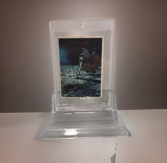
1969 Space Candy Buzz Aldrin Apollo 11 On The Moon Card #19 Taylor-Reed Display
$59.00 USD
-

1980 Polo Player Green Pink Chalk Pastel Bears Andy Warhol Signature AS-IS
$399.00 USD
-

After Andy Warhol Moon Landing Line Drawing 5/50 w/ Astronaut Autographs As-Is
$175.00 USD
-

After John Lennon "I Do" Framed Print, Marked A/P Unverified
$99.00 USD


Browse the collection for current listings.