You can tell an original Richard Avedon Beatles poster from a reproduction by checking five things: the printing method, the paper, the printed credit and copyright text, the sheet size, and the paper trail behind the piece. Period posters from the original 1967–68 releases were mass-produced with the photomechanical printing technology of the era, so under a 10x loupe they show a regular halftone dot structure rather than the sprayed, dithered micro-droplets of a modern inkjet print. Period paper has aged — it tones, softens, and loses the blinding optical brightness of modern stock. Original releases carried publisher credit lines that reproductions frequently omit, alter, or blur. And a genuine period example usually comes with a story: an old frame, a magazine mail-order origin, a family attic. When all five line up with documented examples, you are looking at an original.
That is the short answer. The longer answer is worth your time, because the Avedon Beatles portraits sit at a rare crossroads: they are among the most recognizable rock images ever made, they were printed in large quantities as affordable posters, and they have been reproduced — legally and otherwise — for more than five decades. That combination means the market contains everything from crisp period originals to last week's print-on-demand copies, often described with identical language. This guide walks through the history, the physical examination, the provenance questions, and the buying process step by step, the same way our gallery evaluates a piece before it ever reaches a collector.
What the Avedon Beatles Posters Actually Are
In August 1967, at the height of the Summer of Love and just months after Sgt. Pepper's Lonely Hearts Club Band, Richard Avedon photographed the Beatles in London. Avedon was already one of the most celebrated portrait and fashion photographers in the world, and the sitting was arranged as a commissioned project connected to the band's management organization. From that session came a suite of images that became instantly iconic: four individual portraits of John, Paul, George, and Ringo, each transformed with solarization and saturated psychedelic color, plus a black-and-white group portrait of the four together.
The psychedelic portraits were not straight photographs. Avedon manipulated the images in the darkroom — solarizing, layering, and coloring them — to produce something that looked less like editorial photography and more like the poster art blooming out of San Francisco and London at that moment. The results were published in major magazines in early 1968, most famously in Look magazine in the United States, and licensed to publications in other countries, which issued their own printings for their own markets.
Crucially for collectors, the images were then offered as posters. In the United States, Look promoted a mail-order poster offer, and readers could send away for large-format printings of the psychedelic portraits and the group image. Similar licensed poster distributions happened internationally through the publications that carried the images. This is why period examples exist in real quantity: these were popular, affordable decorations for a generation of fans, printed by the thousands, thumbtacked to bedroom walls, folded into envelopes, and mailed across the country.
That history creates the collecting landscape you face today:
- Period originals (1967–68): posters printed and distributed during the original magazine-era releases, in the US or through licensed international publishers.
- Later authorized reprintings: the images have been licensed and reissued at various points in the decades since. These are legitimate objects, but they are not period originals and the market values them differently.
- Unauthorized reproductions: everything from head-shop bootlegs of the 1970s to modern digital prints made from scans. These range from obvious to genuinely deceptive.
The collector's task is to figure out which of those three buckets a given poster belongs in. The good news: the physical evidence usually tells you, if you know where to look.
Original vs. Reproduction: Define Your Terms Before You Buy
One of the most common sources of grief in music memorabilia is two people using the word “original” to mean different things. Before examining a single dot of ink, get clear on the vocabulary — our collector glossary covers these distinctions in depth, but here is the version that matters for this poster series:
- “Original” should mean a poster printed during the initial 1967–68 release window, by or under license from the original publishers. This is what commands collector premiums.
- “Vintage” is looser — it often just means old. A 1970s bootleg is vintage. It is not an original.
- “Reissue” or “reprint” means a later production run, which may be fully authorized. Honest sellers say so plainly.
- “Reproduction” in the modern sense usually means a copy made photographically or digitally from an existing poster or published image, without any connection to the original printing chain.
When a listing says “original vintage-style Avedon Beatles poster,” every word in that phrase is doing work, and not the work you want. Ask sellers directly: original to what year, printed by whom, and how do you know? A knowledgeable seller of a genuine period piece can answer all three. Our music memorabilia buyer's guide goes deeper on how to read seller language across the whole category.
The Physical Examination: Seven Checks
Now to the object itself. You do not need a laboratory — a 10x loupe, a tape measure, good light, and patience will resolve the overwhelming majority of cases. Work through these checks in order.
1. Put a loupe on the printing
This is the single most powerful test. Posters of the 1960s were produced with photomechanical printing processes, and those processes leave a signature: under 10x magnification, the image resolves into a regular, geometric pattern of halftone dots — in color areas, overlapping dot screens in the printer's process colors, arranged at consistent angles. The pattern is orderly. It repeats. It looks engineered, because it was.
Modern reproductions are usually made on inkjet equipment, and inkjet leaves a completely different signature: a fine, irregular spray of micro-droplets with no fixed screen angle — more like mist than like a grid. Laser-printed and some digitally printed copies show their own telltale textures. You do not need to identify the exact modern process; you only need to recognize that what you are seeing is not a period halftone structure. Five minutes of practice comparing a loupe view of an old magazine page against a modern inkjet photo print will train your eye permanently.
One caution in the other direction: a halftone dot pattern alone does not prove a poster is from 1967. Offset printing has been standard for decades, and a 1990s reissue is also offset-printed. The loupe rules out modern digital copies decisively; the remaining checks separate period printings from later press runs.
2. Read the paper
Paper is honest. A sheet that has existed since 1968 has spent over half a century reacting with light, air, and its own chemistry. Expect some degree of toning — a warm shift, often more pronounced at edges and anywhere the sheet was exposed while framed or tacked up. Expect a certain suppleness or dryness distinct from crisp new stock. Under ultraviolet light, many modern papers fluoresce a bright blue-white because of optical brightening agents used heavily in later paper manufacture; a sheet that glows like a nightclub under UV deserves deep skepticism as a claimed 1960s printing. Period paper typically responds far more dully.
None of these observations is a solo verdict — paper varies, storage varies, and skilled fakers artificially age paper. But paper evidence must at least be consistent with the claimed age. A supposedly 55-plus-year-old poster on bright-white, razor-crisp, uniformly perfect stock is telling you something, and you should listen.
3. Check the printed credit and copyright text
Documented period examples of the Avedon Beatles posters carry printed credit and copyright text identifying the rights holders and the release. This is one of your best friends, for two reasons. First, many casual reproductions simply omit the credit text, or crop it away, because they were copied from an image of the artwork rather than from the full sheet. Second, even when a reproduction includes the text, it was usually photographed or scanned from an original — so under the loupe, the fine text often appears soft, broken, or screened, where on an original printing the text is sharp because it was printed as line matter.
Do not rely on memory for the exact wording. Compare the text on the poster in front of you — its wording, typography, size, and placement — against verified examples from auction archives and institutional collections. Mismatched, missing, or mushy credit lines are among the most common and most decisive reproduction tells in this series.
4. Measure the sheet
Period poster releases were produced in consistent formats, and reproductions frequently are not. Modern print-on-demand services output standard contemporary sizes, which rarely match 1960s publishing formats exactly. Measure the full sheet, not the image, and compare your measurements against documented examples of the specific release you believe you have — US and international printings differed, so identify the release first, then check the size against it. A poster that is a couple of inches off in both dimensions from every documented example of its supposed release has a serious problem. Be alert to trimming, too: some period posters were cut down over the years to fit frames, so a slightly undersized sheet with evidence of trimmed margins is a condition issue, while a cleanly-margined sheet in a wrong size is an authenticity issue.
5. Look at the color behavior
The psychedelic portraits live or die on their color, and color reproduces imperfectly. Copies made from scans of aged originals often bake the aging into the image — toning reproduced as a printed yellow cast, even in areas that should be clean. Others overcorrect into a garish, oversaturated palette that looks digital rather than printed. Meanwhile, genuine period posters may show honest fading, particularly if displayed for years, and the fade will be physical — stronger on the exposed face, uneven where a frame or mat protected the margins. Ask yourself whether the color story matches the object's physical story. Printed-on aging and physically absent aging are contradictions.
6. Examine folds, handling, and the back
Distribution history leaves marks. Posters distributed through mail-order offers were commonly folded or rolled for shipping, and period examples often show fold lines, tack holes, tape ghosts, or corner wear from decades of ownership. These are not flaws to fear — they are corroborating evidence, and the market understands them. Turn the poster over: the back of a period sheet should show age consistent with the front, and fold lines should have genuinely worn paper fibers, not fresh creases added to a new sheet. A pristine, dead-flat sheet is not automatically wrong — well-stored examples exist — but perfection raises the bar for every other check.
7. Weigh the whole picture
No single test authenticates a poster; agreement among tests does. A period-consistent halftone structure, on period-consistent paper, with sharp and correctly worded credit lines, at a documented size, with wear that matches a plausible life story — that convergence is what authentication actually is. One strong contradiction, on the other hand, is usually fatal to the claim. This is exactly how professional evaluation works across the category, and it is the method we teach throughout our guide to spotting fake music memorabilia.
Original vs. Reproduction at a Glance
| Feature | Period original (1967–68) | Modern reproduction |
|---|---|---|
| Under 10x loupe | Regular halftone dot screens at consistent angles | Irregular inkjet droplet spray or other digital texture |
| Paper | Age-toned, period stock; dull under UV | Bright white, often fluoresces strongly under UV |
| Credit/copyright text | Present, sharp, matches documented wording and placement | Missing, cropped, altered, or soft and screened |
| Sheet size | Consistent with documented examples of the specific release | Standard modern print sizes; frequently off-dimension |
| Aging | Physical: toning, fold wear, tack holes, fade on exposed areas | Absent, artificial, or printed into the image itself |
| Color | Period palette, possibly honestly faded | Oversaturated digital color or reproduced yellow cast |
| Story | Coherent provenance: mail-order origin, old framing, long ownership | Vague sourcing, “found in a warehouse,” no history |
Print this table, or keep the logic in your head: dots, paper, text, size, story. Most decisions resolve inside those five words.
Provenance: The Paper Trail Around the Paper
Physical examination tells you what an object is; provenance tells you where it has been, and the two reinforce each other. For a mass-produced poster, nobody expects a museum-grade dossier — but meaningful provenance for this series looks like: a consistent ownership story (“my mother ordered it from the magazine offer and it hung in her room until 1974”), period framing or mounting materials, old inscriptions or price stickers, inclusion in a documented collection, or prior sale records from reputable auction houses with the same example identifiable by its specific wear.
Weak provenance is not proof of a fake, and strong provenance is not proof of an original — stories can be wrong and objects get swapped. But provenance shifts probability, and in a series this heavily reproduced, probability is what you are buying. At Gauntlet Gallery, documented provenance is a pillar of how we source: we would rather pass on ten attractive posters with no history than sell one with a story we cannot stand behind. When you evaluate any seller, ask what they can document, not just what they can describe. Our authentication glossary explains the provenance terms you will encounter along the way.
What If the Poster Is Signed?
A separate question hides inside this topic: some Avedon Beatles posters surface bearing signatures — claimed autographs of one or more Beatles, or of Avedon himself. A signature changes the analysis completely, because now you are authenticating two different things: the poster as a printed object, and the ink on top of it.
Beatles autographs are among the most forged signatures in all of collecting, full stop. The demand is enormous, the supply of genuine examples is finite, and forgers have targeted the band for decades. For any signed example, the industry standard is third-party authentication from the recognized major services: Beckett, JSA, and PSA/DNA. These are the houses whose opinions the market actually prices, and a signed piece without certification from one of them should be valued, conservatively, as if the signature were not there. That is not cynicism; it is how experienced collectors and dealers protect themselves.
Two practical notes. First, authenticate the poster before you celebrate the signature: a genuine-looking autograph on a modern reproduction is a red flag in itself, since the signing opportunity would have to postdate the printing. Second, certification is a process you can pursue — the major services review submissions, and a favorable letter of authenticity materially changes what a piece is. Our signed music authentication guide walks through how Beckett, JSA, and PSA/DNA certification works in practice, and our signed music collection shows what properly certified material looks like when it is presented correctly.
How Our Gallery Evaluates a Poster Like This
It may help to see the process from the dealer's side of the table. When a piece in this category comes to Gauntlet Gallery, it moves through the same sequence we have described — loupe, paper, text, dimensions, condition mapping — before we ever discuss it with a collector. Then it meets the data. That comparison does two jobs at once: it grounds pricing in evidence rather than optimism, and it flags anomalies — when a piece is offered well below what the comparable record says genuine examples bring, the discount usually has a reason, and the reason is usually the answer to this article's title question. Use dated completed sales for the same artist, release, format and condition, recording the venue, currency and fees. Asking prices and broad archive totals do not establish a realized sale price or future return.
We encourage collectors to think the same way even when buying elsewhere. Check recent verified sales of the specific release you are considering. Note what documentation accompanied the strong results. If a listing's price looks like a miracle, treat the miracle as a data point. You can explore how we read the market across categories on our financial insights page.
What Drives Value in This Series
We deliberately avoid quoting dollar figures here, because poster values move with condition, release, and the market cycle — a number printed today misleads someone reading next year. But the value factors are stable, and understanding them tells you what to prioritize:
- Originality of the printing. The period 1967–68 releases sit at the top; authorized later reprintings sit well below; modern reproductions carry decorative value only.
- Which image. Individual portraits and the group image are collected differently, and complete sets kept together are their own category of desirability.
- Condition. Color strength, margin integrity, and the severity of folds, tears, tape, and tack holes drive real differences between examples of the same printing.
- Documentation. Provenance, prior auction history, and — for signed examples — certification from Beckett, JSA, or PSA/DNA.
- Presentation. Professional conservation framing does not make a poster more original, but it preserves the qualities that make it valuable.
For current qualitative context on where the market stands, consult our music memorabilia price guide and, for autographed material specifically, the signed music price guide — and always compare recent verified sales rather than asking prices, which are aspirations, not evidence.
Care, Storage, and Keeping Your Records
Suppose the checks all pass and the poster is yours. Now your job is to stop the clock. Period poster stock is often acidic and inherently fragile, so handle it with clean, dry hands or gloves, and support the full sheet when moving it — old folds tear easily. For display, use UV-filtering glazing, acid-free mounting materials, and hinging or corner methods that never involve adhesive tape touching the sheet; direct sunlight is the enemy of exactly the saturated color that makes these images matter. For storage, flat and archival is the goal: acid-free folders in a flat file, in a stable environment away from humidity swings, attics, and basements.
Just as important: preserve the paper trail you just worked so hard to verify. Keep your purchase records, the seller's representations in writing, any certificates, prior auction listings, and dated photographs of the poster's condition, including its distinctive wear — those specific tack holes and fold intersections are effectively the fingerprint that identifies your example forever. When the poster changes hands again, that file transfers the confidence you built to the next collector, and confidence is a real component of value. This record-keeping discipline is one of the habits we drill in our Collector's Hub, and it applies to a magazine poster exactly as it applies to a five-figure signed piece.
Your Pre-Purchase Checklist
Condensed for use in the field — run every item before money moves:
- Identify the claimed release. Which image, which country, which publisher, which year? “Original Beatles poster” is not an answer.
- Loupe the image. Regular halftone structure: proceed. Inkjet spray or digital texture: stop.
- Loupe the credit text. Present, sharp, and matching documented wording and placement for that release.
- Measure the sheet and compare against documented examples of that specific release; account for trimming.
- Assess the paper — toning, feel, and UV response consistent with the claimed age.
- Map the condition — folds, holes, tape, fading — and ask whether the wear tells one coherent story.
- Ask for provenance in writing, and weigh what can be documented versus merely described.
- If signed, require certification from Beckett, JSA, or PSA/DNA — or price the piece as unsigned.
- Compare recent verified sales for the same release and condition tier before accepting any price.
- Buy from sellers who welcome questions. Evasion about any item on this list is itself an answer.
If you want the same framework applied across the wider category — concert posters, signed albums, instruments, and beyond — our full library of buyer's guides is the place to continue, and the authentication FAQ answers the questions we hear most often from collectors starting out.
Frequently Asked Questions
Were the Avedon Beatles posters originally sold as art prints?
No — they were mass-distributed posters, published through magazines in 1967–68 and offered to the public at popular prices, most famously via a mail-order offer in the United States. They were printed in large quantities as affordable decoration, not as limited fine-art editions. That is precisely why period originals still surface today, and why the series has been so heavily reproduced since.
Does a halftone dot pattern prove my poster is from the 1960s?
No. The loupe test is decisive in one direction only: an inkjet or digital texture rules out a period original, but a halftone pattern is consistent with offset printing from any decade, including later reissues. Combine the loupe result with paper age, credit-line accuracy, sheet dimensions, and provenance before drawing a conclusion.
Are later authorized reprints worthless?
Not worthless — but different. Authorized reissues are legitimate decorative objects and honest entry points for fans, and they should be bought and sold clearly labeled as reprints. The collector premium belongs to the period 1967–68 printings. Problems arise only when a later printing is priced or described as an original.
Should folds and tack holes scare me off?
Usually the opposite. Period posters were folded for mailing and tacked to walls, so honest wear corroborates age, and the market prices it as condition, not as a defect of authenticity. Be more skeptical of a claimed 1960s poster in impossibly pristine condition than of one with a believable life story written into its surface.
Who should authenticate a signed Avedon Beatles poster?
For music autographs, the recognized third-party services are Beckett, JSA, and PSA/DNA. Beatles signatures are heavily forged, so the market treats uncertified signatures as unverified — and prices them accordingly. Authenticate the poster as a printed object first; a signature sitting on a modern reproduction is itself a warning sign.
What is the single fastest check I can do in person?
Carry a 10x loupe and look at the image and the fine credit text. Regular halftone dots with sharp, correctly worded credit lines pass the first gate in under a minute; sprayed inkjet texture or soft, screened, or missing credit text ends the conversation immediately. No other one-minute test carries as much weight.
How do I figure out what a genuine example is worth?
Ignore asking prices and compare recent verified sales of the same image, release, and condition tier. Auction records and dealer sales with documented outcomes are the evidence that matters.
Shop Music memorabilia
Explore current pieces available from the gallery.
-
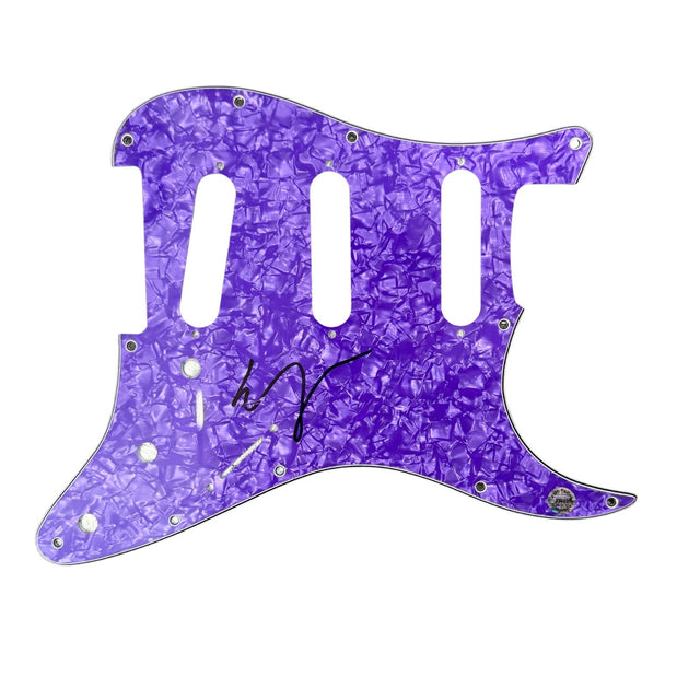
Vampire Weekend Ezra Koenig Signed Guitar Pickguard Autograph Hologram COA
$100.00 USD
-
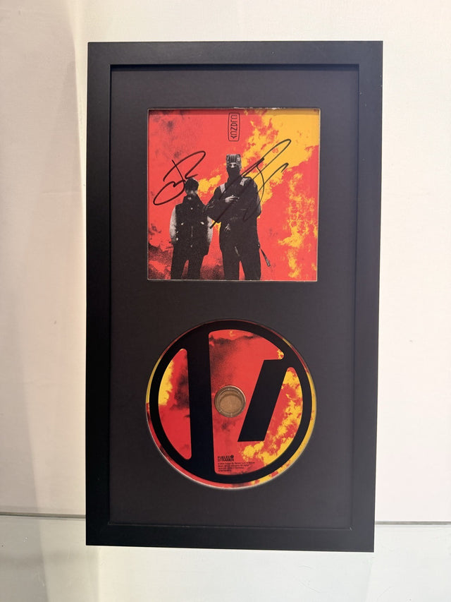
Twenty One Pilots Signed Clancy CD Framed Display Tyler Joseph Josh Dun Auto
$199.00 USD
-
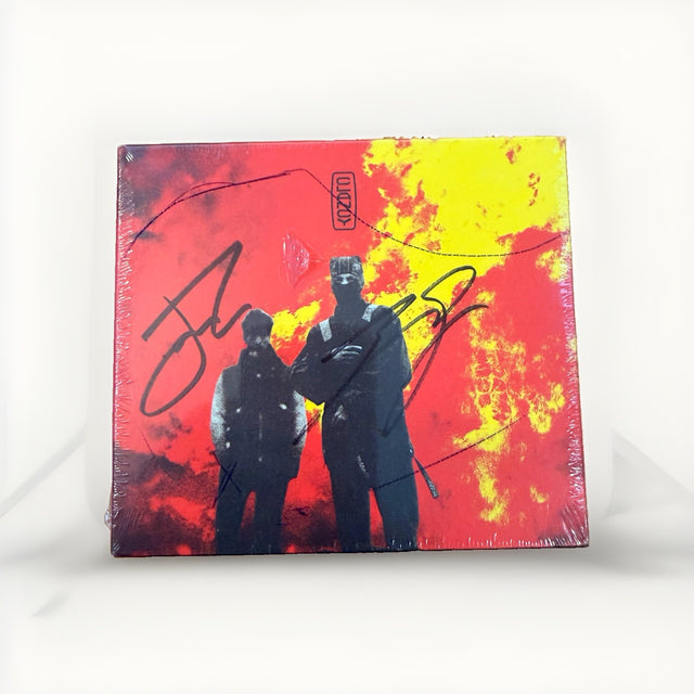
Twenty One Pilots Clancy Signed CD Tyler Joseph Josh Dun Sealed Unopened 2024
$189.00 USD
-
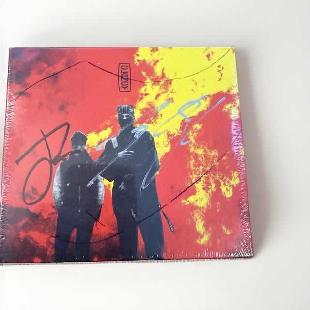
Twenty One Pilots Clancy Signed CD Sealed Tyler Joseph Josh Dun Silver Autograph
$189.00 USD
-
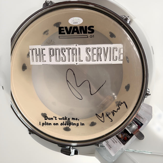
The Postal Service Dual Signed Evans M-80 Drumhead JSA A40371
$499.00 USD
-
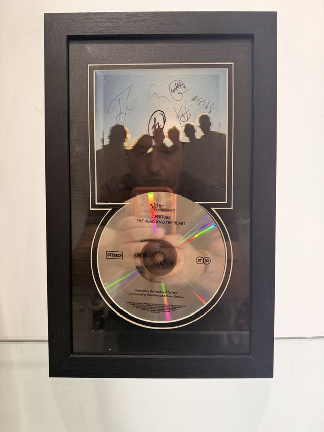
The Head and the Heart Band Signed Framed 'aperture' CD COVER ALBUM
$65.00 USD
Browse the collection for current listings.