

Featured image: AI-generated interior concept using product reference photography. Scale, setting, framing, and placement are illustrative.
The art-first design sequence: client meaning, focal wall, and sightline
Beginning a room design with a single, significant collectible print in mind presents a refreshing deviation from conventional approaches. Often, art is the final flourish, selected to complement an already established palette and furniture layout. However, when a client possesses a piece like Shepard Fairey's Make Art Not War – an offset lithograph with a powerful message and distinctive aesthetic – it's an invitation to reverse the sequence. This 'art-first' methodology allows the artwork to inform foundational decisions, ensuring it truly anchors the space rather than merely accessorizing it. The process begins not just with visual appeal, but with the client's personal connection to the piece. What does Make Art Not War mean to them? Is it a statement of personal philosophy, an appreciation for Fairey's artistic legacy, or a reminder of historical moments? Understanding this intrinsic value is paramount, as it dictates the prominence and context the piece deserves.
Once the emotional resonance is established, the practical design sequence unfolds. First, identify the prime focal wall. This isn't just any blank space; it's the wall that naturally draws the eye upon entering the room, or the one that serves as the backdrop to a primary seating arrangement. The placement of a piece as impactful as Make Art Not War on a secondary wall would diminish its presence and dilute its message. Second, consider sightlines. How will the print be viewed from various points in the room? Will it be visible from the doorway, from a comfortable armchair, or from the dining area in an open-concept space? Optimizing sightlines ensures the artwork is consistently engaging, rather than something glimpsed only incidentally. These initial steps – understanding client meaning, selecting the focal wall, and establishing clear sightlines – lay the groundwork for a truly integrated design where the art is not just present, but central.
Considering furniture proportions and placement relative to the artwork
With the focal wall and primary sightlines established, the next critical phase involves furniture proportions and their placement in relation to the artwork. A common pitfall in art-centric design is selecting furniture that either overwhelms or is dwarfed by the chosen piece. For a print like the 24 x 36-inch Make Art Not War, which has a substantial vertical presence, careful consideration of surrounding elements is essential. Imagine a living room where this print is destined for the wall above a sofa. The length of the sofa should ideally be at least two-thirds the width of the framed artwork, and often longer, to create a sense of balance. A sofa that is too short will make the print feel top-heavy, while one that is excessively long might make the print feel isolated.
The height of the furniture is equally important. A console table or credenza beneath the artwork should not be so tall that it crowds the bottom edge of the frame. Generally, there should be a comfortable visual gap – often between 6 to 12 inches – between the top of the furniture and the bottom of the frame. This creates breathing room and prevents the artwork from appearing precariously perched. For example, if the print is framed to approximately 26 x 38 inches (allowing for a slim frame), and is hung with its center at an average eye-level of 60-62 inches from the floor, the top of a console table below it might ideally be no higher than 30-32 inches. This ensures the artwork remains the primary focus, with the furniture serving as a grounding element rather than a competing one. Think about the overall massing: a heavy, dark sectional might require a larger, more impactful frame or a wider mat to hold its own against the furniture's visual weight. Conversely, delicate, leggy furniture might benefit from a more minimal frame to maintain a light aesthetic. The goal is a harmonious visual dialogue, not a competition for attention.
Integrating the artwork's palette into finish samples and textiles
The distinctive palette of Shepard Fairey's Make Art Not War—muted blue-green, burgundy, and cream—offers a strong starting point for integrating colors into finish samples and textiles. The key is thoughtful integration, not literal matching of every single element. Resist the urge to replicate the exact blue-green of the background on every wall or to find a burgundy sofa that perfectly mirrors the roses. Instead, consider these colors as a guide for selecting complementary and analogous tones that enrich the overall scheme.
For instance, the muted blue-green can inspire choices for wall paint or larger textile elements. A soft sage green or a deeper teal could be used on an accent wall, while cream or off-white forms the primary wall color, echoing the print's dominant neutral. Burgundy, a rich and warm hue, is best introduced through smaller, impactful elements. This could be a velvet throw pillow, a ceramic vase, or even a subtle pattern in an area rug. Repeating the burgundy too broadly risks overwhelming the space and making it feel dated or heavy. The cream provides an excellent base for larger surfaces like ceilings, trim, or foundational furniture pieces such as a linen sofa or upholstered headboard, ensuring the room feels airy and balanced against the bolder art.
When selecting finish samples, look for textures and materials that resonate with the print's aesthetic – perhaps a distressed wood for a console table to hint at the street art origins, or a brushed brass accent that complements the vintage Art Nouveau inspiration. Textiles can introduce subtle patterns that echo the floral motifs without being overt. A rug with an abstract pattern in blues and creams, or curtains with a faint geometric design, can tie the room together without directly copying the artwork. The aim is to create an environment where the print feels organically situated, its colors echoed and celebrated rather than strictly duplicated. This nuanced approach ensures the print remains a focal point, its palette woven subtly through the room's fabric rather than plastered across every surface.
Planning for the final framed size and verifying dimensions
Once the core design elements – client meaning, focal wall, sightlines, furniture, and preliminary palette – are in place, the critical step of planning for the final framed size of the print becomes paramount. The original 24 x 36-inch dimensions of Shepard Fairey's Make Art Not War are just the starting point. The choice of matting and frame will significantly impact its overall visual footprint, and this final dimension must be accurately verified before committing to furniture sizes or wall compositions.
Consider the impact of matting. A wide, neutral mat (e.g., 2-4 inches on each side) can add substantial visual weight and sophistication, especially for a piece with a strong graphic presence. For a 24 x 36-inch print, a 3-inch mat would add 6 inches to both the width and height, making the matted artwork 30 x 42 inches. Then, factor in the frame itself. A slim, contemporary frame might add only an inch or two to each dimension, whereas a more substantial, ornate frame could add several inches. For planning purposes, assume a conservative estimate for a medium-width frame (e.g., 1.5 inches per side). This would bring the total framed dimensions for our example to approximately 33 x 45 inches. This is a significant increase from the original print size and must be accounted for in spatial planning.
Before any final purchases or installations, it is essential to verify these dimensions. Obtain samples of mat board and frame profiles if possible, and physically measure them with the print. Better yet, create a mock-up using craft paper cut to the anticipated final framed size and tape it to the focal wall. This allows you to visually assess its scale in context, ensuring it harmonizes with the proposed furniture and doesn't feel too small or too large for the designated space. This step is particularly crucial when dealing with a piece that carries substantial visual weight and a clear message; its impact is contingent on its proportional presence. Confirming the final framed dimensions avoids costly mistakes and ensures the artwork commands the appropriate attention within the room.
Hypothetical living room plan: a worked example with planning assumptions
To illustrate these principles, consider a hypothetical living room measuring 15 feet wide by 20 feet deep with 9-foot ceilings. The client acquired the Shepard Fairey Make Art Not War signed offset lithograph (24 x 36 inches unframed) to serve as the room's central focus.
Planning Assumptions:
- Print: Shepard Fairey, Make Art Not War (24 x 36 inches unframed).
- Framing: 3-inch mat and a 1.5-inch frame profile on all sides.
- Calculated Framed Size: 33 inches wide by 45 inches high.
- Focal Wall: 15-foot wall (180 inches).
- Primary Seating: Sofa centered on the focal wall.
Design Decisions and Reasoning:
- Focal Wall Placement: Centering the 33-inch-wide framed print on the 180-inch wall leaves 73.5 inches of negative space on each side, allowing the piece to stand out without visual clutter.
- Sofa Selection: A 100-to-110-inch sofa in cream linen provides a stable anchor beneath the print, offering balanced proportions without visually overwhelming the 33-inch frame.
- Hanging Height: Mounting the print with its center at 60 to 62 inches above the floor places the bottom edge roughly 8.5 inches above a standard 31-inch sofa back, maintaining clear sightlines.
- Color Palette Integration: Warm off-white wall paint pulls from the cream paper stock. Deep blue armchairs and subtle burgundy accent pillows reference the print's tones without matching every shade precisely.
- Lighting: Framed picture lights cast direct illumination across the glass face, avoiding glare while establishing the piece as the primary visual anchor.
When the image should influence a palette and when to resist matching everything
The decision of when to let the artwork's palette dictate the room's colors and when to exercise restraint is a nuanced one. For a print like Shepard Fairey's Make Art Not War, with its distinct yet not overly complex color scheme of muted blue-green, burgundy, and cream, the image provides an excellent foundation for influence. The artwork's message and style are bold, but its colors, particularly the blue-green and cream, are relatively subdued, making them amenable to broader application.
The image should influence the palette when its colors are part of its fundamental identity and contribute significantly to its mood or message. In Make Art Not War, the blue-green evokes a sense of calm, while the burgundy adds a touch of passion and historical reference. These colors are integral to the artwork's visual language. Therefore, it makes sense to draw inspiration from them for dominant elements like wall colors, large rugs, or key upholstery pieces. For instance, a soft, analogous blue-gray for the walls can complement the print's background, creating a serene envelope. The cream can be directly adopted for ceilings, trim, or foundational furniture to ensure brightness and visual continuity.
However, it is crucial to resist matching everything. Over-matching – literally replicating every color from the artwork in every textile, accessory, and surface – leads to a monotonous and often overwhelming space. The room becomes a literal interpretation of the artwork, losing depth and sophistication. For example, while burgundy is present in the roses of Make Art Not War, using a burgundy sofa, burgundy curtains, and burgundy throw pillows would be excessive. Instead, burgundy is best introduced as an accent – a single throw pillow, a small decorative object, or a subtle stripe in a rug. This allows the color to pop and draw attention back to the artwork without dominating the entire room. Similarly, the specific blue-green of the print might be too strong for all walls; instead, choose a lighter, analogous shade or use it only on an accent wall. The goal is an informed palette that harmonizes with the artwork, allowing it to sing, rather than a literal echo chamber that stifles its impact.
Installation and lighting considerations for valuable prints
The final installation of a valuable print like Shepard Fairey's Make Art Not War demands meticulous attention to detail, particularly regarding proper hanging and lighting. This isn't just about aesthetics; it's about preservation and ensuring the artwork's longevity. Before installation, confirm the wall's integrity and use appropriate hardware for the framed weight. For a substantial piece, two D-rings and picture wire, or two separate hooks, provide greater stability than a single point of attachment, minimizing tilt and potential stress on the frame.
Lighting is paramount. Direct sunlight is the arch-nemesis of paper-based art. Even with UV-filtering glass or acrylic in the frame, prolonged exposure to direct sunlight will inevitably lead to fading and degradation over time. Position the artwork on a wall that receives minimal or no direct sunlight throughout the day. If this is unavoidable, consider blackout blinds or curtains for windows that expose the wall. For artificial lighting, dedicated picture lights are an excellent choice. They should be positioned to illuminate the entire surface evenly, avoiding hot spots or shadows. The angle of the light source is critical to prevent glare – typically, a light mounted slightly above and forward of the frame, angled down, works best. LED lights are preferable as they emit minimal heat and UV radiation. Recessed ceiling lights can also be effective if angled correctly, but be mindful of creating reflections on the glass.
Beyond light, environmental stability is crucial. Avoid hanging valuable prints directly above heat sources like radiators or fireplaces, or in areas prone to extreme temperature fluctuations and humidity, such as bathrooms or poorly insulated exterior walls. Stable temperature and humidity levels (ideally around 68-72°F and 40-55% relative humidity) are best for preserving paper. A professional installer can ensure secure hanging and advise on specific site conditions. While not an everyday consideration, these installation and lighting practices are fundamental to protecting and showcasing the artwork appropriately, ensuring it remains a vibrant focal point for years to come.
Alternative artwork for a different aesthetic: Shepard Fairey's Deco Floral Pattern (Blue)
While Shepard Fairey's Make Art Not War offers a bold, graphic statement with its Art Nouveau influences and muted blue-green, burgundy, and cream palette, a designer might seek a different aesthetic while retaining Fairey's distinctive hand. Consider Shepard Fairey's Deco Floral Pattern (Blue). This piece, a hand-signed and numbered edition of 275, offers a more intricate and perhaps less overtly political visual language. The title suggests a focus on decorative elements, likely drawing inspiration from Art Deco rather than Art Nouveau, and specifically highlights a blue palette.
If Deco Floral Pattern (Blue) were the starting point for a room, the design approach would shift. Its likely emphasis on pattern and a predominant blue hue would lead to a more intricate and layered textile selection. Instead of the clear, bold color blocks of Make Art Not War, a room designed around Deco Floral Pattern (Blue) might incorporate subtle patterns in wallpapers, upholstery, and rugs that echo the artwork's decorative complexity. The blue would likely be deeper and richer, perhaps a navy or sapphire, lending itself to a more luxurious or sophisticated atmosphere. Accent colors might be drawn from metallic finishes – silver, chrome, or even a subtle gold – to play into the Art Deco glamour. The overall feeling would lean towards elegance and subtle opulence, rather than the grassroots, activist energy of Make Art Not War.
Furniture choices would also adapt. While Make Art Not War might pair well with clean-lined, minimalist, or even slightly industrial pieces, Deco Floral Pattern (Blue) would likely thrive with furniture featuring more curvilinear forms, polished wood, or mirrored surfaces. The visual weight of the art itself, being an edition of 275, suggests a degree of collectibility that warrants careful framing to enhance its exclusivity. This comparison highlights how a different artwork from the same artist, even with similar foundational influences, can fundamentally alter the entire design trajectory of a room, emphasizing different aspects of an interior's character.
The lasting impact of an art-first design and practical next steps
Designing a room with an artwork as the primary muse, rather than an afterthought, cultivates a space with unparalleled depth and personal resonance. When a piece like Shepard Fairey's Make Art Not War guides the initial decisions – from focal point and furniture arrangement to color palette and material selection – the resulting interior feels intentional, cohesive, and deeply reflective of the client's values. This 'art-first' approach isn't merely about aesthetics; it's about creating an environment that genuinely supports and amplifies the artwork's presence, transforming it from a mere decorative object into the soul of the room. The piece becomes a constant source of inspiration and conversation, its message woven into the very fabric of the living space. Such a room avoids the generic and embraces individuality, offering a unique narrative that unfolds through thoughtful design choices.
The beauty of starting with a significant print is that it provides a clear, defined point of departure. The colors, themes, scale, and emotional weight of the artwork offer tangible constraints and inspirations, simplifying what can often be an overwhelming array of choices in interior design. It forces a disciplined approach, where every subsequent decision must justify its relationship to the central artwork. This creates a powerful feedback loop: the room enhances the art, and the art enriches the room. The outcome is a space that doesn't just look good, but feels right, imbued with character and a sense of purpose. This method is particularly effective for clients who possess a cherished collectible – be it a print, a painting, or a sculptural object – and wish for their home to reflect its significance. It ensures that the investment in art translates into an investment in a truly personalized and meaningful living environment.
For designers and clients embarking on such a project, the practical next steps are clear. First, meticulously measure the artwork and plan for its final framed dimensions, including matting and frame profile. Use paper mock-ups to test scale on the actual wall. Second, gather material and finish samples that draw inspiration from the artwork's palette – not by direct matching, but by selecting complementary and analogous tones that create harmony. Third, finalize furniture layouts, ensuring proportional balance with the framed artwork. Fourth, consult with a professional framer to select appropriate archival materials that protect the print while enhancing its visual appeal. Verify all current availability and condition of the art before specifying. Finally, arrange for professional installation, paying close attention to optimal hanging height, secure fixtures, and most critically, protective lighting conditions that avoid direct sunlight and excessive heat. By following these steps, the vision of an art-centric room can be brought to life, creating an interior that is both beautiful and deeply personal.
Consider the powerful statement an artwork can make when given its rightful place at the heart of your design. Explore the range of collectible prints that could inspire your next art-first interior.
Available at Gauntlet Gallery
Explore current pieces available from the gallery.
-

1963 Farquhar Earth in Space Transparent Celestial Globe 16" Compass VTG
$699.00 USD
-

1967 Beatles Richard Avedon STERN Original Posters Set of 4 Linen Backed Copy
$999.00 USD
-
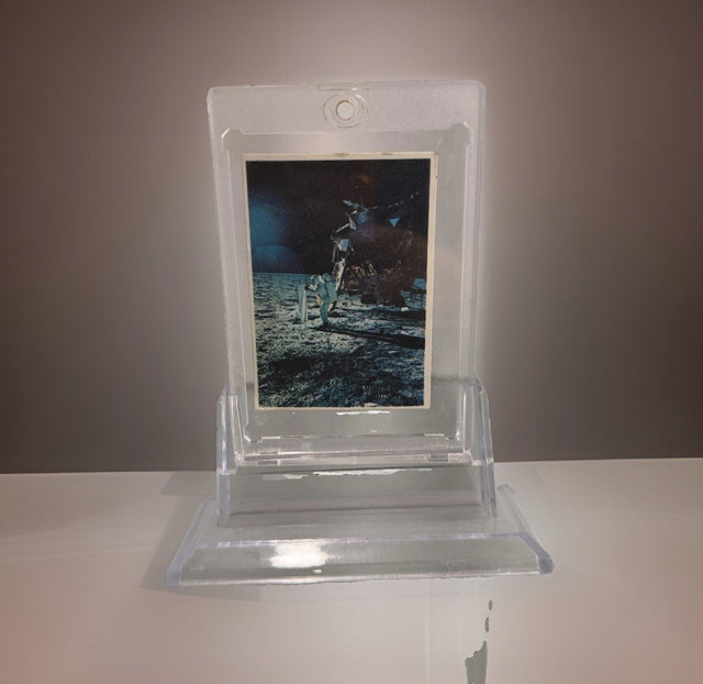
1969 Space Candy Buzz Aldrin Apollo 11 On The Moon Card #19 Taylor-Reed Display
$59.00 USD
-

1980 Polo Player Green Pink Chalk Pastel Bears Andy Warhol Signature AS-IS
$399.00 USD
-

After Andy Warhol Moon Landing Line Drawing 5/50 w/ Astronaut Autographs As-Is
$175.00 USD
-

After John Lennon "I Do" Framed Print, Marked A/P Unverified
$99.00 USD


Browse the collection for current listings.