Best Statement Art for Above the Sofa: A Styling Guide
What art should you hang above your sofa? The short answer: choose one bold statement piece (or a tightly grouped set) that spans roughly two-thirds of your sofa's width, and hang it so its center sits about 57–60 inches from the floor, leaving 6–10 inches of breathing room above the sofa back. For a living room that anchors a whole room, favor confident, graphic work — street art, pop art, or a bold limited-edition print — in a frame that matches your palette. And whenever you can, buy an authenticated original or edition rather than a mass-market poster: it looks richer in person and it holds its value over time.
Below is the complete styling playbook — the scale-and-height math, the single-piece-versus-grouping decision, how to pick a subject and style that carries the room, framing that flatters the work, and why an authenticated piece is the better long-term buy. It's written for design-conscious homeowners and interior designers who want the sofa wall to look intentional, not accidental.
The one-sentence answer, then the rules
A sofa wall reads best with a single dominant focal point sized to the furniture beneath it, hung at eye level, framed to complement the room, and — ideally — an original or numbered edition rather than an open-run reproduction. Everything else is refinement. Let's take the rules one at a time so you can measure your own wall with confidence.
Scale and sizing: the two-thirds rule
The single most common mistake above a sofa is art that's too small — a lonely little frame floating over a big piece of furniture. Designers avoid this with a simple proportion.
Width: aim for about two-thirds of the sofa
Your art (or your grouping, measured edge to edge) should span roughly two-thirds to three-quarters of the sofa's width. On a standard 84-inch sofa, that means a piece or arrangement about 55–63 inches wide. Going wider than three-quarters can feel top-heavy; going much narrower than half looks undersized and tentative. If you love a piece that's a little small, don't stretch it thin — pair it into a grouping (more on that below) so the collective footprint hits the two-thirds mark.
Height above the sofa: 6 to 10 inches of gap
Leave a deliberate gap between the top of the sofa back and the bottom of the frame — usually 6 to 10 inches. Closer than that and the art looks like it's sliding down behind the cushions; much more and the piece drifts up into no-man's-land, visually disconnected from the furniture that grounds it. The art and the sofa should read as one composition.
Eye-level hanging: the 57–60 inch center
The gallery standard is to hang so the center of the artwork sits about 57 to 60 inches from the floor — average eye level. Above a sofa, you're balancing two things: that eye-level ideal and the 6–10 inch gap above the cushions. For most sofas (with a back around 30–34 inches high), those two guidelines land in the same zone. If your sofa is unusually tall or low, prioritize the gap above the back so the pairing stays cohesive, and let the exact center drift a couple inches to accommodate it.
Quick reference table
| Sofa width | Target art / grouping width (≈⅔–¾) | Gap above sofa back | Center height from floor |
|---|---|---|---|
| 72 in (loveseat) | 48–54 in | 6–10 in | 57–60 in |
| 84 in (standard) | 55–63 in | 6–10 in | 57–60 in |
| 96 in (large) | 63–72 in | 8–10 in | 57–60 in |
Treat these as a confident starting point, not a straitjacket — trust your eye once the piece is on the wall, and use painter's tape to mock up the footprint before you drive a single nail.
One statement piece vs. a grouping
The biggest styling fork is whether to hang a single hero piece or build a composition of several works. Both can be beautiful; they send different signals.
When a single statement piece wins
- You want maximum impact and calm. One large, confident work is the fastest way to make a room feel curated and intentional. It gives the eye a single place to land.
- Your room is already busy. Patterned rug, layered pillows, lots of texture? A single clean piece quiets the wall and lets everything breathe.
- You have a genuine hero work. A bold street-art print or pop-art edition deserves to stand alone — grouping it can dilute its presence.
When a grouping (or gallery wall) wins
- Your favorite pieces are individually small. Cluster them so the collective footprint hits that two-thirds-of-the-sofa width.
- You want a collected-over-time story. A grouping reads as personal and evolving — ideal for collectors who add pieces gradually.
- You want flexibility. Diptychs and triptychs, or a tidy grid of same-size frames, let you swap and grow the wall later.
If you go the grouping route, impose one unifying discipline — consistent frames, a shared palette, or a common subject — so the wall looks composed rather than accumulated. A pair or trio of related editions by the same artist is one of the easiest ways to get a cohesive, high-impact result.
Single piece vs. grouping at a glance
| Consideration | Single statement piece | Grouping / gallery wall |
|---|---|---|
| Visual impact | High, focused | High, dispersed |
| Best for | Busy rooms, true hero works | Smaller works, evolving collections |
| Difficulty to hang | Low (one anchor point) | Higher (layout planning) |
| Flexibility to grow | Lower | Higher |
| Risk if done poorly | Too small = undersized look | Too scattered = cluttered look |
Choosing the subject and style that anchors a living room
The sofa wall is usually the most-seen wall in the home — it's what you face when you sit down and what guests see first. That makes it the right place for a piece with real presence. In practice, three families of work anchor a living room especially well.
Street art and street-pop
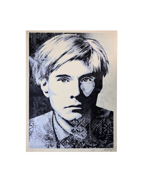
Graphic, high-contrast, and unapologetically modern, street-pop work from artists like Shepard Fairey, Banksy, Invader, and Mr. Brainwash reads powerfully from across a room. The bold line work and limited palettes hold their impact even at a distance, which is exactly what a sofa wall needs. Browse the broader authenticated collection to see how these pieces scale.
Pop art and neo-pop
Pop art — classic Warhol imagery and the neo-pop lineage that followed — thrives on repetition, saturated color, and instantly legible subjects. It's inherently decorative in the best sense: designed to command a wall. Explore the dedicated pop art collection for editions that bring color and confidence to a living room. A single vivid pop print above a neutral sofa is one of the most reliable "wow" moves in interior design.
Bold prints and designer editions
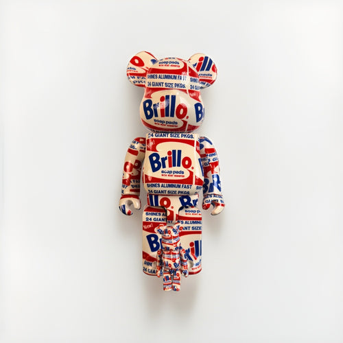
Beyond the two categories above, any bold limited-edition print with a strong composition can anchor the room — think confident color-field work, iconic figures, or a striking silkscreen. Designer figures and objects from makers like KAWS and BE@RBRICK also play a supporting role on nearby shelves or consoles, echoing the palette of the hero print above the sofa.
Matching subject to your palette and mood
- Neutral room, need energy? Choose a piece with one or two saturated accent colors that you can echo in pillows or a throw.
- Colorful room, need calm? A monochrome or black-and-white graphic piece adds impact without adding chaos.
- Want timelessness? Iconic imagery and recognizable artists age better than trend-driven decor prints — and, not coincidentally, they hold value better too.
Framing: the finishing detail that flatters the work
The right frame can elevate a good print into a genuine focal point; the wrong one can flatten it. A few principles carry most rooms.
- Match the frame to the room, not just the art. Thin black or natural wood frames suit most modern interiors; a warm gilt frame can add richness to a traditional space.
- Give bold work a mat and clean lines. A generous white mat gives graphic prints room to breathe and signals care. For very large statement pieces, a slim frameless float or a minimalist frame keeps the focus on the image.
- Protect what you hang. UV-filtering glazing (glass or acrylic) guards against fading, and acid-free matting prevents discoloration — small choices that protect both the look and the long-term value of an authenticated piece.
- Keep a family consistent. In a grouping, uniform frames unify disparate images; in a single hero piece, let the frame quietly support rather than compete.
For a deeper walkthrough of framing and display specific to street art and designer editions, see our guide on how to frame and display street art and designer toys.
Why authenticated originals and editions beat posters
It's tempting to reach for an open-run poster to fill the sofa wall quickly. But for the room's most important surface, an authenticated original or limited edition is the better call — on both aesthetics and economics.
They simply look better in the room
Screenprints and fine-art editions have physical presence a poster can't fake: richer ink density, real paper texture, embossing, deckled edges, and the depth that comes from proper printmaking. Under natural light, across a room, that difference is visible. A statement wall is exactly where that quality shows.
They hold — and can build — value
A poster is a decorating expense; an authenticated edition is an asset that happens to be beautiful. Limited editions from established artists have a documented secondary market, and the best pieces appreciate over time rather than heading to the recycling bin at your next redecoration. For how collectors think about that, see our market and financial insights, and our companion piece on authenticated art as home decor that protects value.
Authentication is what makes it real — and it varies by artist
"Authenticated" means the piece's legitimacy is documented, and the standard differs by artist. A few accurate reference points:
- Shepard Fairey / OBEY: pieces don't carry an artist-issued COA; confidence comes from provenance and buying through a reputable dealer.
- DEATH NYC: works come with a certificate of authenticity and a gold seal.
- KAWS & BE@RBRICK / Medicom: authentication relies on third-party verification such as TrueCOA.
- Warhol: provenance plus third-party verification such as TrueCOA (note that the former Warhol authentication board dissolved in 2012, so beware anyone claiming board authentication today).
The through-line: buy from a source that documents authenticity, understand the correct chain for your artist, and keep the paperwork. That's the difference between owning decor and owning a collectible.
Five common sofa-wall mistakes (and how to fix them)
Even a great piece can look off if the wall around it isn't handled with care. These are the errors interior designers correct most often above a sofa.
- Going too small. By far the most frequent misstep. A modest frame over a wide sofa reads as an afterthought. Fix it by hitting the two-thirds-width rule, sizing up, or grouping smaller works into one larger composition.
- Hanging too high. When art floats far above the sofa back, the pairing loses its visual connection and the wall feels empty. Keep the gap to 6–10 inches so the art and furniture read as a single unit.
- Ignoring the palette. A piece that fights the room's colors creates tension. Pull one or two hues from the art into pillows, a throw, or a nearby object so the wall feels integrated rather than bolted on.
- Over-cluttering a gallery wall. Too many small frames scattered without a system looks busy, not collected. Impose one discipline — matching frames, a shared palette, or a common subject — and leave consistent spacing (about 2–3 inches between frames).
- Defaulting to a poster. Reaching for an open-run print to "fill the space fast" undersells your most-seen wall. An authenticated edition costs more up front but looks dramatically better in person and retains value — a smarter buy for a focal point you'll live with for years.
Avoid those five and the wall will already look more intentional than most. Ready to shop with intent? Our buyer's guides break down what to look for artist by artist before you commit.
A simple 6-step workflow for the perfect sofa wall
- Measure the sofa and calculate two-thirds of its width — that's your target art footprint.
- Decide single vs. grouping based on the room's busyness and your collection.
- Pick a subject and palette that either energizes a neutral room or calms a colorful one.
- Choose an authenticated piece over a poster, and confirm the right authentication chain for the artist.
- Frame for the room with UV glazing and acid-free matting.
- Mock up with painter's tape, then hang at a 57–60 inch center with a 6–10 inch gap above the sofa.
New to buying original work? The collector hub and our full art index are the fastest way to find a statement piece that fits your room and your budget.
Frequently asked questions
How big should art be above a sofa?
Aim for a piece — or a grouping measured edge to edge — that spans about two-thirds to three-quarters of the sofa's width. On a standard 84-inch sofa, that's roughly 55–63 inches wide. Art that's too small is the most common sofa-wall mistake; when in doubt, size up or group smaller pieces together.
How high should I hang art above a sofa?
Hang so the center of the artwork sits about 57–60 inches from the floor (gallery eye level), while leaving a 6–10 inch gap between the top of the sofa back and the bottom of the frame. For most sofas those two guidelines overlap. Mock up the position with painter's tape before hanging.
Should I hang one big piece or a gallery wall above my couch?
Choose a single statement piece for maximum, focused impact — especially in an already-busy room or when you own a true hero work. Choose a grouping or gallery wall when your favorite pieces are individually small, or when you want a collected-over-time look. If you group, unify the wall with consistent frames or a shared palette.
What style of art works best above a sofa?
Bold, graphic, high-contrast work reads best from across a living room: street art and street-pop (Shepard Fairey, Banksy, Invader, Mr. Brainwash), pop and neo-pop (Warhol-lineage color and repetition), and confident limited-edition prints. Match the piece to your palette — accent color for a neutral room, monochrome for a colorful one.
Is original art or a poster better for above the sofa?
An authenticated original or limited edition is the better choice for your most-seen wall. It looks richer in person — real paper, ink density, and texture a poster can't match — and it holds or builds value over time rather than becoming a disposable decorating expense. Just confirm the correct authentication chain for the artist and keep the documentation.
How do I know a piece is authentic?
Authentication varies by artist. Shepard Fairey works rely on provenance and a reputable dealer rather than an artist COA; DEATH NYC pieces include a COA and gold seal; KAWS and BE@RBRICK use third-party verification such as TrueCOA; Warhol relies on provenance plus third-party verification such as TrueCOA. Always buy from a source that documents authenticity and keep the paperwork.
Buy & authenticate with confidence
A statement piece above the sofa is where styling and collecting meet: it should look extraordinary today and be worth owning for years. Start with a bold, authenticated print or edition sized to your sofa, frame it to flatter the room, and hang it at eye level. Explore the pop art collection and the full range of authenticated works, lean on the collector hub for guidance, and check financial insights to understand the market before you buy. Do it once, do it right, and your sofa wall becomes the piece everyone notices first.