How to Choose Art for Your Home: A Room-by-Room Guide
How do you choose art for each room in your home? Match four things to the character of each space: subject (what the image is about), scale (how big it reads on the wall), mood (energetic versus calm), and framing (how it is protected and presented). Living rooms reward a bold statement piece; bedrooms want calm, personal, restful work; entryways get one confident first-impression piece; dining rooms suit refined, conversation-friendly art; home offices benefit from focused, motivating imagery; hallways and stairs are made for series and groupings; and kitchens and bathrooms call for smaller, well-protected pieces because of heat and humidity. Buy authenticated originals and limited editions rather than open-edition posters, and you get a home that looks collected and holds its value.
Below is a practical, gallery-tested walkthrough for every room in the house — how to pick the right subject, scale, mood, and framing for each space, how to mix framed prints with designer art figures, and why buying authenticated work protects both the look and the long-term worth of your collection. Use the room-by-room comparison table as a quick reference, then read the sections for the reasoning behind each call.
The four decisions that drive every room: subject, scale, mood, framing
Choosing art room by room gets much easier once you separate it into four decisions. Make each one deliberately and almost any space comes together.
- Subject. What the work depicts and what it is "about." Match it to how the room is used — social, restful, focused — and to your genuine taste, not a trend.
- Scale. How large the piece reads relative to the wall and the furniture beneath it. The most common home mistake is going too small; art should feel intentional, not marooned.
- Mood. The emotional register — bold and energetic, quiet and contemplative, playful, graphic. Energy suits gathering spaces; calm suits rest and focus.
- Framing. How the work is presented and protected: mat, frame finish, and crucially the glazing. UV-filtering glass or acrylic is the single best upgrade for anything you care about, especially near light or moisture.
Everything that follows is just these four decisions, tuned to each room. You can browse how an authenticated inventory is organized across the art index and the full collection as you build a mental library of what you like.
Room-by-room comparison at a glance
Use this table as a fast reference. The columns are the four decisions; treat every measurement as a well-tested guideline, not a rigid rule.
| Room | Best subject & mood | Scale guidance | Framing priority |
|---|---|---|---|
| Living room | Bold statement pieces; social, energetic | Large; span ~two-thirds of the sofa/console below | Quality frame; UV glazing if the wall gets light |
| Bedroom | Calm, personal, restful; soft palette | Medium; centered over the headboard | Warm frames, generous mats; UV glass off any sunny wall |
| Entryway | One confident first-impression piece; graphic | Medium-large; sized to the console or wall | Durable framing; keep clear of door-swing bumps |
| Dining room | Refined, conversation-friendly; considered | Large single work or a balanced pair | Anti-reflective, UV glazing; hang for seated sightlines |
| Home office | Focused, motivating; clean and graphic | Medium; scaled to the wall behind the desk | Low-glare glazing to cut screen and window reflections |
| Hallway & stairs | Series, sets, and groupings; rhythmic | Multiple smaller works with consistent gaps | Secure hanging; slim protective frames for tight traffic |
| Kitchen & bathroom | Small, cheerful, easy-going; playful | Small to medium; away from splash zones | Sealed, moisture-resistant framing; skip your best originals |
Living room: your statement space
The living room is where guests gather, so it can carry your boldest, most confident work. This is the room for a statement piece — a large, graphic, high-energy image that anchors the whole space and signals your taste the moment someone walks in.
Subject and mood
Favor energy and presence over quiet subtlety. Bold pop and street-art imagery — strong color, clean line, a recognizable graphic voice — thrives here because a living room can absorb visual weight without feeling busy. A single Shepard Fairey screenprint or a punchy neo-pop image above the sofa does more work than a scatter of small pieces. Explore the range in the pop art collection to see how graphic work reads at living-room scale.
Scale and placement
- Go large. Over a sofa or console, the piece (or a tight grouping read as one shape) should span roughly two-thirds the width of the furniture below it.
- Mind the height. Center the work around 57–60 inches from the floor — gallery eye level — leaving about 6–10 inches between the top of the sofa and the bottom of the frame.
- Let a hero breathe. One strong piece with generous negative space feels more important than a crowded wall.
Mixing prints with designer figures
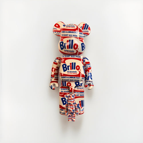
Living rooms are ideal for mixing media. Set a designer art figure — a KAWS or BE@RBRICK piece — on a console or shelf near a related print so they read as a curated set rather than a gift-shop shelf. Keep a unifying thread (shared palette or graphic sensibility) and let one hero win the vignette. Browse authenticated figures in the KAWS and BE@RBRICK collections.
Bedroom: calm and personal
The bedroom is a retreat, so the art should lower the temperature of the room, not raise it. Choose calm, personal, restful work — softer palettes, gentler subjects, pieces that mean something to you rather than pieces meant to impress visitors who will rarely see them.
Subject and mood
Aim for serenity and intimacy: muted tones, atmospheric or abstract imagery, or a favorite artist rendered in a quieter register. This is the room to follow your heart over the trend cycle. A restrained edition you genuinely love will make the space feel like yours.
Scale, placement, and framing
- Center over the headboard. A single medium work or a balanced pair centered above the bed is the classic, calming arrangement; keep the grouping narrower than the bed itself.
- Hang so it relates to the bed, not the ceiling — slightly lower than living-room height often feels right above a headboard.
- Frame warmly. Warm frame finishes and generous mats add softness. If any wall catches morning sun, use UV-filtering glazing to prevent fading.
Entryway: the first impression
The entryway is a first-impression space and usually a small one, so it needs a single confident piece rather than a crowd. This is your handshake — one graphic, memorable work that sets the tone for the whole home.
Subject, scale, and durability
- Pick one confident piece. A bold, recognizable image over a console or on the main sightline as you enter does more than several timid ones.
- Scale to the wall or console. Medium-to-large depending on the space; if there is a console, span about two-thirds of its width.
- Protect against traffic. Entryways see bumps, door swings, and temperature swings from the outside door. Use durable framing and hang clear of the door’s arc; save the most fragile originals for calmer walls.
Because it is the first thing guests see, the entryway is a natural place for a signed, authenticated work — provenance you can quietly stand behind. The Collector’s Hub walks through what provenance means and why it matters.
Dining room: refined and conversational
The dining room is a considered, social space where people sit for a while, so it rewards refined, conversation-friendly art. Think elevated and intentional — a large single work or a balanced pair that gives the room a focal point without shouting over the table.
Subject and mood
Lean sophisticated and cohesive: a strong graphic print, a considered pop image, or a matched pair that frames the room. Because diners face the walls for extended periods, choose work that rewards a longer look and sparks conversation.
Scale, sightlines, and glare
- Hang for seated sightlines. Diners are seated, so you can hang slightly lower than gallery standard so the art relates to eye level at the table.
- Go with a hero or a pair. One large statement work or two balanced pieces flanking a sideboard both read as intentional.
- Cut glare. Dining rooms often mix candlelight, pendant light, and daylight; anti-reflective, UV-filtering glazing keeps the image readable and protects it.
Home office: focused and motivating
A home office is a focus space, and increasingly a video-call backdrop, so the art should motivate without distracting. Choose clean, graphic, purposeful work that energizes concentration and looks composed on camera.
Subject, mood, and the camera
- Favor clarity. Bold, well-composed graphic pieces — a single strong print behind or beside the desk — read as intentional and stay crisp on a webcam.
- Motivate, don’t clutter. One considered piece beats a busy wall that competes for attention during deep work.
- Manage reflections. Offices are full of screens and windows; low-glare, anti-reflective glazing prevents distracting reflections and protects the work from any window light.
An authenticated print in an office also quietly signals seriousness and taste on every call. For how graphic editions hold value over time, see Financial Insights.
Hallways and stairs: rhythm and series
Hallways and staircases are transitional, linear spaces — perfect for series, sets, and groupings viewed in motion. Where a living room wants one hero, a hallway wants rhythm: several related works marching along the wall or climbing the stairs.
How to hang a hallway or stair gallery
- Work in a series. A themed set — a run of related prints or a single artist’s editions — turns a corridor into a considered gallery.
- Keep consistent gaps. A uniform 2–3 inches between frames reads as intentional; uneven gaps read as accidental.
- Follow the stair line. On a staircase, step the frames to follow the diagonal, keeping a consistent gap from the treads so the grouping feels anchored.
- Template first. Cut paper templates and tape them up before drilling to minimize holes and get the spacing right.
- Hang securely. Tight-traffic spaces get bumped; use proper hardware and slim, protective frames.
For the mechanics of frames, glazing, and secure display — especially for prints and designer toys shown together — see our companion guide on how to frame and display street art and designer toys.
Kitchen and bathroom: the special-conditions rooms
Kitchens and bathrooms can absolutely have art — but heat, grease, steam, and humidity make them the riskiest rooms for anything valuable. The rule here is simple: keep it small, cheerful, and well-protected, and never hang your best originals where moisture and heat can reach them.
Subject and mood
These rooms suit lighter, playful, easy-going work — small prints and cheerful graphic pieces that add personality without putting a prized edition at risk.
Protecting art in humid, hot rooms
- Mind the enemies. Steam and humidity invite cockling, mold, and foxing on paper; kitchen heat and airborne grease build up over time.
- Seal the frame. Use well-sealed, moisture-resistant framing and keep pieces well away from the stove, sink, and shower splash zones.
- Choose replaceable pieces. Reserve open-edition or lower-stakes work for these rooms; keep authenticated originals in stable, dry spaces.
- Ventilate. Good extraction and airflow reduce the moisture load on anything you do hang.
Why authenticated originals beat posters — in every room
Whatever room you are styling, the same principle holds: an authenticated original or limited edition looks better and protects value in a way a mass-market poster never can. Original prints are typically pulled in a defined edition, often signed and numbered, on heavier archival paper with richer ink and cleaner registration — the eye registers that quality even when a guest cannot name it. And because an authenticated piece carries documented provenance, it is a decor object that can hold or grow in worth, not just a decoration.
What “authenticated” means (it varies by artist)
Authentication is not one universal certificate — different artists and makers have different, legitimate standards, and buying into the right chain for the right work is what keeps a piece both credible and valuable:
- Shepard Fairey / OBEY: most prints are bought on provenance and dealer trust rather than an artist-issued certificate, so a reputable source and clean history matter most.
- DEATH NYC: pieces generally come with a certificate of authenticity and a gold seal.
- KAWS and BE@RBRICK / Medicom: commonly verified through packaging, hologram, and release-record checks, backed by TrueCOA certificates where applicable.
- Andy Warhol works: backed by verifiable certification such as TrueCOA.
- Signed music memorabilia: authenticated by established autograph specialists like Beckett, JSA, or PSA.
The takeaway for a decorator-collector: the “look” you hang should sit on a real authentication foundation. Our buyer’s guides break down each artist’s standard so you know exactly what you are buying.
A universal framing and preservation checklist
Framing is the through-line for every room. Get it right and your art looks gallery-grade and lasts.
- Use UV-filtering glazing on anything near light — conservation glass or acrylic dramatically slows fading and is the best single upgrade for a work you value.
- Choose acid-free mats and backing to prevent the brown burn lines that quietly ruin value.
- Keep the artwork off the glass with a mat or spacer so the image cannot stick to the glazing.
- Avoid direct sun, high humidity, and heat sources in every room, not just kitchens and baths.
- Match frame weight to the room — slim frames for modern spaces, wider or warmer frames for traditional ones.
- Keep COAs and provenance with each work so it stays sellable whenever you rotate or move it.
Where to start: building a home collection room by room
You do not need a large budget to fill a home with authenticated art — you need a plan and a reputable source. Many collectors start with one statement piece for the living room, frame it properly, and let it set the tone before adding calmer work for the bedroom, a first-impression piece for the entry, and a hallway series over time.
- Start with the hero. Choose one authenticated statement work for your most-used social room and build around it.
- Add by room and mood. Layer in calmer pieces for rest spaces and graphic pieces for focus spaces as budget allows.
- Frame consistently. A shared framing language instantly makes mixed works feel like one collection.
- Grow with intent. Deepen a theme rather than chasing every release; a focused collection reads as more sophisticated and often holds value better.
Because prices vary widely by artist, edition, and condition, treat any figure as a range and lean on real market context. Ground your decisions in Financial Insights and browse authenticated pieces across the full collection when you are ready to buy.
Frequently asked questions
How do I choose art for each room in my home?
Match four things to each space: subject, scale, mood, and framing. Living rooms suit bold statement pieces; bedrooms want calm, personal, restful work; entryways get one confident first-impression piece; dining rooms suit refined, conversation-friendly art; home offices benefit from focused, motivating imagery; hallways and stairs are ideal for series and groupings; and kitchens and bathrooms call for small, well-protected pieces because of heat and humidity. Buying authenticated originals rather than posters gives you a home that looks collected and holds its value.
What size art should I hang above a sofa or console?
Aim for a piece (or a grouping read as one shape) that spans roughly two-thirds the width of the furniture below it, centered around 57–60 inches from the floor at gallery eye level, with about 6–10 inches between the top of the furniture and the bottom of the frame. Going too small is the most common mistake; art should feel intentional, not marooned on the wall.
Can I put art in a kitchen or bathroom?
Yes, but keep it small, cheerful, and well-protected, and never hang your best originals there. Steam, humidity, heat, and grease invite cockling, mold, and buildup, so use well-sealed, moisture-resistant framing, keep pieces away from splash zones and the stove, ensure good ventilation, and reserve open-edition or lower-stakes work for these rooms.
How do I arrange a gallery wall on a staircase or hallway?
Work in a series or themed set, keep consistent 2–3 inch gaps between frames, and on stairs step the frames to follow the diagonal at a steady distance from the treads. Cut paper templates and tape them up before drilling to get the spacing right and minimize holes, and use secure hardware and slim, protective frames because tight-traffic spaces get bumped.
Should I buy an authenticated original or a poster for decorating?
Buy the authenticated original or limited edition. Original prints have richer ink, heavier archival paper, and often a signature and edition number, so they simply look better on any wall — and because they carry documented provenance, they can hold or grow in value while a poster cannot. Authentication standards vary by artist, so confirm the right chain for the work before you buy.
How should I frame art to protect it in different rooms?
Use UV-filtering conservation glass or acrylic on anything near light, with acid-free mats and backing and a spacer so the image stays off the glazing. Avoid direct sun, high humidity, and heat sources in every room, use anti-reflective glazing in dining rooms and offices to cut glare, and use well-sealed moisture-resistant framing in kitchens and baths. Keep each work’s COA and provenance stored with it so it stays sellable.
Buy & authenticate with confidence
Choosing art room by room comes down to matching subject, scale, mood, and framing to how each space is used — bold in the living room, calm in the bedroom, confident in the entry, refined in the dining room, focused in the office, rhythmic in the hall, and small and protected in the kitchen and bath. Do that with authenticated originals and you get a home that looks extraordinary today and protects its value for years. Start by exploring authenticated work across the full collection and the pop art collection, learn each artist’s authentication standard in our buyer’s guides, walk through provenance at the Collector’s Hub, and ground your decisions in Financial Insights.