Pairing Art with Your Color Palette: How to Match Art to Your Room
To match art to your room's color palette, decide whether the art will follow your decor or lead it, then build one clear color relationship around it. Either pull two or three accent colors out of a piece you love and echo them in pillows, throws, and objects, or choose art whose palette complements what you already own. Complementary pairings (opposites on the color wheel, like blue and orange) create energy; tonal pairings (variations of one hue) create calm. In most rooms, the strongest result comes from a neutral backdrop, one bold pop or street-art piece as the color anchor, and a few small repeats of its accent colors placed around the space. Below is the practical framework, plus how framing, mats, and authentication factor into choices you'll live with for years.
Two Starting Points: Pull Colors from Art, or Match Art to Your Room
Every color decision starts with one question: is the art leading, or following? Both approaches work. The mistake is trying to do both at once without a plan, which is how rooms end up busy and uncoordinated.
Approach 1: Pull accent colors from the art
Here the artwork is the anchor and the room takes its cues from it. Choose a piece you genuinely love first, then identify its two or three most assertive colors and repeat them in smaller doses around the room. A print with cobalt blue, mustard gold, and a coral accent gives you a ready-made palette: a coral pillow, a mustard vase, a blue throw. The art sets the key; the room harmonizes.
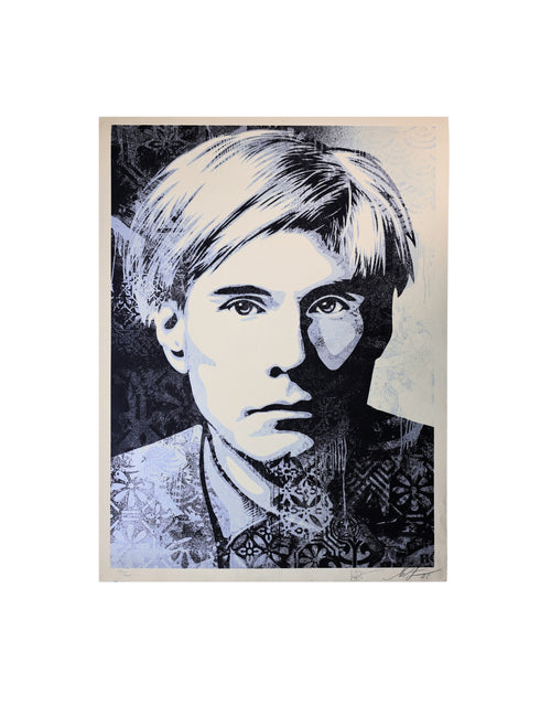
This approach suits collectors buying a signature piece, such as a bold Shepard Fairey or a pop-art print, and building the room around it. It keeps the art as the focal point rather than one competing element among many.
Approach 2: Match art to your existing decor
If your furniture, rugs, and paint are already set, work the other direction: choose art whose palette either echoes or deliberately contrasts what's in the room. A sofa in warm terracotta pairs beautifully with art carrying warm reds and oranges (tonal), or with art built on teal and blue (complementary contrast). Bring a photo of the room, with the largest color fields in frame, when you shop so you're matching reality, not memory.
A useful discipline is to identify your room's three dominant surfaces by color: usually the walls, the largest upholstered piece, and the floor or rug. Those three are your fixed palette. Good art either lives comfortably inside that palette (tonal) or introduces exactly one deliberate outside color as contrast (complementary). Problems arise when a piece introduces several new colors at once, none of which repeat anywhere else in the room. If a work you love does that, plan to add one or two small accessories in its colors so the art has an echo and doesn't feel stranded.
| Starting point | Best when | How to execute |
|---|---|---|
| Pull colors from the art | You have a piece you love and flexibility on decor | Identify 2–3 accent colors; repeat them in pillows, objects, textiles |
| Match art to the room | Furniture and paint are fixed | Bring a room photo; choose art that echoes or contrasts existing colors |
| Neutral room + one vivid piece | You want maximum impact from a single work | Keep walls and large surfaces neutral; let the art carry all the color |
| Tonal, layered scheme | You want a calm, gallery-quiet feel | Choose art within one hue family; vary value, not color |
Complementary vs. Tonal: The Two Color Relationships That Matter
Once you've decided which is leading, choose the relationship between the art and the room. Almost every successful pairing is either complementary or tonal. Knowing which you're going for keeps decisions consistent.
Complementary pairings create energy
Complementary colors sit opposite each other on the color wheel: blue and orange, red and green, yellow and purple. Pairing an artwork's dominant color with its opposite in the room creates contrast and vibrancy. A blue-heavy print above a rust or ochre chair reads lively and intentional. Use complementary contrast when you want the space to feel active and the art to pop.
The guardrail: let one color dominate and the other accent. Equal amounts of two opposites can feel like a tug-of-war. A common ratio is roughly 70 percent dominant, 20 percent secondary, 10 percent sharp accent.
Tonal (analogous) pairings create calm
Tonal schemes stay within one color family or use neighbors on the wheel (blue, blue-green, green). An artwork in dusty blues over a room of slate, denim, and gray-blue textiles feels serene and cohesive. Tonal pairing is the move for bedrooms, reading nooks, and any space where you want the art to soothe rather than command. You still get interest, but from changes in value (light to dark) and texture rather than from color clash.
A quick rule of thumb
- Want the art to be the event? Go complementary against a restrained room.
- Want the art woven into a calm whole? Go tonal.
- Unsure? Neutral walls plus one accent repeat is the safest high-impact default.
Bold Pop and Street Art as the Color Anchor
Pop art and street art are built on saturated, confident color, which makes them ideal anchors for a room's palette. A single bold piece can dictate the entire scheme and do the heavy lifting of coordination for you.
Let the loudest piece set the palette
When a work carries strong reds, blues, or yellows, treat those as your source palette. Pull the two or three most dominant colors and repeat each once or twice in the room, small and deliberate. The art stays the star; the repeats make it feel deliberate rather than dropped in. Explore high-color options in the Pop Art collection or browse signature works in the Shepard Fairey collection, whose red, cream, and black palettes anchor a room cleanly.
Keep the rest of the room quiet
A bold anchor works best against restraint. If the art is loud, let walls, sofa, and rugs stay neutral so the piece has room to breathe. Two or three loud works competing in one sightline usually cancel each other out. One anchor, echoed thoughtfully, almost always wins.
Scale matters as much as color
A large-format print on a big empty wall reads as intentional; a small bold piece lost on that same wall reads as an afterthought. Match the work's size to the wall and the furniture below it. As a starting guide, art above a sofa often looks best at roughly two-thirds the width of the sofa, with the center of the piece around eye level (about 57 to 60 inches from the floor). Color intensity and scale interact: a very saturated piece can be smaller and still hold a wall, while a quieter palette often needs more size to register. When a bold piece feels almost too strong for the room, that's usually a sign it's the right anchor, provided you keep everything around it calm.
The Neutral Room Plus One Vivid Piece
The most forgiving and most striking formula in interior styling: keep the room largely neutral and let a single vivid artwork carry all the color. It's the approach behind countless gallery-like interiors, and it's nearly foolproof.
Why it works
Neutrals (warm whites, greige, oatmeal, soft grays) act as a matte backdrop that makes saturated color read cleaner and brighter. Against that calm field, one vivid piece becomes the undisputed focal point. There's no competition, so the eye goes straight to the art.
How to build it
- Keep walls and large surfaces neutral.
- Choose one vivid, well-composed piece as the focal point.
- Pull one or two of its colors into small accents (a pillow, a vase, book spines) so the piece feels connected to the room.
- Stop there. The discipline of not adding more color is what makes it work.
Where it shines
Entryways, living-room feature walls, and above-console moments all benefit. It's also the easiest scheme to update later: swap the single piece and small accents, and the room reads new without repainting or reupholstering.
Coordinating Multiple Works Without Chaos
Gallery walls and multi-piece groupings are where color coordination is most often lost. The fix is to treat the whole group as one composition with a shared palette, not as separate pieces that happen to share a wall.
Give the group a common thread
Cohesion usually comes from one of three shared elements: a common color that appears in most pieces, a consistent framing treatment, or a shared subject or medium. Any one of these will unify a wall. A group of prints with different imagery but a repeated blue or a uniform black frame reads as intentional; the same prints with clashing colors and mismatched frames read as clutter.
Limit the palette across the group
Decide on a two- or three-color palette for the entire wall and choose works that live within it. It's fine for individual pieces to lean different directions as long as the group shares a color spine. When in doubt, let one piece be the loudest and keep the others quieter around it.
Plan the layout before you hang
Lay pieces on the floor first, or cut paper templates and tape them to the wall. Balance visual weight: a darker or more saturated piece anchors one area, lighter pieces balance the opposite side. Keep consistent spacing (a couple of inches between frames is a common starting point) so the grouping reads as one unit.
Framing and Mat Color: The Quiet Decisions That Coordinate
Frame and mat choices are color decisions too, and they're often where a well-chosen piece either integrates or fights the room. These finishing choices deserve as much thought as the art itself.
Mat color
A wide mat (the border between art and frame) gives the eye a place to rest and makes a piece feel more considered. White and off-white mats are the safe, gallery-standard default; they keep attention on the art and suit almost any palette. A colored or black mat can be effective but is a stronger statement, so use it deliberately, ideally picking up a color already in the artwork. When unsure, choose a white or cream mat and let the art speak.
Frame color and finish
The frame connects the art to the room. A few reliable guidelines:
- Black frames are crisp and modern and suit bold, graphic, and pop or street-art work.
- Natural wood warms a piece and bridges to wood furniture and warmer palettes.
- White frames disappear into light walls for an airy, minimal look.
- Metallic frames add polish but read more formal; use where that tone fits.
For a multi-piece wall, a single consistent frame treatment is one of the fastest ways to make varied art feel coordinated. Also consider glazing: UV-protective glass or acrylic guards against fading and is worth it for works you intend to keep, a point covered in more depth in our guide to authenticated art as home decor.
Choosing Authenticated Pieces You'll Love Long-Term
Color coordination gets a room right for today. Buying authenticated work is what makes the piece worth living with for years, and worth something if you ever sell. The two goals reinforce each other: a well-chosen, properly documented piece is one you keep, and a piece you keep is one worth coordinating a room around.
Buy the piece first, coordinate second
Trends in accent colors change; a great artwork doesn't. Choose work you respond to on its own terms, then build the palette around it. Pillows and vases are cheap to swap; the art is the lasting investment. Starting from a piece you love, rather than from a color you're chasing, produces rooms that still feel right years later.
Authentication is standard, and it protects value
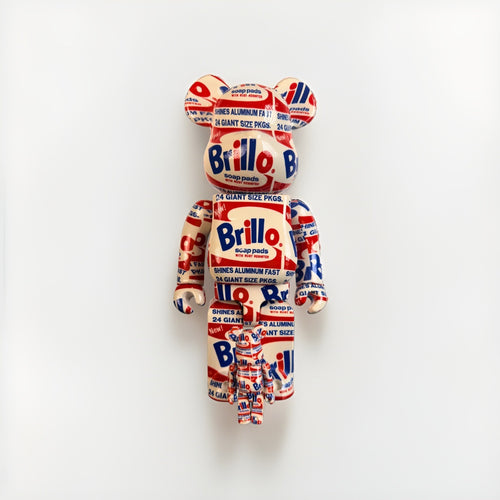
At Gauntlet Gallery, authentication is a baseline expectation, and the chain of proof differs by artist. Signed, numbered Shepard Fairey prints are handled on their own documented basis; Death NYC works carry a COA and gold seal; KAWS and BE@RBRICK figures are verified with TrueCOA; Warhol works with TrueCOA; music memorabilia through recognized authenticators such as Beckett, JSA, or PSA; and space memorabilia with specialist verification. These chains are never mixed or substituted. Knowing exactly what documentation a piece carries protects both your confidence and its long-term value.
Where to start
If you're building a collection with an eye on both aesthetics and value, browse the full art index and the wider complete collection, learn the fundamentals in the Collector's Library, and review category-level market data in Financial Insights before committing to a signature piece.
Frequently Asked Questions
How do I match art to my room's color palette?
Decide whether the art will lead or follow. If it leads, pull two or three accent colors from a piece you love and repeat them in pillows, throws, and objects around the room. If it follows, choose art whose palette echoes (tonal) or deliberately contrasts (complementary) your existing furniture and paint. In most rooms, a neutral backdrop plus one bold piece as the color anchor is the highest-impact, lowest-risk approach.
Should art match my room exactly or contrast with it?
Neither extreme is ideal. Exact matching can look flat, and unplanned contrast can look chaotic. Aim for a deliberate relationship: tonal (variations of one hue) for a calm, cohesive feel, or complementary (opposite colors like blue and orange) for energy. Let one color dominate and use the other as an accent rather than splitting the room evenly between two strong colors.
What color mat and frame should I choose?
A white or off-white mat is the gallery-standard default that suits almost any palette and keeps attention on the art. For frames, black suits bold and graphic work, natural wood warms a piece and bridges to wood furniture, and white frames recede into light walls. For a multi-piece wall, use one consistent frame treatment to unify varied art. Add UV-protective glazing on works you intend to keep.
How do I coordinate several artworks on one wall?
Treat the group as a single composition with a shared palette. Give it a common thread: a repeated color across most pieces, a consistent frame treatment, or a shared subject or medium. Limit the whole wall to a two- or three-color palette, plan the layout on the floor or with paper templates first, and keep consistent spacing so the grouping reads as one unit.
Can one bold piece really anchor a whole room?
Yes, and it's one of the most reliable formulas in styling. Keep walls and large surfaces neutral, choose one vivid, well-composed piece as the focal point, and pull one or two of its colors into small accents so it feels connected to the room. Pop art and street art work especially well as anchors because their saturated palettes give you a ready-made color scheme.
Does buying authenticated art matter for decorating?
It matters for the long term. Color coordination gets a room right today, but authenticated work is what makes a piece worth keeping and worth something if you sell. Buy a piece you genuinely love and coordinate the palette around it, since accents are cheap to swap while the art is the lasting investment. At Gauntlet Gallery, authentication is standard and the documentation chain differs by artist and is never mixed.