One Big Artwork vs. a Grouping: Choosing Your Statement
Short answer: Hang one large artwork when you have a tall, wide, or minimalist wall and you want instant drama and a single focal point; choose a grouping of smaller pieces when you want flexibility, a story that unfolds, or a collection you can build over time on a budget. A single hero piece controls a room the moment you walk in. A gallery grouping rewards a slower read and can grow with you. Both work beautifully when the art is properly scaled, correctly spaced, and—critically—authenticated so your walls also hold their value. Below is a decision framework, a side-by-side comparison, exact scale and spacing rules for each approach, and how to mix prints with a designer figure without cheapening either.
The Core Decision: What Are You Trying to Do to the Room?
Before you measure anything, get clear on the job you want the art to perform. Most rooms want one of two things from a wall: a declaration or a conversation. A single large artwork is a declaration—it sets the tone, anchors the sightline, and tells anyone entering exactly where to look. A grouping is a conversation—it invites the eye to move, compare, and linger, and it lets you reveal your taste in layers.
When one hero piece wins
- You have a large, uninterrupted wall. A tall stairwell, a wide sofa wall, or a double-height living room begs for scale. Small pieces get swallowed; one big work fills the volume.
- Your interior is minimalist or architectural. Clean rooms with restraint elsewhere let a single artwork breathe. Negative space around the piece is the point, not a problem.
- You want drama and a clear focal point. Over a bed, a fireplace, a console, or a dining table, one commanding piece organizes everything beneath it.
- You've found the piece. Sometimes a work is simply strong enough to carry a room alone. Trust that.
When a grouping wins
- You want flexibility. Groupings can be rearranged, added to, and edited as your taste evolves. Nothing is permanent.
- You're building a collection over time—and a budget. Several smaller authenticated prints let you start now and grow, spreading spend across months instead of one large outlay.
- You want storytelling. A grouping can trace an artist's career, a movement, a palette, or a personal narrative—a wall that reads like a chapter.
- Your wall is broken up. Walls interrupted by doors, switches, sconces, or corners often suit a cluster better than one large frame that fights the architecture.
Side-by-Side: One Big Piece vs. a Grouping
| Consideration | One Large Artwork | Grouping / Gallery Cluster |
|---|---|---|
| Visual effect | Instant drama, single focal point, calm authority | Energy, movement, layered storytelling |
| Best walls | Tall, wide, uninterrupted, minimalist rooms | Broken-up walls, hallways, stairwells, sofa/bed walls |
| Flexibility | Low—committed placement | High—rearrange, add, edit anytime |
| Budget pattern | One larger investment up front | Build over time; spread spend |
| Difficulty to hang well | Lower—one center line, one measurement | Higher—layout planning and consistent gaps |
| Room mood | Formal, editorial, gallery-like | Personal, collected, lived-in |
| Risk if done wrong | Piece too small → looks stranded | Uneven gaps → looks cluttered |
If you're still torn, walk the two lists above against your actual wall. Most people already know which word—declaration or conversation—fits the room. For deeper collecting context and how to think about building a wall over time, our Collector's Hub is a good next stop.
How Each Choice Changes a Room
The single statement piece
One large work does three things at once: it establishes a hierarchy (everything else in the room defers to it), it creates calm (the eye lands in one place and rests), and it signals confidence. In an open-plan space, a hero piece can define a "zone"—the living area versus the dining area—without a single wall being built. The trade-off is commitment: you're marrying that wall to that piece, so scale and placement have to be right.
The grouping
A cluster does the opposite work: it activates a wall and makes a room feel collected rather than decorated. Groupings read as personal because they imply choices made over time. They're forgiving, too—if one print no longer fits, you swap it. The risk is visual noise. Without a unifying thread (color, frame, subject, or artist) and disciplined spacing, a grouping tips from "curated" to "cluttered" fast.
How the two feel in daily life
There's a lived-in difference beyond the first impression. A single statement piece tends to age gracefully into the background—you notice it powerfully at first, then it becomes the quiet backbone of the room, the thing guests comment on but you stop consciously seeing. A grouping stays active longer because the eye keeps finding new relationships between pieces. Neither is better; they suit different temperaments. If you crave calm and order at home, lean toward the hero piece. If you like a room that feels alive and revisable, the grouping will keep rewarding you. Many collectors ultimately run both—a single commanding work in the primary living space and a growing grouping in a hallway, stairwell, or study where the story-telling has room to unfold.
Scale and Spacing Rules for a Single Large Piece
Get the size right
- Over furniture, aim for two-thirds to three-quarters of the furniture's width. A piece that spans roughly 66–75% of a sofa, bed, or console feels intentional. Narrower than half looks stranded.
- On a blank wall, fill the visual volume, not the whole wall. Leave a comfortable margin of negative space on all sides so the piece reads as framed by the wall, not crammed into it.
Get the height right
- Center the artwork at eye level—about 57–60 inches from the floor to the center of the piece. This is the standard gallery sightline and works for most ceilings.
- Over furniture, leave roughly 6–10 inches between the top of the furniture and the bottom of the frame so the two read as a related pair rather than floating apart.
Scale and Spacing Rules for a Grouping
Treat the cluster as one shape
The trick to a grouping that looks designed is to treat the whole arrangement as a single rectangle or defined silhouette. Plan the outer footprint first, center that shape at eye level (again, ~57–60 inches to the center of the group), and then arrange pieces within it.
Keep gaps consistent
- Use a uniform gap—commonly 2–3 inches—between every frame. Consistency is what separates a gallery wall from a jumble. Pick one gap and hold it everywhere.
- Anchor with your largest piece, then balance outward. Place the biggest work slightly off-center or as the visual anchor, then distribute smaller pieces to balance weight on both sides.
- Mock it up on the floor first, or trace paper templates and tape them to the wall before you put a single nail in. It costs nothing and prevents a wall full of holes.
Give the group a unifying thread
Coherence comes from at least one shared element: a consistent frame color, a shared palette, a single artist or movement, or a repeated subject. You can mix sizes freely as long as something ties the group together. That thread is also how you fold a designer object into a print wall—covered next.
Common grouping mistakes to avoid
- Starting from the wall edges in. Build from the center or your anchor piece outward, not from the corners. Working inward from the edges almost always produces an off-balance result.
- Letting gaps drift. The single most common tell of an amateur gallery wall is inconsistent spacing. Cut a spacer block to your chosen gap and use it between every pair of frames.
- Mixing too many "loud" pieces. If several works all fight to be the focal point, the wall reads as chaos. Choose one dominant piece and let the rest support it.
- Hanging the whole group too high. Because a grouping occupies vertical space, people tend to creep it upward. Keep the center of the overall shape at eye level, even if that means the top rows sit higher than you'd hang a single piece.
Mixing Prints with a Designer Figure
One of the most effective ways to give a wall or shelf personality is to combine framed prints with a three-dimensional designer piece—a KAWS or BE@RBRICK figure, for example, on a floating shelf beside a print cluster, or on the console beneath a single large work. The dimensional object adds depth and a collector's signature without competing with the art if you follow a few rules.
Rules for mixing 2D and 3D
- Let one element lead. If the figure is the star, keep surrounding prints quieter. If a hero print leads, treat the figure as a supporting accent, not a second focal point.
- Echo a color. Pull one color from the figure into a nearby frame or print so the object reads as part of the composition, not an orphan.
- Give it a pedestal moment. A shelf, a stack of monographs, or a small plinth elevates a designer figure and separates it from clutter.
- Mind the scale relationship. A small figure against a very large print can look lost; pair it with a mid-size work or group it with a few objects so it holds its own.
Pop and street-art imagery mixes especially well with designer figures because they share a visual language. If that's your direction, our Pop Art collection and the broader full catalog are good places to source pieces that speak to each other.
Framing: The Detail That Makes or Breaks Both
For a single statement piece
- Scale the frame and mat to the room, not just the paper. A generous mat (wide white border) makes a piece feel more important and more gallery-like—often worth the extra glass and molding.
- Use conservation-grade, UV-protective glazing for anything you care about. Light is the slow enemy of works on paper.
- Match the frame to the architecture. Thin black or natural wood reads modern; ornate profiles read traditional. Let the room, not the trend, decide.
For a grouping
- Decide: matching frames or intentional mix. All-black or all-wood frames create instant cohesion. A deliberate mix works only if another thread (palette, subject) holds the group together.
- Keep mat widths consistent across the group so the pieces feel like a set even at different sizes.
- Standardize glazing so reflections and finish read uniformly across the wall.
Buying Authenticated Editions—Either Way You Go
Whether you buy one large work or a dozen small ones, the rule that protects both your enjoyment and your money is the same: buy authenticated editions with the correct paperwork for that artist. Decor and value are not a trade-off—the same authentication that gives you peace of mind is what makes a piece resellable later. We wrote about this at length in authenticated art as home decor, and it applies doubly when you're spreading a budget across a grouping, where it's tempting to cut corners on the cheaper pieces.
Authentication is artist-specific—never mix chains
Different artists and estates use different, non-interchangeable verification systems. Confirm the right one for the piece in front of you:
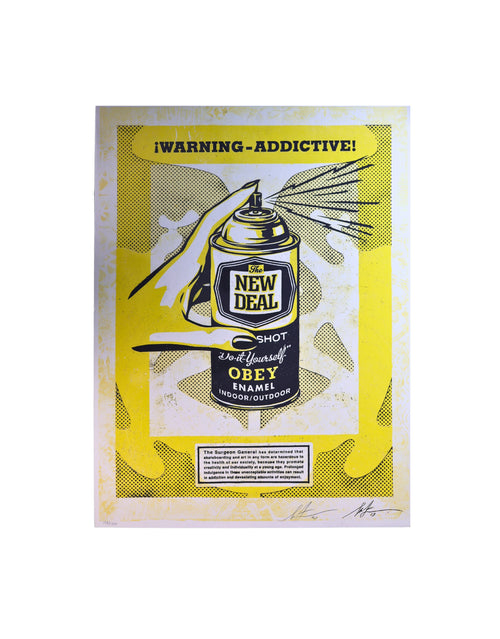
- Shepard Fairey (OBEY): verified through signature, edition details, and reliable provenance—there is no single central certificate service, so documentation and a trustworthy chain of ownership matter.
- Banksy: handled exclusively through Pest Control, the artist's official authentication body. Accept nothing else as a substitute.
- KAWS and BE@RBRICK: best supported with TrueCOA certification alongside the factory packaging and markings.
- DEATH NYC: a certificate of authenticity paired with the artist's gold seal.
- Warhol (authorized editions/estate-related works): supported with TrueCOA verification.
- Signed music and entertainment memorabilia: third-party authentication from Beckett (BAS), JSA, or PSA.
The one hard rule: never mix authentication chains or apply one artist's system to another. A KAWS-style certificate has nothing to do with a Banksy, and a Fairey doesn't run through Pest Control. Our buyer's guides break down what to look for artist by artist.
Why this protects a grouping specifically
When you build a wall over time, you're making many small buying decisions—and each is a chance to acquire something unverified. A single unauthenticated piece in an otherwise strong grouping can drag on the whole wall's resale story. Treat every acquisition, large or small, to the same standard. If you're thinking about how art holds value alongside its decorative role, our financial insights put the market context around it, and the art index is a useful reference as you compare pieces.
A Simple Decision Framework
Run your wall through these five questions. If most answers point one direction, you have your answer.
- Is the wall large and uninterrupted? Yes → leans single piece. No/broken up → leans grouping.
- Do you want commitment or flexibility? Commitment → single piece. Flexibility → grouping.
- Is your budget one outlay or spread over time? One outlay → single piece. Spread → grouping.
- Do you want a declaration or a conversation? Declaration → single piece. Conversation → grouping.
- Do you already own the piece? Yes → hang it alone. Not yet → a grouping lets you start today.
And whichever way you land: get the scale right, hold your spacing, frame with intent, and buy authenticated. Do those four things and both approaches look like they were done by a professional.
Frequently asked questions
Should I hang one large artwork or a grouping of smaller pieces?
Choose one large artwork for a tall, wide, or minimalist wall where you want instant drama and a single focal point. Choose a grouping of smaller pieces when you want flexibility, a wall that tells a story, or a collection you can build over time on a budget. Both work when the art is scaled correctly, spaced consistently, framed with intent, and authenticated.
How big should a single statement piece be over a sofa or bed?
Aim for roughly two-thirds to three-quarters of the furniture's width, centered at eye level (about 57–60 inches from the floor to the center of the piece), with about 6–10 inches between the top of the furniture and the bottom of the frame. Anything narrower than half the furniture width tends to look stranded.
How do I space frames in a gallery grouping so it doesn't look cluttered?
Treat the whole cluster as one shape, center that shape at eye level, and keep a uniform gap—commonly 2–3 inches—between every frame. Anchor the layout with your largest piece, give the group a unifying thread like a shared frame color or palette, and mock the arrangement up on the floor or with paper templates before hanging.
Can I mix framed prints with a designer figure like KAWS or BE@RBRICK?
Yes, and it adds depth and collector's personality. Let one element lead so the figure and the prints don't compete, echo one color from the figure into a nearby frame, give the figure a shelf or plinth moment, and mind the scale relationship so a small figure isn't lost next to a large print. Pop and street-art imagery pairs especially naturally with designer figures.
Does buying decor-focused art mean giving up resale value?
No. The same authentication that gives you confidence is exactly what preserves resale value, so decor and value are not a trade-off. Buy authenticated editions with the correct paperwork, keep provenance documentation, and use conservation-grade framing to protect the work from light and handling.
What authentication should I look for by artist?
It is artist-specific and the systems are not interchangeable. Shepard Fairey relies on signature, edition details, and provenance; Banksy is handled only through Pest Control; KAWS and BE@RBRICK are best supported with TrueCOA plus the factory packaging and markings; DEATH NYC uses a certificate with a gold seal; authorized Warhol editions use TrueCOA; and signed music memorabilia should carry Beckett, JSA, or PSA authentication. Never mix one artist's authentication chain with another's.