Pop Art for Your Home: A Buyer's & Styling Guide
To use pop art in your home decor, treat it as the joyful, high-energy focal point of a room: choose one or two bold pieces per wall, scale them to the furniture beneath them, and let a neutral backdrop carry the color. Anchor a living room or hallway with a large graphic print (Warhol, Fairey, or Mr. Brainwash), add a designer art figure like a KAWS Companion or BE@RBRICK for dimension, frame everything with generous mats and simple moldings, and buy authenticated editions rather than posters so the look holds its value over time. The rest of this guide walks through why pop art works so well at home, how to pick pieces by room and palette, how to handle scale, placement, framing, and mixing prints with figures, and how to buy real editions with the right paperwork for each artist.
Why Pop Art Works as Home Decor
Pop art was built to grab attention. It borrowed the visual language of advertising, comics, and packaging, then blew it up to gallery scale. That DNA is exactly what makes it so effective on a living-room wall: flat fields of saturated color, hard graphic outlines, and instantly readable imagery that reads well from across a room and photographs beautifully.
Three qualities make pop art unusually forgiving to decorate with:
- It carries a room on its own. A single strong print can set the entire palette, so you can keep walls, upholstery, and floors quiet and let the art do the talking.
- It plays well with almost any style. Because the forms are graphic and modern, pop art sits comfortably against mid-century, contemporary, industrial, and even traditional interiors, where it adds a welcome jolt of contrast.
- It is joyful without being fussy. The subject matter, from soup cans to comic panels to street stencils, keeps the mood light. Pop art rarely feels precious, which makes a home feel collected rather than staged.
There is also a practical dividend. When you buy authenticated editions instead of open-run posters, the pieces you hang for their look can also hold or grow in value. We explored that dynamic in depth in our companion piece on authenticated art as home decor and styling that protects value, and it is the throughline of everything below: decorate with pieces that are real, documented, and worth keeping.
Choosing Pieces by Artist
Different pop artists bring different energy to a room. Matching the artist to the mood you want is the fastest way to a coherent space.
Andy Warhol
Warhol is the reference point for the whole movement. His repeated-image grids and single-subject portraits, from flowers to consumer icons, deliver clean, confident color and read as instantly recognizable. A Warhol works best as a statement over a sofa, bed, or console where its symmetry can breathe. Authenticated Warhol material is documented through TrueCOA in our stock, and provenance matters enormously with this name, so buy carefully.
Shepard Fairey (OBEY)
Fairey bridges fine art and street art. His work layers propaganda-poster reds and creams, ornamental patterning, and strong central figures, so it brings warmth and texture rather than flat brightness. Fairey prints suit studies, entryways, and creative workspaces, and they mix effortlessly with books, records, and vintage furniture. Fairey is authenticated silently through provenance and the physical characteristics of the edition, so you rely on documented sourcing rather than a separate certificate.
KAWS
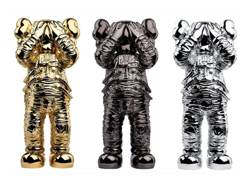
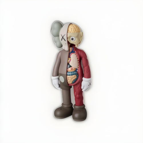
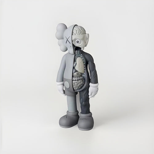
KAWS translates the pop sensibility into three dimensions. His prints carry graphic, cartoon-derived figures, while his vinyl and figures add sculptural presence to a shelf or console. A KAWS figure is one of the easiest ways to give a room a contemporary, collectible edge. Browse the range on our KAWS collection. KAWS and BE@RBRICK pieces in our stock are authenticated with TrueCOA, which ties the piece to a digital record you can check online.
DEATH NYC
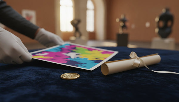
DEATH NYC produces small-format, mashup-heavy prints that pack luxury logos and pop icons into dense, playful compositions. Because they are typically more affordable and come in modest sizes, they are ideal for gallery walls, powder rooms, and tight nooks where you want personality without a huge footprint. Each DEATH NYC piece we sell ships with its COA and a gold seal, the pairing that authenticates the edition.
Mr. Brainwash
Mr. Brainwash (Thierry Guetta) leans into exuberant, splattered, high-color compositions built from pop and street references. His work is theatrical and maximalist, which makes it a natural anchor for a bold living room or a double-height wall where you want unapologetic energy.
Choosing Pieces by Room and Palette
Once you know the artist mood you want, match it to the room and to a working palette. The simplest approach: pull one or two colors from the artwork and echo them lightly in textiles or accessories, then let the rest of the room stay neutral.
| Room | Best fit | Scale & approach | Palette move |
|---|---|---|---|
| Living room | Warhol or Mr. Brainwash statement piece | One large work above the sofa, or a pair flanking a fireplace | Neutral walls; pull one accent color into throw pillows |
| Entryway / hallway | Fairey or a KAWS print | Single vertical piece or a tight run of three | Warm neutrals; let the print supply the color |
| Home office / studio | Fairey or DEATH NYC | Gallery wall mixing sizes above a desk or shelf | Repeat a single hue across frames for cohesion |
| Dining room | Warhol series or a KAWS print | One centered large work, hung slightly higher for a seated view | Cool neutrals; echo the art in tableware or a rug |
| Bedroom | Warhol flowers or a softer Fairey | Single calm piece above the headboard | Muted base; one gentle accent from the art |
| Powder room / nook | DEATH NYC small format | One or a pair of small framed prints | Dark or bold wall paint to frame the piece |
A quick palette rule of thumb: warm-dominant art (Fairey creams and reds, Mr. Brainwash) flatters wood, brass, and earth tones, while cool or high-contrast art (many Warhols, KAWS blues and grays) pops against white, charcoal, and chrome.
Scale and Placement
Scale is where most home installs go wrong. Pop art rewards being big and being hung correctly.
Sizing to the furniture
Above a sofa, console, or bed, aim for artwork (or an arrangement) that spans roughly two-thirds to three-quarters of the width of the furniture below it. A print that is too small floats and looks tentative; pop art in particular wants presence. If a single piece is not large enough, group two or three to build that width.
Hanging height
Hang so the center of the piece sits around 57 to 60 inches from the floor, the standard gallery eye line. Over furniture, leave roughly 6 to 10 inches of breathing room between the top of the sofa or console and the bottom of the frame so the art relates to the piece without crowding it.
Gallery walls and pairs
For a gallery wall, keep consistent gaps (about 2 to 3 inches between frames) and let one larger piece anchor the composition. Mixing a couple of prints with a single art figure on a nearby shelf adds depth. For a symmetrical pair flanking a bed or fireplace, match frame style and mat width so the eye reads them as a set.
Light and protection
Keep works on paper out of direct, sustained sunlight, which fades pigment over years. Position pieces on walls that get bright, indirect light, and consider UV-filtering glazing (covered below) for anything hung near a strong window.
Mixing Prints with Designer Figures
The move that makes a pop-art room feel current rather than dated is combining two-dimensional prints with three-dimensional designer art figures. A framed Warhol or Fairey on the wall, plus a KAWS Companion or a BE@RBRICK on the console beneath it, creates a layered, collected look that flat art alone cannot.
A few guidelines:
- Vary the height, not the color story. Let the figure share a color with the print above it so the pairing reads as intentional.
- Give figures a pedestal moment. A single figure on an otherwise clear console or a floating shelf has more impact than several crowded together.
- Odd numbers and negative space. One strong figure, or three at varied heights, tends to look more deliberate than a symmetrical row.
- Protect the surface. Keep figures out of direct sun and away from heat sources; vinyl and paint can degrade over time.
Designer figures are also a lower barrier to entry for collecting than large prints, and they photograph well, which is part of why they have become a fixture of contemporary interiors. Explore what pairs well with your prints across our pop art collection and the full catalog of available works.
Framing Pop Art
Framing is where a good print becomes a finished piece of decor, and where you protect both the look and the value.
Frame profile
Pop art generally looks best in simple, modern moldings: thin black, white, natural wood, or a slim metallic. Let the art supply the drama; an ornate frame fights the graphic clean lines. Match the frame to the room's hardware and wood tones for cohesion.
Mats and floating
A generous white or off-white mat gives bold color room to breathe and signals gallery quality. For deckled edges or artist-signed margins you want to show, consider float mounting so the full sheet, including the edge, is visible. Never trim a print to fit a frame; the margins carry signatures, edition numbers, and value.
Glazing and conservation
Use UV-filtering acrylic or glass to slow fading, and acid-free, archival mats and backing so the paper does not yellow or burn over time. For valuable editions, reversible, archival mounting (hinges or corners rather than adhesive) keeps the work in original condition, which matters if you ever sell.
Buying Authenticated Editions, Not Posters
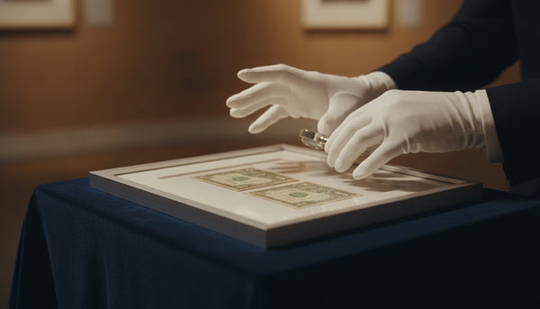
The single most important decision in this whole process is what you actually buy. An open-edition poster and a numbered, authenticated print can look similar on a wall from ten feet away, but they are not the same object: one is decoration that depreciates the moment it is opened, the other is a documented edition that can appreciate and can be resold.
Buying authenticated editions gives you three things a poster cannot: confidence the work is genuine, documentation you can pass to a future buyer, and the upside of owning a limited, collected object. If you are weighing the investment side, our financial insights resources break down how edition scarcity and comparable sales shape value, and our collector hub covers how to build a collection deliberately.
Authentication differs by artist
Every artist and estate handles authentication differently. The critical rule is that these systems are never mixed or substituted, and no single certificate covers everything. Here is how the pieces we sell are verified:
| Artist / line | How it is authenticated |
|---|---|
| Andy Warhol | TrueCOA documentation with provenance |
| Shepard Fairey (OBEY) | Silent authentication through documented provenance and edition characteristics |
| KAWS & BE@RBRICK | TrueCOA blockchain certificate linking object to digital record |
| DEATH NYC | Certificate of Authenticity (COA) paired with a gold seal |
| Signed music & memorabilia | Third-party authentication such as Beckett, JSA, or PSA |
A note on names you will hear elsewhere: Banksy works are only ever authenticated by Pest Control, the artist's official body, and no gallery certificate substitutes for it. When you see any piece, ask which system authenticates it and confirm the paperwork matches the artist, because a certificate from the wrong system is a red flag.
A simple buying checklist
- Confirm the correct authentication for that specific artist (see the table above).
- Check the edition details: numbering, size, year, and signature where applicable.
- Ask for provenance and keep every document with the piece.
- Inspect condition, including margins, corners, and any prior restoration.
- Buy from a seller who specializes in the category and stands behind authenticity.
You can browse authenticated pieces across the pop art collection and explore artists and indexes through our art index.
Putting It All Together: A Sample Room
Imagine a bright living room with warm white walls and a mustard mid-century sofa. Above the sofa hangs one large Warhol or Fairey print in a slim black frame with a wide white mat, sized to about three-quarters of the sofa's width and centered at eye line. On the walnut console beside it, a single glossy KAWS figure picks up a color from the print above. A jute rug and brass lamp keep the base neutral so the art supplies all the color. Every piece is a documented edition with its authentication kept on file. The result reads as joyful and collected, and it holds its value because nothing on the wall is a disposable poster.
Frequently Asked Questions
How do I use pop art in my home decor without it looking cluttered?
Restraint is the key. Choose one or two bold pieces per wall, scale them to about two-thirds to three-quarters of the furniture beneath, and keep walls and upholstery neutral so the art carries the color. Let one strong print or figure be the focal point rather than filling every surface, and repeat a single accent color from the artwork in a couple of textiles to tie the room together.
What size pop art print should I buy for above my sofa?
Aim for a piece, or a grouping, that spans roughly two-thirds to three-quarters of the sofa's width, hung so its center sits about 57 to 60 inches from the floor with 6 to 10 inches of clearance above the sofa. If one print is not large enough, group two or three with consistent spacing to build that width.
Should I buy an authenticated print or is a poster fine for decor?
If you only care about the look for a short time, a poster works, but it has no resale value and can fade or crease quickly. An authenticated, numbered edition looks just as bold, comes with documentation, stays in better condition when framed archivally, and can hold or grow in value. For a lasting room, authenticated editions are the better buy.
How are pop art pieces authenticated, and can one certificate cover any artist?
No single certificate covers every artist, and the systems are never mixed. Warhol is documented via TrueCOA with provenance; Shepard Fairey is authenticated silently through provenance and edition characteristics; KAWS and BE@RBRICK use TrueCOA; DEATH NYC uses a COA with a gold seal; and signed music or memorabilia uses third-party authenticators like Beckett, JSA, or PSA. Banksy is authenticated only by Pest Control. Always confirm the paperwork matches the specific artist.
How do I mix pop art prints with designer figures like KAWS or BE@RBRICK?
Place a print on the wall and a single figure on the console or shelf below it, and let the figure share a color with the print so the pairing looks intentional. Vary the height between the two, give the figure clear space rather than crowding it, and keep both out of direct sun. One well-placed figure usually has more impact than several grouped together.
How should I frame a pop art print to protect it?
Use a simple modern molding (thin black, white, natural wood, or slim metal) with a generous acid-free mat, and never trim the sheet to fit. Choose UV-filtering acrylic or glass to slow fading, use archival, reversible mounting rather than adhesive, and hang the piece on a wall with bright indirect light rather than harsh direct sun.