There is a particular kind of stillness that comes over people standing in front of a Cleon Peterson painting for the first time. It is not the hush of reverence. It is closer to the pause a person takes at the top of a staircase they were not expecting — a small recalibration of the body before the mind has caught up. The images are graphically seductive, flat and clean and almost decorative in their economy, and then the eye resolves what it is actually looking at: a figure raising a blade over another, a mob pressing in, a body already down. Beauty and brutality arrive in the same instant, on the same picture plane, in the same three colours. The discomfort is the point.
Peterson, born in Seattle in 1973 and based in Los Angeles, has spent the better part of two decades building a body of work around a single, unfashionable proposition: that the story of human power is a story of violence, and that we look away from it at our peril. His paintings, prints, murals, and sculptures do not flatter their audience. They do not offer catharsis, and they refuse the easy comforts of a villain to blame. Instead they hold up a surface — hard, lacquered, insistent — in which we are invited to recognise something about the societies we build and the appetites we obey.
This guide is written for the collector who wants to understand what they are looking at. Peterson's imagery is legible enough to read at a glance and layered enough to reward a lifetime of looking, and the gap between those two experiences is exactly where the meaning lives. Over the chapters that follow we will decode the recurring themes that structure his work: violence as subject rather than spectacle; the allegory of power and submission that sits at the centre of everything; the crowd and the individual; the questions of morality, law, and authority that give the carnage its moral weight; the deliberate reach back into antiquity; and finally, how to actually read a Peterson composition when it is hanging in front of you. The aim is not to make the work comfortable. It is to make it comprehensible — and, in the process, to make its considerable seriousness visible.
Violence as Subject, Not Spectacle

The first thing to settle, because everything else depends on it, is what Peterson is doing with violence and — just as importantly — what he is not doing. His pictures are full of it: figures striking, choking, dragging, standing over the fallen. To the casual viewer this can read as shock for its own sake, the visual equivalent of a raised voice. That reading is a misunderstanding, and Peterson has been unusually direct in heading it off.
"I'm not an advocate for violence, but I am an advocate for people being un-apathetic." — Cleon Peterson
That sentence is the interpretive key to the entire practice. The violence is not being celebrated, prescribed, or eroticised. It is being reported — held up so that we cannot pretend not to see it. Peterson's ambition is diagnostic rather than prescriptive. He is less interested in telling us what to do about human cruelty than in refusing to let us be numb to the fact of it. Apathy, in his framework, is the real enemy; the discomfort his pictures produce is the intended cure.
The mirror, not the megaphone
It helps to think of the work as a mirror rather than a megaphone. A megaphone tells you what to think. A mirror shows you what is already there. Peterson's scenes of conflict are not bulletins from some distant war; they are reflections of a violence he understands to be constant, structural, and close to home — woven into the way power is acquired and defended everywhere and always. When the imagery lands as accusation, the accusation is general. It is aimed at the species, and by extension at the viewer, who is implicated simply by being human and by living inside systems that run on domination.
This is why the pictures resist the moral shortcut of a hero. In a conventional depiction of violence, we are given someone to root for and someone to condemn; the fight has a right side. Peterson withholds that. His aggressors and victims are rendered in the same flat, anonymous idiom, often nearly interchangeable, and in many compositions the roles look reversible — today's victor is tomorrow's victim. The absence of a clear moral anchor is not carelessness. It is the argument. Violence, the pictures insist, is not an aberration performed by monsters; it is a human capacity, distributed broadly, and the sooner we stop outsourcing it to villains the sooner we can look at it honestly.
Archetype, not reportage
Crucially, the brutality is stylised rather than graphic in the forensic sense. There is no gore, no anatomical detail, no attempt at documentary realism. The figures are silhouettes; the wounds are implied by posture and composition rather than illustrated. This abstraction does real work. Adam Lerner, the curator who organised Peterson's museum solo exhibition The Shadow of Men at MCA Denver, observed that the carnage in the paintings is "clearly archetypal, not real" — that we read it as a symbolic drama rather than a specific atrocity. Lerner also noted the work's "incredible, cool, graphic, decorative quality," and the tension between those two registers is the whole engine of the work.
That tension — coolness and carnage, decoration and dread — is what separates Peterson's violence from spectacle. Spectacle wants your adrenaline; it aims at the gut and moves on. Peterson's images aim somewhere slower and more uncomfortable. Because the surface is so composed, so controlled, so almost pleasant to look at, the mind is given room to register the content without the escape hatch of pure sensation. You cannot simply flinch and be done. The picture keeps its poise while you lose yours, and in that gap a thought has time to form. That is the difference between an image that shocks you and an image that changes how you see.
For the collector, this distinction matters practically as well as intellectually. Work that trades in shock ages quickly; the jolt fades and little remains. Work that uses a legible surface to smuggle in a durable idea tends to hold its interest — and, over time, its cultural standing. Peterson's paintings are built for the long look, not the double take.
Power and Submission — The Core Allegory

If violence is the medium, power is the message. Ask what any given Peterson picture is about and the honest answer is almost always the same: it is about who has power over whom, and what that domination costs. Peterson has said as much plainly.
"The subject of power is always central." — Cleon Peterson
Once you carry that sentence into the work, the compositions organise themselves. The recurring visual grammar — one figure raised, another lowered; one standing, another kneeling or fallen; a hand gripping, a body yielding — is a grammar of dominance and submission. These are not narrative scenes with beginnings and ends so much as diagrams of a relationship: the vertical axis of power, endlessly restaged. The aggressor and the subjugated are the two poles between which the entire body of work oscillates.
The vocabulary of dominance
Peterson builds his allegory from a small, repeatable set of postures, and learning to read them is most of the work of understanding him. The raised arm, weapon or fist, is the sign of authority asserting itself. The bowed head and buckled knee are submission, the body organised around its own defeat. Hands do enormous work: gripping a throat, seizing hair, clamping a limb, they are the instruments through which one will is imposed on another. Feet and the ground matter too — to be underfoot, to be down, is to be beneath power in the most literal sense the picture plane allows.
What makes this more than a catalogue of cruelty is the sense that the roles are not fixed. Peterson's world is one of perpetual reversal. The figure standing over another is not a stable ruler but a momentary victor, and the flatness and anonymity of the style keep insisting that the positions could swap in the next instant. Power here is not a possession; it is a wave that lifts and drops the same bodies. This is why his scenes so rarely feel like the record of a single historical event and so often feel like the depiction of a condition — the human condition of living inside hierarchies that are always being contested, defended, and overturned.
Colour as an argument about authority
Peterson's palette is not decorative; it is thematic, and it is inseparable from the subject of power. His most iconic register is a triad — black, white, and a fluorescent red — and he has been explicit that these are not neutral choices. "Just using three colours: black, florescent red, and white, is the quickest way to communicate that," he has said of the work's directness. Elsewhere he has explained the specific charge those colours carry: "Red, black, and white feels violent and references the authoritarian colours used in propaganda, uniforms and symbols from the past."
That is a remarkable admission to build into a body of work. Peterson is reaching for the exact chromatic language of propaganda — the palette of banners, insignia, and uniforms designed to make power feel inevitable and total. He is borrowing the aesthetic of authority in order to interrogate it. The red does the heaviest lifting: it is at once blood, alarm, and flag, and its fluorescence gives it an artificial, electric intensity that keeps the images from ever settling into something merely historical. Peterson also works in other accents — blue, pink, gold — but the logic holds across them. The single accent colour, whatever it is, functions as the emotional and political temperature of the picture, the one hot note against the black-and-white architecture of the composition.
The flat surface as a statement
The flatness is part of the allegory too. Peterson has traced it directly to his training: "Flat and clean is the design training in me, always looking for the most direct mark to make." He came to painting through graphic design — his BFA is from ArtCenter College of Design in Pasadena, followed by an MFA from Cranbrook Academy of Art — and the designer's instinct for the most direct possible mark never left him. But in the context of his subject, that flatness acquires meaning beyond efficiency. A flat, silhouetted, poster-like image reads instantly and universally, the way a warning sign or a piece of propaganda is meant to. It strips away the individuating detail — faces, particulars, the texture of a specific life — and leaves the bare relationship of forces. You are not looking at a person; you are looking at a position in a structure of power. The style enacts the theme: dehumanisation rendered as design.
The Mob and the Individual

Power in Peterson's work is rarely a private affair. It is social, collective, contagious. Alongside the one-on-one confrontations, some of his most charged imagery deals with the crowd — the mob as a body with its own appetites, moving as a single organism against those it has marked out. To move from his duels to his multitudes is to shift the scale of the argument from the personal to the political, from the encounter to the mass.
The crowd as a single organism
In the mob compositions, individual figures dissolve into a mass. The flat silhouettes that already suppress individuality now compound into a pattern — arms and legs and torsos interlocking, the many becoming an undifferentiated wave. This is one of the places where Peterson's graphic sensibility pays its richest dividends. The crowd becomes almost ornamental, a rhythm of repeated forms, and the decorative pleasure of that rhythm sits in queasy tension with what the crowd is doing. We are drawn in by the pattern and then made complicit by it. The eye enjoys the design before the mind understands that the design is a lynching, a rout, a pile-on.
The mob is Peterson's image for the way individual moral responsibility evaporates inside a group. When everyone is acting, no one is accountable; when the body is collective, the conscience is diffused. The anonymity that his style imposes on every figure becomes, in the crowd, a comment on anonymity itself — on how easily a person surrenders their singularity to the momentum of the many, and how much violence that surrender licenses. There is a direct line between the flat, faceless figure and the phenomenon of the mob: both are studies in what is lost when the individual is subsumed.
The isolated figure
Against the mass, Peterson sometimes sets the single figure — isolated, exposed, sometimes fallen. The contrast is where a great deal of the work's pathos lives. If the crowd is power as overwhelming force, the lone figure is the site where that force lands. But Peterson resists sentimentality here as strictly as he resists heroism. The isolated figure is not necessarily innocent, not necessarily a martyr; it is simply, for the moment, alone against the many, occupying the losing position in the eternal exchange. Tomorrow it might be part of the crowd. The point is structural, not sentimental: to be individual in a world organised by collective power is to be perpetually vulnerable to it.
This oscillation — between the crowd and the one, the mass and the singular — gives the body of work its range. It allows Peterson to move between something like political allegory (the crowd, the state, the movement) and something like existential drama (the individual, exposed, at the mercy of forces larger than itself) without ever leaving his fixed vocabulary. It is the same set of silhouettes, the same three colours, reconfigured to speak at different scales. That economy of means against breadth of meaning is one of the surest signs of a serious artist, and it is worth attending to when you stand in front of the work: notice whether you are looking at a duel, a crowd, or a solitary figure, because the scale is telling you which register of the argument you are in.
Morality, Law, and Authority

It would be a mistake to read Peterson as a nihilist. The pictures are relentless, but they are not amoral; on the contrary, they are saturated with moral concern. The violence is disturbing precisely because it is measured against a sense of how things ought to be. Peterson's interest is not simply in cruelty but in the systems that are supposed to restrain cruelty — morality, law, authority — and in what happens when those systems fail, or worse, when they become instruments of the very violence they claim to prevent.
Law as the theme, not the backdrop
Authority is not neutral in Peterson's world. The uniforms, the insignia, the propaganda palette he has described — these place the state and its institutions squarely inside the frame of accusation. The figures who dominate are not always outlaws; often they carry the visual markers of sanctioned power. This is the uncomfortable heart of the moral inquiry: that the machinery built to protect can be turned to oppress, that authority and violence are not opposites but frequently the same thing wearing an official face. When Peterson borrows the aesthetic of propaganda, he is asking us to notice how readily legitimacy is manufactured, and how thin the line is between order and domination.
Yet Peterson does not appear to have given up on the idea that authority could be otherwise. His vision of what law and justice should aspire to is worth quoting, because it reframes the entire body of work as an act of protest rather than despair.
Peterson has spoken of his belief that law should be redemptive rather than merely punitive — that a just system ought to aim at repair rather than retribution.
That conviction — that the purpose of a justice system should be redemptive, oriented toward repair rather than punishment — is the moral ground beneath the imagery. It explains why the work is so pained rather than merely provocative. Peterson depicts a world of retributive, cyclical violence because he can imagine a different one and is measuring the distance between them. The pictures are dark, but the darkness is the shadow cast by a standard the artist plainly holds. Without that standard, the violence would be flat and pointless; with it, the violence becomes an indictment.
The personal root of the moral vision
Peterson has said that his moral seriousness on these questions is not abstract. He has spoken about having struggled with heroin addiction and having faced felony possession charges in the 1990s before turning his life around. He tells this as his own story, and it should be treated as such — his account, offered by him, rather than a documented biography. But it illuminates the work's preoccupations. An artist who has been on the wrong side of the law, who has experienced the machinery of punishment from the inside, and who has come out the other side is well placed to ask whether that machinery repairs anyone. The interest in a redemptive rather than punitive conception of justice reads, in that light, as hard-won rather than theoretical. It is one thing to argue for redemption in the abstract; it is another to build a decade of unflinching imagery around the failure to deliver it.
Complicity and the viewer
The moral dimension of the work extends, finally, to the viewer. Peterson's refusal to supply a hero, his insistence on making the crowd beautiful, his borrowing of the palette of power — all of these implicate the person looking. You are not permitted the comfortable position of the outraged spectator, safely outside the frame, tut-tutting at other people's cruelty. The pictures suggest that the capacity for domination is general, that the appetite for spectacle is yours as much as anyone's, and that apathy is itself a moral choice. This is the deepest sense in which the work functions as a mirror. It does not let you off. And that refusal is inseparable from Peterson's insistence on being un-apathetic: the pictures ask of the viewer exactly what the artist asks of himself.
Antiquity and the Timeless Cycle

One of the most sophisticated aspects of Peterson's project is its relationship to the past. The work looks aggressively contemporary — the palette, the flatness, the graphic punch all belong to the age of the poster and the screen — and yet it is deliberately shadowed by antiquity. This is not accident or affectation. Peterson has been explicit that the reach backward is a load-bearing part of the argument.
"…my sculptures intentionally reference the classical because it enforces the idea that the issues we're dealing with today also existed in the past." — Cleon Peterson
That single sentence unlocks the whole temporal dimension of the work. The classicism is not nostalgia and not pastiche; it is evidence. By echoing the forms of the ancient world — the friezes and processional compositions, the bronze figures on their plinths, the sense of a mythic rather than a modern drama — Peterson argues that the violence he depicts is not a symptom of our particular moment but a constant of human organisation. The point of invoking the past is to deny us the alibi of progress. We would like to believe that domination and brutality are problems we are outgrowing; the classical register insists that they are problems we have always had and have not solved.
The sculptures and the weight of the ancient
This is most legible in Peterson's move into three dimensions. His sculptures — cast in bronze with dark patinas, glazed in porcelain, or built at monumental scale — carry the physical authority of the classical object. A blackened bronze figure on a plinth reads instantly as a monument, and monuments are how societies enshrine their values and their victors. By casting his figures of domination in the permanent, honoured materials of the monument, Peterson performs a quiet subversion: he gives the form of commemoration to the content of atrocity. The result forces the question of what, exactly, our monuments have always celebrated. The materials themselves — bronze, patina, porcelain — are the materials of the museum and the memorial, and Peterson is using them to say that the drama of power has always been considered worth memorialising, which is itself a kind of indictment.
The classical reach also operates in his large public works, where the scale and gravity of the ancient are most available. A monumental ground fresco, for instance, laid out to be walked around and looked down upon, borrows the logic of the mosaic floor and the temple pavement — surfaces on which ancient societies depicted their own myths of conflict and order. To encounter such a work is to be placed in the position of a citizen of an old city, reading the civic drama written into the ground beneath them.
Whose comparison is it?
It is important to be precise here about where the classical framing comes from, because the critical literature around Peterson has tended to run ahead of the artist. Writers and critics have reached readily for a genealogy: they have compared his processional violence to Greco-Roman friezes and vase painting, aligned the darkness of his vision with Goya, invoked the grand history-painting drama of Delacroix, and placed him in a lineage with the twentieth-century painter of political brutality Leon Golub. On the more contemporary side, critics have noted the street-art and advertising directness of his imagery and drawn comparisons to the poster-clarity of Keith Haring.
Those comparisons are illuminating, and a collector will encounter them repeatedly. But they should be understood as the observations of critics rather than as Peterson's own citations. What Peterson himself has said is more general and more precise: that the classical reference "enforces the idea that the issues we're dealing with today also existed in the past." He is claiming a relationship to antiquity as a concept — the ancient as proof of the perennial — rather than declaring specific artistic fathers. The distinction matters for anyone thinking or writing seriously about the work. The named lineages are a critical framework built around the art; the argument about the timelessness of violence is the artist's own. Both are worth carrying into the gallery, but they should not be confused.
The cycle without end
What the classical dimension finally produces is a sense of cycle. Peterson's world has no arrow of progress running through it. The same postures of dominance and submission that he stages in a contemporary red-black-and-white idiom could be lifted, he suggests, straight from a vase two and a half thousand years old. This is bleak, but it is not hopeless — it is diagnostic. If violence is cyclical and perennial, then the task is not to congratulate ourselves on having transcended it but to remain awake to it, generation after generation. The reach into antiquity is, in the end, another form of the same demand the whole body of work makes: do not be apathetic, do not assume the problem belongs to some other, darker age. It is ours, as it was theirs.
How to Read a Peterson Composition

Having traced the themes, it is worth turning to the practical question of how to actually look at one of these works — how to move from the first jolt of recognition to a genuine reading. Peterson's pictures are unusually legible on the surface and unusually dense underneath, and a collector who learns the grammar will get far more from them, both intellectually and in the long relationship of living with a piece.
Start with the axis of power
Begin by locating the vertical relationship. In almost every composition there is a figure or group in the ascendant position — raised, standing, gripping, above — and a figure or group in the subordinate one — lowered, fallen, held, beneath. Identifying that axis first orients you inside the picture's central subject. Then ask the harder question the work always poses: is the relationship stable, or is it about to reverse? Peterson's compositions frequently hold both readings at once, and the tension between them — the sense that the wave of power is mid-turn — is often where the specific charge of an individual work lives.
Read the colour
Next, attend to the accent colour and what it is doing. In the classic black-white-and-fluorescent-red works, track the red: where it pools, what it touches, whether it reads as blood, alarm, or flag. Because Peterson uses a single accent against a monochrome architecture, that one colour is doing concentrated emotional and political work, and following it is like following the pulse of the picture. When the accent is blue, pink, or gold instead, the temperature of the work shifts, and it is worth asking why the artist chose that particular heat for that particular scene.
Notice what the style suppresses
Then consider the flatness and the anonymity — not as neutral style but as content. The absence of faces, of individuating detail, of depth is the picture telling you that these are positions rather than persons, a structure rather than a story. Ask what the design is smoothing over. In the crowd works especially, notice the moment when the decorative rhythm of repeated figures resolves into the recognition of what the crowd is doing; that moment of resolution, engineered by the composition, is the work operating exactly as intended.
Locate the scale of the argument
Finally, place the work on the spectrum from the intimate to the collective. Is this a duel — two figures, the personal encounter of power? A mob — the mass, the political and social scale? A single isolated figure — the existential register of the individual against forces larger than itself? Each scale tunes the same themes to a different pitch, and knowing which one you are in tells you how to weight what you see. A collector building a considered holding of Peterson's work might well think in these terms, seeking pieces that speak across the registers rather than repeating a single note.
A note on the objects themselves
Reading the image is one thing; reading the object is another, and for the collector it is inseparable. Peterson works across media, and each carries the theme differently. The paintings are the fullest statements — the largest, the most valued, the place where the ambition is most complete. The hand-pulled screenprints translate that ambition into a democratic, editioned form; printed on heavy Coventry Rag paper with deckled edges, pencil-signed and dated at the lower right and numbered at the lower left, they carry the graphic argument at an accessible scale. The sculptures give the theme the permanent authority of bronze and porcelain and the monumental. Understanding which medium you are looking at, and what that medium does to the argument, is part of reading the work — and, as the final chapter will make clear, part of collecting it responsibly.
Why These Themes Endure

Why does this work last? Why does an art of such apparent bleakness continue to draw serious attention, serious exhibition, and serious collecting? The answer returns us to the beginning, to the stillness that comes over people in front of the paintings. Peterson has built something rare: an art that is instantly legible and permanently unresolved. It communicates in a second and refuses to be finished in a lifetime. That combination — the poster's clarity married to the fresco's gravity — is what gives the work its staying power.
Legibility without simplicity
Part of the endurance is formal. Peterson's visual language is so direct, so stripped-down, so efficient in its three colours and flat forms, that it crosses barriers of language and context effortlessly. This is the designer's gift — "always looking for the most direct mark to make" — repurposed for content that a designer would rarely be asked to carry. The result is an art with the reach of advertising and the seriousness of history painting. It can hang in a museum and read from across the room; it can be reproduced as a print and lose none of its force; it can be scaled up to a monument or down to a page. Very little contemporary work operates so well across so many registers, and that versatility is itself a form of durability.
A subject that will not go away
But the deeper reason the work endures is that its subject does. Power and its abuses, the mechanics of domination and submission, the failures of law and authority, the ease with which crowds do what individuals would not, the perennial and cyclical nature of human violence — these are not topical concerns that will date with a news cycle. They are permanent features of collective life, which is exactly Peterson's argument. By insisting through his classicism that today's violence also existed in the past, he insulates the work against obsolescence. It cannot go out of date, because it was never really about now; it was always about the constant. An art built on a permanent subject has a structural advantage over an art built on a moment.
The demand it keeps making
And there is the ethical charge, which does not soften with familiarity. The demand to be un-apathetic, to look and keep looking, to refuse the comfort of the villain and the alibi of progress — that demand renews itself with every viewing. A Peterson work does not become wallpaper. It keeps asking the same hard question of whoever is standing in front of it, and because the question is a real one, it does not stop mattering. Work that flatters its audience exhausts itself; work that implicates its audience keeps its edge. Peterson's is firmly the latter.
A collector's takeaway
For the collector, the practical upshot of all this is straightforward. Peterson is an artist of genuine seriousness whose themes are unusually coherent across a body of work spanning painting, print, sculpture, murals, and design collaborations. That coherence rewards study and rewards commitment; the more you understand the grammar of power and submission, the more any single piece opens up. The market has recognised the standing of the work — his auction record was set by the 2015 painting The Nightcrawler, which sold at Phillips Hong Kong in July 2020 — while his editioned prints have historically been released at accessible primary prices, often in the region of a few hundred dollars, making the work available across a wide range of budgets. Editions are typically modest in size and, as with much sought-after work, desirable releases have a way of selling out quickly.
With that accessibility comes the ordinary caution of any serious market. Peterson's prints carry documented physical hallmarks — heavy Coventry Rag paper, deckled edges, a pencil signature and date at the lower right and an edition number at the lower left — and his Case Studyo sculptures are the clearest documented example of his certification practice, shipping in a screen-printed wooden box with a certificate signed and numbered by the artist. Knowing what the genuine object looks like, and buying from sources who stand behind provenance and authenticity, is simply part of collecting an artist whose work is both widely admired and widely reproduced. At Gauntlet Gallery, our approach begins with authentication and honest documentation rather than persuasion; the aim is to help you acquire the right work, understood correctly, with its condition and provenance clearly established. That is the quiet counterpart to Peterson's own project. He asks us to look without flinching and without illusion. A collector deserves nothing less when it comes to what they are actually buying.
Stand in front of the work, then, and let the discomfort do its job. Locate the axis of power. Follow the red. Notice what the flatness hides and what the crowd conceals. Ask whether the relationship is about to reverse, and remember that the drama in front of you is, by the artist's own design, as old as the friezes and as current as this morning. That is the whole of Cleon Peterson's argument, made in three colours and rendered impossible to look away from: power is always central, violence is its recurring language, and the only response the work will accept from you is to refuse to be indifferent.
Shop Cleon Peterson
Explore current pieces available from the gallery.
-

Cleon Peterson POWER Sculpture White Resin Ltd Edition 500 Beyond The Streets NT
$600.00 USD
-
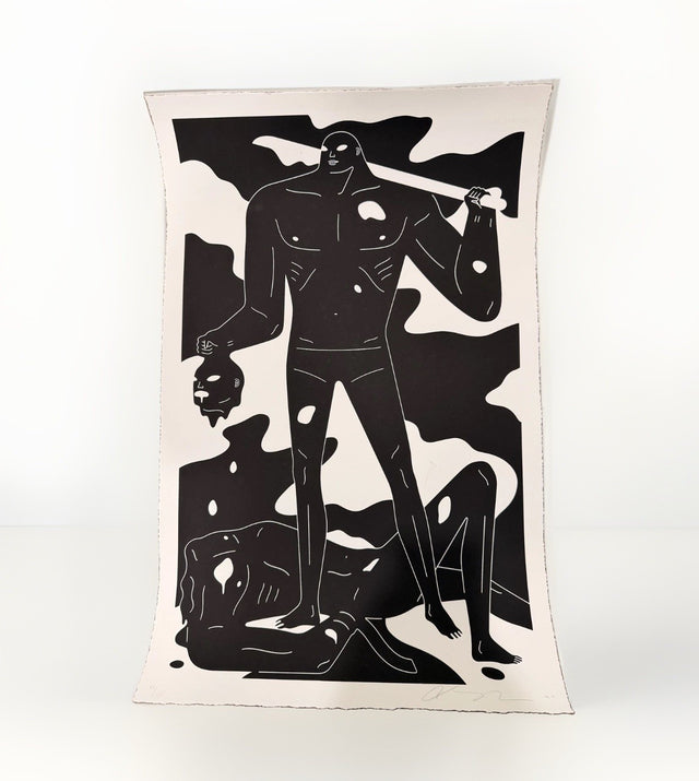
Cleon Peterson A Perfect Trade White Screen Print Signed Numbered /125
$325.00 USD
Browse the collection for current listings.