There is a particular kind of contemporary artist whose work you recognize before you know the name attached to it. Flat black figures locked in combat, rendered against a field of white and lit by a single scorching red. Clubs raised, bodies falling, hands reaching for throats. The compositions have the frozen clarity of an ancient frieze and the punch of a protest poster. This is the visual language of Cleon Peterson, and once it has been seen it is not easily forgotten.
Peterson occupies an unusual position in the art world. He is fluent in the grammar of street art and graphic design, yet his work hangs in serious galleries from Tokyo to New York and has anchored a museum solo exhibition. He is a moralist who insists he is not moralizing, a chronicler of violence who says he is not an advocate for it. His pictures are, in his own framing, a mirror rather than a manifesto. For collectors, the appeal is layered: the images are instantly legible, formally disciplined, thematically urgent, and produced across a range of media and price points that make the work approachable without diluting its seriousness.
This guide is an attempt to answer the question that new collectors and curious viewers ask most often. Who is Cleon Peterson, and why does his work land the way it does? To answer it well, we have to trace a path that runs from Seattle to Los Angeles, through a graphic design education and a working design career, into the orbit of one of the most recognizable street artists of the era, and out the other side into a mature and unmistakable body of work. Along the way we will look at how the work is made, what it says, where it sits in the contemporary market, and why so many collectors form a lasting attachment to it.
Origins — Seattle to Los Angeles

Cleon Peterson was born in 1973 in Seattle, Washington. He is now based in Los Angeles, the city that has become both his home and, in a sense, the backdrop against which much of his mature work reads. The move from the Pacific Northwest to Southern California is more than a biographical footnote. It maps onto a broader arc in Peterson's life and practice, from a regional upbringing to the sprawling, contradiction-rich metropolis where power, spectacle, and precarity sit side by side. It is not difficult to see how a city like Los Angeles, with its glamour and its harder edges pressed up against one another, might sharpen an artist's interest in dominance and vulnerability.
Peterson's formal education is a matter of public record and worth stating precisely, because it is frequently reported incorrectly. He earned a Bachelor of Fine Arts in Graphic Design from ArtCenter College of Design in Pasadena in 2004, graduating with honors. He then went on to complete a Master of Fine Arts at Cranbrook Academy of Art in Bloomfield Hills, Michigan, in 2006. Those two institutions, ArtCenter and Cranbrook, are the correct pillars of his training. The pairing is telling. ArtCenter is one of the most rigorous design schools in the United States, a place where the discipline of communication is drilled into students until it becomes second nature. Cranbrook, by contrast, is an intensive fine-art crucible, small and idiosyncratic, known for pushing artists toward conceptual depth and individual voice.
Taken together, the two schools describe the double identity that runs through everything Peterson makes. On one side is the designer, trained to strip a message down to its most direct and reproducible form. On the other is the fine artist, encouraged to sit with difficult ideas and to make work that resists easy consumption. Most artists lean decisively toward one pole or the other. Peterson's distinctiveness comes in large part from refusing to choose, from letting the clarity of the poster carry the weight of the painting.
A biography he tells in his own words
Any honest account of Peterson has to include the story he tells about his own past, and it has to be told carefully. Peterson has said that he struggled with heroin addiction and faced felony possession charges in the 1990s before turning his life around. This is his account of his own history, offered in interviews over the years, and it deserves to be treated as exactly that: something the artist has chosen to disclose about himself. It is not our place to embellish it, to sensationalize it, or to present it as anything other than his own testimony.
What matters for understanding the work is not the lurid detail but the sensibility it seems to have left behind. An artist who has, by his own telling, been close to the edge of self-destruction and social collapse is likely to have a particular relationship to themes of chaos, authority, and survival. The violence in Peterson's pictures is not the violence of someone who finds it exotic. It reads as the violence of someone who has thought hard about how order breaks down and how people behave when it does. That lived weight is part of what separates his work from mere shock imagery.
"I'm not an advocate for violence, but I am an advocate for people being un-apathetic." — Cleon Peterson
The origin story, then, is one of transformation. A person moves from the margins toward the center of a serious art world, and carries the memory of the margins into the work. Seattle to Los Angeles, addiction to discipline, the street to the gallery. These are the tensions that animate the pictures, and they are present from the very beginning.
The Graphic-Design Foundation

To understand why a Cleon Peterson image looks the way it does, you have to take seriously the fact that he is, in the most literal professional sense, a graphic designer. This is not a metaphor or an art-historical framing device. Peterson has worked as a designer for real commercial clients, and the roster is substantial. His design work has included clients such as Saks, Coca-Cola, Paramount, Bacardi, Mozilla, and MOCA. These are not the projects of a dabbler. They are the assignments of a working professional operating at a high level in a demanding field.
Commercial design imposes a specific discipline. A logo has to read at a glance and at any size. A campaign has to communicate in the half-second before a viewer's attention moves on. There is no room for ambiguity, no patience for a mark that does not earn its place. Years spent solving those problems leave a permanent imprint on how an artist thinks about images. Peterson has been direct about this himself, and his phrasing is worth quoting because it names the mechanism precisely.
"Flat and clean is the design training in me, always looking for the most direct mark to make." — Cleon Peterson
That single sentence unlocks a great deal. The flatness of his figures, the absence of modeling or shading, the refusal of fussy detail, the reliance on silhouette and clean edge, all of it descends from the design training. Where a traditionally trained painter might reach for depth, texture, and atmospheric nuance, Peterson reaches for the most direct mark. The result is an image that behaves like a sign. It communicates instantly, from across a room, the way a well-designed piece of visual communication is built to do.
The economy of the flat mark
There is a common misconception that flatness in art signals simplicity or a lack of skill. In Peterson's case the opposite is true. Achieving genuine directness is difficult. It requires knowing what to leave out, which is a harder discipline than knowing what to put in. A figure reduced to a black silhouette has to carry all of its meaning through posture, gesture, and relationship to the other figures around it. There is nowhere to hide. A raised arm, the angle of a falling body, the way one shape presses down on another, these become the entire vocabulary. Everything decorative has been burned away, and what remains has to work.
This is where the design foundation and the fine-art ambition meet. The designer's instinct for reduction gives Peterson the tools. The artist's ambition tells him what to point those tools at. He uses the economy of commercial design not to sell a product but to deliver a charged and uncomfortable idea with the same efficiency. The pictures hit fast, and only afterward does the viewer register how disturbing the content actually is. That delay, that gap between the pleasure of the graphic surface and the horror of the subject, is engineered, and the engineering comes straight out of the design studio.
Color as a designed decision
Nowhere is the designer's logic more visible than in Peterson's use of color. His most iconic register is severely restricted: black, white, and a single accent, most famously a fluorescent red, though he has also worked in blue, pink, and gold. This is not an intuitive or accidental palette. It is a decision made the way a designer decides, with an eye to what the combination does to a viewer.
"Just using three colors: black, florescent red, and white, is the quickest way to communicate that." — Cleon Peterson
Peterson has been explicit that the choice carries meaning beyond mere visual impact. He has connected the palette directly to the history of power and coercion.
"Red, black, and white feels violent and references the authoritarian colours used in propaganda, uniforms and symbols from the past." — Cleon Peterson
Here the two halves of his training fuse completely. The palette is chosen for maximum communicative efficiency, which is a design concern, and it is chosen because it carries the historical charge of propaganda and authority, which is a fine-art and political concern. The same three colors do both jobs at once. This is the kind of decision that looks simple on the surface and reveals, on inspection, a great deal of thought. It is the graphic-design foundation operating in service of serious content.
Studio Number One and the Fairey Connection

No account of Cleon Peterson's development is complete without Shepard Fairey. The two artists have a relationship that predates either man's prominence, and it has shaped Peterson's trajectory in concrete ways. Peterson and Fairey have been friends since the late 1990s, going back to the San Diego skateboarding scene. This is worth pausing on, because it locates the origin of the friendship in a specific subculture, one built around a do-it-yourself ethos, a distinctive graphic sensibility, and a comfort with putting images out into the world through unofficial channels.
That shared background matters. Skate culture and street art overlap heavily in their visual instincts. Both prize bold graphics, high contrast, immediate legibility, and imagery that can survive being reproduced on a sticker, a deck, or a wall. When you understand that Peterson and Fairey came up together in that world, the affinities between their work stop looking like influence and start looking like a common dialect learned young.
Working inside the studio
The friendship became a professional relationship as well. Peterson worked at Shepard Fairey's Studio Number One, the design and creative studio through which much of Fairey's commercial and artistic output flows. The exact role Peterson held and the precise years he was there are not thoroughly documented, and we will not pretend otherwise. What is clear is that he spent time inside one of the most influential engines of contemporary street-art-adjacent design, a place where the machinery of turning a graphic idea into a finished, reproducible object is refined to a high degree.
For an artist with Peterson's design training, Studio Number One would have been a natural environment and an instructive one. It is one thing to learn the principles of reduction and directness in school. It is another to see them applied, day after day, to work that reaches a mass audience through prints, murals, and merchandise. The experience of the studio reinforced the lesson of his education: that a serious idea and a clean, reproducible graphic are not in tension. They can be the same thing.
Collaborations that put both names on the wall
The Peterson–Fairey relationship has produced tangible collaborative work, and these projects are among the most significant in Peterson's career. The two artists created a monumental four-wall mural titled Power & Glory in 2014, painted at Wynwood Walls during Art Basel Miami. A large-scale public mural at the most visible art event in the United States, executed jointly with an artist of Fairey's stature, is not a minor credit. It signaled that Peterson had arrived as a public artist capable of operating at architectural scale.
The collaboration also extends to editioned prints, the format through which most collectors first acquire work by either artist. Peterson and Fairey produced Scales of Injustice in 2016, a letterpress edition of 300 signed by both artists, as well as Pattern of Corruption in 2015. There have also been OBEY artist-series projects, including the Practice of Masters print in 2013. For a collector, a work signed by both Peterson and Fairey carries a particular resonance. It documents a genuine artistic friendship, situates Peterson within a lineage that many collectors already follow, and offers an accessible entry point into his work.
It would be a mistake, though, to read Peterson merely as Fairey's associate. The relationship opened doors and sharpened tools, but the work that came through those doors is unmistakably Peterson's own. Where Fairey's imagery often carries a propagandistic optimism, a call to look and to act, Peterson's is darker, more ambivalent, more concerned with the mechanics of cruelty than with any program for change. The friendship is a foundation, not a ceiling.
Finding the Signature Style

Every artist with a recognizable style arrives at it through a process of elimination as much as invention. Peterson's mature visual language, the one that collectors now recognize instantly, is a synthesis of everything discussed so far, resolved into a set of consistent choices. It is worth describing that language carefully, in our own words, because the coherence of it is central to the work's appeal.
The core is flat, clean, silhouetted figuration. Figures are rendered as solid shapes, most often in black against white, stripped of interior detail. They exist in a shallow, stage-like space, arranged in compositions that read clearly as scenes of conflict. Bodies grapple, strike, fall, and dominate one another. The single accent color, whether the signature fluorescent red or an alternative such as blue, pink, or gold, is deployed with precision, often to mark blood, weapons, or the charged points of contact between figures. Nothing is wasted. Every element earns its place.
The frozen moment
One of the most distinctive qualities of a Peterson composition is its stillness within violence. Although the subject is action, often brutal action, the images do not feel chaotic or blurred. They have the arrested, ceremonial quality of a carved relief. Figures are caught at the peak of a gesture and held there. This gives the work a strange dignity and a sense of inevitability, as if we are watching not a specific brawl but the eternal recurrence of the same human patterns.
Critics have reached for a range of art-historical touchstones to describe this quality, and it is worth being precise about whose observation is whose. Critics, not Peterson himself, have compared his compositions to Greco-Roman friezes and vase painting, and have invoked figures such as Goya, Delacroix, and Leon Golub, as well as the street-art and advertising directness of Keith Haring. These are the comparisons of observers looking for a frame, and they are illuminating precisely as such. The friezes and vases point to the compositional flatness and the sense of ritual. Golub points to the unflinching treatment of political violence. Haring points to the graphic immediacy and the public, poster-like reach. Peterson's own stated reference points are more sparing, and we should not put art-historical name-dropping in his mouth.
The consistency that makes a market
From a collector's standpoint, the achievement of a stable signature style is not merely an aesthetic milestone. It is what makes a coherent body of work possible, and a coherent body of work is what a market forms around. When every piece is recognizably part of the same project, each new work reinforces the others. A collector who acquires one strong example is acquiring a piece of a larger, legible whole. Peterson's discipline, his refusal to wander stylistically, is therefore part of what gives the work its collectible integrity. The style is not a gimmick to be exhausted. It is a language he keeps writing new sentences in.
That said, Peterson has not stood entirely still. The single-accent palette expands and contracts across projects. The scale ranges from intimate paper editions to monumental murals and ground frescoes. The figures appear in paintings, in prints, and in three dimensions as sculpture. What holds constant is the underlying grammar. The vocabulary of black silhouette, white ground, and charged accent color remains, no matter the medium or the size. This is the mark of an artist who has found his style and now explores its range rather than abandoning it.
Voice and Intent — What His Work Says

It would be easy, and wrong, to treat Peterson's work as simply violent imagery made attractive. The pictures are about violence, but they are not celebrations of it. Understanding what Peterson is actually saying is essential to collecting the work with any seriousness, and fortunately the artist has been articulate about his intentions.
At the center of everything is a single relationship: power and submission. This is the core allegory that recurs across the work. One figure dominates, another yields. A club comes down, a body goes under. Peterson uses these encounters not to thrill the viewer but to hold up a mirror to how societies actually organize themselves, to the constant negotiation of who holds power over whom. He has stated the priority plainly.
"The subject of power is always central." — Cleon Peterson
The violence, in other words, is a means rather than an end. It is the most direct visual shorthand for the abstract subject of power, the same way his three-color palette is the most direct shorthand for authoritarian menace. Peterson is not interested in gore for its own sake. He is interested in the structures, moral and political, that produce it. The carnage is a diagnostic tool.
A mirror, not a sermon
This is the point on which Peterson is most insistent and most easily misread. He does not present his scenes of brutality as endorsements, and he does not present them as simple condemnations either. He presents them as reflections, provocations designed to jolt viewers out of complacency. His stated aim is not to make people agree with a position but to make them stop being indifferent.
"I'm not an advocate for violence, but I am an advocate for people being un-apathetic." — Cleon Peterson
The distinction is crucial. A sermon tells you what to think. A mirror shows you what is already there and dares you to look. Peterson's work operates as the latter. This is also why the work can feel uncomfortable to live with in the best sense. It does not resolve into a tidy moral. It keeps asking the viewer to sit with the recognition that the patterns depicted are not exotic or historical but ongoing and near.
The classical as argument
Peterson's move into sculpture sharpened one particular strand of this argument. In three dimensions, and especially in works that echo classical statuary, he found a way to say something about time. He has explained the choice directly.
"…my sculptures intentionally reference the classical because it enforces the idea that the issues we're dealing with today also existed in the past." — Cleon Peterson
By casting contemporary violence in a classical mold, Peterson collapses the distance between antiquity and the present. The message is that the human tendencies he depicts are not a symptom of modern decline but a permanent feature of the species, as old as the marble it evokes. This gives the work a tragic dimension. It is not reportage about a particular crisis. It is a statement about a recurring condition.
How a curator framed it
When the Museum of Contemporary Art Denver mounted a solo exhibition of Peterson's work, its curator Adam Lerner offered a reading that has become a useful lens. Lerner emphasized that the carnage in the work is, in his words, "clearly archetypal, not real," and he noted that the work possesses "this incredible, cool, graphic, decorative quality." The two observations together capture the productive contradiction at the heart of the work. The subject is archetypal violence, universal and symbolic rather than journalistic, and it is delivered through a surface that is genuinely, seductively beautiful. That tension, between the cool decorative appeal and the disturbing content, is not a flaw. It is the engine. It is what makes the viewer keep looking, and keep thinking, long after a more literal depiction would have been dismissed.
His Standing in Contemporary Art

An artist's standing is measured in part by who chooses to represent and exhibit the work. On this measure Peterson has a serious and international profile that extends well beyond the street-art context in which he is sometimes casually filed.
Peterson is represented by a set of notable galleries across multiple continents. He works with Kaikai Kiki, the Tokyo enterprise founded by Takashi Murakami, one of the most influential figures in contemporary art. He is represented by Over the Influence, which operates across Hong Kong, Los Angeles, and Bangkok. And he is represented by albertz benda in New York. Representation by galleries of this caliber, and across these markets, is a meaningful signal. It places Peterson in a professional context of established fine art, not merely urban or graphic art, and it gives collectors confidence in the infrastructure supporting the work.
A record of substantial exhibitions
The exhibition history reinforces the point. Peterson's projects have been ambitious and, in several cases, monumental. Under the Sun, the Moon, and the Stars, presented at Kaikai Kiki in Tokyo in 2023, comprised twenty-seven new paintings. Mr. Sinister was shown at albertz benda in New York in 2022. Blood & Soil, at Over the Influence in Los Angeles in 2018, included bronzes alongside two-dimensional work. Earlier, Poison was shown at Library Street Collective in Detroit in 2015, and End of Days at New Image Art in Los Angeles in 2014.
Beyond the gallery circuit, Peterson has undertaken major public and institutional projects. In 2016 he created Endless Sleep, a monumental ground fresco for Nuit Blanche in Paris, sited at the Eiffel Tower and based on the imagery of Francesco Colonna's 1499 Hypnerotomachia Poliphili. The scale and setting of that commission speak for themselves. He has also participated in the Palais de Tokyo's Lasco Project. Press coverage described the Nuit Blanche fresco as the first mural under the Eiffel Tower, a striking claim that we attribute to press reporting rather than assert as verified fact.
The museum solo
The clearest institutional endorsement in Peterson's career to date is The Shadow of Men, a solo museum exhibition mounted at the Museum of Contemporary Art Denver in 2018 and curated by Adam Lerner. A solo show at a contemporary art museum is a genuine marker of standing. It represents a considered institutional judgment that an artist's work merits sustained curatorial attention and public presentation on its own terms. For collectors weighing the seriousness of an artist, a museum solo is among the more reliable indicators, and Peterson has one.
A note of precision is warranted here, because it matters for how collectors evaluate provenance and stature. Having exhibited at a museum is not the same as being held in a museum's permanent collection, and we are careful to say only the former. Peterson has exhibited at significant institutions. Any claim about permanent acquisitions would go beyond what is confirmed, and a responsible collector should treat such claims with the same caution.
Beyond the gallery: reach and collaboration
Part of what makes Peterson's standing distinctive is that it is not confined to the gallery. His imagery has reached wide audiences through editorial and design collaboration. His work has appeared in The New Yorker, illustrating fiction by George Saunders, and in The New York Times, and he created a Penguin Classics cover for Philip K. Dick's The Man in the High Castle. He has collaborated with the furniture maker Modernica on a series of projects, and his imagery has extended into objects and editions with a range of partners. This breadth is not a dilution of his fine-art credibility. It is a continuation of the graphic-design DNA that has always allowed his work to move fluidly between the wall and the world. Few artists operate as convincingly in both registers.
Why Collectors Connect

Having traced the biography, the training, the influences, the style, the intent, and the professional standing, we can finally address the question that most concerns anyone considering an acquisition. Why do collectors connect with Cleon Peterson's work, and what should they understand before they do?
The first answer is the immediacy already described at length. Peterson's work communicates instantly. A collector does not need an art-history degree to feel the force of a composition. That accessibility, inherited from the design foundation, lowers the barrier to appreciation without lowering the ceiling on meaning. The work rewards the casual glance and the sustained study alike, which is a rare combination and a durable basis for attachment.
The second answer is coherence. Because Peterson has arrived at and maintained a signature language, his body of work reads as a single sustained project. Collectors are drawn to that kind of integrity. Acquiring a Peterson is acquiring a piece of a legible, ongoing argument about power and human nature, not an isolated pretty object. Each piece speaks to the others.
A range of ways in
The third answer, and a practical one, is the breadth of formats. Peterson's practice spans unique paintings, three-dimensional work, and hand-pulled screenprint editions, which means there are multiple points of entry at different levels of commitment.
The prints deserve particular attention, because for many collectors they are the first, and sometimes the lasting, form of engagement. Peterson's editions are hand-pulled screenprints, and they carry a set of recurring physical characteristics worth knowing. They are frequently printed on heavy Coventry Rag paper, in the range of 290 to 320 gsm, often with deckled edges. The documented signing convention is consistent: the work is pencil-signed and dated at the lower right on the front of the sheet, and numbered at the lower left, with the signature typically taking the form of the artist's first name followed by a two-digit year. Editions commonly run at sizes such as 125 or 150, though other sizes appear as well, and primary-release prices have historically clustered in an accessible band, with sets and special gallery editions reaching higher. These are the traits an informed collector looks for, and they are the traits that ground confidence in a given sheet.
The sculptures and objects add another dimension, literally and figuratively. Peterson has produced editioned three-dimensional works with specialist fabricators, and it is worth noting a documented best practice around their authentication: certain of these sculptural editions have shipped with a certificate signed and numbered by the artist, presented in a screen-printed wooden box. That kind of documented certification practice is exactly the sort of provenance signal a careful collector should value.
The market in brief
On the question of value, a few sober observations are in order, stated as facts rather than forecasts. At the top of Peterson's market sits his auction record for a painting: The Nightcrawler, an oil on canvas from 2015, sold at Phillips Hong Kong on July 9, 2020, for HK$350,000, roughly US$45,161. That result establishes the ceiling that his most significant unique works have reached at auction to date. At the more accessible end, primary-release prints have historically been priced in the low hundreds of dollars, and the trailing print-auction averages have tended to sit in a comparable range.
The broad hierarchy of value in Peterson's work follows a pattern familiar across many artists' markets: unique paintings tend to command more than sculpture, and sculpture more than paper editions, with scale, edition size, condition, provenance, and subject all acting as further drivers. We offer these as orientation, not as predictions. No one should acquire art on the expectation of a specific future return, and we will not pretend to forecast one. The soundest reason to acquire a Peterson is that the work speaks to you and that you have verified you are buying what you think you are buying.
A collector's takeaway
Cleon Peterson is that unusual artist who is at once immediately legible and genuinely deep, at once a working designer and a museum-exhibited fine artist, at once a chronicler of violence and a moralist who refuses to moralize. The work connects because it refuses the easy categories. It gives you the graphic pleasure of a great poster and the sustained disquiet of a serious painting, in the same instant. For a collector, that is a rare and lasting combination.
If there is a single practical principle to carry away, it is this. The very qualities that make Peterson's work desirable, its clean reproducibility, its accessible price points, its wide circulation across prints and objects, also make attention to authenticity essential. The documented markers matter: the recto pencil signature and edition number on the prints, the signed and numbered certificate that accompanies certain sculptures, and a clear, checkable provenance. Know the traits of the specific format you are considering, insist on documentation, and verify before you commit.
That authentication-first discipline is the quiet foundation beneath any confident collection, and it is the approach we take at Gauntlet Gallery. We would rather a collector understand exactly what they are acquiring, and why, than rush a purchase. Cleon Peterson's work is more than strong enough to reward that patience. Buy the piece that moves you, confirm it is what it claims to be, and let the work do what it was built to do, which is to keep you from looking away.
Shop Cleon Peterson
Explore current pieces available from the gallery.
-

Cleon Peterson POWER Sculpture White Resin Ltd Edition 500 Beyond The Streets NT
$600.00 USD
-
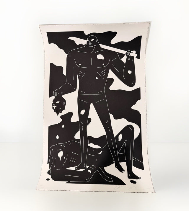
Cleon Peterson A Perfect Trade White Screen Print Signed Numbered /125
$325.00 USD
Browse the collection for current listings.