

Featured image: AI-generated interior concept using product reference photography. Scale, setting, framing, and placement are illustrative.
When curated interior spaces demand an architectural anchor with deep cultural resonance, designers frequently look toward twentieth-century graphic art. Yet introducing paper ephemera into high-end residential projects presents structural, visual, and conceptual hurdles. A prime case study is Richard Avedon’s late-1967 psychedelic portraiture of The Beatles. Commissioned by manager Brian Epstein at the height of the Sgt. Pepper movement, Avedon photographed John Lennon, Paul McCartney, George Harrison, and Ringo Starr in London, subjecting their portraits to intense solarization and vibrant Day-Glo color overlays. Published in early 1968 across North America and Europe, these works bridged commercial publishing and vanguard fine art. Today, integrating original period printings, such as the European Stern portfolio editions, requires balancing intense mid-century color theory, delicate historical paper substrates, and contemporary interior architecture.
Understanding the medium: photographic origin versus commercial offset print
To specify vintage graphic art correctly, design practitioners must distinguish between an original photographic silver gelatin print, a hand-signed fine art edition, and a period commercial offset lithograph. A common misconception among residential clients is that any vintage visual artifact bearing a photographer’s name is a direct studio photo print or carries an original autograph. The 1967 Avedon Beatles series was designed specifically as a mass-distributed portfolio of offset lithographs, designed to reach a global youth culture through publications like Look magazine in the United States, the Daily Express in the United Kingdom, and Stern in Germany. These works are unsigned, commercial first editions rather than signed studio prints. They derive their design authority from their historical timing, graphic invention, and original printing typography.
The distinction between an original 1967 printing and a later reproduction is vital when structuring a room’s narrative. The original European Stern printings were produced in England by Waterlow & Sons Ltd. and distributed through Düsseldorf’s Populäre Propaganda Presse (PPP). These original printings feature specific margin text, publisher credits, copyright notices for NEMS Enterprises Ltd., and precise ink densities that late-twentieth-century digital or decorative reprints fail to replicate. Modern giclée or offset reprints often flatten the complex solarized tones, muddying the delicate tonal transitions in the faces and over-saturating the background fields. When specifying an original vintage poster for a high-end interior, one is placing an authentic artifact of 1960s print culture into the room, where paper grain, period typography, and vintage ink chemistry interact with natural room light.
Consider a hypothetical design decision in a modern architectural living space featuring cast concrete walls and minimalist contemporary furnishings. The designer must evaluate whether to specify an original linen-backed edition or a framed modern decorative reprint. An authentic print like the Richard Avedon Paul McCartney Beatles 1967 Stern Poster Linen Backed Original introduces subtle tactile depth through its age-appropriate paper substrate and historic ink saturation. Choosing a later modern reproduction saves upfront procurement cost, yet it introduces a glossy, uniform surface that feels disconnected from authentic period craftsmanship. Selecting the original piece demands a higher acquisition budget and careful framing considerations, but it establishes a genuine historical link between mid-century print culture and contemporary interior architecture.
The physical presence of vintage paper provides a deliberate textural contrast against the slick glass and polished chrome found in contemporary furniture pieces. While modern photographic prints present a perfectly uniform surface, vintage offset lithographs contain slight variations in paper absorbency that react softly to ambient interior lighting. When designing around a music history motif, integrating authentic original printings elevates the room beyond mere retro decoration into a curated gallery environment. Practitioners should counsel clients on how the original NEMS credits along the margin serve as visible marks of provenance, establishing the artwork as both a visual centerpiece and a piece of historic graphic design.
Navigating color, solarization, and portrait gaze in living spaces
Avedon’s visual technique for the Beatles series relies on solarization, a photographic process where an image is briefly re-exposed to light during development, reversing highlights and shadows, combined with hard-edged Day-Glo overlays and symbolic icons. In a residential setting, these vivid graphic treatments establish strong chromatic and psychological forces. For example, in the Richard Avedon Paul McCartney 1967 Stern Poster, McCartney’s face is rendered in hyper-saturated magenta and soft yellow hues, juxtaposed against a mint green floral background. His direct, piercing gaze acts as a visual anchor on a wall, pulling the eye inward. The graphic treatment creates a dynamic tension between the familiar human contours of the subject and abstract, flat color blocks.
Similarly, the portrait of Ringo Starr, titled “Dove Loving Ringo”, utilizes a complementary palette that incorporates a white dove as a symbol of peace, balanced by cool electric blues and vivid warm accents. When placing a piece such as the Richard Avedon Ringo Starr 1967 Stern Poster in a living or dining space, the designer must account for how these Day-Glo hues interact with ambient lighting throughout the day. Under daylight, the mint green, cyan, and electric pinks reveal subtle shifts in tone; under warm evening interior lighting (2700K to 3000K), the warm pinks and golds illuminate while cool background tones recede. Because these works feature direct portrait gazes, placing them opposite seating areas creates an engaging visual dialogue, making them ideal for grand entry hallways, library nooks, or modern gallery corridors.
Linen backing as a structural conservator consideration
Vintage posters were printed on lightweight commercial newsprint or medium-weight magazine stock designed for temporary consumption. Consequently, surviving originals often bear fold lines, edge wear, or minor stress tears. To stabilize these delicate paper artifacts for long-term interior display, professional conservators perform linen backing. This archival restoration technique involves mounting the original paper print onto a acid-free Japanese paper backing sheet using a water-soluble wheat starch paste, which is then adhered to a neutral cotton canvas substrate. Linen backing flattens historic storage creases, reinforces fragile edges, provides dimensional stability against room humidity changes, and creates a uniform border for framing without altering the original paper structure.
For interior designers and art consultants, specifying a linen-backed original offers significant practical advantages: It ensures the artwork hangs perfectly flat inside the frame without buckling, rippling, or sliding over time. However, practitioners should always consult a professional paper conservator or specialist framer when assessing a linen-backed piece for a client project. The backing process should be fully reversible, preserving the artifact’s historical integrity. Furthermore, because linen backing adds a structural margin around the original image sheet, often expanding the total canvas size beyond the original image area, framing dimensions must be planned around the complete backed footprint rather than theoretical image measurements alone.
Spatial arrangements: hanging single, paired, or full quad sets
The Avedon Beatles series was conceived both as individual standalone portraits and as a cohesive four-part narrative ensemble (often accompanied by a fifth black-and-white panoramic group banner). Deciding whether to hang a single portrait, a complementary pair, or the complete four-piece set depends entirely on room architecture, wall elevation proportions, and visual scale. The individual portraits, with sheet size, linen margins and final framed dimensions to be confirmed, carry enough graphic weight to serve as singular focal points in smaller architectural zones, such as an executive home office, a reading alcove, or a secondary foyer.
When designing for expansive living room walls or long residential galleries, hanging a paired set, such as Paul McCartney opposite or alongside Ringo Starr, establishes a balanced visual rhythm. A paired arrangement works exceptionally well when spaced deliberately, using symmetrical sightlines to flank a doorway, a architectural fireplace breast, or a bespoke credenza. When displaying all four portraits together, designers generally choose between a linear horizontal sequence or a 2x2 grid layout. A linear horizontal hanging requires substantial wall width (a minimum planning assumption of 10 to 12 feet of uninterrupted wall surface) to allow for generous matting, framing, and negative space between frames. A 2x2 grid layout offers a compact, high-impact graphic square, bringing immediate structural focus to modern grand rooms with elevated ceiling heights.
Juxtaposing 1960s pop artifacts with contemporary furniture
Integrating mid-century psychedelic graphics into high-end residential interiors requires a thoughtful balance of textures, materials, and architectural styles. Placing an original 1967 Avedon poster within a room filled exclusively with mid-century modern furniture can make a space feel overly thematic or historical. Conversely, setting these historic works against minimalist contemporary architecture or classic period moldings creates a compelling visual contrast, allowing the art to act as a bridge between historical periods.
Consider how the vibrant ink surfaces of Avedon’s offset lithographs react with nearby interior materials. The flat, saturated Day-Glo inks contrast beautifully with natural wood grains (such as quarter-sawn white oak, walnut, or charred shou sugi ban finish), matte architectural plaster, and honed stone surfaces like travertine or soapstone. When paired with low-profile contemporary Italian seating in neutral bouclé, mohair, or aniline leather, the vivid pinks, greens, and blues of the McCartney or Ringo Starr portraits become intentional chromatic accents within an otherwise restrained palette. The key is allowing the historic artwork to provide the room’s primary visual energy while surrounding architecture and furniture maintain quiet, tactile elegance.
Environmental protection, UV glazing, and conservation framing
Paper artworks, particularly vintage offset prints using mid-century inks, are vulnerable to environmental degradation if framed incorrectly. Ultra-violet radiation from direct sunlight or unfiltered high-output interior lighting causes fugitive inks, especially vintage pink, yellow, and red dyes, to shift or fade over time. While modern UV-filtering glazing significantly reduces light transmission risk, no glass or acrylic makes paper entirely immune to light damage. Therefore, art consultants must advise clients against hanging vintage prints on walls that receive direct, unfiltered sunlight throughout the day.
Proper archival framing for a linen-backed paper poster requires specific technical specifications:
- UV-Filtering Glazing: Always specify museum-grade acrylic or optical glass offering at least 99% UV protection to safeguard delicate inks.
- Acid-Free Spacers or Windows: Ensure the artwork never touches the inner surface of the glazing directly. Use archival acid-free matting or hidden acrylic spacers along the frame rabbet to maintain air circulation and prevent condensation transfer.
- Sealed Archival Backing: The back of the frame must be sealed with a rigid, acid-free backing board (such as archival coroplast or foam board) to block dust, insects, and atmospheric pollutants.
- Reversible Mounting: The linen-backed canvas should be secured within the frame package using fully reversible archival hinges, avoiding pressure-sensitive tapes or permanent adhesives.
Additionally, keep paper displays clear of heat sources, steam, radiators, and areas subject to fluctuating humidity, such as directly opposite HVAC supply vents or near uninsulated exterior walls.
Comparative analysis: Avedon 1967 Stern editions versus alternative printings
When sourcing vintage Avedon Beatles posters for a design project, practitioners will encounter multiple historic editions published during the 1967–1968 global release window, as well as subsequent exhibit posters and late-edition commercial prints. Understanding the visual, structural, and regional differences between these releases helps ensure accurate specification and proper framing design.
| Release / Edition | Primary Publisher & Region | Printing Medium & Process | Key Visual Characteristics | Framing & Handling Notes |
|---|---|---|---|---|
| Stern First Edition (1967) | Stern / PPP (Germany, printed in UK by Waterlow) | Offset lithography on period stock; Day-Glo overlays | German margin text ("fotografiert von Richard Avedon für Stern"); rich ink density | Requires confirmation of linen-backed border dimensions before custom frame fabrication |
| Look Magazine Edition (1968) | Look Magazine (United States) | Mass-market commercial offset lithography | US copyright line; often folded as magazine inserts; lighter paper weight | Fold lines usually visible; requires expert linen backing to flatten storage creases |
| Daily Express Edition (1968) | Daily Express (United Kingdom) | Newspaper portfolio offset lithography | UK publication credits; distinct paper texture and trim sizing | Rarely found unfolded; delicate paper requires careful archival stabilization |
| Modern Gallery / Museum Reprints | Various Art Institutions (Post-1990s) | Modern digital giclée or commercial offset | Smooth modern paper stock; sharp digital typography; crisp white margins | Lacks vintage paper character and original period ink qualities; decorative value |
As detailed in the comparison above, the original European Stern printings represent an exceptionally desirable historic release of Avedon’s portfolio. Their rich ink saturation, distinct German publication credits, and substantial paper quality make them top-tier choices for architectural art placement.
Hypothetical worked project: a Beacon Hill townhouse library conversion
To demonstrate how these principles operate in a live interior project, let us examine a hypothetical residential design scenario. A design firm is tasked with converting a formal second-floor library in a late-nineteenth-century Boston townhouse into a contemporary music lounge and private art gallery for a private client. The room features restored dark-stained walnut millwork, high ceilings (10 feet, 6 inches), architectural picture molding, and muted slate-gray plaster walls.
The design challenge
The client owns a collection of contemporary seating and requests a high-impact, music-focused art feature on the main wall opposite a bay window. The wall measures 14 feet wide by 10 feet 6 inches high. The window receives indirect northern light, making it a safe environmental setting for vintage works on paper, provided UV protection is installed.
Art specification and spatial placement
The designer selects a paired set of original 1967 European Stern printings from Gauntlet Gallery: the Richard Avedon Paul McCartney 1967 Stern Poster and the Richard Avedon Ringo Starr 1967 Stern Poster. Both pieces are professionally linen-backed original offset lithographs.
When curating graphic media from this era, designers must distinguish between a fine art photograph, a commercial poster, a modern reproduction, and an autographed collectible. These listings are vintage offset lithograph posters featuring Avedon's photography, printed with solarized Day-Glo inks for commercial distribution in 1967. They are unsigned commercial prints rather than hand-signed darkroom photographs or signed modern reissues. Presenting unsigned posters as vintage fine-art graphic design honors their original function as pop culture ephemera while celebrating their current status as museum-collected historical artifacts. The lack of a physical signature from the artist or the musician keeps the focus entirely on Avedon's radical studio imagery and the pristine state of the paper medium.
Framing and mounting strategy
To establish continuity across the two pieces and connect them with the room’s dark walnut millwork, the designer specifies matching custom gallery frames:
- Frame Profile: A deep, slim 3/4-inch face by 1-3/4-inch deep satin black ebonized hardwood frame with an internal spacer, allowing the linen-backed borders to show slightly as a float-mount presentation.
- Glazing: Museum-grade anti-reflective UV acrylic (99% UV blockage) to eliminate light reflection from room lamps while preserving deep color saturation.
- Overall Frame Footprint (Planning Assumption): Approximately 24 inches wide by 32 inches high per framed piece, accounting for linen borders and frame moulding.
The decision to display the raw linen edges within the frame shadowbox involves specific aesthetic and conservation trade-offs. Standard window matting conceals the outer perimeter of the paper, offering a clean line that covers edge tears or registration marks. However, window matting hides the historical character of the sheet. Float mounting reveals the entire linen backing edge, documenting the archival stabilization process and allowing the paper's full physical history to remain visible. In a room with historic architecture, showing the aged edge of the original paper creates a compelling dialogue with the restored 19th-century millwork.
Linen backing serves as an essential stabilization method for vintage paper works. The process involves affixing the original paper sheet to a thin layer of acid-free Japanese tissue and a fine cotton linen canvas using natural starch paste. This process smooths out historic handling creases, neutralizes paper acidity, and prevents future tearing during handling. Because linen backing alters the physical substrate, interior designers should advise clients to consult an independent paper conservator to verify that any historic backing treatment remains stable and fully reversible before proceeding with mounting.
Spatial layout logic and color dynamic
The two framed portraits are mounted horizontally side-by-side on the 14-foot slate-gray wall. The center line of both frames is established at 58 inches above the finished floor (eye level for standing viewing). The two frames are separated by a precise 12-inch gap between frame edges. This creates a balanced visual block measuring approximately 60 inches wide overall, leaving roughly 54 inches of negative slate-gray wall space on either side. The vivid pinks and mint greens of McCartney’s portrait and the cool blues and white dove motifs of Ringo Starr’s portrait pop dramatically against the muted wall finish, creating an immediate graphic anchor that reflects into the room without overpowering the vintage walnut millwork.
The spatial logic relies heavily on the directional gaze and color energy of the two sitters. Paul McCartney’s portrait features intense, warm solarized tones, vibrant magenta, acid yellow, and leaf green, with his direct, piercing gaze oriented forward. Ringo Starr’s portrait, titled "Dove Loving Ringo", utilizes cool cyan, deep violet, and the stark white graphic of the peace dove, with his head turned slightly toward the center axis. Hanging McCartney on the left and Starr on the right directs the visual flow inward toward the 12-inch gap, locking the pair into a cohesive narrative unit across the slate-gray plaster background.
This arrangement creates a strong juxtaposition between mid-century pop media and contemporary interior furnishings. Placing high-saturate psychedelic art against neutral, hand-troweled plaster walls prevents the intense Day-Glo palette from overwhelming the architecture. The high-contrast graphic portraits bridge the historical gap between the traditional 19th-century dark walnut trim and sleek modern low-profile seating, proving that historic print ephemera can act as a sophisticated visual bridge in modern luxury interiors.
Sourcing, verification, and specifying for interior projects
When specifying vintage graphic art or historical collectibles for architectural clients, design practitioners must maintain rigor regarding object condition, provenance records, and description accuracy. Dealer descriptions, catalog entries, and transaction records function as commercial documentation of what is offered; they describe physical attributes, printing sources, and seller background rather than acting as official legal guarantees of authenticity. Designers should always inspect listing details carefully to confirm exact item status.
Key steps when preparing to specify a vintage poster include:
- Distinguish Media Clearly: Ensure the client understands that the piece is an original period commercial poster or offset lithograph, not an autographed photograph or modern photo print.
- Confirm Backing and Stabilization: Verify whether the poster has been linen-backed. If linen-backed, request total canvas dimensions from the dealer to ensure frame calculations account for outer border edges.
- Review Condition Photos: Examine all detailed listing imagery closely under high magnification to check margin state, color freshness, and potential historical folds or edge repairs.
- Plan Frame Clearances Early: Never order custom frames or construct millwork niches based on general published dimensions. Always confirm final framed dimensions with the framer once the physical object is in hand.
By treating vintage posters as significant historic artifacts that require specialized framing, environmental awareness, and considered spatial layout, interior designers can create spaces that celebrate both graphic design history and contemporary architectural refinement.
Final design considerations and exploring the collection
Integrating Richard Avedon’s 1967 Beatles posters into an interior design project brings a powerful combination of twentieth-century music heritage, world-class portraiture, and bold graphic color into the home. Whether hung as a focused pair in a townhouse library or deployed as a dynamic gallery statement across a modern living room, these original Stern printings offer a tangible connection to a pivotal moment in art and pop culture history. To review physical condition details, inspect archival linen backing, or select specific pieces for your next project, explore the curated collection of authentic vintage posters and fine art collectibles available at Gauntlet Gallery today.
Shop Music memorabilia
Explore current pieces available from the gallery.
-
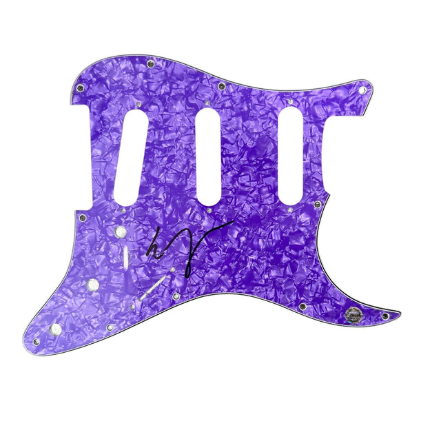
Vampire Weekend Ezra Koenig Signed Guitar Pickguard Autograph Hologram COA
$100.00 USD
-
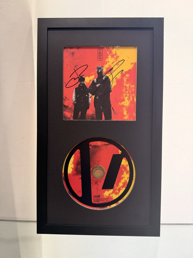
Twenty One Pilots Signed Clancy CD Framed Display Tyler Joseph Josh Dun Auto
$199.00 USD
-
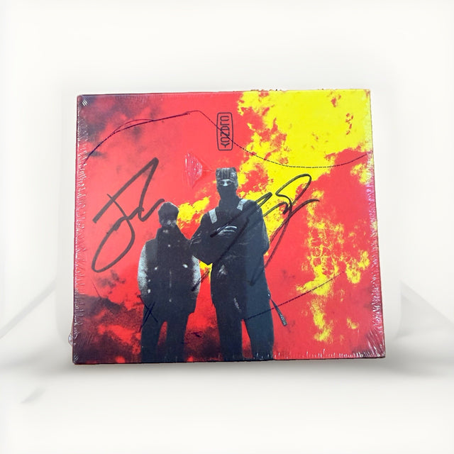
Twenty One Pilots Clancy Signed CD Tyler Joseph Josh Dun Sealed Unopened 2024
$189.00 USD
-
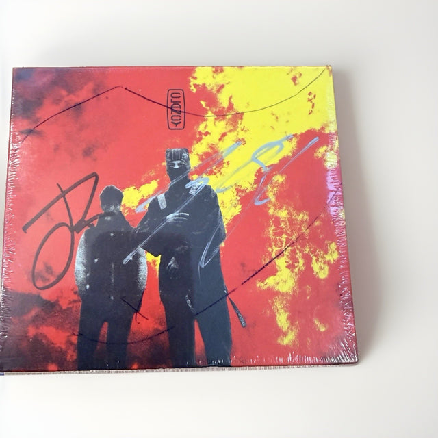
Twenty One Pilots Clancy Signed CD Sealed Tyler Joseph Josh Dun Silver Autograph
$189.00 USD
-
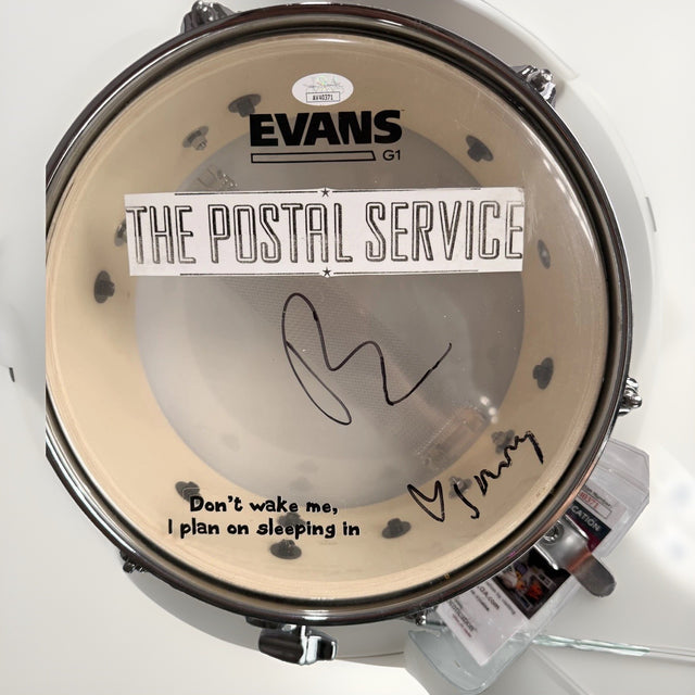
The Postal Service Dual Signed Evans M-80 Drumhead JSA A40371
$499.00 USD
-
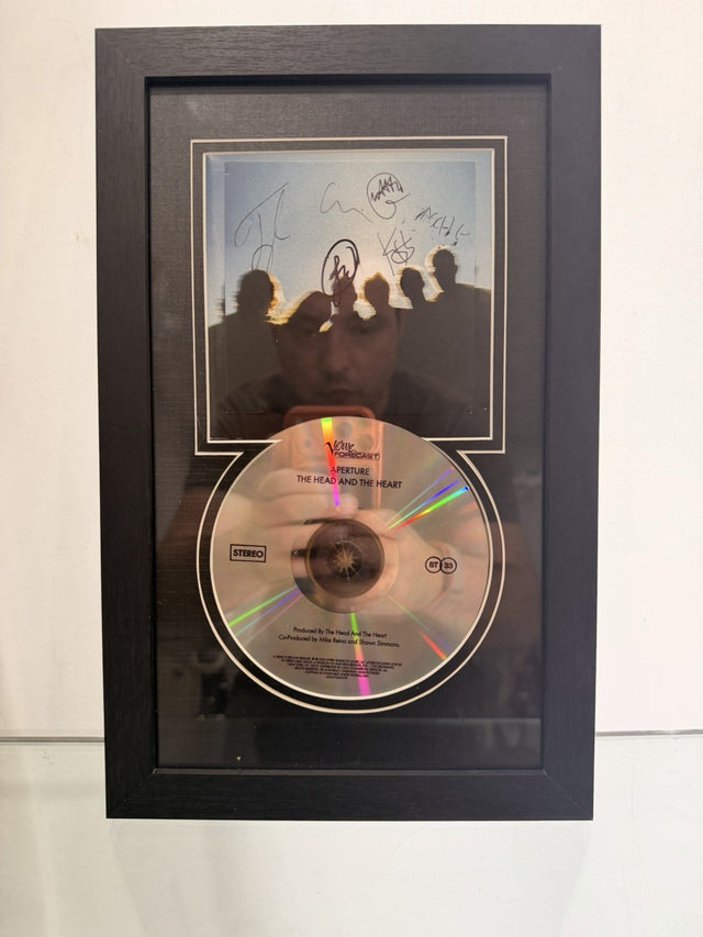
The Head and the Heart Band Signed Framed 'aperture' CD COVER ALBUM
$65.00 USD
Browse the collection for current listings.