

Featured image: AI-generated interior concept using product reference photography. Scale, setting, framing, and placement are illustrative.
When a client requests a place for signed memorabilia, interior designers often feel a slight hesitation. Pop culture collectibles, autographed album inserts, and signed physical media are frequently associated with chaotic basements or juvenile bedrooms. Standard commercial shadowboxes with neon-colored mats and aggressive typography can feel completely disconnected from a thoughtfully designed home. Yet, completely excluding personal artifacts leaves a living space feeling clinical and devoid of genuine biographical character. An autographed object represents a lived human connection to a performance, a era, or a formative creative work, making it a valuable element in interior decoration when handled with architectural rigor.
Integrating framed autographs into elevated residential settings requires shifting away from high-density fan rooms and toward intentional spatial design. The difference between visual noise and an intriguing focal point depends entirely on presentation. Framing choices, matte proportions, spatial lighting, and clear visual hierarchy transform flat autographed items into refined spatial accents. By treating signed music inserts, compact discs, and original photographs as distinct structural elements, designers can anchor personal history within polished interior schemes. Achieving this balance involves mastering mat balance, handling physical documentation appropriately, avoiding speculative collecting logic, and carefully integrating pieces like the Benson Boone signed Pulse CD display or the Twenty One Pilots signed Clancy CD framed display into curated private spaces.
The spatial challenge of autographed physical media
Autographed music memorabilia presents specific challenges for interior balance. Unlike large-scale abstract paintings or expansive landscape photography, signed CD inserts and promotional photographs are fundamentally intimate objects. They were originally manufactured for physical handling, liner notes, and close personal contact. When mounted on a wall without adequate breathing room, small scale artifacts can look lost across expansive plaster, drywall, or paneled surfaces. Standard retail frames often compound this issue by clustering too many elements together in a small footprint, resulting in a cluttered aesthetic.
A successful design approach treats the scale of the object as an opportunity for close-range engagement rather than a layout limitation. Placing small autographed displays on wide structural piers, within built-in library shelving, or beside dedicated reading chairs encourages close viewing. Positioning a small framed work where an observer naturally pauses creates an inviting moment of discovery. The goal is to avoid forcing a small autograph to command a high-ceilinged room on its own, grounding it instead within an intimate spatial boundary.
Material continuity is another essential consideration. Autographed displays frequently include metallic inks, glossy paper stock, and polycarbonate discs, which create mixed reflective qualities under ambient light. Integrating these textures requires balancing surrounding wall finishes, joinery materials, and nearby soft furnishings. A polished gold mat or bright white frame demands thoughtful pairing with matte wall paint, textured linen drapery, or warm timber paneling to prevent unwanted glare and harsh contrast.
Establishing visual hierarchy: photo, signature, and disc
Multi-element music displays typically combine three main components: a portrait photo or art insert, an authentic ink signature, and the physical disc itself. Designing an elegant presentation requires establishing a clear primary, secondary, and tertiary hierarchy among these elements. When all three elements compete for equal visual attention, the eye struggles to find a comfortable resting point, turning the frame into a fragmented layout.
In high-end residential framing, the signed artwork or portrait should generally serve as the primary focal anchor. The signature provides the central emotional connection, making its position, clarity, and contrast vital. A dark ink signature against a light background naturally draws the viewer in, whereas a faint marker stroke on a dark image requires generous surrounding matting to maintain readability. The physical CD functions best as a supporting geometric counterpoint, grounding the overall layout with its clean circular silhouette.
Consider the Benson Boone signed Pulse CD display. The presentation features a portrait art insert hand-signed across the chest in bold black ink, mounted directly above the screen-printed CD disc. The upper rectangular portrait naturally takes primary focus due to the direct posture and strong sign-off, while the lower circular compact disc balances the composition. The metallic gold mat fabric introduces an elevated warm backdrop, framed by a sleek white molding. By organizing these shapes vertically, the display feels balanced and intentional rather than cluttered.
Similarly, evaluating the multi-autograph arrangement in the Twenty One Pilots signed Clancy CD display illustrates how dual signatures shift the visual weight of the central portrait insert. With both Tyler Joseph and Josh Dun signing the same surface, the ink placement occupies a wider proportion of the lower image field. In this structural composition, the secondary element of the screen-printed CD must be matted with sufficient margin so its geometric circle does not clash with the fluid curves of two distinct hand signatures.
Mathematical proportions and optical centering
When engineering custom mat layouts for multi-element media, standard geometric centering often fails to account for human visual perception. A mathematical center frequently appears dropped or bottom-heavy to a standing viewer. To establish visual stability, the top mat border and side mat margins should maintain a strictly uniform dimension, while the bottom mat margin receives an additional percentage of weighted space. For a standard medium-format display, a three-inch top and side margin paired with a three-and-a-half-inch bottom margin establishes an ideal baseline weight that keeps the internal elements from feeling as though they are sliding out of the frame.
The aperture windows dividing the portrait, signature area, and compact disc require precise spacing to avoid crowding. Maintaining a minimum distance of three-quarters of an inch to one full inch of mat board between distinct cutouts ensures that each component retains its visual identity. If the cutouts are placed too close together, the eye processes the cluster as a single broken object rather than a curated set of complementary media. Conversely, expanding the spacing beyond two inches breaks the relational tension between the image and the disc, causing the elements to float independently within an oversized frame.
Managing tonal contrast across layered components
Integrating a reflective optical disc alongside a matte paper insert creates inherent lighting and texture challenges. Compact discs feature micro-grooves and metallic substrates that bounce room light differently than paper surfaces. To mitigate harsh reflections and harmonize these materials, the matting field must act as a tonal bridge. Utilizing textured or woven fabric top mats, such as linen or silk, absorbs surrounding room illumination and softens the stark contrast between shiny polycarbonate and matte paper.
Color selections for matting should extract secondary or muted accents directly from the album art rather than mirroring the dominant field color. If an album cover features a dark charcoal backdrop with subtle gold highlights, selecting a gold accent reveal or secondary inner mat board creates a deliberate border without overpowering the focal artwork. Avoid selecting neon or highly saturated primary-colored mats; bright colors visually collapse the depth of the frame and draw the viewer's eye away from the autographed details.
Explicit decision scenario: a hypothetical residential library
To examine how these structural principles apply in practice, consider a hypothetical residential library installation featuring a precise room scale. The hypothetical reading nook measures eleven feet wide by fourteen feet deep, clad in matte dark walnut millwork with built-in shelving and low-voltage directional accent light fixtures running along the perimeter ceiling track.
The target wall space consists of an eighteen-inch-wide vertical pier between two recessed bookcase bays. The design goal is to mount an autographed album display that serves as a subtle, intimate focal point for a seated reader without disrupting the architectural rhythm of the surrounding woodwork.
| Design Option | Matting & Frame Selection | Visual & Spatial Tradeoffs | Decision Outcome |
|---|---|---|---|
| Option A: Symmetrical High-Contrast Layout | Double-white rag mat with thin black metal frame; exact geometric centering | Creates sharp modern contrast against dark walnut; lacks bottom visual weight, making the frame appear lower than its physical placement | Rejected: Modern frame profile clashes with traditional millwork moldings |
| Option B: Triple-Element Horizontal Layout | Wide-format three-window mat in cream; dark brown wood molding matching the millwork | Extends horizontal width to sixteen inches; leaves less than one inch of margin on the pier wall, creating a cramped architectural boundary | Rejected: Horizontal span disrupts the tall, vertical orientation of the library pier |
| Option C: Vertically Stacked Warm-Tone Layout | Warm gold woven silk mat; one-inch white lacquer molding; optical bottom-weighting | Fits comfortably within the eighteen-inch pier; white molding breaks up dense wood tones while gold fabric complements walnut grain | Selected: Achieves balance between media elements and surrounding architecture |
In this hypothetical scenario, Option C proved optimal because it directly addressed the physical constraints of the narrow pier and the lighting conditions of the room. The vertical alignment of the autographed photo insert directly over the circular compact disc reinforced the tall proportions of the library wall. By applying a three-inch margin to the sides and top with a three-and-a-half-inch bottom margin, the optical center elevated the focal autograph insert precisely to the sightline of an individual seated in the adjacent reading chair.
Furthermore, the choice of a warm gold fabric mat created a tactile transition between the smooth cover glass and the rich texture of the surrounding walnut shelves. The white outer molding added a crisp perimeter line that isolated the display from the dark background without requiring aggressive accent lighting. This step-by-step evaluation demonstrates how prioritizing architectural scale, structural spacing, and material compatibility yields a calm, integrated presentation.
| Element | Primary Function | Design Considerations | Common Placement Mistakes |
|---|---|---|---|
| Signed Photo Insert | Visual anchor and direct subject point | High-contrast placement; adequate space around signature | Overcrowding with secondary text inserts |
| Physical Compact Disc | Architectural counterpoint and graphic element | Clean alignment; neutral mount to prevent slipping | Overlapping the art insert or covering signatures |
| Matting and Mounting | Proportional boundary and tonal transition | Generous borders; archival rag materials; neutral tones | Narrow borders; hyper-saturated or distracting neon mats |
| Outer Frame Molding | Structural bridge to room architecture | Profile scale matching surrounding millwork and trim | Overly ornate plastic frames that distract from art |
Moving past redundant fan decor and room clutter
A common pitfall when styling spaces with memorabilia is accumulating redundant fan items. Displaying multiple tour posters, commercial banners, plastic keychains, and duplicate album covers across a single room creates visual chaos. This approach quickly turns a sophisticated living room or study into a commercial theme space. Thoughtful residential design relies on restraint, choosing one or two exceptional pieces that tell a clear story.
To elevate autographed displays, designers must prioritize quality of presentation over sheer quantity of items. A single, well-framed piece like the Twenty One Pilots signed Clancy CD framed display carries far more aesthetic presence than an uncurated wall of loose posters. Featuring authentic signatures from Tyler Joseph and Josh Dun alongside artwork and physical media, a singular display serves as a understated tribute without overwhelming the surrounding interior scheme.
Restraint also highlights the unique physical qualities of the artwork itself. Modern pop and alternative releases often feature striking art direction, minimalist typography, and intentional color palettes. When isolated within a custom frame and surrounded by clean, quiet space, these design elements shine. Limiting signed items to distinct, well-considered locations allows each piece to hold its own against surrounding furniture, fine art, and architecture.
Managing documentation, provenance, and physical records
Handling provenance paperwork is an essential aspect of collecting and displaying autographed pieces. Certificate documents, gallery receipts, and acquisition records provide valuable context, but mounting these papers directly inside the primary display frame often creates visual clutter. Official paperwork features dense legal copy, barcoding, or administrative seals that clash with the clean lines of fine custom framing.
A preferred approach is keeping administrative records separate from the main art presentation. Important documentation can be stored securely in an acid-free portfolio folder, attached to the back of the dust cover in a archival envelope, or archived digitally. Keeping paper records out of the primary window allows the focus to remain squarely on the autographed artwork and media balance.
Authenticity records remain vital personal files, but they should not dictate room aesthetics. A framed autograph should be evaluated primarily on its visual appeal, personal meaning, and spatial fit within the home. Displaying signed items clean of visible administrative tags preserves an uncluttered, gallery-quality environment.
Designing for close viewing and micro-environments
Unlike massive canvas art designed to be viewed from across a room, autographed CD displays invite close, detailed inspection. Viewers naturally lean in to study the authentic stroke of a pen, read fine line details on an insert, or admire the disc print. Designing for these pieces requires creating micro-environments tailored for intimate viewing.
Ideal placements include private corridors, study nooks, adjacent to home office shelving, or integrated into a sophisticated media room gallery wall. Setting the display's center point around eye level for a seated or standing viewer ensures a comfortable reading distance. Accent lighting should be selected carefully, using focused LED fixtures with high color rendering indices to illuminate details without introducing harsh glare or excessive heat.
Ideal locations for close-range display
- Private study or home office alcoves situated near natural light control
- Custom built-in library millwork integrated among curated books and sculpture
- Dedicated media room or listening lounge gallery walls
- Transition corridors or hall spaces with controlled ambient illumination
In addition to eye-level placement, nearby architectural materials shape how small framed items are experienced. A display mounted against a matte plaster wall or warm wood paneling creates a tactile contrast with smooth glass and metal frames. Soft surrounding furnishings, like an upholstered armchair or a rich wool rug, frame the viewing area and encourage visitors to linger.
Selecting collectibles by personal resonance rather than market hype
Acquiring autographed art should be driven by genuine personal connection rather than speculative investment expectations. Treating autographs purely as financial assets often leads to trend-chasing, resulting in collections of items that lack personal relevance to the homeowner. Interior spaces feel most authentic when the displayed items reflect the true passions, memories, and musical tastes of the people living there.
Music possesses a unique ability to evoke specific times, places, and personal milestones. A signed album display from an artist whose work defined a formative era, or a memorable concert attended years ago, carries deep emotional weight. That personal resonance transforms a piece from a simple decorative object into an authentic part of the home's narrative identity.
Designing with emotionally meaningful pieces yields a more timeless, enduring interior. Long after short-term media hype fades, a authentic autograph that holds personal significance remains a valued element of the home. Framing decisions should prioritize long-term aesthetic enjoyment over market speculation, ensuring the display continues to enrich the living space for years to come.
A hypothetical design project: The urban study alcove
To demonstrate these layout principles in practice, consider a hypothetical residential design project for a renovated urban apartment study. The client, an avid modern music collector, requested a place for a compact signed display within a multi-functional reading nook. The planning assumptions for this space include a cozy six-foot wide wall alcove featuring built-in oak millwork, warm grey painted walls, and low-profile LED track lighting overhead.
The goal was to integrate a signed music display into the alcove without disrupting the warm, restrained feel of the study. Rather than mounting the item centered on a massive blank wall, the designer integrated the piece directly into the shelving layout. The display chosen was a custom-framed autographed CD insert, featuring warm golden matting and a clean white outer frame. The warm metallic mat tone complemented the surrounding natural oak paneling, while the crisp white frame provided a clean transition against the grey walls.
Placement was carefully calculated. The display was mounted on an adjustable shelf wall bracket, resting at eye level for a seated reader. To maintain balance, the adjacent shelves were dressed with bound design books, minimalist ceramic vessels, and dark matte objects, allowing the framed piece to stand out without competing for attention. Provenance paperwork was filed neatly inside a protective sleeve on the reverse side of the frame backing.
The final layout created an inviting, personalized reading corner. The gold matting caught light softly from the overhead LED fixture, highlighting the artist's handwritten signature without creating harsh reflections across the glass. By treating the autographed item as an integrated architectural element rather than an isolated wall hanger, the study achieved a refined balance between modern design and deep personal history.
Integrating framed collectibles across different interior styles
A persistent misconception is that autographed media displays only suit modern or contemporary homes. In reality, a well-framed autograph can complement a wide range of interior aesthetics, provided the matting, frame profile, and mounting choices align with the broader room context.
In mid-century modern spaces, autographed displays featuring bold graphic design and vibrant album art harmonize with organic wood tones and sleek furniture profiles. Simple walnut or matte black frames paired with off-white rag mats anchor the physical media while respecting mid-century clean lines. For industrial or loft-style interiors, metallic accents, steel framing profiles, and high-contrast silver or gold matting resonate with exposed brick and metal architectural elements.
Even traditional or transitional spaces can accommodate signed collectibles when framed thoughtfully. Utilizing deeper molding profiles, traditional rag mats, and warm metallic accents allows contemporary signed inserts to sit comfortably alongside classic architectural trim, oil paintings, and vintage furnishings. The secret lies in selecting framing materials that speak directly to the existing finishes in the room.
Practical recommendations for specification, placement, and care
Successfully adding framed autographed displays to an interior scheme requires careful attention to framing materials, lighting, and environmental factors. Paper inserts and physical CDs are sensitive to environmental conditions, making proper specification essential for preserving both the physical integrity and visual clarity of the display.
When specifying or adjusting custom frames, always insist on archival-grade, acid-free mat boards and mounting materials. Standard acidic mats can yellow and deteriorate paper inserts over time, causing irreversible discoloration around the autographed art. UV-filtering acrylic or glass glazing is strongly recommended to protect signatures and printed covers from light damage. While light filtering helps reduce risks, it does not make sensitive paper immune to damage; keeping items out of direct sun is essential.
Environmental placement requires equal attention. Direct sunlight, high humidity, and extreme temperature fluctuations can degrade paper fibers, fade signature inks, and distort printed album art over time. Avoid placing framed displays directly opposite unshaded south-facing windows, over active fireplaces, or near bathroom doorways where steam is present. Choosing stable interior walls with controlled ambient lighting ensures that autographed media remains vibrant and well-preserved for years to come.
Bringing personal history into elevated interior design
A thoughtfully framed autographed display bridges the gap between refined residential design and authentic personal storytelling. By treating signed CDs and art inserts with architectural discipline, designers can celebrate cultural history without sacrificing spatial harmony. Establishing clear visual hierarchy, choosing appropriate framing profiles, and positioning items for intimate viewing turns personal collectibles into sophisticated visual assets.
Whether designing a quiet home office, a cozy reading nook, or a dynamic media room gallery, incorporating authentic signed pieces adds rich texture and warmth to a home. If you are looking to add an extraordinary, ready-to-hang centerpiece to your next interior layout, take a moment to explore the Benson Boone signed Pulse CD display or discover unique options within our curated collection of framed music collectibles at Gauntlet Gallery.
Shop Music memorabilia
Explore current pieces available from the gallery.
-
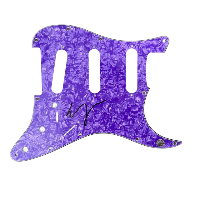
Vampire Weekend Ezra Koenig Signed Guitar Pickguard Autograph Hologram COA
$100.00 USD
-
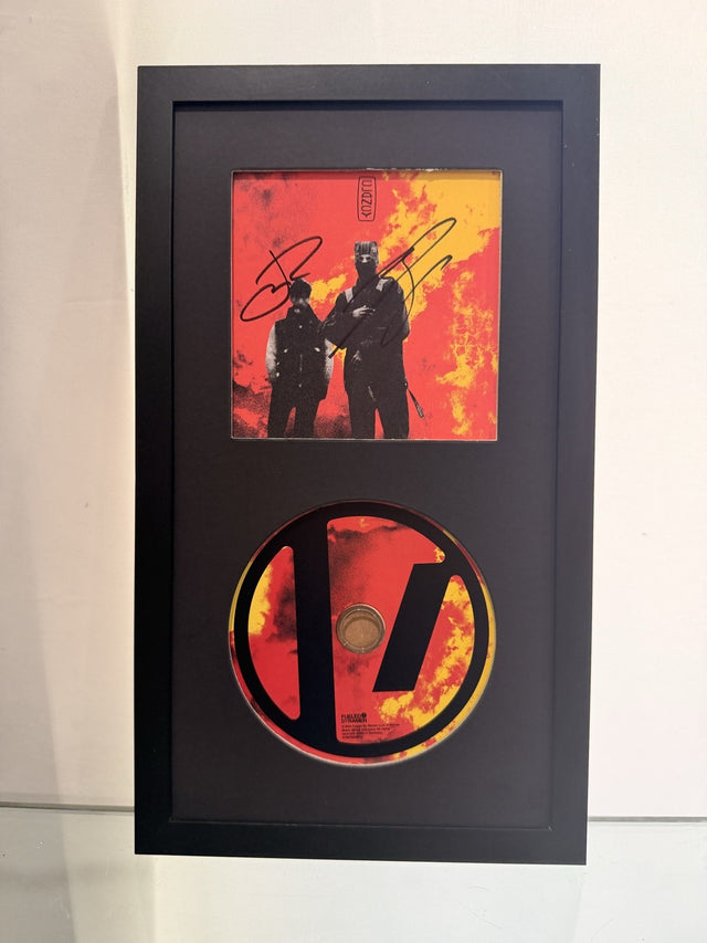
Twenty One Pilots Signed Clancy CD Framed Display Tyler Joseph Josh Dun Auto
$199.00 USD
-
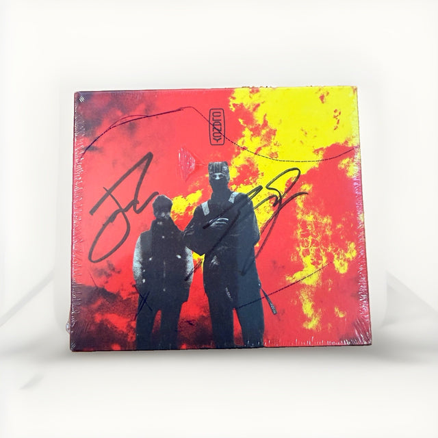
Twenty One Pilots Clancy Signed CD Tyler Joseph Josh Dun Sealed Unopened 2024
$189.00 USD
-

Twenty One Pilots Clancy Signed CD Sealed Tyler Joseph Josh Dun Silver Autograph
$189.00 USD
-
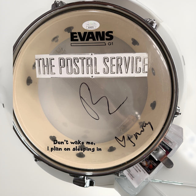
The Postal Service Dual Signed Evans M-80 Drumhead JSA A40371
$499.00 USD
-

The Head and the Heart Band Signed Framed 'aperture' CD COVER ALBUM
$65.00 USD
Browse the collection for current listings.