Art for the Home Office & Creative Studio: What to Hang, How to Scale It, and How to Choose Pieces That Hold Value
Direct answer: For a home office, hang art that supports the mental state you actually work in. Choose energizing pop and street art (bold color, strong graphics) for a desk wall you want to feel motivated at, and calmer, more tonal works for the zone behind you that shows up on video calls. Scale the piece to the wall, not the desk: a single work should span roughly two-thirds the width of the furniture beneath it, and a gallery cluster should read as one shape. Frame prints properly (acid-free mat, UV-filtering glazing), mix two or three framed prints with one designer figure on a shelf for dimension, and prioritize authenticated pieces from artists with real secondary-market demand so your decor doubles as an asset. Below is the practical playbook, room zone by room zone.
A home office is the one room where your walls are on camera, in your peripheral vision eight hours a day, and quietly shaping your focus. That makes it the highest-leverage room to get right. This guide is written for people who want their workspace to look intentional, feel motivating, hold up on a Zoom call, and — if they're buying real prints and editions — appreciate rather than depreciate. If you want the styling-first companion piece, start with our guide to authenticated art as home decor, then come back here for the office-specific decisions.
Start With How You Want the Room to Feel
Before you shop for a single piece, decide what the room is for emotionally. Most home offices are trying to do two contradictory things at once — energize you for deep work and calm you enough to think — and the art can carry that load if you zone it deliberately.
Energizing vs. calming: match art to the task
High-saturation pop and street art — think bold reds, electric blues, hard graphic edges — reads as stimulating. It's a good match for the wall you face when you want momentum: the sales-call wall, the ship-it wall, the wall behind your monitor that pushes you forward. Quieter, more tonal work — muted palettes, negative space, single-color fields — lowers the visual volume and suits the reading-and-thinking zone or a small-office where a loud piece would overwhelm the square footage.
A simple rule: the smaller and more enclosed the room, the calmer the dominant piece should be, with energy delivered in smaller accent works. In a large studio you can lead with a statement piece and let it set the tempo.
The three zones of a working office
- The focus wall — what you face while working. This is where a motivating statement piece earns its keep.
- The backdrop — what sits behind you on video calls. This wall is styling, not stimulation; it should read as composed and credible, never busy.
- The peripheral shelf — bookcase, credenza, or floating shelf where a designer figure or a small framed print adds depth without competing for wall space.
The Video-Call Backdrop: Your Most-Seen Wall
The wall behind you during calls is seen by more people than any physical visitor will ever be. Treat it as a set, not an afterthought.
What reads well on camera
Webcams compress and slightly wash out color, so pieces with strong contrast and clear composition survive the format; fine detail and subtle tonal work turns to mud. One confident piece or a tidy two-by-two grid behind you looks intentional. A sprawling salon wall reads as chaotic on a small video tile and pulls focus from your face.
Positioning to avoid the "trophy over the head" look
Center art off to one side behind you rather than directly, halo-like, over your head. Hang it so the art's center lands roughly at or just above your seated shoulder line in frame — too high and it floats out of the shot; too low and it disappears behind you. Angle a light so the glazing doesn't throw a glare hotspot into the camera; matte or anti-reflective glazing helps enormously here.
A quick backdrop checklist
- One strong piece or a clean grid — never a cluttered cluster.
- Bold contrast over fine detail.
- Art positioned to one side, centered near shoulder height in the frame.
- No direct glare on the glazing.
- Nothing you wouldn't want a client, recruiter, or investor to read into.
Scaling Art to a Desk Wall
The single most common mistake in home offices is art that's too small — a postage-stamp print marooned on a wide wall above a desk. Scale is what separates "intentional" from "renter energy."
The two-thirds rule
A piece (or a grouping treated as one piece) hung above a desk or credenza should span roughly 60–75% of the furniture's width. Below that, it looks lost; much above it and the proportions feel top-heavy. For a standard 60-inch desk, that means artwork or a grouping roughly 36–45 inches wide.
Height and hang line
Center the artwork's midpoint at about 57–60 inches from the floor — standard gallery eye level — unless it hangs over furniture. Over a desk, leave roughly 6–10 inches of breathing room between the top of the desk (or monitor) and the bottom of the frame so the two elements relate as a group rather than colliding.
Single statement vs. gallery grid
| Approach | Best for | Watch-outs |
|---|---|---|
| Single large piece | Focus walls, video backdrops, small rooms wanting calm | Must be scaled correctly — small solo pieces look accidental |
| Two-by-two or three-print grid | Desk walls, collectors mixing related editions | Keep consistent frames and even gaps (2–3 in) so it reads as one shape |
| Asymmetric gallery cluster | Large studios, peripheral walls away from camera | Anchor with the largest piece; too many sizes reads as noise on calls |
| Print + shelf figure combo | Adding depth, breaking a flat wall | Let one element dominate; don't let the figure and the print compete |
Mixing Prints With a Designer Figure on a Shelf
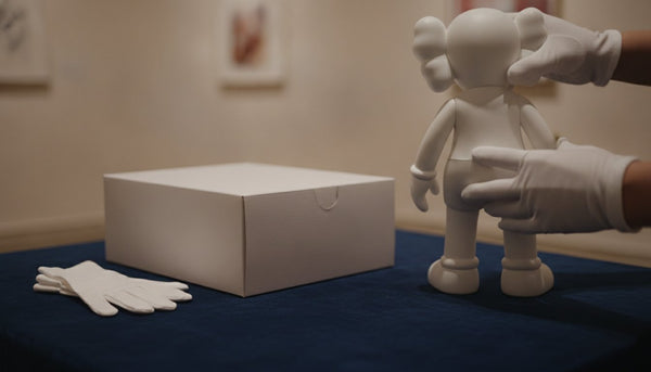
Flat walls of framed prints can feel one-note. Introducing a three-dimensional object — a designer vinyl figure, a sculpture, a collectible art toy — adds depth, a focal accent, and a bit of personality that signals a real collector rather than a catalog order.
Why the print-plus-object mix works
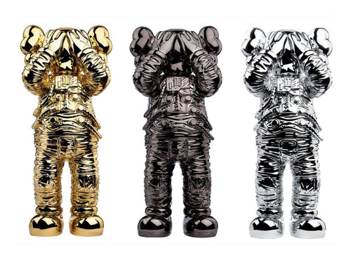
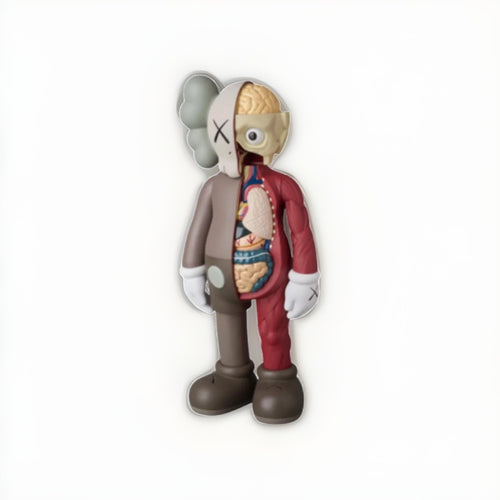
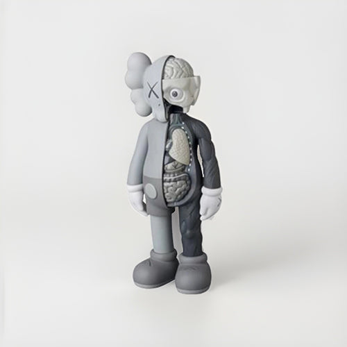
Two framed prints on the wall and one designer figure on the shelf beneath creates a layered composition: your eye travels from the two-dimensional graphic on the wall down to the sculptural object, and the negative space between them does the styling. It's the same logic galleries use — vary the plane, vary the scale, and let the arrangement breathe. Explore designer figures and art toys in our KAWS collection, and see the full range of graphic prints in the pop art collection.
Styling the shelf
- Give the figure air — don't crowd it with books and mugs. One object, well-lit, beats a shelf full of clutter.
- Echo a color. If the figure picks up the red or blue in the prints above, the whole vignette locks together.
- Mind the sightline. On a video call, a single sculptural object on a shelf reads as tasteful; a row of them reads as a merch shelf.
- Protect it. Keep vinyl figures out of direct sun to prevent fading and out of arm's reach of a rolling desk chair.
Lighting the Art (Without Frying It)
Lighting is the difference between a piece that glows and one that hides in shadow. But in an office full of screens and a window, lighting art is a balancing act between visibility, glare, and conservation.
Get light onto the art — from the right angle
Aim to light artwork from above at roughly a 30-degree angle. Steeper, and you cast harsh top-down shadows from the frame; shallower, and the light rakes across the glazing and bounces glare straight into your eyes or your webcam. Small picture lights, adjustable track heads, or a directional floor lamp angled at the wall all work. The goal is even wash across the piece, not a hotspot in the middle.
Warm vs. cool bulbs
A warm-white bulb in the 2700–3000K range flatters most paper-based prints and keeps the room feeling like a study rather than an operating theater. Very cool, blue-white light can make warm-toned work look flat and clinical. If your monitor and overheads run cool, a warm accent light on the art restores balance to the room.
Protect the piece from its own spotlight
Light is cumulative damage. Keep any fixture far enough back that it doesn't heat the frame, avoid pointing a bright bulb at a valuable print for eight hours a day, and lean on the UV-filtering glazing discussed below. The brightest, most sun-drenched wall in the room is the worst place for anything you want to keep.
Using Color to Steer the Room's Mood
The palette on your walls does quiet psychological work all day. You don't need a color-theory degree — just a few reliable pairings.
Reds and warm tones for drive
Red, orange, and hot pink read as energetic and attention-grabbing — useful on a focus wall, in small doses, or as the accent that pulls a room together. In large fields they can feel aggressive over a full workday, so let saturated warm color arrive as an accent rather than the whole wall.
Blues and greens for focus and calm
Cooler blues and greens read as steady and low-stress, which is why they suit reading zones, small rooms, and the video backdrop where you want to look composed rather than frantic. A predominantly blue or green graphic piece behind you on calls signals calm competence.
Let the art set the palette, then echo it
The cleanest rooms pull one or two colors out of the art and repeat them elsewhere — a red in the print echoed in the figure on the shelf, a blue echoed in a desk accessory. That repetition is what makes a space look designed rather than assembled. You don't need to match everything; you need one deliberate thread of color running through the room.
Framing and Protection: Where Value Is Won or Lost
For anyone buying real prints and editions, framing isn't decoration — it's conservation. Bad framing can permanently damage a piece and erase its resale value; good framing protects both the object and the investment.
The non-negotiables
- Acid-free, archival mat and backing. Standard mats yellow and can leach acid into the paper, causing burns and staining that are effectively irreversible.
- UV-filtering glazing. Museum-grade acrylic or UV glass slows the fading that direct and even indirect light causes over years. This matters doubly in a sunlit office.
- Reversible mounting. Never dry-mount, trim, or permanently glue a collectible print. Hinged, reversible mounting keeps the work — and its value — intact.
- Keep it off the sun wall. No amount of glazing fully defeats a south-facing window. Hang valuable work on a wall that doesn't take direct sun.
Float vs. mat
A window mat (a border of mat board around the image) is the classic, protective choice and visually formal. A float mount (the print raised so its full sheet and deckled edges show) suits works where the paper edge is part of the object. Both are fine; both should use archival materials. The wrong move is a cheap frame with a paper mat pressed directly against the artwork.
Choosing Authenticated Pieces That Hold Value
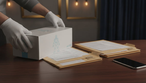
The difference between office decor and a collection is authentication. A piece with clean provenance and the correct paperwork can hold or grow in value; the same image without it is just a poster. If you want your walls to double as an asset, buy authenticated work and understand how each artist's chain of authenticity actually works — because they are not interchangeable.
Authentication is artist-specific — never mix the chains
| Artist / category | How authenticity is established |
|---|---|
| Shepard Fairey (OBEY) | Established through provenance and documentation history; no single central issuing body validates every print. |
| Banksy | Authenticated exclusively through Pest Control, the artist's official handling service. No other body can validate a Banksy. |
| KAWS & BE@RBRICK figures | Verified via TrueCOA blockchain certificates. |
| DEATH NYC | Accompanied by a Certificate of Authenticity with a gold seal. |
| Andy Warhol works | Verified via TrueCOA. |
| Signed music & memorabilia | Authenticated by recognized third-party services such as Beckett, JSA, or PSA. |
The critical rule: these systems are distinct and must never be conflated. A gold-seal COA belongs to DEATH NYC, not to a Banksy; a Banksy is validated by Pest Control alone. Anyone offering the "wrong" chain for an artist is a red flag. For the deeper collector framework — comps, holding periods, and market context — see our financial insights resource and the collector's hub.
What actually holds value in a workspace
Prioritize named artists with an active secondary market, editions with documented sizes, and works you can verify. Signed and numbered limited editions from in-demand street and pop artists tend to hold value better than open-edition giclée reproductions, which are decor first and rarely appreciate. Condition is everything — which loops straight back to framing and sun exposure. Browse the vetted range on our art index or the full catalog at all works.
Building the Wall by Budget
You can furnish an office wall at almost any budget — the trick is knowing what each tier buys you and how it behaves over time. The through-line: buy fewer, better, authenticated pieces rather than many disposable ones.
Entry: one great piece over many mediocre ones
Starting out, resist the urge to fill every wall. A single well-chosen, properly framed print anchors a room better than a dozen open-edition posters. Open-edition giclée reproductions are legitimate decor, but understand they're decor first — they rarely appreciate and shouldn't be confused with limited editions.
Mid: signed, numbered limited editions
The sweet spot for most collectors is signed and numbered limited editions from artists with genuine secondary-market demand. Documented edition sizes, an artist's signature, and clean provenance give the piece a floor under its value and a reason to hold up over time. This is where decor and asset start to overlap.
Upper: blue-chip street and pop art
At the top tier, established names with deep auction histories function as both statement pieces and stores of value. Here, condition and authentication are everything, and the paperwork chain matters as much as the image. This is the tier where a single wall can hold real, trackable worth — which is exactly why the authentication rules below are non-negotiable.
Common Mistakes to Avoid
- Hanging too small. The number-one error. Undersized art on a big wall reads as accidental. Scale to the wall and furniture, not to your caution.
- Hanging too high. Art marooned near the ceiling floats out of frame on calls and out of eye line at the desk. Aim for the 57–60 inch center, lower over furniture.
- Cheap framing on a good print. A non-archival mat pressed to the paper can permanently damage a valuable piece. Never economize on framing for anything you want to keep.
- The sun wall. Direct light fades work over months and years. Don't hang anything you value on a window-facing wall.
- A cluttered video backdrop. Too many pieces behind you read as chaos on a small tile. Edit ruthlessly.
- Mixing authentication chains. A COA style that belongs to one artist attached to another is a red flag. Learn the correct chain per artist and insist on it.
- Buying image over provenance. The same picture with and without documentation are two completely different assets. Pay for the verified one.
Putting It Together: Three Office Setups
The motivator (open-plan, big wall)
Lead with one large, high-contrast pop or street-art piece on the focus wall, scaled to two-thirds of the wall. Keep the video backdrop simple — a single quieter work off to one side. Add a designer figure on the credenza to pick up the accent color.
The small studio (calm, compact)
Choose a calmer, tonal statement piece as the anchor so the room doesn't feel loud. Deliver energy through one small, saturated accent print near the desk. Skip the gallery wall; in tight rooms, restraint reads as expensive.
The collector's office (mixed media)
Run a clean two-by-two grid of related editions on the desk wall with consistent frames, then layer a sculptural figure on a nearby shelf. Everything authenticated, everything documented, everything framed archivally — decor that quietly appreciates.
Frequently Asked Questions
What kind of art is best for a home office?
Art that matches the mental state you work in. Bold, high-contrast pop and street art energizes a focus wall, while calmer tonal pieces suit small rooms or reading zones. Above all, scale it correctly to the wall and, if you're investing, choose authenticated pieces from artists with real secondary-market demand.
How big should the art above my desk be?
A piece or grouping above a desk should span roughly 60–75% of the desk's width — about 36–45 inches over a standard 60-inch desk. Leave 6–10 inches of space between the top of the desk or monitor and the bottom of the frame so they read as a group.
What's the best art for a video-call background?
One strong piece or a tidy grid with bold contrast reads best; fine detail washes out on webcams. Position art to one side behind you, centered near shoulder height in the frame, and angle lighting to avoid glare on the glazing. Avoid sprawling gallery walls, which look chaotic on a small tile.
How do I mix prints with a designer figure without it looking cluttered?
Let one element dominate. Hang two framed prints on the wall and place a single designer figure on the shelf beneath, giving it room to breathe. Echo a color from the prints in the figure so the vignette locks together, and avoid lining up multiple figures, which reads as a merch shelf rather than a collection.
Does framing really affect an artwork's value?
Yes. Non-archival mats and mounting can permanently stain or damage paper and erase resale value, while acid-free materials, UV-filtering glazing, and reversible mounting protect both the object and its worth. Never dry-mount or trim a collectible print, and keep valuable work off direct-sun walls.
How do I know a street-art or pop-art piece is authentic?
Authentication is artist-specific and the systems must never be mixed. Banksy is validated only through Pest Control; KAWS and BE@RBRICK figures use TrueCOA; DEATH NYC carries a gold-seal COA; Warhol works use TrueCOA; Shepard Fairey relies on provenance and documentation; and signed music memorabilia uses Beckett, JSA, or PSA. Buy from sellers who provide the correct chain for that specific artist.