Framing & Finishes: Matching Art to Your Interior Style
To choose frames that match your interior style, start by identifying your room's dominant register — minimalist, mid-century, traditional, industrial, or maximalist — then pick a frame profile, material, and mat that echo it: thin matte-black or raw aluminum for minimalist and industrial spaces, warm oak or walnut for mid-century rooms, gilded or wide hardwood mouldings for traditional interiors, and bold color or ornate profiles for maximalist walls. Whatever the style, the framing that touches the artwork should always be conservation-grade: acid-free (rag or alpha-cellulose) mats and backing, UV-filtering glazing, and reversible hinges with no dry-mounting. Design decisions live on the outside of the frame; conservation decisions live on the inside, and they protect both the art and its long-term value.
A frame does two jobs at once. On the wall it is a design object — it either belongs in the room or fights it. Behind the glass it is a preservation system — it either shields the art from light, acid, and moisture or slowly damages it. The best framing decisions honor both jobs simultaneously. This guide walks through frame styles by interior, the mat and glazing choices that matter, mounting methods that protect value, and why, for authenticated and collectible art especially, conservation framing is not optional. For the storage-and-insurance side of the same equation, see our companion guide on how to store, frame, and insure fine-art prints.
Frame Styles by Interior: A Quick Map
Before the details, a comparison at a glance. Use this as a starting point, then adapt to your specific piece and room. The right answer is the one that lets the art breathe while feeling native to the space.
| Interior Style | Frame Profile | Material & Finish | Mat Approach | Glazing |
|---|---|---|---|---|
| Minimalist / Scandinavian | Thin, square-edge, low profile | Matte black, natural or white-washed ash, brushed aluminum | Generous white mat or no mat (float) | Anti-reflective UV (museum) or standard UV |
| Mid-Century Modern | Slim to medium, clean rectangular | Warm walnut, teak, natural oak | Medium cream or warm-white mat | UV-filtering; museum glass for prized pieces |
| Traditional / Classic | Wide, stepped or ornate moulding | Gilded gold, dark stained hardwood, burnished finishes | Wide mat, sometimes double mat with a fine liner | UV-filtering; anti-reflective for glare-heavy rooms |
| Industrial / Loft | Flat, raw, utilitarian | Blackened or raw steel, gunmetal, dark aluminum | No mat (float) or narrow charcoal mat | Anti-reflective UV; acrylic for very large pieces |
| Maximalist / Eclectic | Bold, wide, or mixed profiles in a salon wall | Lacquered color, ornate gilt, mixed woods and metals | Colored, extra-wide, or double mats | UV-filtering across the wall for consistency |
Minimalist and Scandinavian Rooms: Let the Frame Disappear
In pared-back interiors, the frame's job is to vanish so the art and the negative space around it do the talking. The mistake here is over-framing — a heavy or decorative moulding reads as clutter against clean plaster walls and simple furniture.
What to Reach For
Choose a thin, square-edge profile in matte black, raw or white-washed ash, or brushed aluminum. Widths in the slim range keep the visual weight low. A wide white mat is your friend: it creates a quiet buffer of breathing room that feels intentional and calm. For photographs and graphic prints, consider skipping the mat entirely and floating the piece so its edges show.
When to Keep It Minimal
If your walls are already doing something — textured plaster, a bold paint color, exposed brick — let the frame be the quietest element in the composition. One well-chosen thin black frame with a broad white mat will almost always outperform a fussier option in these rooms.
Mid-Century Modern: Warm Wood, Clean Lines
Mid-century interiors pair organic warmth with disciplined geometry, and the framing should follow suit. This is the natural home of walnut, teak, and honeyed oak in a slim-to-medium rectangular profile — frames that echo the furniture's tapered legs and warm tones without competing with them.
Mat and Tone
A medium cream or warm-white mat bridges the wood frame and the artwork. Avoid stark bright-white mats with warm-wood frames — the temperature mismatch can look accidental. For a cohesive gallery grouping, keep the wood species and mat tone consistent even when frame sizes vary.
A Note on Iconic Graphic Prints
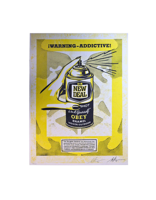
Bold graphic and street-derived work sits beautifully in mid-century rooms. A Shepard Fairey screenprint, for instance, carries strong flat color and heavy line — a warm walnut frame with a clean cream mat lets that graphic punch land without fighting it. Browse the kind of graphic and pop pieces that suit these rooms in our art index.
Traditional and Classic Interiors: Presence and Proportion
Traditional rooms — think crown moulding, rich textiles, and formal symmetry — can carry framing with real presence. Here a wider, stepped, or gently ornate moulding is not clutter; it is part of the language of the room.
Gilded and Hardwood Options
Gilded gold and burnished finishes lend gravitas and pair naturally with classical and figurative work. Dark stained hardwoods offer a slightly more restrained route that still reads as formal. The key is proportion: the frame's width should feel balanced against the art's size and the wall's scale. A too-narrow frame on a large classical piece looks undersupported.
Double Mats and Liners
Traditional framing often uses a wide mat, sometimes a double mat with a thin colored liner that picks up a hue from the artwork. This adds depth and a sense of craft. Keep every layer that touches or surrounds the art acid-free — decoration and conservation are not in conflict here.
Industrial and Loft Spaces: Raw and Utilitarian
Industrial interiors — concrete, exposed ductwork, steel, reclaimed wood — call for framing with an honest, unfussy character. Flat, utilitarian profiles in blackened or raw steel, gunmetal, or dark aluminum feel native to these rooms.
Float Mounts and Narrow Mats
Floating the artwork — where the print appears to hover on a backing with its edges visible — suits the industrial aesthetic's love of exposed structure. When you do use a mat, a narrow charcoal or deep-gray mat reads more industrial than a wide bright-white one.
The Glare Problem
Loft spaces often have big windows and hard light. Anti-reflective museum glazing earns its keep here by cutting glare on large pieces. For very large or high-traffic installations, UV-filtering acrylic (rather than glass) reduces weight and shatter risk — a practical consideration in open, active spaces.
Maximalist and Eclectic Walls: Curated Abundance
Maximalism thrives on layering, color, and the salon-style gallery wall. Here framing becomes part of the show rather than a neutral container. You can mix profiles, materials, and even eras — but there should be a thread that ties the wall together.
Finding the Through-Line
Pick one unifying element and let everything else vary. That anchor might be a shared mat tone, a repeated frame color, a consistent metal finish, or a common glazing type across the whole wall. Consistent UV-filtering glazing is an easy, invisible through-line that also protects every piece equally. Bold lacquered color frames, extra-wide mats, and ornate gilt can all coexist when one deliberate constant holds them together.
Planning the Arrangement
Lay the grouping out on the floor first, or cut paper templates and tape them to the wall. For a collector building toward a considered wall over time, our collector resources cover how to think about acquisition, arrangement, and long-term care as a coherent practice.
Mats: The Choice That Quietly Governs Everything
The mat (or mount) does more than fill space. It creates a visual rest between art and frame, and — critically — it holds the artwork's surface off the glazing. Art pressed directly against glass can stick, trap condensation, and develop mold or surface damage. The mat's spacing function is a conservation feature, not just an aesthetic one.
Width and Proportion
As a general starting point, wider mats read as more gallery-like and give the eye room to settle; narrow mats feel more contemporary and compressed. Larger and more valuable works often benefit from more generous mat borders. There is no single correct width — balance it against the piece and the room — but err toward slightly wider rather than cramped.
Acid-Free Is Non-Negotiable
Standard paper mats contain lignin and acids that, over years, cause the dreaded brown "mat burn" line and yellowing on the artwork. Always specify 100% cotton rag or buffered alpha-cellulose (conservation or museum grade) for any mat and backing board that touches or surrounds art you care about. This single choice prevents one of the most common and avoidable forms of paper damage.
Glazing: Museum and UV Glass Protect Value
Glazing is the clear layer — glass or acrylic — between the viewer and the art. It is also the front line of light protection, and the choice here has real consequences for both appearance and long-term value.
UV-Filtering Glazing
Ultraviolet light is a primary driver of fading in inks, pigments, and paper. Conservation-grade glazing filters a high percentage of UV, dramatically slowing fading and paper degradation. For any print with pigment or dye that can shift — which is most works on paper — UV filtering is the baseline standard, not a luxury.
Anti-Reflective and Museum Glass
"Museum glass" typically combines strong UV filtering with an anti-reflective coating that makes the glazing nearly disappear, so you see the art rather than a mirror of the room. It costs more, but for signed, limited-edition, or authenticated pieces the improvement in both viewing and protection is substantial. In bright or glare-prone rooms, the anti-reflective quality alone can transform how a piece reads.
Glass Versus Acrylic
Glass is more scratch-resistant and stays flatter; conservation and museum glass are glass products. Acrylic (often UV-filtering) is far lighter and shatter-resistant, which matters for very large pieces, high-traffic areas, or shipping. The trade-off: acrylic scratches more easily and can carry a static charge, so it is generally avoided for charcoal, pastel, or loose-media works that can lift toward it.
Float Mounting and Reversible Hinging: Mount Without Damage
How the artwork is held inside the frame is where conservation is won or lost. The governing principle is reversibility: any mounting should be undoable without harming the piece.
Float Mounting
Float mounting presents the artwork raised slightly off a backing board so its full sheet — including deckled or torn edges — is visible, often with a shadow gap around it. It suits minimalist, industrial, and contemporary rooms and celebrates the paper as an object. Done correctly, the piece is supported by discreet, reversible corner mounts or hinges, never adhered face-down across its whole back.
Reversible Hinging — and What to Avoid
Conservation framing attaches works on paper with reversible hinges — traditionally Japanese tissue with a wheat or rice starch paste, or acid-free archival photo corners for smaller sheets. These can be removed later without tearing or residue.
What to avoid is just as important: never allow dry-mounting (heat-bonding the artwork permanently to a board), pressure-sensitive tapes, masking tape, or ordinary adhesives on collectible or authenticated art. Dry-mounting is essentially irreversible and can significantly reduce a work's value and its acceptability at auction or resale. If a framer proposes dry-mounting a signed or limited-edition print, decline it.
Metal Versus Wood: Choosing the Frame Material
Beyond style, the frame's material shapes both look and practicality. Neither is universally "better"; they simply serve different rooms and pieces.
Metal Frames
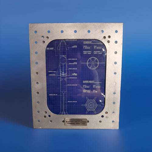
Metal (usually aluminum, sometimes steel) offers thin, precise profiles and a clean, contemporary line. It excels in minimalist and industrial rooms, comes in matte black, silver, gunmetal, and colored finishes, and is dimensionally stable. Its slimness is the point — it recedes. The limitation is presence: metal rarely delivers the warmth or gravitas that wood can.
Wood Frames
Wood brings warmth, depth, and a huge range of profiles from slim to ornate. Walnut and oak anchor mid-century rooms; gilded and stained hardwoods carry traditional interiors. Wood can be as quiet or as commanding as the moulding you choose. For conservation, the essential point is that the wood must never contact the art directly — the acid-free mat, backing, and spacers do that job, isolating the artwork from the frame material.
When to Keep It Minimal — and When Not To
A recurring question is how much frame a piece "deserves." A useful rule: let the busier element lead. If the artwork is bold, graphic, and color-saturated, a quiet frame gives it room. If the artwork is subtle, tonal, or classical, a frame with more presence can complete it. And if the room itself is loud — strong wall color, heavy pattern, lots of competing objects — restraint in the frame usually wins.
For collectors, there is also a value dimension. Simple, high-quality conservation framing rarely dates and travels well between homes and even between owners. Over-styled or trend-driven framing can feel dated in a few years and may need redoing. When a piece is authenticated or limited-edition, conservative, reversible framing protects optionality: you preserve the ability to reframe, sell, or consign without having compromised the work.
Why Conservation Framing Protects Authenticated Art
For authenticated and collectible pieces, framing is part of stewardship. Light damage, acid burn, and irreversible mounting don't just harm the object — they erode the market value and the credibility of the piece when it changes hands. Conservation framing is how you keep an authenticated work in the condition its documentation implies.
Framing and the Authentication Chain
Different artists and makers carry different authentication standards, and good framing practice respects that chain rather than muddying it. A few examples of how authentication works across categories we handle:
- Shepard Fairey / OBEY works are authenticated through provenance and the pieces themselves — keep original signatures, edition numbering, and any dated markings fully visible and undamaged; never trim or dry-mount a signed sheet.
- Banksy works are authenticated solely through Pest Control; framing should never obscure or endanger documentation tied to that verification.
- KAWS and BE@RBRICK collectibles are verified via TrueCOA blockchain certification — preserve packaging and any associated certificates alongside the display piece.
- DEATH NYC pieces come with their COA and gold seal — keep the certificate and seal intact and stored with the work.
- Andy Warhol works in our care are verified through TrueCOA — conservation framing preserves both the print and the documentation that supports it.
- Signed music memorabilia is authenticated by Beckett, JSA, or PSA — frame so the certification and matching signature remain verifiable and undisturbed.
The common thread: never let framing damage a signature, obscure edition information, or separate a piece from its certificate. When in doubt, choose the reversible, conservation-grade route. For how framing choices intersect with a work's market value over time, our financial insights pages give useful context, and our buyer's guides cover authentication category by category.
Putting It Together: A Simple Decision Path
When you stand in front of a new piece, work in this order. First, name the room's dominant style and pick a frame profile and material that belong to it. Second, choose a mat approach — wide and warm for traditional and mid-century, minimal or floated for contemporary and industrial — and specify acid-free throughout. Third, select glazing: UV-filtering as the floor, museum glass for prized and authenticated pieces. Fourth, insist on reversible hinging and refuse dry-mounting on anything collectible. Get those four right and the frame will both flatter the room and protect the art for decades.
Ready to find pieces worth framing this well? Explore the full collection at our complete catalog or start with the curated art index.
Frequently Asked Questions
How do I choose a frame to match my interior style?
Identify your room's dominant register first, then match the frame to it: thin matte-black or aluminum profiles for minimalist and industrial spaces, warm walnut or oak for mid-century rooms, wide gilded or hardwood mouldings for traditional interiors, and bold color or ornate profiles for maximalist walls. Let the busier element — art or room — lead, and keep the framing that touches the art conservation-grade regardless of style.
Is museum or UV glass really worth the extra cost?
For any work on paper, UV-filtering glazing is the baseline standard because ultraviolet light is a primary cause of fading. Museum glass adds an anti-reflective coating that makes the glazing nearly disappear. For signed, limited-edition, or authenticated pieces — where fading directly erodes value — the upgrade is well justified. In bright or glare-heavy rooms, the anti-reflective quality alone transforms how the art reads.
What is float mounting and when should I use it?
Float mounting raises the artwork slightly off a backing board so the entire sheet, including natural or deckled edges, is visible — often with a shadow gap around it. It suits minimalist, industrial, and contemporary interiors and celebrates the paper as an object. Done correctly it uses discreet, reversible corner mounts or hinges and never adheres the sheet permanently across its back.
Should I choose a metal or wood frame?
Choose metal for thin, precise, contemporary profiles that recede — ideal in minimalist and industrial rooms. Choose wood for warmth, depth, and a wide range of profiles from slim mid-century walnut to ornate traditional gilt. Neither is inherently better; the material should match the room and the piece. In both cases the frame must never touch the art directly — acid-free mats, backing, and spacers isolate the work.
Why does conservation framing matter for authenticated art?
Authenticated and collectible pieces derive value from their condition and their documentation. Light damage, acid burn from non-archival mats, and irreversible mounting like dry-mounting all reduce value and can compromise a piece at resale or auction. Conservation framing — acid-free materials, UV glazing, reversible hinging, no dry-mounting — keeps the work in the condition its authentication implies and preserves your ability to reframe or sell later.
Can I dry-mount a signed or limited-edition print to keep it flat?
No. Dry-mounting heat-bonds the artwork permanently to a board and is effectively irreversible, which can significantly reduce the value of a signed or limited-edition print and hurt its acceptability at auction. Use reversible conservation hinging — Japanese tissue with starch paste, or acid-free archival photo corners — instead. If a framer suggests dry-mounting a collectible piece, decline it.