No body of work states Shepard Fairey’s central preoccupation more explicitly than the Duality of Humanity series. The title is almost a thesis statement for the entire career: the human being as a creature capable, in the same instant, of tenderness and atrocity. It is the series that names his whole project — and, for the collector who reads Fairey as a single continuous argument rather than a catalog of pretty prints, it is the intellectual spine to which everything else attaches.
Where the punk and peace threads represent the two poles of Fairey’s influences — the snarl of Sid Vicious and the sincerity of John Lennon — Duality of Humanity puts those poles inside a single frame and forces them to coexist. It refuses the comfort of a clean position. That refusal is easy to miss on a first pass, because the surfaces are so seductive: the ornamental borders, the radiating lines, the confident reds and creams and blacks. But the seduction is the argument. Fairey builds a beautiful object out of unbearable material and dares you to hold both at once. And that refusal is exactly what has given the series its unusual longevity, in a genre — protest art — that usually expires the moment its headline does.
September 2008: The White Walls Exhibition
The series anchored a solo exhibition of the same name at White Walls Gallery, 835 Larkin Street, San Francisco. It opened with a reception on September 13, 2008 and ran through early October, and it was Fairey’s third solo show with the gallery — by then his most substantial, gathering well over a hundred pieces including one of the largest groupings of his canvas works assembled in a single room to that point.
The timing was not incidental; it was the whole atmosphere of the work. The show opened in the final weeks of the 2008 election, only months after Fairey had made the HOPE portrait of Barack Obama that would turn him from a well-known street artist into a nationally consequential one. In his own framing of the exhibition, his recent turn toward optimism came directly from his involvement with, and inspiration by, the political ideals of the Obama campaign. Yet the war in Iraq was still grinding on in the background, and the images on the walls were anything but triumphant. The result is a body of work caught precisely between hope and dread — a tentative optimism that never lets itself off the hook. Fairey described the show’s subject as the human struggle between good and bad, hope and fear, and threaded environmental anxieties — the consumption of non-renewable resources against a stated ecological intent — through the martial imagery so that the “duality” reads on more than one axis at once.
That is the first thing to understand about the series: it is not a detached meditation on war in the abstract. It is a specific object made at a specific hinge of American feeling, when the country was being asked, all at once, to hope harder and to reckon with what it had done. The Duality of Humanity works hold that contradiction still, which is part of why they have not aged into period pieces.
The Al Rockoff Collaboration
The series was built in collaboration with the combat photographer Al Rockoff, and the choice of collaborator is a large part of what gives the work its weight. Rockoff is not a decorative name borrowed for prestige. He was a freelance photojournalist in Southeast Asia in the 1970s, working in Cambodia across 1973 to 1975, and he was among the small number of Western journalists who stayed in Phnom Penh through the fall of the city and witnessed the opening brutality of the Khmer Rouge firsthand. His war photography carries a directness — a refusal to compose the horror into something comfortable — that Fairey’s stylization both honors and complicates.
Fairey drew on Rockoff’s reference images, including his photographs of teenage Khmer Rouge soldiers, and translated them into the ornamental, halftone-and-stencil language of a street artist. Stated plainly, that translation is the argument. Bringing a combat photographer’s witness into a graphic vocabulary developed on skate decks and pasted-up posters forces two registers into the same object: the beauty of the design and the horror of the source. The collaboration, in Fairey’s framing, was meant to show the brutality of war but also the conflicted humanity inside it — the fact that the figures behind the guns are frequently frightened children, not monsters.
There is a deliberate friction here that rewards attention. A photojournalist’s job is to record what was actually in front of the lens; a propaganda artist’s job, historically, is to simplify a person into a symbol. Fairey does something stranger than either: he takes documentary witness and runs it through the machinery of propaganda, not to flatten the subject but to make you feel the flattening — to make you notice how easily a real human being gets converted into an emblem of a side. The Rockoff source is what keeps the series honest. Without it, the war-and-peace motifs would risk becoming a graphic exercise. With it, every stylized soldier carries the residue of a real one.
The Vietnam ↔ Iraq Parallel
Fairey drew an explicit parallel between the complex emotions surrounding the Vietnam War and those attached to the invasion of Iraq. That parallel is the connective tissue of the whole series. Rockoff’s Southeast Asian material is roughly a generation old by 2008, but Fairey deploys it as a mirror rather than a museum piece: the moral confusion of one war made to comment on the moral confusion of another, the sense in both cases of a nation unsure whether it was liberating or destroying, and unsure how to feel about the young people it had sent to do the work.
This is why the series does not read as a history lesson about Cambodia, nor as topical commentary about Iraq. It reads as a statement about the recurrence — the way the same emotions, the same justifications, the same wreckage return in each generation wearing new uniforms. By collapsing two wars three decades apart into a single visual language, Fairey removes the escape hatch of “that was then.” The duality he is naming is not the property of any one conflict. It is a standing feature of the species.
The Title: Kubrick’s “Joker” and the Duality of Man
The title itself was inspired by the peace-sign-wearing American soldier “Joker” from Stanley Kubrick’s Full Metal Jacket — the character who wears a peace button on his body armor beside a helmet hand-lettered “Born to Kill.” When a superior officer demands to know what that contradiction is supposed to mean, Joker answers that he was trying to say something about the duality of man — “the Jungian thing, sir.” Fairey took Kubrick’s phrase, lifted it out of a single scene, and made it the organizing principle of an entire body of work.
The borrowing is exact and telling. Joker’s helmet-and-button is precisely a worn contradiction — one man carrying both the capacity to kill and the wish for peace on his own body, at the same time, without resolving them. That is the exact structure Fairey builds into image after image. He is not illustrating a debate between two camps. He is showing you a single figure who contains both impulses, the way Joker does, the way — the series insists — every person does. Kubrick gave Fairey a ready-made emblem for the thesis he had been circling his whole career, and Fairey repaid the debt by expanding one line of film dialogue into a room full of pictures.
The Iconography: Weapons Made of Peace, Peace Made of Weapons
The visual engine of the series is a deliberate collision, and Fairey runs it in both directions. Peace signs are constructed out of military hardware — rifles, jets, and ordnance assembled into the very symbol they exist to contradict. Soldiers wear the peace emblem. Weapons and flowers occupy the same composition. The most quoted image from the show depicts a child holding a gun in one hand with a flower tucked into his hat — an almost unbearable compression of innocence and violence into one small figure.
Notice how deliberately each of these motifs is engineered to deny you a resting place:
- The peace sign built from weapons — the symbol of the antiwar movement literally made of the thing it opposes, so that you cannot see the dove without also seeing the gun.
- The soldier wearing peace — Kubrick’s Joker generalized, the fighter who is also, and simultaneously, a person who wants the fighting to stop.
- The child with the gun and the flower — the collapse of the categories of victim and combatant into a single body too young to have chosen either.
- The flower beside the weapon — the 1960s gesture of a bloom in a rifle barrel, but stripped of its easy optimism and returned to a state of unresolved tension.
None of these is a slogan. Each is a knot. The point of the iconography is that it cannot be reduced to a caption without losing its meaning — the moment you resolve one of these images into “war is bad,” you have stopped looking at what it actually shows, which is that the same hand holds both.
The Speckletone Editions and the Four-Part Set
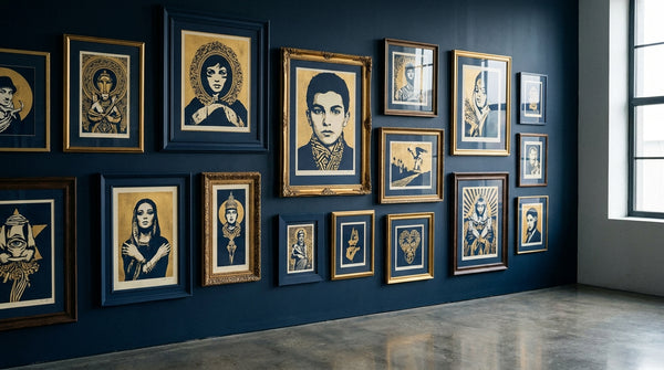
Alongside the canvases and mixed-media pieces in the exhibition, the series lives on, for most collectors, through its screen-print editions — and the editions are worth knowing in some detail, because they are the works that actually circulate. The Duality of Humanity prints were screen printed in colors on cream Speckletone fine-art paper, the soft, flecked stock that has become a signature of Fairey’s print output, at eighteen by twenty-four inches. The editions were numbered, and the prints were signed and dated by the artist.
The best-known configuration is the four-part set — Duality of Humanity 1 through 4 — released as companion images that read as a single argument across four sheets. Duality of Humanity 4, for instance, was released in November 2008 in an edition of 450. The set is prized precisely because it is a set: the four images were conceived to speak to one another, and a complete, condition-matched grouping tells the story of the series more fully than any single sheet can. That is a meaningful collecting distinction. With most print series, completeness is a nicety. With Duality of Humanity, the argument is distributed across the set, so completeness is closer to the point.
These are, therefore, not anti-war posters in any simple sense. They insist that the same species that invents the peace sign also invents the weapons the peace sign is here to protest, and that the soldier and the pacifist are frequently the same frightened human being. A poster picks a side. These prints refuse to.
A poster that simply says “war is bad” ages the moment its war ends. A body of work that says “the capacity for war and the capacity for peace live inside the same human being” does not expire, because the observation is permanent.
Against the Shout: Where the Series Sits in Protest-Art History
It helps to situate Duality of Humanity against the anti-war print tradition it extends — because its innovation only becomes visible in contrast. Twentieth-century protest imagery, for all its variety, shares a basic rhetorical strategy: it picks a side and shouts. The photomontage of the Weimar era assembled found images into blunt indictments of militarism and its financiers. The silkscreen posters of the 1960s and early 1970s turned peace symbols, doves, and defiant slogans into a graphic language of righteous opposition. The tradition is built on clarity of accusation. It names a villain and rallies against him.
Fairey’s innovation is to refuse the shout. His soldiers are not villains and his pacifists are not saints; they are the same person seen from two angles. He keeps the visual force of the propaganda tradition — the bold flat color, the arresting central figure, the ornamental authority borrowed from the very regimes such art usually opposes — but he empties it of the certainty that normally accompanies that force. He hijacks the aesthetics of the shout to deliver something that is not a shout at all, but a question the viewer cannot answer on the way past.
This is a genuinely unusual position within the genre, and it is the source of the work’s durability. Protest art that picks a side is only as durable as the fight it belongs to; when the war ends, the poster becomes a period document. Protest art that locates the conflict inside the human being cannot be retired by any ceasefire, because the war it depicts never fully ends. For the collector thinking in decades rather than seasons, that durability of meaning is the whole game. The pieces that keep saying something true after their news cycle has passed are the pieces that keep their place in the story of the art.
Why the Series Is the Catalog’s Intellectual Spine
For a serious collector, Duality of Humanity is arguably the most intellectually load-bearing print series in Fairey’s catalog — and the case for that claim is worth making in full, because it changes how the rest of the catalog reads.
It names his subject. Fairey’s entire practice, from the OBEY sticker campaign forward, is about the tension between power and dissent, obedience and resistance, the seductive image and the critical mind. Duality of Humanity is the one series whose title states that preoccupation outright. Everything else in the catalog can be read as a variation on this theme; this is the theme, given a name.
It reconciles his two lineages. The punk works — the Sid Vicious portraits, the Sex Pistols and Clash imagery — carry the aggression and refusal Fairey absorbed at fourteen. The peace works — the Lennon and Ono portraits — carry the sincerity and yearning he took from the Beatles’ activist wing. Those two inheritances pull in opposite directions everywhere else in the catalog. Only in Duality of Humanity are they made to occupy the same frame and account for each other. The series is where the snarl and the sincerity finally meet.
It documents his method at full maturity. By 2008 Fairey’s technique had reached its complete form: the layered collage of found media, the halftone dots, the ornamental propaganda borders, the stenciled central figure, the flat commanding palette. The series is a fully mature demonstration of the aesthetic, not an early experiment toward it.
It sits at the exact chronological hinge of the career. The show opened in the same season as HOPE, at the precise moment the underground provocateur became a nationally consequential political artist and entered the national conversation. To hold a work from this series is to hold an object made at the pivot point of the whole story — with the street years behind it and the museum years just ahead.
Works from this series therefore reward the collector who cares about meaning, because their meaning is not decorative varnish — it is the entire point. The numbered editions on Speckletone, signed and dated in the artist’s hand, are exactly the kind of object where the values that govern Fairey collecting do the work of establishing worth. You are not buying a pretty print that happens to carry a theme. You are buying the theme itself, in its clearest statement.
Collecting the Series
Shepard Fairey collecting rests entirely on the fundamentals — the artist’s own signature, the edition numbering and date, documented provenance, and condition, rather than any third-party certificate program — so the discipline for Duality of Humanity works is old-fashioned and straightforward:
- Favor signed, numbered, dated editions in strong condition. Study the pencil signature and the fraction-style edition number and date in the lower margin; look at many examples of the artist’s hand before committing.
- Prize complete, condition-matched sets. Because the four-part set was conceived as one argument across four sheets, a complete grouping consistent in condition carries more of the work’s meaning than a single print — and this is one of the few series where completeness is closer to essential than to optional.
- Respect the paper. These prints live on soft cream Speckletone, which is vulnerable to the ordinary enemies of works on paper — light fading, foxing, handling creases, and the adhesive and tape damage that comes from careless framing. Prize clean margins, strong saturation, and the absence of restoration.
- Insist on a documented chain of ownership. An original release receipt, a reputable gallery invoice, or an exhibition history lets a future buyer trace the object back toward its source.
Above all, understand what each piece argues before you understand what it costs. With most art that is good advice. With this series, it is the whole method — because here the argument is the asset, and a buyer who grasps the duality at the heart of the work is holding something that will keep meaning what it means long after any single headline has faded.
Explore available works in our Shepard Fairey collection and browse the full catalog reference in the Fairey Index.
Continue the series
- Shepard Fairey and the Beatles
- Shepard Fairey, Sid Vicious & the Sex Pistols
- The Four Stages of Shepard Fairey's Career
- Shepard Fairey's Major Exhibitions
This is an editorial and educational piece intended to inform collectors about the art-historical context of Shepard Fairey’s work. It is not investment advice, and it makes no representation about the value or authenticity of any specific artwork.