

Featured image: AI-generated interior concept using product reference photography. Scale, setting, framing, and placement are illustrative.
Understanding the Open-Plan Challenge
The allure of an open-plan home lies in its expansive feel, the fluid transition between living, dining, and sometimes kitchen areas. This architectural choice encourages connection and light, but it also presents a distinct challenge for interior designers: how to introduce substantial elements, particularly large-format art, without disrupting the very openness it champions. A single, dominant wall piece in a traditional room might feel grounded, but in an open space, it risks becoming a visual obstruction or, worse, an isolated island. The key is to leverage the art's presence to define zones, create focal points, and guide the eye, rather than allowing it to float aimlessly or compete with other elements like a television or a busy doorway. This requires a strategic approach to scale, sightlines, and the overall visual hierarchy of the space. Rather than merely filling a blank wall, a large print in an open-plan setting should serve as an anchor, drawing disparate elements together while maintaining the intended flow. We are not just hanging art; we are integrating it into a dynamic environment, ensuring it contributes to both function and aesthetic cohesion. The final framed dimensions become the real measurement of impact.
An open-plan layout demands a more nuanced approach than simply filling empty wall space. The absence of traditional room boundaries means that every element, especially a large one, has a ripple effect across multiple zones. This creates both opportunity and constraint. On one hand, a thoughtfully placed artwork can imbue a sense of purpose and identity to an otherwise undifferentiated area. On the other, a misplaced piece can disrupt the very sense of spaciousness and connectivity that defines the open-plan aesthetic. Designers must consider how a piece of art will be perceived from various vantage points, from the immediate zone it occupies to distant corners of the combined space. The goal is to create visual interest and structure without sacrificing the light, air, and seamless transitions that are the hallmarks of open-plan living. This involves a careful interplay of scale, color, and subject matter, all calibrated to the specific architectural context.
Defining Zones and Focal Points with Art
In an open-plan layout, the absence of physical walls means that visual cues become paramount for delineating different functional zones. A large art print is an exceptionally powerful tool for this purpose. Consider a scenario where a dining area flows directly into a living room. Placing a significant piece of art on the wall that visually terminates the dining space can clearly mark its boundary without needing a physical barrier. This gives the dining area its own identity and weight. The art becomes a destination for the eye, signaling a shift in activity. For instance, a print with strong horizontal lines or a landscape orientation can effectively broaden a perceived dining zone, while a vertical piece might emphasize ceiling height in a living area. The goal is to create a deliberate focal point that draws attention and provides a sense of enclosure or purpose to a specific area. This is not about overwhelming the space but about giving it structure and visual interest. The choice of art itself can reinforce this. A calming, expansive image might work well to define a relaxed seating area, while a more vibrant, dynamic piece could energize a dining or conversation zone.
The power of a large print to define a zone stems from its sheer visual weight. Unlike smaller pieces that might blend into a gallery wall or serve as accents, a substantial artwork inherently draws the eye and commands attention. This makes it ideal for establishing a visual anchor for a specific functional area. Imagine a long, undifferentiated wall in an open living and dining space. By carefully positioning a large print, such as the Shepard Fairey These Sunsets Are to Die For, with its striking red and blue palette, on the dining side of this wall, the designer can immediately suggest a boundary for the dining zone. The artwork becomes a visual magnet, drawing the eye and subtly communicating that this area has a distinct purpose. The subject matter, with its blend of natural beauty and industrial presence, could even spark conversation during meals, further enhancing the dining experience. This strategy avoids the need for physical partitions, preserving the open feel while still providing necessary definition. The art functions as an unspoken architectural element, guiding interaction and perception within the fluid space.
The Critical Role of Sightlines and Flow
One of the most common pitfalls in open-plan design is failing to account for sightlines. In a space where multiple areas are visible from various vantage points, a poorly placed artwork can create visual clutter or interrupt the natural flow. Before committing to a location, consider how the art will appear from the entryway, from the sofa, from the dining table, and even from adjacent hallways or kitchen islands. A large print should ideally offer an engaging view from several key positions without dominating every single one. It should invite the eye to pause, not demand constant attention. For example, if a large print is placed on a wall visible from the main entrance, it sets an immediate tone for the home. If it's positioned behind a dining table, it should complement the dining experience without being distracting. Crucially, the art should not impede the visual connection between zones. Instead, it should act as a visual bridge or a harmonious backdrop. This means avoiding placement directly in the path of primary circulation or on walls that are too narrow to comfortably accommodate its scale, even if they appear empty at first glance. The goal is to enhance the sense of spaciousness, not diminish it.
Consider the dynamic nature of an open-plan space: movement is constant, and perspectives shift with every step. A piece that looks perfect from a static vantage point might appear awkward or out of place when viewed in motion or from an unexpected angle. This is particularly true for very large works. A commanding portrait, for instance, might be ideal for creating a strong focal point, but if it's positioned where it's constantly glimpsed from a sharp angle, it could lose its impact or even feel imposing. The goal is to create a visual journey, where the art reveals itself gracefully as one moves through the space. This might mean placing a piece like the Mr Brainwash KING Muhammad Ali on a wall that offers a clear, unobstructed view from a primary seating area, while still being visible, perhaps as a backdrop, from other zones. The robust scale of this print demands careful consideration of its visual weight and how it anchors the wall without overwhelming its surroundings. Its placement should enhance the overall sense of order and intentionality, rather than creating visual noise.
Scale: From Print to Final Framed Dimensions
When selecting a large art print for an open-plan space, the listed print dimensions are only the beginning of the story. The true measure of its impact on the wall is its final framed dimension. A print measuring 31.5 inches by 23.5 inches, like the Shepard Fairey These Sunsets Are to Die For, might become closer to 38 inches by 30 inches or more once matted and framed. This additional size is significant, especially in an open layout where every inch contributes to the overall perception of scale. A substantial mat board, typically 3-5 inches wide, and a frame profile of 1-2 inches will add considerable bulk. For a truly commanding presence, especially with a piece like the Mr Brainwash KING Muhammad Ali, which measures 35 x 47 inches before framing, the final dimensions could easily exceed 40 x 52 inches. This transformation from print size to framed size must be meticulously planned. It affects not only the visual weight of the piece but also its relationship to surrounding furniture, ceiling height, and adjacent walls. Underestimating this final dimension can lead to a piece looking either too small and lost on a vast wall or, conversely, too large and overwhelming for its intended location. Always factor in the full framed size when assessing suitability.
The choice of matting and frame is not merely an aesthetic decision; it is a critical component of how a large print integrates into an open-plan environment. A wide, neutral mat can provide essential breathing room around a vibrant or complex image, preventing it from feeling cramped or visually aggressive. Conversely, a narrow, minimalist frame might be appropriate for a piece intended to blend seamlessly into a contemporary setting. For the Shepard Fairey print, with its rich, almost painterly texture from the three-color silkscreen process and hand-deckled edges, a float mount within a deep-set frame could highlight its tactile qualities and create an elegant shadow line, adding an extra dimension to its perceived size. For the Mr Brainwash print, with its bold graphic quality, a clean, substantial frame without a mat might emphasize its directness and scale, allowing the image to extend to the very edges of its visual boundary. These framing choices are not incidental; they are extensions of the artwork itself, shaping its final impact and its dialogue with the surrounding architecture and furnishings. Confirming final framed dimensions with your framer is a vital step.
Hypothetical Project: The Urban Loft
Consider an urban loft with an open-plan living and dining area, approximately 25 feet long by 14 feet wide, featuring 10-foot ceilings. The main challenge is to define these zones and add visual interest without breaking up the airy feel. We have a long wall, about 18 feet, behind the primary sofa in the living zone, and a shorter wall, about 10 feet, in the dining area. There is also a prominent television on a media console along the perpendicular wall in the living area. Placing artwork in this environment requires carefully evaluating sightlines from the entryway, balancing architectural scale, and managing visual competition between primary electronic displays and static fine art.
For the living area, directly behind a 9-foot sectional sofa, we choose the Mr Brainwash KING Muhammad Ali print. Its substantial pre-framed dimensions of 35 x 47 inches make it an excellent candidate for anchoring a large seating arrangement. Assuming a 4-inch mat and a 1.5-inch frame, the final piece will be roughly 44 x 56 inches. This scale is appropriate for a 9-foot sofa, leaving sufficient breathing room on either side and above. The dynamic portrait of Ali commands attention but, placed behind the sofa, it avoids direct sightline conflicts with the television screen on the adjacent wall. Instead, it offers a strong secondary focal point when viewing the living area from the dining space or entryway. The vibrant aesthetic complements the loft's industrial architecture without visual clutter. The tradeoff with a portrait of this physical scale is its weight and presence; a 56-inch vertical presentation consumes substantial wall real estate, requiring the surrounding wall to remain free of wall sconces or secondary shelving to prevent visual crowding.
For the dining area, which houses a 7-foot dining table, we select Shepard Fairey These Sunsets Are to Die For. The original print is 31.5″ × 23.5″. With a 3-inch mat and a 1-inch frame, the final dimensions would be approximately 38.5″ x 29.5″. This slightly smaller, horizontally oriented piece suits the 10-foot dining wall. Its evocative imagery and rich colors provide a distinct mood for the dining experience, contrasting with the high-contrast portrait in the living room while maintaining a cohesive contemporary palette across the long floor plan. By keeping this piece horizontal, it balances the tall vertical orientation of the Mr Brainwash piece across the room, preventing the two zones from feeling monotonous. However, selecting a horizontal framing option on a 10-foot wall means leaving more negative space on the left and right margins, which requires centering the table precisely to preserve symmetrical sightlines from the main entry passage.
To test these placements before mounting hardware, craft full-scale paper templates using butcher paper cut to the exact post-framing dimensions: 44 x 56 inches for the living room and 38.5 x 29.5 inches for the dining zone. Tape these templates onto the drywall using low-tack painter's tape. Stand at key transition points, such as the front door, the edge of the kitchen island, and the seated position at the dining table, to verify how the sightlines behave across the room. Adjust the paper templates until the balance feels correct across all primary vantage points.
The strategic height of these pieces is also critical. For the Mr Brainwash print behind the sofa, hanging it so the bottom edge of the final frame sits approximately 6 to 8 inches above the top of the sofa back ensures it feels integrated with the furniture island rather than floating disconnectedly. This places the center of the artwork roughly at standing eye level while remaining comfortable for seated viewers across the room. For the Shepard Fairey print in the dining area, a lower hanging profile accounts for seated sightlines; positioning the center at approximately 58 to 60 inches from the floor allows guests seated at the dining table to engage with the artwork at eye level without forcing them to tilt their heads upward. These assumed planning dimensions are starting points, subject to adjustment based on ceiling height, furniture scale, and specific sightlines within the actual loft space. The interplay of these two distinct, large-format works creates a balanced visual dialogue across the open floor plan, each anchoring its zone while preserving fluid sightlines across the interior.
Testing Placement with Paper Templates
Before any nail is hammered or frame is ordered, a crucial step in open-plan art placement is to create and test paper templates. This simple, low-cost method allows for a dynamic visualization of the art's scale and impact within the actual space. Obtain large sheets of butcher paper, craft paper, or even taped-together newspaper. Measure and cut the paper to the exact final framed dimensions of your chosen print, including the mat and frame. Label the template clearly with the artwork's name to avoid confusion. Then, using painter's tape that won't damage walls, affix the template to the proposed wall location. Step back, walk around the room, view it from different angles – from the sofa, the dining table, the kitchen, and the entryway. Live with it for a day or two. This process reveals much more than static measurements on a floor plan. It exposes potential issues with sightlines, furniture clearances, and overall balance. Does it feel too small? Too large? Does it compete with a window or another architectural feature? Does it create the desired focal point or get lost? This iterative testing allows for adjustments to height, horizontal positioning, and even the decision to move the piece to an entirely different wall, all without the commitment of a framed artwork. It's an indispensable step for ensuring confidence in your final design choices.
The value of paper templates cannot be overstated, particularly in complex open-plan environments where visual relationships are constantly shifting. What appears balanced on a two-dimensional floor plan can often feel entirely different in three dimensions. For instance, a print that seems perfectly centered on a wall might, when viewed from the adjacent kitchen island, appear off-kilter due to a nearby doorway or a change in ceiling height. The template allows for immediate, real-time adjustments. You might discover that the proposed 44 x 56 inch Mr Brainwash print, while ideal for the sofa, needs to be shifted six inches to the left to align with a specific architectural element visible from the entryway. Or, the 38.5 x 29.5 inch Shepard Fairey piece, initially planned for the dining wall, might actually have more impact on a different wall, perhaps a shorter one near a transition point, where its rich colors can draw the eye to a new area. This hands-on, iterative process safeguards against costly mistakes and ensures the final placement is truly optimized for the unique dynamics of the open space. It’s a small investment of time for a significant return in design confidence.
Addressing Competition: Art and the Television
In many modern open-plan homes, the television inevitably becomes a significant visual element, often competing for attention with artwork. Placing a large art print effectively requires acknowledging this competition and designing around it. Rarely should a large artwork and a television be placed on the same wall, especially if they are of similar visual weight or size. This often results in a visual tug-of-war that neither wins, creating a cluttered and unfocused wall. Instead, consider placing the art on an adjacent or opposing wall. This allows each element to have its own moment and purpose. If the television is the primary focal point for entertainment, the art can serve as a more contemplative or aesthetic anchor for another part of the room, defining a conversation area or a quiet reading nook. For instance, if a living room's main wall is dedicated to a large screen, a substantial print like the Mr Brainwash KING Muhammad Ali could be positioned on a perpendicular wall, perhaps behind a sofa, where it can be appreciated from the dining area or as a backdrop to social gatherings. This strategy creates distinct zones, each with its own visual draw, preventing either the art or the television from feeling diminished or creating an overwhelming sense of visual noise. The goal is harmonious coexistence, not direct confrontation.
The visual dominance of a large television, especially when it is off and presents a dark, reflective surface, can easily overpower even a substantial piece of art if they are too close or on the same visual plane. Smart design dictates creating a clear hierarchy. If the television is integrated into a media cabinet or a built-in unit, the art might be placed on an entirely separate wall, perhaps one that anchors a more intimate conversation area. For example, in a large open living space, if a 75-inch television occupies the primary viewing wall, a piece like the Mr Brainwash KING Muhammad Ali, with its powerful graphic presence, could be positioned on the adjacent wall, behind a large sectional. This placement allows the Ali portrait to command its own space, creating a distinct visual destination that is enjoyed when attention is not on the screen. The print's vibrant colors and bold lines would offer a striking contrast to the often-monochromatic nature of a television, ensuring that both elements contribute to the room's aesthetic without cannibalizing each other's impact. The key is to distribute visual weight intentionally, ensuring each focal point serves a distinct purpose within the overall design.
Considering Furniture Islands and Room Dividers
Open-plan spaces often feature furniture arrangements that act as informal room dividers or
Available at Gauntlet Gallery
Explore current pieces available from the gallery.
-

1963 Farquhar Earth in Space Transparent Celestial Globe 16" Compass VTG
$699.00 USD
-

1967 Beatles Richard Avedon STERN Original Posters Set of 4 Linen Backed Copy
$999.00 USD
-
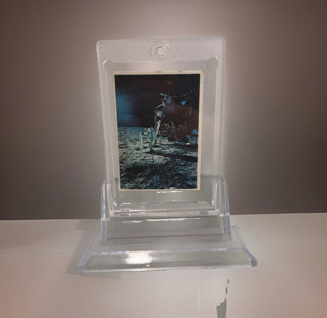
1969 Space Candy Buzz Aldrin Apollo 11 On The Moon Card #19 Taylor-Reed Display
$59.00 USD
-

1980 Polo Player Green Pink Chalk Pastel Bears Andy Warhol Signature AS-IS
$399.00 USD
-

After Andy Warhol Moon Landing Line Drawing 5/50 w/ Astronaut Autographs As-Is
$175.00 USD
-

After John Lennon "I Do" Framed Print, Marked A/P Unverified
$99.00 USD


Browse the collection for current listings.