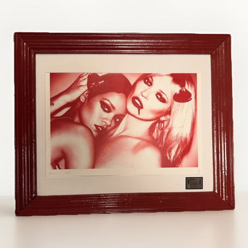
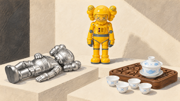
When considering a new Death NYC print, collectors often wonder how it will fit with existing pieces or if it will start a new direction. The key is to look beyond individual subjects and identify recurring visual families. This approach allows you to build a collection with a coherent visual rhythm, even across diverse images. Instead of focusing solely on a specific character, consider the broader visual language: the familiar silhouette, the celebrity-like portrait, the masked or costumed figure, the art-history quotation, the luxury signal, the comic interruption, the floral overlay, or the graphic field. These elements act as visual anchors, helping you to group works that resonate together.
For example, a collector might be drawn to the recurring motif of a figure obscured by an overlay – perhaps a floral pattern or a graphic field. While the underlying figure might change, the visual device creates a strong connection between pieces. Similarly, a series of works featuring a distinctive silhouette, even if the context varies, can form a compelling visual narrative. This guide will help you identify these visual families and develop a strategy for building a Death NYC collection that feels intentional and integrated into your home.
Identifying visual families and recurring roles
Death NYC works often feature visual elements that reappear across different prints, creating a sense of continuity. These aren't always specific named characters, but rather recurring roles or visual archetypes. Understanding these can help you build a more cohesive collection. Think of them as visual echoes rather than direct repetitions.

One common visual family involves the familiar silhouette. These works often present an iconic outline, instantly recognizable, but stripped of specific detail. The power lies in the suggestion, allowing the viewer to fill in the blanks. When collecting, consider how these silhouettes interact. Do they create a sense of mystery or playful recognition? Grouping several such works can create a minimalist yet strong display, relying on form and implied narrative.
Another strong visual family is the celebrity-like portrait. These pieces often depict figures with exaggerated features or poses reminiscent of pop culture icons. The focus is on the visual shorthand of fame and recognition. When selecting these, consider the overall mood they convey. Are they celebratory, critical, or simply observational? A collection of these portraits can create a saturated, energetic wall, reflecting contemporary visual culture.
The masked or costumed figure is a recurring motif that adds an element of intrigue and transformation. These figures often hide their identity, inviting speculation about who or what lies beneath. This theme can explore ideas of anonymity, performance, or alter egos. Collecting works with this motif can create a sense of narrative depth, suggesting hidden stories or playful disguises. They often work well in spaces where you want to spark conversation.
The art-history quotation is a sophisticated visual device. Death NYC frequently references classic artworks or artistic styles, recontextualizing them within a contemporary framework. These pieces often play with irony or homage. For a collector, these works can add an intellectual layer to a display, inviting viewers to recognize the original source and appreciate the modern interpretation. They pair well with other works that engage with art history or cultural commentary.
Finally, the luxury signal is a visual shorthand for opulence and consumer culture. These works often incorporate symbols of high-end brands or aspirational lifestyles. They can be seen as a commentary on consumerism or simply an aesthetic celebration of design. When grouping these, consider the balance between critique and admiration. A collection of luxury signals can create a bold, contemporary statement, particularly in a modern interior.
Building coherence through visual rhythm
Visual rhythm in a collection is about how your eye moves from one piece to another, creating a harmonious flow. It's not just about matching colors or subjects, but about establishing a consistent visual language. Think of it like music: some collections might have a fast, staccato rhythm, while others are slow and contemplative.
One way to achieve visual rhythm is through repetition of graphic devices. For instance, if you have several Death NYC prints that feature a prominent floral overlay, even if the underlying subject changes, the repeated floral motif creates a strong visual link. Your eye learns to anticipate this element, creating a sense of continuity. This works similarly with recurring patterns, textures, or even specific typographic styles. A collection built on this principle feels deliberate and well-considered.
Another method is to focus on consistent compositional structures. Some Death NYC works might consistently feature a central figure against a stark background, while others might employ a more dynamic, multi-layered composition. Grouping works with similar compositional approaches creates a visual cadence. For example, a series of portraits, all framed similarly, will have a different rhythm than a series of busy, collage-like scenes. Consider the overall energy you want your collection to convey.
Color palette repetition is perhaps the most straightforward way to establish visual rhythm. If you consistently choose works that share a dominant color scheme – perhaps a saturated pop art palette or a more muted, monochromatic range – your collection will naturally feel cohesive. Even if the subjects vary, the unifying color acts as a strong visual thread. This is particularly effective in creating a calming or energetic atmosphere, depending on the chosen colors. For more on this, see our Death NYC interior design guide.
Finally, consider the scale and framing of your pieces. While Death NYC prints come in standard sizes, how you frame and arrange them impacts the visual rhythm. A uniform framing style across multiple pieces can create a sense of order and professionalism, even if the art itself is playful. Conversely, varying frame styles can introduce a more eclectic, dynamic rhythm. The key is to be intentional about these choices to support the overall visual flow of your collection.
Grouping by subject family
Beyond individual characters, Death NYC works often fall into broader subject families. These groupings allow for a more nuanced collection strategy, where pieces might not be identical but share a thematic resonance. This approach moves beyond simple identification to a deeper appreciation of the artist's recurring interests.
One prominent subject family revolves around pop culture commentary. These works often appropriate imagery from advertising, comics, or media, recontextualizing it to make a statement about consumerism, fame, or contemporary society. A collection focused on this family might include pieces that use familiar brand logos, comic book panels, or iconic movie stills. The common thread is the engagement with mass media and its influence. This can create a lively, thought-provoking display, especially when paired with other pop art pieces.
Another family explores art historical appropriation. As mentioned earlier, these works directly reference famous paintings, sculptures, or artistic movements. The subject here isn't just the original artwork, but the act of reinterpretation itself. Collecting works from this family can create a dialogue between past and present, showcasing the enduring power of classic imagery and its adaptability. These pieces often appeal to collectors with an interest in art history and its ongoing evolution.
The theme of urban landscape and street art aesthetics forms another subject family. Some listings in the current collection use a graphic, street-art-adjacent visual language – stencils, tags, layered textures, and a raw, immediate quality. Works in this family might feature cityscapes, graffiti-like elements, or figures that evoke an urban sensibility. A collection built around this theme can bring an edgy, contemporary feel to a space, connecting to the broader street art movement.
A more abstract subject family involves graphic fields and patterns. Some listings foreground the interplay of colour, shape, and repeated motifs rather than a single figure. These works often feature saturated backgrounds, geometric patterns, or intricate overlays that dominate the composition. Collecting these pieces can create a visually dynamic display, focusing on pure aesthetic impact rather than narrative. They can also serve as excellent transitional pieces between more figurative works.
Finally, there's a subject family centered on playful interruption and comic elements. Many Death NYC works incorporate unexpected, often humorous, visual disruptions – a small, incongruous detail, a cartoonish element, or a surprising juxtaposition. These pieces often have a lighthearted, whimsical quality. A collection of such works can inject humor and personality into a room, demonstrating a collector's appreciation for wit and unexpected twists. For more on this, see our Death NYC bestiary and mashup vocabulary.
Color as a unifying element
Color is a powerful tool for unifying a Death NYC collection, perhaps even more so than specific subjects. A consistent color palette can make disparate images feel like part of a larger whole, creating visual harmony and a specific mood in your space. This doesn't mean every print has to be identical in color, but rather that they share dominant hues or a similar color temperature.
Consider a collection dominated by saturated, high-contrast colors. Many Death NYC prints feature bold reds, electric blues, and bright yellows. Grouping these together creates an energetic, dynamic display that immediately grabs attention. This approach works well in contemporary interiors that can handle a strong visual statement. The sheer intensity of color becomes the unifying factor, making the collection feel cohesive despite varied subjects.
Alternatively, you might opt for a collection with a more muted or monochromatic palette. Some Death NYC works lean towards grays, blacks, whites, or desaturated tones with only a hint of color. A collection built around these cooler, more subdued hues can create a sophisticated and calming atmosphere. This approach emphasizes form, texture, and subtle variations in tone, allowing the viewer to appreciate the nuances of each print without being overwhelmed by color.
A third strategy is to focus on complementary or analogous color schemes. You might choose prints that predominantly feature blues and oranges (complementary) or blues, greens, and purples (analogous). This creates a more sophisticated and balanced visual effect. The colors work together to enhance each other, creating a rich and harmonious display. This requires a more deliberate selection process but yields a highly refined collection.
Finally, think about the overall color temperature. Do you want your collection to feel warm (dominated by reds, oranges, yellows) or cool (dominated by blues, greens, purples)? A consistent temperature across your prints will create a strong sense of unity, even if the specific hues vary. This is a subtle but effective way to ensure your Death NYC collection feels cohesive and contributes to the desired ambiance of your room.
Deciding which visual register belongs in your home
The visual register of a Death NYC print refers to its overall tone, complexity, and aesthetic impact. Some prints are bold and direct, others are intricate and layered, while some are more subtle and reflective. Choosing the right register for your home involves considering your existing decor, the function of the room, and your personal aesthetic preferences.
If your home has a minimalist or Scandinavian-inspired aesthetic, you might lean towards Death NYC prints with a clean, graphic register. These works often feature strong lines, limited color palettes, and clear, uncluttered compositions. They can add a touch of contemporary edge without overwhelming the serene atmosphere of such interiors. Look for pieces that emphasize form and negative space.
For a more eclectic or maximalist interior, a layered, complex register might be more suitable. These prints often feature multiple visual elements, intricate details, and a rich interplay of textures and colors. They can contribute to a sense of visual abundance and storytelling, fitting smoothly into spaces that celebrate diverse objects and styles. These works often reward closer inspection and reveal new details over time.
If you aim for a playful or whimsical atmosphere, Death NYC prints with a humorous or ironic register are an excellent choice. These pieces often incorporate unexpected juxtapositions, cartoonish elements, or witty visual commentary. They can inject personality and lightheartedness into a room, making it feel more inviting and less formal. Consider where a touch of unexpected humor would be most appreciated, perhaps in a living room or study.
For a sophisticated or art-focused space, prints with an art-historical or conceptual register can elevate the room. These are the works that engage with artistic traditions, cultural critique, or deeper thematic ideas. They invite contemplation and discussion, making them ideal for areas where you entertain or spend time reflecting. These pieces often pair well with other art objects or a curated collection of books.
Ultimately, the best register for your home is one that genuinely resonates with you and complements the existing environment. Don't force a style that doesn't feel right. Take your time, visualize the print in your space, and consider how it will contribute to the overall feeling of the room. A well-chosen Death NYC collection enhances your home and reflects your unique taste.
Curating a collection with impact
Curating a Death NYC collection with impact goes beyond simply acquiring prints; it involves thoughtful selection and arrangement to create a cohesive and compelling display. The goal is to make your collection feel like a deliberate statement, rather than a random assortment of pieces. This requires an understanding of how individual works contribute to the larger whole.
Start by identifying your core aesthetic preference. Are you drawn to bold, high-energy pieces, or do you prefer more subtle, thought-provoking works? Once you understand your preference, you can filter your choices. For example, if you love the vividness of Mr. Brainwash, you might gravitate towards Death NYC prints with similar color intensity and pop culture references.
Consider creating mini-collections or groupings within your larger collection. Instead of scattering prints throughout your home, try grouping two or three pieces that share a strong visual link – perhaps all featuring a specific graphic overlay, or all in a similar color palette. This creates focal points and allows each grouping to tell a small story. A well-placed grouping can have more impact than many individual pieces spread out.
Think about contrast and balance. A collection doesn't have to be perfectly uniform to be strong. Sometimes, a carefully chosen contrasting piece can highlight the qualities of others. For instance, a single black and white Death NYC print might stand out powerfully amidst a collection of saturated, colorful works, drawing the eye and providing a moment of visual pause. The key is intentional contrast, not random variation.
Varying scale and format can also add impact. Size and format vary by listing, so use the stated dimensions when considering how two works might interact. A larger, dominant piece can serve as an anchor for smaller, complementary works. Similarly, if you have any sculptural objects or other art forms, consider how they might be integrated with your Death NYC prints to create a multi-dimensional display.
Finally, don't be afraid to rearrange and experiment. Your collection is a living entity, and its impact can change with different arrangements. What works in one room might not work in another. Take photos of different layouts, live with them for a while, and see what feels most effective. The process of curation is ongoing, and your preferences may evolve over time.
Let a visual family evolve without losing its point
A visual family is useful because it gives a collection a point of view. It becomes unhelpful when it turns into a rule that every new work must follow. The better test is narrower: does the next piece add a new note to the same conversation, or does it merely repeat the first piece at a lower volume?
One way to make that judgment is to write down three qualities that attracted you to the first work. They might be compressed scale, a particular colour temperature, a collision of fine-art and pop-language signals, or the tension between a calm background and a crowded image. Those are not claims about a fixed Death NYC canon. They are your own selection criteria. They also travel well. A second work can differ in subject while still sharing one or two of those qualities.
Use the room to test the idea. Photograph the existing wall straight on, then place a paper mock-up of the prospective work where it would hang. Ask what changes at doorway distance. If the addition creates a new rhythm, it may belong. If the two images fuse into one noisy patch, try a different wall or a longer interval between them. Most collecting mistakes are placement mistakes before they are taste mistakes.
Colour is often the easiest bridge, but it is not the only one. A work with a spare field can give a visually dense print room to register. A small, quiet work can make an energetic one appear sharper. A frame can make two very different images read as a pair without pretending that they are the same. The goal is not to prove a theme. It is to create enough continuity that the room has a pulse.
That is also why rotation is useful. Put two related works into dialogue for a season, then let one rest while a third comes forward. Rotation protects against the urge to fill every blank wall. It also shows you which visual relationships keep working after the novelty has passed.
Use comparison to keep the collection legible
Comparing works side by side is more valuable than scrolling until an image produces a quick reaction. Open two or three individual listings and compare only what is actually described there: dimensions, format language, condition notes, images, framing status, and the visual qualities you can see. Keep a short note beside each candidate about where it would live. This moves the decision from recognition to fit.
For a recurring-figure or theme-led group, begin with contrast rather than resemblance. Pair a high-energy image with one that offers a calmer field. Put a smaller work close to a seated viewing position, not across a large room. Let a frame with a wide mat slow down a visually busy composition. These choices make the image easier to live with, which matters more than making the wall look instantly complete.
Be exact about the language you repeat when you describe a work to yourself or someone else. If a listing uses a familiar cultural reference, call it a reference in the listing language. Do not turn recognition into a claim of relationship, permission, or shared authorship. Precision is part of good collecting because it keeps the record and the visual story aligned.
A collection can also have more than one register. A graphic, high-colour group may suit a social room, while a smaller and quieter group fits a hallway or study. The connection can be a framing rule, a material, or a repeated interval of empty wall, rather than a single visual subject. That flexibility lets a collection expand without becoming a themed display.
When you are unsure, leave a gap. Empty wall is not unfinished wall. It is the interval that lets a collector see what is already there, decide what the collection is actually about, and wait for a work that earns its place.
| Decision | Practical check | Why it matters in a room |
|---|---|---|
| Scale | View the work from the doorway and from the seat where it will be seen most. | A small work gains authority when its viewing distance is intentional. |
| Frame | Choose the mount and profile around the paper and the wall, not only the furniture. | The framing creates a visual boundary and keeps the display from feeling improvised. |
| Context | Give the work one quiet neighbour rather than several competing accents. | Negative space lets a graphic image register before the room asks the eye to move on. |
Frequently asked questions
What is the best way to start collecting Death NYC prints?
Begin by identifying what visually appeals to you most. Do you prefer bold colors, specific recurring figures, or certain graphic devices? Focus on one or two visual families or color palettes to build a cohesive initial collection. Don't try to collect everything; instead, aim for pieces that resonate with each other and with your personal style.
How can I ensure my Death NYC collection looks cohesive if the subjects are very different?
Focus on unifying elements beyond the main subject. Consistent color palettes, similar graphic overlays (like floral patterns or comic interruptions), or a uniform framing style can create strong visual coherence. Think about the overall mood or energy you want to convey, and select pieces that contribute to that feeling.
Should I frame all my Death NYC prints in the same way?
While not strictly necessary, using consistent framing – such as the same frame style, color, or matting – can significantly enhance the visual unity of your collection. It creates a professional and deliberate look, allowing the art itself to stand out while maintaining a harmonious display.
Can I mix Death NYC prints with other artists' work?
Absolutely. Death NYC prints often complement other contemporary art, especially those in the pop art or street art genres. When mixing, look for shared elements like color schemes, thematic connections (e.g., pop culture commentary), or a similar artistic sensibility to ensure the pieces interact harmoniously rather than clashing.
Where can I find more Death NYC prints to expand my collection?
You can explore a wide selection of Death NYC prints right here at Gauntlet Gallery. Use the collection page to review the current selection and the individual listing details. Browse our Death NYC collection to discover your next piece.