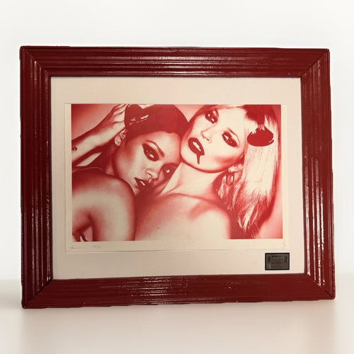
You have found a Death NYC listing with a Haring-associated visual cue, and you like the charge it could bring to a room. The useful next move is not to fill in a story around that cue. Read the object on the page: its exact title, the format described, the images, the condition notes, and the documentation that is actually supplied. Let those details determine what you are considering.
That restraint is not dry or overly cautious. It gives the work room to be interesting on its own terms. A Haring-referencing descriptor may help you place a visual language quickly, especially when you are building a wall around graphic line and movement. It does not turn the work into a different kind of object. The cleanest way to buy and display it is to separate what the listing says from everything a familiar cue might make you assume.
This is also a useful habit for a home. A room does not need a history lesson on every wall. It needs a clear focal point, enough visual quiet around it, and an arrangement that feels chosen rather than assembled from associations. Use the reference as a starting point for looking, then make your decision from the actual work, its presentation, and the practical demands of the space where it will live.
Begin with the decision in front of you
The first question is simple: do you want the particular work in the listing, or do you want the feeling produced by a familiar visual language? Those are different buying decisions. The first is concrete. It asks about the listed object, its condition, dimensions, format, colors, framing, and how it will sit in your room. The second can be useful for searching, but it can become unhelpful when it substitutes a broad association for close looking.

Start by hiding the title for a moment and looking at the product images as a composition. Notice the dominant direction of the lines. Are they clipped and architectural, loose and looping, or packed into a small field? Is the color doing most of the work, or does the image rely on negative space? Is the surface presented as a quiet paper piece, a more layered object, or something already framed for a wall? These are the things you will live with every day.
Then return to the listing language. A title may use a recognisable cultural shorthand. A tag may sort the work into a visual family. A description may use words such as Haring-associated or Haring-referencing. Treat each as a reading aid, not a transfer of status. A reference is not evidence of an affiliation, a joint release, permission, or endorsement.
That sentence has a practical effect. It keeps you from paying attention to the wrong part of the page. Instead of treating a reference as the reason to buy, ask whether the exact balance of line, field, scale, and presentation works for you. The most satisfying pieces often pass this test even after the shorthand is removed.
Separate a visual reference from a relationship
Visual references are part of how viewers orient themselves. A listing may point to a related graphic vocabulary so that a buyer can quickly understand its energy: bold contour, compressed motion, emphatic marks, direct color, or a compact figure-ground rhythm. Such a descriptor can be accurate and useful. It tells you where your eye may find a connection. It does not establish a relationship beyond the wording that appears in the listing.
For a collector, that distinction matters because the object, not the association, is what enters the collection. The listing may describe a Haring-referencing cue. The item may also have a title that directs attention toward a certain visual register. Neither fact supplies missing information about how the work was made, what material is present, or what documents accompany it. Those questions remain work-specific.
It helps to think of reference language as a label on a shelf in a library. It can lead you to a section with related concerns, but it does not make all books in that section the same book. A visual comparison can be a prompt to look closer at gesture, rhythm, contrast, or placement. It should not be used to infer provenance, rights, relationships, or approval.
This is especially important with a living-room purchase. People tend to choose art through fast recognition. A familiar cue can make an image feel immediately legible, which is part of its appeal. Yet recognition alone does not tell you if the work will hold a wall, fit the available width, or sit comfortably beside your furniture. Let the reference open the door, then let the actual composition make the case.
If your interest is primarily historical context, a separate reference-reading resource can help you keep that research distinct from an individual product listing. When you are choosing a piece for a room, return to the listed work and its own evidence.
Read titles, tags, and descriptions in the right order
A listing has layers of information, and each layer has a different job. Reading them in a consistent order prevents a strong title from doing too much work. Begin with the images and the primary factual fields. Next, check the title and any visible format labels. Then read the full description, condition notes, and any information supplied about what is included. This sequence keeps the object at the center.
Titles are often concise. They may contain a reference, a subject category, a format label, or a phrase that helps a seller distinguish one listing from another. They are not a complete condition report. Tags can be even narrower. A tag such as Haring-associated or Haring-referencing should be read as a way of grouping visual context. It is not a substitute for the description, and it does not turn a search term into a claim about the work.
The description is where you look for the particular facts that affect ownership. Read it for medium as stated, dimensions as stated, framing as stated, and any condition or documentation details actually shown. If something important to your decision is absent, do not promote the absence into a fact. A missing dimension is not a small dimension. A photograph that does not show an edge is not evidence that the edge is perfect. A reference word is not a complete account of the object.
Use the table below as a practical reading order. It is deliberately modest. The point is not to create a detective exercise; it is to make sure you do not ask one line of copy to answer questions that belong elsewhere on the page.
| What you are reading | What it can help you understand | What it cannot establish by itself |
|---|---|---|
| Images | Composition, visible color, presentation, and apparent condition | Unshown details or materials outside the frame |
| Title | How the item is being identified | The full history or status of the work |
| Haring-associated tag | A useful visual-context cue | An affiliation, joint release, permission, or endorsement |
| Description | Work-specific format and presentation details stated by the seller | Details that are not described or documented |
| Included records | What accompanies the listed object | Claims not present in those records |
A good listing can support a clear decision without having to answer every imaginable question. If you are comparing several works, make a short note under the same headings for each one. You will notice quickly whether you are responding to the actual object or simply to a term that keeps appearing in your search results.
Keep format labels attached to the exact work
Format language is easy to flatten when a collection includes more than one kind of object. A numbered edition, an artist proof notation, an H/C notation, and a unique hand-finished object are labels that belong to the item described in a particular listing. They should not be treated as interchangeable categories, and a label on one listing should not be carried across to another work with a similar visual reference.
This is where a calm comparison sheet is more useful than a quick impression. Write down only what the listing provides: the object type, stated medium, stated dimensions, the edition or uniqueness notation if one is shown, presentation, condition notes, and included records. You do not need to rank the formats in the abstract. You need to decide which listed object makes sense for your wall and your collecting preferences.
For example, a smaller piece can be the right choice if you have a narrow vertical zone beside a bookcase or between doors. A framed work may save a framing decision but also requires you to judge the whole presentation, including its outside dimensions and glazing. A listing that describes a unique hand-finished work may ask you to look especially carefully at the surface, since that surface is part of the individual object. None of these observations tells you what another, similarly tagged work will be.
Use the same discipline with language about records. If a listing describes documents that travel with the particular item, preserve them with that item. If you are comparing a work with another, compare the records on the page rather than assuming a common package across a broad category. This keeps your collection file usable later and makes the initial choice much clearer.
When the question is how a piece will function at home, format is not only a collector concern. It controls viewing distance, the amount of wall it needs, and the degree of visual pressure the room can absorb. A compact line-driven work can feel lively at arm's length. A larger graphic field can be more effective from across a room. The listing is where you find the information needed to test that fit.
Look at the composition before you style the association
A Haring-associated description may point you toward movement, but movement alone is not a decorating plan. Study how the listed image creates it. Some pieces feel active because the line travels broadly across the picture. Others feel active because the image packs many marks into a tight field. Some use a quiet background to sharpen the foreground. Others rely on a dense color field that needs more breathing room around the frame.
Once you identify the mechanism, you can make a room-level decision. A composition with strong outward movement usually needs visual quiet on both sides. Give it a wall that is not already occupied by a television, an elaborate lamp, or a row of open shelves. A tighter image may work well in a smaller zone because the contained energy rewards close viewing. Neither approach requires the room to borrow the reference language literally.
Consider the direction of traffic through the space. In an entry, a compact graphic work can establish a clear first impression without asking someone to stop and study it. In a dining area, a more detailed composition can sustain repeated viewing from several seats. In a work area, high-contrast art should sit outside the direct line of sight if you need the desk wall to remain visually calm. These are placement questions, not cultural-category questions.
Color deserves the same attention. If the listing shows a limited palette, use one quiet echo in a nearby textile or object, not a room full of matching accents. If the work is primarily dark line on a pale field, a slim dark frame may create a clean boundary, while a pale mat can give the image enough air. If the image is visually dense, a wider margin around it can lower the pressure on the rest of the wall.
For a broader comparison of how a graphic work participates in a room, see the interior-design guide. Use it to make a placement plan, then return to the exact listing rather than trying to make a room illustrate a reference.
Build a room around energy, not a tribute display
There is a difference between a room that has a point of view and a room that repeats one cue until it becomes a costume. The goal with Haring-referencing visual energy is to let one work provide movement while the surrounding objects change the rhythm. A room becomes more convincing when the art, furniture, lighting, and materials answer each other without trying to say the same thing.
Start with one anchor. Put the work where it can be seen with a little distance and without competing labels, objects, or wall text. Then add a contrasting material nearby: a woven shade, a matte ceramic, a wood surface, a smooth metal lamp, or a fabric-covered chair. The contrast gives the graphic mark a physical setting. It is more useful than repeating every color from the image in pillows, rugs, and accessories.
Next, choose one supporting object with a different silhouette. A low rounded vessel can quiet a sharp, linear composition. A tall, spare lamp can add vertical order beside a busy image. A small three-dimensional piece can work on a console below the art if it does not repeat the image's main gesture. The design-object collection is a useful place to look for changes of scale and material, not for a literal visual match.
Keep the wall count low. Two forceful graphic works can share a room when they have enough separation, but a row of tightly related cues often feels more like a display case than a lived-in space. If you own several pieces with similar energy, rotate them. Rotation protects your attention as much as it refreshes the wall. A work that has been stored carefully and brought out seasonally can make the room feel newly considered without any new purchase.
Pairing across categories can help. A more typographic or geometric print from a different part of a collection can introduce structure beside looser marks. A photographic or materially quiet piece can create a pause. The point is not to create a hierarchy between artists or categories. It is to make a composition in the room where each work retains its own voice. The Pop Art collection can offer useful contrast when you are looking for that second, different register.
Use framing, color, and spacing as editing tools
Framing is where a visual reference becomes a practical interior decision. The frame does not need to interpret the work. Its job is to protect the piece, separate it from the wall, and establish the amount of visual formality the room needs. In a restrained interior, a thin black, dark wood, or natural-wood profile often gives a graphic piece a decisive edge without making the presentation theatrical. In a more textured room, a wider quiet frame can slow down a very active image.
Consider the wall color before choosing a mat or frame. Pale walls amplify contrast, which can make a compact graphic work feel larger and louder. A warmer off-white wall can soften that effect while keeping the image clear. Deep walls create drama, but they can reduce the visible outline of a dark frame. If you use a dark wall, choose a frame that preserves a readable edge or let the mat provide separation.
Spacing is an equally powerful edit. A common mistake is to hang a graphic work too close to a chair, shelf, or neighboring frame because the wall feels empty. Empty wall is often the element that allows the composition to work. Step back to the doorway and make sure the outer edge of the frame has a quiet field around it. If the work looks better after you remove one object from below it, that is useful information rather than a sign that the room is unfinished.
Lighting should describe the work, not flatten it. Aim an adjustable fixture so it avoids glare and does not turn the wall into a spotlighted stage. Daylight can be beautiful, but it changes throughout the day. Check the location in bright morning light, late afternoon light, and after dark. If the image is easy to read only at one time of day, reconsider its placement or the light source rather than forcing the arrangement.
These choices allow you to enjoy the energy of a Haring-associated composition without making every surrounding decision a reference to it. The result is a room with a clear focal point and enough range to feel personal.
Follow a repeatable viewing and buying process
A repeatable process keeps the search enjoyable. It also prevents comparison fatigue when several listings use similar language. You do not need a complicated scorecard. You need a short sequence that brings you back to the work, the room, and the information actually shown.
- Save the listing and look at it without the title. Write one sentence about the composition and the emotional temperature it would bring to your room.
- Read the factual fields and full description. Record only dimensions, format wording, presentation, condition notes, and included records that are stated on the page.
- Mark the reference language separately. Note Haring-associated or Haring-referencing terminology as visual context, then keep it out of the work-specific column.
- Test the proposed wall. Measure the available width and height, consider viewing distance, and identify the object or light source most likely to compete with the work.
- Compare no more than three candidates at once. If a decision remains unclear, pause. A good choice should become clearer when you return to the same notes after a day or two.
This process also makes it easier to buy across different visual registers. You may find that your first choice is not the work with the strongest shorthand, but the one whose proportions, blank space, and tone resolve the room best. That is a more durable reason to own something.
Keep any records supplied with a work in a simple file with the saved listing, invoice, measurements, installation photos, and a note about where it hangs. The purpose is not to predict future outcomes. It is to make the ownership experience organized and to keep information from becoming detached from the actual object.
When you want another graphic voice in the room, browse widely enough that familiarity does not decide for you. A collection such as contemporary street art can offer a different way to think about scale, color, and wall energy. Let the room's needs, rather than a search label, determine the next piece you pursue.
Frequently asked questions
What does Haring-associated mean on a Death NYC listing?
It is a visual-context descriptor. Read it as a pointer to graphic cues that may help you understand the work's energy or references. It does not replace the factual details of the listing, and it does not establish a relationship beyond what the listing expressly states.
How should I compare two Haring-referencing works?
Compare the exact listed objects. Put their stated dimensions, format language, presentation, condition notes, and included records side by side. Then consider each one on the proposed wall. A similar reference term does not make two works equivalent in scale, material, or display effect.
Can a graphic piece with strong linear movement work in a calm home?
Yes. Give it one clear wall, quiet space around the frame, and nearby materials that change the tempo, such as linen, wood, ceramic, or a simple lamp. Keep repeated accent colors to a minimum so the work remains a focal point rather than the beginning of a themed room.
What should I do if a listing does not show a detail that matters to me?
Treat the missing detail as unknown. Do not infer it from a title, tag, or visual reference. Ask for clarification before deciding, or move on to a listing whose stated information lets you judge the work comfortably.
Where can I compare current Death NYC works?
Browse the Death NYC collection with the same checklist: study the individual images, read the exact listing language, compare the stated details, and choose the work that makes sense for your collection and your room.