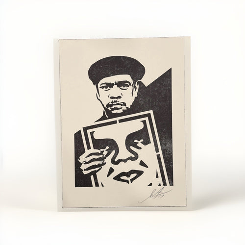
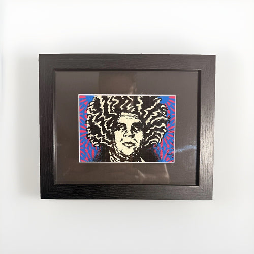
Many collectors find themselves with a visually compelling limited edition print, perhaps a Death NYC piece, and wonder how to integrate its bold aesthetic into a refined home without creating a visual discord. The challenge is real: these works often possess a saturated energy and graphic punch that can feel overwhelming if not handled with intention. The good news is that even the most dynamic prints can find a harmonious place in an elegant interior, especially when approached with a clear design strategy.
The key lies in understanding that a limited print, particularly one with a strong narrative or pop culture reference, doesn't need to dominate a room. Instead, it can act as a precise accent, a carefully chosen punctuation mark that elevates a corner, a narrow wall, or even a functional space. Think of it as a concentrated dose of personality rather than a sprawling mural. With thoughtful framing, strategic placement, and a disciplined approach to the surrounding decor, a Death NYC print can transform an ordinary area into a curated moment, reflecting your individual taste without sacrificing the room's overall serenity.
This guide will walk you through the practical steps to style your limited prints effectively. We will focus on how to select the right frame, where to place the artwork for maximum impact in compact areas, and how to ensure the print complements your existing furnishings. The goal is to create a sophisticated, personal space where your art feels thoughtfully integrated, not simply hung.
Understanding the appeal of compact prints
Small-format prints, like many of the works from Death NYC, offer a distinct advantage in interior design: versatility. Unlike large canvases that demand significant wall space and often dictate the room's entire aesthetic, smaller prints provide flexibility. They are perfect for those tricky spots in a home that often go overlooked or feel incomplete. Consider the narrow wall beside a doorway, the space above a bedside table, or the often-neglected powder room. These are prime candidates for a compact, visually punchy artwork.

The appeal extends beyond mere size. A smaller print invites closer inspection, encouraging an intimate engagement with the artwork. This is particularly effective for pieces that contain detailed details, subtle humor, or layered references, which are hallmarks of many contemporary limited editions. When a print is scaled appropriately for its setting, it feels deliberate and considered, adding a layer of sophistication that a generic decorative object simply cannot achieve. It becomes a conversation starter, a personal statement, rather than just background filler.
Furthermore, compact prints allow for a more dynamic approach to collecting. You can acquire several diverse pieces over time, experimenting with different artists or themes, and rotate them as your tastes evolve or as seasons change. This contrasts with the commitment required for a monumental artwork. For instance, you might pair a saturated Death NYC piece with a more subdued Cleon Peterson print in an adjacent space, creating a dialogue between contrasting styles without overwhelming the overall design. This iterative approach to art acquisition and display makes collecting more accessible and enjoyable for the design-conscious individual.
The framing imperative: Beyond the basics
Framing is not merely a protective measure; it is a critical design decision that can make or break how a limited print integrates into your interior. For works like those by Death NYC, which often feature bold graphics and pop culture iconography, the frame acts as a bridge between the artwork's energy and the room's decor. A poorly chosen frame can either diminish the print's impact or clash with its surroundings, creating an unsettling visual tension.
Start with the matting. A generous, acid-free mat provides essential breathing room around the artwork, allowing the eye to rest before engaging with the image. For saturated prints, a wide white or off-white mat is almost always the safest and most elegant choice, as it creates a clean boundary and prevents the colors from feeling confined. Avoid colored mats unless you are absolutely certain they enhance the artwork without competing with it. For most contemporary prints, simplicity in matting allows the art to speak for itself.
Next, consider the frame material and finish. A sleek, minimalist frame in black, white, or a natural wood tone often complements the modern aesthetic of many street art-inspired prints. Thin metal frames in black or brushed silver can lend a gallery-like sophistication, particularly effective in contemporary or industrial-leaning spaces. Wooden frames, whether a light maple, a rich walnut, or a painted finish, can introduce warmth and texture. The key is to select a frame that echoes elements already present in your room – perhaps matching a furniture finish, a metal accent, or the overall color temperature.
Glazing is another crucial element. Museum-quality, anti-reflective, and UV-protective acrylic or glass is a worthwhile investment. Not only does it protect your valuable print from fading and environmental damage, but it also minimizes glare, ensuring the artwork is always visible and enjoyable from various angles. Standard glass can create distracting reflections, especially in well-lit rooms, hindering the visual experience. Think of the frame as an extension of the artwork itself, a carefully chosen border that enhances its presence and integrates it into your home's narrative.
Strategic placement: Making a big impact in small spaces
The beauty of a compact, visually engaging print is its ability to transform an overlooked corner or a functional space into a focal point. Instead of relegating small art to large, empty walls where it might get lost, consider these strategic locations for maximum impact:
- The Powder Room: Often a forgotten space, a powder room is an ideal canvas for a bold print. Its enclosed nature allows for a concentrated dose of personality. A well-placed Death NYC print here can provide an unexpected moment of visual delight for guests, turning a utilitarian space into a curated experience. Ensure the print is properly framed with museum-quality glazing to protect against humidity.
- Entryways and Hallways: These transitional spaces are perfect for introducing your home's aesthetic. A single, striking print above a console table or on a narrow wall can set a welcoming and intriguing tone. It's the first hint of your taste, offering a concise statement without overwhelming the limited space.
- Above a Desk or Reading Nook: Personal workspaces or cozy reading corners benefit immensely from a piece of art that inspires or entertains. Placing a print directly above a desk or within a reading nook personalizes the area, making it feel more intentional and less purely functional. It provides a visual anchor for your eyes when you look up from a book or screen.
- Kitchen or Dining Nook: While less common for art, a small, saturated print can add character to a kitchen or dining area, particularly on a small wall or above a credenza. Choose a location away from direct heat or moisture, and ensure the frame is reliable. A playful print can inject a sense of humor or modern flair into these often-practical spaces.
- Between Windows or Doorways: These narrow vertical strips of wall are often challenging to decorate. A small, well-proportioned print can fit perfectly, adding visual interest without cluttering the architectural lines. It breaks up blank space and draws the eye, creating a natural pause.
The key to strategic placement is to think about how people interact with the space. Where do their eyes naturally land? What areas could benefit from an unexpected pop of color or a moment of reflection? A small print, precisely placed, can fulfill these roles with elegance and impact.
Creating visual breathing room
One of the most common mistakes when styling art, especially bold prints, is to overcrowd the surrounding space. For a Death NYC print to truly shine, it needs visual breathing room. This means resisting the urge to fill every inch of wall or surface around it with other objects, photographs, or competing artworks. Think of the negative space around your print as an integral part of the composition; it allows the eye to focus and appreciate the artwork without distraction.
When placing a print above a console table, for example, consider a single, well-chosen decorative object on the table – perhaps a sculptural vase, a stack of art books, or a simple plant. Avoid multiple small tchotchkes that create visual noise. The goal is to create a moment of calm around the artwork, allowing its narrative or aesthetic to take center stage. If you have a collection of smaller items you wish to display, group them together on a tray or in a designated area elsewhere in the room, rather than scattering them around your primary art piece.
Similarly, if you are hanging a print on a wall, ensure there is ample blank space around it. Don't push it too close to a doorway, window frame, or another piece of furniture. Give it room to breathe. The exact amount of space will depend on the size of the print and the wall, but a good rule of thumb is to imagine a generous invisible border around the frame. This principle applies whether you are styling a single piece or creating a small gallery wall. Even in a gallery wall arrangement, each piece benefits from a clear separation, allowing individual works to be appreciated while contributing to the overall cohesive display.
Integrating prints into existing decor
Successfully integrating a saturated print into your home requires an understanding of how color, texture, and style interact. A Death NYC print, with its distinctive aesthetic, can complement a surprising range of interiors, from minimalist to eclectic, provided you approach its integration thoughtfully. The goal is not to match everything perfectly, but to create a sense of harmony and intentionality.
Begin by identifying the dominant colors and textures in the room where the print will reside. Does your space lean towards cool tones or warm? Are there prominent natural materials like wood or linen, or more refined elements like glass and polished metal? Your print, even if it introduces new colors, should ideally find some echo in the room's existing palette. Perhaps a subtle hue in the print can be picked up by a throw pillow, a ceramic object, or even the binding of a book. This creates a visual thread that connects the artwork to its surroundings.
Consider the interplay of styles. A bold, contemporary print can be a striking counterpoint in a more traditional room, creating an intriguing tension that adds character. Imagine a Death NYC piece hanging above a classic credenza or against a wall with architectural molding. The juxtaposition can be incredibly effective, demonstrating a confident and sophisticated design sensibility. Conversely, in a modern, minimalist space, such a print can inject a much-needed pop of personality and color, preventing the room from feeling sterile.
When styling multiple artworks, think about how different artists converse. A piece by Shepard Fairey, with its iconic graphic style and social commentary, might share a wall with a Death NYC print, creating a cohesive narrative within a specific genre. Or, for a more playful approach, consider how a Mr Brainwash print, known for its irreverent humor and saturated colors, could offer a different energy in an adjacent space. The key is to build a collection that reflects your personal journey and aesthetic, allowing each piece to contribute to the overall story of your home.
Table: Integrating Print Styles with Room Aesthetics
| Room Aesthetic | Print Style Complement | Integration Strategy |
|---|---|---|
| Minimalist Modern | Bold graphic, Pop Art-inspired | One statement piece, clean white mat, thin black/white frame. Adds focal point without clutter. |
| Traditional/Classic | Contemporary, irreverent | Unexpected juxtaposition. Use a classic frame (e.g., gold leaf, dark wood) or a simple modern frame. |
| Eclectic/Bohemian | saturated, narrative-rich | Mix with other art/objects, but ensure clear visual separation. Can be part of a curated gallery wall. |
| Industrial/Loft | Street Art, graphic, urban | Metal frame (black, silver). Complements raw materials. Can be larger scale for the space. |
| Transitional | Modern yet approachable | Balanced choice, often with a neutral mat and medium-toned wood frame. Adds personality without dominating. |
Building a cohesive collection, one piece at a time
Collecting art is a journey, not a sprint. A single limited print, such as a Death NYC piece, can be the genesis of a much larger, more personal collection. Approaching your acquisitions one piece at a time allows for thoughtful consideration and ensures each artwork genuinely resonates with you and your home. There's no need to rush into filling every wall; a single, well-chosen print can make a significant impact on its own.
When you acquire your first print, live with it for a while. Observe how it changes the feel of the room, how it interacts with the light throughout the day, and how it makes you feel. This experience will inform your next acquisition. Perhaps you discover a particular color palette you love, or a thematic element you wish to explore further. This organic growth ensures your collection remains deeply personal and truly reflects your evolving taste.
As your collection grows, you might find yourself drawn to other artists who share a similar spirit or aesthetic. For example, if you appreciate the graphic punch of Death NYC, you might also find yourself exploring the dynamic energy of Pop Art or the socially charged works of artists like Shepard Fairey. The beauty of contemporary art is its vast diversity, offering endless avenues for exploration. Remember, a cohesive collection isn't necessarily about matching styles perfectly; it's about creating a dialogue between pieces, where each artwork contributes to a broader narrative that is uniquely yours.
Consider how different artists or genres can complement each other. A bold street art print might be softened by a more abstract piece, or a photographic work might add a different textural quality. The art of collecting is about discovering these relationships and curating them within your home. It's a continuous process of discovery, where each new acquisition adds another layer to your personal story and the character of your living space.
The power of unexpected pairings
One of the most exciting aspects of interior design with art is the element of surprise. An unexpected pairing – a bold print in an unlikely setting, or a contemporary piece alongside a traditional antique – can elevate a room from merely well-decorated to truly distinctive. A Death NYC print, with its often playful yet incisive commentary, is perfectly suited for such deliberate contrasts.
Imagine a saturated print hung above a formal Chippendale chest, or placed in a bathroom with classic marble tiling. The juxtaposition creates a dynamic tension that draws the eye and sparks curiosity. This isn't about clashing; it's about creating a dialogue between different eras, styles, and sensibilities. The contemporary edge of the print breathes new life into the traditional elements, while the classic surroundings provide a sophisticated backdrop that highlights the artwork's modern appeal.
This approach requires confidence and a discerning eye. The key is to ensure that while the pairing is unexpected, it still feels intentional. This can be achieved through subtle connections, such as a shared color tone between the print and an antique object, or a complementary line quality. For instance, a print with strong geometric elements might find an echo in the carvings of a traditional piece of furniture, even if their overall styles are vastly different.
Unexpected pairings also work well when creating a focal point in a room that lacks a natural one. A bold print, strategically placed, can instantly become the anchor of a space, commanding attention and guiding the eye. This is particularly effective in open-plan living areas or rooms that might otherwise feel generic. By deliberately introducing an element of surprise, you infuse your home with personality and demonstrate a sophisticated understanding of design principles. It's about breaking conventions gracefully and allowing your art to tell a richer, more complex story.
Frequently asked questions
Can I hang a Death NYC print in a bathroom?
Yes, you can, but with specific precautions. Bathrooms are high-humidity environments. To protect your print, it is crucial to have it professionally framed using museum-quality materials. This includes acid-free matting, UV-protective and anti-reflective glazing (such as acrylic or glass), and a sealed frame back to prevent moisture ingress. Ensure the bathroom is well-ventilated to minimize humidity fluctuations. Avoid placing the print directly above a shower or in a spot where it might be splashed frequently.
What is the best lighting for a small print?
The best lighting for a small print is typically soft, diffuse light that illuminates the artwork evenly without creating glare or hot spots. Avoid direct sunlight, as UV rays will cause fading over time, even with UV-protective glazing. Track lighting with adjustable LED fixtures can be effective, allowing you to direct a narrow beam onto the print. If using ambient room lighting, ensure the print is not in shadow. Consider a small, dedicated picture light mounted above the frame, but ensure it doesn't generate excessive heat or create harsh reflections.
How high should I hang a print above furniture?
When hanging a print above furniture like a console, sofa, or credenza, a good rule of thumb is to allow 6 to 8 inches of space between the bottom of the frame and the top of the furniture piece. This creates a visual connection between the artwork and the furniture without making them feel crammed together. The exact height can be adjusted based on the scale of the furniture and the print, but the aim is to create a cohesive grouping where the art feels anchored by the furniture below it, rather than floating aimlessly on the wall.
Should I group multiple small prints or display one?
Both approaches are valid and depend on your design goals and the specific prints. Displaying a single, strong print can create a strong focal point and a sense of minimalist elegance. This works well for a particularly saturated or detailed Death NYC piece. Grouping multiple small prints, on the other hand, can create a dynamic gallery wall or a curated vignette, adding layers of interest and allowing you to tell a broader story. If grouping, ensure there's a consistent element (e.g., similar frames, a shared color palette, or a thematic connection) to maintain cohesion and avoid visual clutter. Always provide adequate breathing room between each framed piece.
How do I protect my print from fading?
Protecting your print from fading primarily involves minimizing its exposure to UV light and stable environmental conditions. Always use museum-quality framing with UV-protective glazing (acrylic or glass) which blocks a significant percentage of harmful UV rays. Avoid hanging prints in direct sunlight or under harsh, unfiltered artificial light. Maintain stable temperature and humidity levels in your home, as extreme fluctuations can also degrade the artwork over time. Rotate your prints periodically if they are in high-light areas, and keep them away from heat sources like radiators or fireplaces.
Integrating a limited print into your home is an art in itself. It's about making deliberate choices that allow the artwork to enhance your space, rather than merely occupy it. By focusing on thoughtful framing, strategic placement, and an edited approach to surrounding decor, you can ensure that even a visually bold piece, like those found in the Death NYC collection, contributes to a sophisticated and personal interior. These prints offer a unique opportunity to infuse your home with contemporary energy and a distinct point of view, creating moments of visual interest that reflect your individual style. We invite you to explore our Death NYC collection and discover the perfect piece to begin or expand your own curated space.