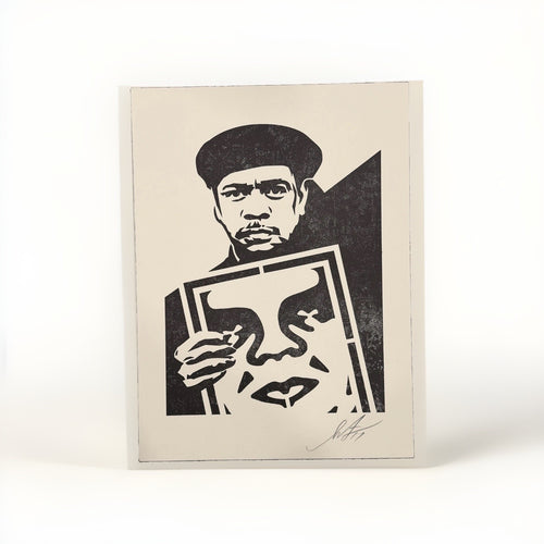
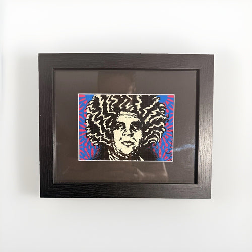
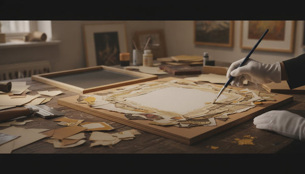
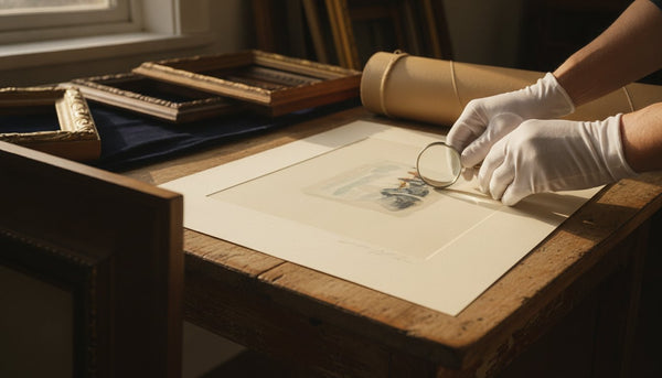
Framing and lighting decide whether a street-art print looks deliberately installed or temporarily pinned to a wall. The distinction is not decorative fussiness. It is a series of physical choices: a frame that gives the paper a margin of quiet, glazing that does not turn the image into a mirror, light that lets colour read without beating down on the work, and a hanging height that connects the piece to the people who live with it.
Start with the room rather than a shopping list. Stand where you will most often see the work. From the sofa, from the desk, and from the doorway, note what catches the eye first and where daylight falls during the day. A graphic Shepard Fairey print, a colour-forward Mr Brainwash work, or a compact Death NYC print needs a different amount of wall, contrast, and distance. None needs a busy frame or a competing light source.
The practical aim is simple: make the work easy to see and sensible to care for. The following rules cover framing, placement, glazing, light, and storage in the plain language a home installation needs. They are not a substitute for a condition report, conservation advice, or a specialist framer's assessment of a particular piece.
The Difference Framing Makes
Framing is the single highest-leverage decision you will make for a print, and it happens before the piece ever touches the wall. A frame does three jobs at once: it protects the paper, it sets a boundary that lets the eye rest, and it signals , instantly, before anyone reads a title card , how seriously the work should be taken. A five-dollar clip frame and a properly built gallery frame can hold the identical print and produce two entirely different objects. One reads as a poster. The other reads as art.

Consider what a frame actually does at the level of perception. The human eye needs edges to make sense of an image; without a defined boundary, a print bleeds into the wall and loses authority. A frame supplies that boundary and, with a mat, a buffer of breathing room around it. That buffer is why a small, quiet print can command a large wall , the emptiness is doing work, drawing the eye inward like the hush before a performance.
A great frame does not decorate the art. It disappears into service of it, the way a good waiter is felt but never noticed.
There is a common instinct to match the frame to the furniture , brass frames for a warm room, black frames for a modern one. Resist the reflex to overthink it. The frame's first loyalty is to the artwork, not the sofa. A graphic, high-contrast print in the vein of the work you will find across the Pop Art collection often wants a clean, narrow frame in black or white so nothing competes with the color inside. A softer, more painterly image can carry a wider profile or a warm wood tone. When in doubt, choose restraint: a simple frame rarely looks wrong, while an ornate one can date a piece or overwhelm it within a season.
The three registers of framing
- Poster framing , thin frame, no mat, standard acrylic. Fine for a hallway placeholder or a piece you expect to swap out. Cheap, fast, and disposable, and it looks it.
- Decorative framing , a considered profile, a mat, a reasonable spacer. This is where most homes should live: it flatters the work and reads as intentional without a custom-shop budget.
- Conservation framing , acid-free materials, UV-filtering glazing, reversible mounting, sealed backing. The standard for anything you value, financially or personally. More on this next, because it is the difference between a print that ages gracefully and one that quietly destroys itself.
Let the frame quiet a high-energy image
Graphic art with saturated colour can make people reach for equally loud framing. That is usually the point where the room loses control. A print from the Mr Brainwash collection often brings plenty of visual motion on its own. The frame should give that energy a perimeter, not add another competing gesture. Thin black metal, a restrained white profile, or pale oak will often do more than a decorative moulding because the eye lands on the image before it notices the surround.
The same idea applies across the rest of a street-art wall. A Shepard Fairey print can carry a hard red, black, cream, and blue structure. A Death NYC print may work best as a sharp point of colour in a smaller zone. They can sit in the same home without being forced into a matching set. Give them a common visual rule instead: one or two frame finishes, enough wall around each work, and a light level that does not flatten the paper.
| Room condition | Presentation move | What it solves |
|---|---|---|
| Quiet plaster wall and large sofa | One generously sized work in a thin black or wood frame | Creates a clear focal point without a crowded gallery wall |
| Compact entry or desk zone | Smaller print with a wide off-white mat | Gives a compact work enough visual room to register |
| Bright room with reflected windows | Non-reflective glazing and an adjustable picture light | Keeps the image visible when the room changes through the day |
| Mixed street-art collection | Repeat two frame finishes and keep gaps consistent | Lets different artists read as an intentional group |
Do not make a colour match your only design rule. Pulling every hue from a print into cushions, rugs, and lamps turns the art into wallpaper. A single echo is enough. Let a small ceramic object, a book spine, or an upholstered chair acknowledge one colour from the work, then leave the rest of the room calm. The frame and the room have done their jobs when the print keeps its own voice.
Conservation framing protects the paper
Here is the uncomfortable truth about framing that most people never hear: an ordinary frame can be actively hostile to the print inside it. Standard mat board and backing are made from wood pulp, which is acidic. Over years, that acid migrates into the paper, producing the brown, mottled staining collectors call foxing and a creeping yellow discoloration that no restorer can fully reverse. The frame that was supposed to protect the piece becomes the instrument of its decay. This is why conservation framing is not a luxury upgrade , it is basic maintenance for anything you intend to keep.
Conservation framing is a specific, checkable set of choices. Learn the vocabulary once and you can walk into any framer and specify exactly what you want.
Acid-free, archival materials
Every surface that touches or surrounds the paper should be acid-free and, ideally, buffered or made from cotton rag rather than wood pulp. That means the mat, the mount board behind the print, and the backing. Ask specifically for "conservation" or "museum" board, and for the print to be hinged with acid-free tape or archival corners , never glued down, never dry-mounted, never taped at all four edges in a way that traps the paper as it expands and contracts with humidity. Reversibility is the governing principle: a conservator should be able to remove the print from its mount decades later without a trace.
UV-filtering glazing
Glazing is the glass or acrylic in front of the art, and it is your primary defense against the single most destructive force acting on a print: ultraviolet light. UV radiation fades pigments and yellows paper, and it does so invisibly and permanently. Standard glass blocks almost none of it. Conservation-grade glazing filters roughly 97 to 99 percent of UV, and the best museum acrylic adds anti-reflective coatings so the surface nearly vanishes. Acrylic is also lighter and shatter-resistant, which matters for large pieces and for anything hung where it might be knocked. For a bold, saturated print , the propaganda reds of a Shepard Fairey or the electric palette of the Pop Art collection , UV glazing is the difference between a color that stays vivid for decades and one that goes chalky in a sunny room.
Light is the slow thief of art. Every hour a print spends behind non-filtering glass in a bright room is an hour it will never get back.
Why this matters in daily use
Condition changes how a print looks on the wall. Foxing, fading, pressure marks, and poor mounting can distract from an image that otherwise has plenty of visual force. Conservation materials help avoid preventable damage, and a qualified framer can explain what will suit the paper, the ink, and the room where the work will hang.
Mats, Floats, and Frame Styles
Between the print and the frame lies a set of choices that quietly determine whether a piece reads as generous and considered or cramped and cheap. The mat, the float, and the frame profile are the grammar of presentation. Get them right and even an inexpensive print looks like it belongs in a collection.
The mat: air around the art
A mat is the border of board between the image and the frame, and its job is breathing room. Galleries tend toward generous mats , often three to four inches or more , because that expanse of quiet space reads as confidence. A narrow mat can look tentative, as if the framer ran short on board. There is also a subtle rule of proportion: many framers weight the bottom margin slightly heavier than the top, a technique called a weighted or bottom-weighted mat, which corrects an optical illusion that otherwise makes the image look like it is sinking in its frame. For most works on paper, a white or off-white rag mat is the safe, timeless choice; colored mats age quickly and tend to fight the art.
The float mount: showing the whole sheet
Some prints are meant to be seen entire , deckled edges, the artist's signature in the margin, an embossed chop mark, the full dimension of the sheet. For these, a float mount is the answer. Instead of the mat overlapping the edges of the print, the sheet is mounted so it appears to hover just in front of the backing, its edges fully visible, usually with a small shadow gap around it. Floating is the correct treatment for signed and numbered works where the margin is part of the value , a signed Death NYC print, for instance, where the artist's certificate and gold seal accompany the piece and the signature itself is part of what you are living with. Floating says: this is a complete object, and I want you to see all of it.
Frame profiles, briefly
- Thin metal (black, white, or natural) , the default gallery look. Recedes almost completely, lets graphic and photographic work speak. Ideal for street art and pop pieces.
- Wood, natural or stained , warmth and weight; pairs well with softer imagery and traditional interiors.
- Wide matte (often black or bone) , architectural presence for large statement pieces on a big wall.
- Box or shadow frame , depth for float mounts, three-dimensional works, or anything you want to feel like an object rather than an image.
One discipline worth adopting: within a single room or gallery wall, limit yourself to one or two frame styles. A consistent frame vocabulary lets a diverse group of images read as a collection rather than a collision. You can mix wildly different artists , a Fairey next to a Warhol-lineage pop print next to a street stencil , and the shared frame language will hold them together.
The 57-Inch Rule and the Art of Placement
If there is one number that separates a gallery from an amateur hang, it is 57. Museums and galleries hang art so that the center of the work sits at roughly 57 inches from the floor , average human eye level. It is the reason art in a good gallery always seems to meet your gaze, and the reason art in most homes floats a frustrating few inches too high, hung to the picture rail or the top of the sofa instead of to the human looking at it.
Hang to the eye, not to the furniture. The wall does not look at your art. People do.
The single most common mistake in home display is hanging too high. The instinct is to align a print with the top of a doorframe or a bookshelf, or to leave a polite gap above the couch, and the piece ends up marooned near the ceiling. Anchor to 57 inches on center and the whole room settles. A few working refinements to the rule:
- Over furniture, leave roughly four to eight inches between the top of the sofa or console and the bottom of the frame, so the art relates to the furniture without touching it. If holding to 57 on center conflicts badly with this, split the difference , but err lower, not higher.
- In a group or gallery wall, treat the entire arrangement as one object and center the whole cluster at 57 inches. Do not try to put every individual frame at eye level.
- In tall or double-height rooms, resist the pull to fill the vertical space by hanging high. Keep the art at human scale and let the emptiness above become part of the drama.
- For scale, a single piece over a sofa generally looks best when the frame spans roughly two-thirds to three-quarters of the furniture's width. Too small and it looks like an afterthought; too wide and it crowds.
Placement is also about what a piece can hold. A commanding, high-contrast work , a stark Cleon Peterson composition in black, white, and red, for example , wants a clear field around it and a sightline that lets it land as you enter the room. Quieter pieces reward closer viewing and suit intimate spots: a reading nook, the end of a hallway, the wall you face from a desk. Match the intensity of the work to the intensity of the location.
Lighting Art: Picture Lights, Track, and Avoiding Glare
Framing and placement compose a piece; lighting is what animates it. The same print can look flat and forgotten under a distant ceiling bulb and luminous under considered light. But lighting art is a balance of two opposing risks: too little and the work disappears into the wall; too much or too careless and you get glare, heat, and UV damage. The goal is even, warm, controlled illumination that reveals the work without attacking it.
The tools, from most to least committed
- Picture lights , the slim fixtures mounted on the frame or wall directly above a piece. They read as classic and gallery-like, throw a focused pool of light, and now come in cordless, battery, LED versions that require no wiring. Ideal for a single hero piece over a console or fireplace.
- Track and adjustable spots , the professional's tool. Ceiling-mounted heads that can be aimed at multiple works and re-aimed when the arrangement changes. The most flexible option for a gallery wall or a collection that rotates.
- Recessed adjustable (gimbal) downlights , clean and architectural, aimed to graze a wall of art. Requires planning but disappears into the ceiling.
- Ambient and natural light , the wildcard. Beautiful, free, and the most dangerous of all, because daylight carries the most UV.
Avoiding glare
Glare is the enemy of framed art, and it is almost always a geometry problem. Light striking glazing at the wrong angle bounces straight back into the viewer's eye, turning the surface into a mirror. The professional fix is the 30-degree rule: aim a spotlight so it hits the center of the artwork at roughly a 30-degree angle from vertical. Steeper than that and the beam skims the frame, casting shadows and missing the art; shallower and it reflects off the glazing into your eyes. Anti-reflective museum glazing helps enormously, but good aiming does most of the work.
Heat and UV , the invisible dangers
Old halogen and incandescent fixtures throw heat and UV, both of which damage paper over time; a hot lamp inches from a frame can cook the air inside it. The modern answer is simple: use LED. Quality LEDs run cool, emit essentially no UV, and last for years. Choose a warm color temperature in the 2700K to 3000K range for a gallery-like warmth, and look for a high color-rendering index (CRI 90 or above) so the colors in a saturated print , the reds and blacks of street art, the full spectrum of a Pop Art piece , read true rather than washed out. Put the lights on a dimmer, keep the levels modest, and never leave a spotlight blazing on a print all day when no one is in the room.
The best lighting is felt, not seen. You should notice the art glowing, never the fixture doing the glowing.
Humidity, Sunlight, and Where Not to Hang
Some of the most tempting walls in a home are the worst possible places to hang art on paper. Knowing where not to hang a piece protects it more effectively than almost anything else you can do, because environmental damage is cumulative, invisible while it happens, and largely irreversible once it shows.
The three environmental enemies
- Direct sunlight , the fastest way to destroy a print. A sunny wall may look glorious, but hours of direct sun will fade pigments and yellow paper within a few years, even behind ordinary glass. Never hang a valued work where the sun lands on it directly. If a wall gets direct sun for part of the day, either move the art or commit to UV glazing and window treatments , and even then, prefer indirect light.
- Humidity and damp , the second great destroyer. Paper is hygroscopic; it drinks moisture from the air, swelling and cockling, and damp conditions invite the mold and foxing that stain a sheet permanently. This rules out the obvious offenders: bathrooms, directly above kitchen stoves, and any wall prone to condensation.
- Heat and temperature swings , expansion and contraction stress paper and mounts. Above a working fireplace, over a radiator, or against an exterior wall that runs cold and damp in winter, a print is subjected to a daily cycle of stress it was never built to endure.
Walls to avoid
- Directly above a fireplace that is actually used , beautiful sightline, punishing environment of heat, soot, and temperature swing.
- Bathrooms and powder rooms with real steam.
- The sunniest wall in the house, unless fully mitigated with UV glazing and shading.
- Kitchens near cooking surfaces, where grease and humidity travel farther than you think.
- Exterior and below-grade walls prone to damp, and anywhere near an HVAC vent that blasts hot or cold air across the surface.
The ideal is unglamorous and stable: an interior wall, out of direct sun, in a room that stays reasonably steady in temperature and humidity , roughly the comfort range humans prefer, around 40 to 55 percent relative humidity and normal room temperature. A designer figure has an easier life here than a print , a black BE@RBRICK or a KAWS piece from the figurines collection is far more forgiving of a sunlit shelf than a sheet of paper , but even sculptural works prefer to be kept out of direct, prolonged sun.
Grouping, Sightlines, and Gallery Walls
A single well-placed print can anchor a room, but a considered grouping tells a story. The gallery wall , a composed cluster of framed works , is one of the most powerful moves in home display and one of the easiest to get wrong. Done well it feels collected and alive; done carelessly it feels like a bulletin board. The difference is planning and spacing.
Building a group that works
- Plan on the floor first. Lay the whole arrangement out on the ground and shuffle it until it sings before a single nail goes in. Better still, trace each frame onto kraft paper and tape the templates to the wall to test the composition at scale.
- Keep the gaps consistent and tight. Roughly two to three inches between frames, held constant across the whole group, is what reads as intentional. Uneven or overly generous gaps make a group look scattered.
- Anchor on a line. Give the arrangement an organizing logic , a shared centerline, a straight top or bottom edge, or a strong central piece the others orbit. The eye needs a spine.
- Unify with frames, diversify with content. A shared frame language lets you combine wildly different works , a graphic Shepard Fairey, a street-art stencil, a pop print , into one coherent statement.
- Center the whole cluster at 57 inches. Treat the group as a single object for the eye-level rule.
Sightlines: composing the room as you move
Sightlines are the views a person actually experiences moving through a home , what you see from the doorway, from the sofa, at the top of the stairs, down the length of a hall. Great display thinks in sightlines rather than walls. Position your strongest piece where it lands as a natural focal point at the end of a sightline: framed by a doorway, at the terminus of a hallway, on the wall you face when you sit down. A commanding work , a bold Cleon Peterson or a striking pop portrait , earns a primary sightline. Quieter pieces reward the incidental discoveries: the small print noticed only when you round a corner or settle into a reading chair.
Design the journey, not just the wall. A home reveals its art in a sequence, and sequence is something you can compose.
Rotating a Collection
Museums keep only a fraction of their holdings on view at any time, rotating works in and out to protect fragile pieces and to keep the experience fresh. A home collection benefits from the same discipline, for the same two reasons: conservation and vitality. Art you never rotate becomes invisible , the eye stops registering what it sees every day , and a print left in the same bright spot for a decade simply endures more cumulative light than one that gets rested.
Why rotation is good stewardship
- It spreads the light load. Rotating a print off a bright wall for stretches meaningfully reduces its lifetime light exposure and slows fading , the conservation logic behind a museum's dim, rotating works-on-paper galleries.
- It keeps the collection alive. A piece returned to the wall after months away is seen freshly, almost as if newly acquired. Rotation renews your own attention.
- It lets a modest collection do more. A handful of prints and a couple of designer figures, thoughtfully rotated, can furnish a home's worth of moments across a year.
Doing it well
Keep resting works flat or upright in an interleaved, acid-free manner in a cool, dry, dark place , never stacked loose in a damp basement or a hot attic. Rotate seasonally or a few times a year; the change need not be constant to matter. Consider the mood you want a room to hold and let the rotation serve it: warmer, brighter pieces as the light shifts, quieter works when you want calm. Sculptural works make this especially easy. A rotating cast of vinyl figures from the figurines collection on an open shelf , a KAWS companion one season, a BE@RBRICK the next , changes a room's register instantly with none of the fading risk that governs paper.
Caring for Works on Paper
Paper is the most vulnerable material in most collections and the most rewarding to care for well, because good habits cost almost nothing and prevent damage that is otherwise permanent. The core discipline is minimalism: touch the work as little as possible, keep it in a stable environment, and never attempt a repair you are not qualified to make.
Handling
- Handle framed, or handle clean. Whenever possible, handle a print inside its frame or mount. If the bare sheet must be touched, wash and dry your hands first , oils and salts from skin stain paper over time , or wear clean cotton or nitrile gloves. Support the sheet from underneath; never lift it by a single corner, which invites tears and creases.
- Never trim, never mount permanently. Margins, deckled edges, and the artist's signature are part of the work's identity and value. Trimming a sheet or dry-mounting it can render a valuable print nearly worthless to a serious buyer.
Cleaning and repair
- Dust the frame, not the art. Wipe the glazing with a soft, dry or barely damp cloth , never spray cleaner directly onto glass, where it can wick under the frame and reach the paper. Never apply any liquid to the print itself.
- Leave real repairs to conservators. Tears, foxing, adhesive residue, and old tape are jobs for a trained paper conservator. Household tape and glue are how minor problems become catastrophic ones. If a piece is worth keeping, it is worth a professional's hands.
Storage and documentation
Unframed works belong in acid-free folders or portfolios, interleaved with archival tissue, stored flat in a cool, dry, dark place. Keep the paperwork with the piece: the certificate of authenticity, receipt, edition details, and any condition notes. This documentation is not bureaucracy , it is provenance, and provenance is value, which leads directly to the last pillar of stewardship.
Keep the paper trail with the work
Good display has an administrative side, and it takes only a few minutes. Keep the purchase record, the listing photographs, any condition notes supplied at the time of purchase, and a photograph of the work after it has been framed. Store copies away from the frame in a dry place. If a framer has used particular glazing or mounting materials, write that down as well. Those notes help you make sensible decisions if the work is moved, reframed, insured, or passed on.
Do not assume that a generic certificate, an image search, or a frame shop can answer every question about a work on paper. If documentation is important to your decision, review the current listing closely and ask the seller what is included before you buy. Then protect the documents with the same care you give the print. A well-run home collection is easier to live with when every work has a clear folder, a known location, and a recent condition photograph.
That attention also gives you freedom to rotate. A home does not need every print on view all year. Rest a paper work away from harsh light, bring a different piece into the hallway or office, and look at your own collection with fresh eyes. The most convincing interiors are not frozen. They change because the owner is paying attention.
Frequently Asked Questions
How do I choose art for a small living room?
In a small room, scale and restraint win. Rather than many small pieces that make the walls feel busy, choose one confident work sized to about two-thirds the width of the sofa or console beneath it, and give it generous negative space so the room feels calm rather than crowded. A single bold graphic print , something in the vein of the Shepard Fairey collection , can anchor a compact space with more authority than a cluster of smaller frames. Hang it at 57 inches on center and let it breathe.
What is the right height to hang a picture?
Hang so the center of the artwork sits at roughly 57 inches from the floor, which is standard human eye level and the height galleries use. Over furniture, leave four to eight inches between the top of the sofa or console and the bottom of the frame so the art relates to the piece below without touching it. For a group of works, center the whole arrangement at 57 inches rather than trying to put each individual frame at eye level. The most common mistake by far is hanging too high , when in doubt, go lower.
Does UV glass really matter for prints?
Yes, more than almost any other framing choice. Ultraviolet light fades pigments and yellows paper permanently, and ordinary glass blocks very little of it. Conservation-grade UV glazing filters roughly 97 to 99 percent of UV and is the single best defense for a valued print, especially a saturated one like the work across the Pop Art collection that would show fading readily. Pair it with placement out of direct sun and the piece can stay vivid for decades rather than years.
How do I display designer figures like KAWS or BE@RBRICK?
Treat them as sculpture: give each figure a clear plinth, a floating shelf, or a defined pocket of a shelving unit, with negative space around it so it reads as an object rather than clutter. A single spotlit figure on an open shelf carries real presence, and unlike works on paper these pieces tolerate brighter, sunnier spots , though prolonged direct sun is still best avoided to protect finishes. Rotating a few pieces from the figurines collection keeps a shelf feeling fresh, and keeping the authentication documentation with each piece preserves both value and provenance.
How do I build a gallery wall that does not look cluttered?
Plan the whole arrangement on the floor or with paper templates on the wall before you hang anything, keep the gaps between frames consistent and tight , roughly two to three inches , and give the group an organizing line or a strong central piece to anchor the eye. Unify the frames even when the artwork varies wildly, so a mix of styles from the Death NYC or Pop Art collections reads as one collected statement rather than a scatter. Then center the entire cluster at 57 inches on center and let consistent spacing do the rest.
Frame the work carefully, aim the light with restraint, and give the image enough room to be seen. When you are ready to choose a new focal point, browse the current Shepard Fairey, Mr Brainwash, and Death NYC collections.