A collected room can hold a graphic print, a pop image, and a sculptural object without looking like a brand shrine. The trick is to stop treating the room as a display case for everything you own. Start with a visual hierarchy, choose one work to lead, and give the others supporting roles. Space does most of the editing for you.
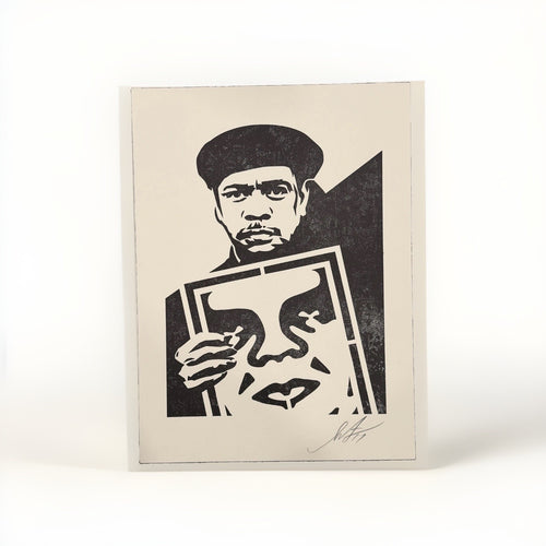
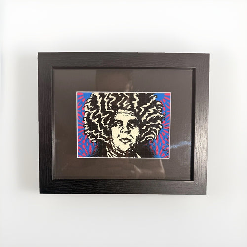
Street art gives a room its graphic voltage. Pop art can bring another register of colour or image-making. A designer object adds height, silhouette, and a change of material. The combination is strong when the parts have one point of connection and plenty of room to disagree. A Shepard Fairey print might supply the hard graphic structure; a Mr Brainwash print can add a punch of colour; a Death NYC work can work as a smaller, sharper interruption. The object on the console should not repeat any of them. It should change the tempo.
This is a practical guide to making those choices: which work gets the main wall, how a figure earns its place beneath it, where colour should repeat and where it should stop, and how to keep a home personal rather than over-programmed. It deals with presentation, not pricing, authenticity, licensing, or artist biography. Check the current listing and its supplied documentation before buying any individual work.
Give every object one clear job
Most crowded rooms do not have too much art. They have too many items trying to do the same thing. If every wall is loud, every shelf is packed, and every object is a focal point, the eye has nowhere to pause. Begin by assigning roles. One large work can own the primary sightline. A second work can reward closer viewing. One sculptural object can hold the console or shelf below. Everything else either supports that composition or gets stored for another season.

| Element | Best role in the room | Useful restraint |
|---|---|---|
| Large street-art print | Primary wall and first sightline | Keep the furniture and frame quiet |
| Smaller pop or street-art work | Close-viewing zone, hall, desk, or reading corner | Use a wide mat or generous wall margin |
| Designer object | Three-dimensional pause on a console, shelf, or plinth | Give it empty space on at least two sides |
| Books and secondary objects | Texture and evidence of use | Use a small group, then stop |
This hierarchy lets unlike things sit together. A saturated print does not need a saturated object below it. A glossy figure can sit beneath a matte frame. A small work can live across the room rather than competing on the same wall. The goal is tension with a reason, not a lineup of matching merchandise.
Treating a Figure as a Focal Object
Every well-composed room has a hierarchy. The eye enters, lands somewhere first, and then travels. In a living room it might be the fireplace, or the art above the sofa, or the view through a window. In a dining room it is usually the table and whatever hangs above it. The mistake amateurs make is letting a room have five focal points, which is the same as having none , the eye ricochets and never settles. The mistake collectors make is the opposite: assuming that because a piece is valuable, it will automatically command attention. It will not. Presence is designed, not inherited.
A designer figure earns focal status through three levers: position, isolation, and contrast. Position means putting it where the eye naturally arrives , on the console that faces the entry, at the end of a sightline down a hallway, on the mantel that the whole room orients around. Isolation means giving it room to breathe, which we will return to at length, because negative space is the single most underused tool in styling collectibles. Contrast means ensuring the figure reads distinctly against whatever sits behind and beneath it.
Building the Sightline
Walk into your own room and stop at the threshold. Where does your eye go? That first landing spot is the most valuable real estate in the house, and it is where a focal figure belongs. A single sculptural piece placed at eye level along that primary sightline will do more work than a dozen scattered objects. If the natural landing spot is a low console, that is fine , a seated or bowed figure such as many KAWS COMPANION poses reads beautifully from slightly above, since the composition was designed to be looked down upon with a certain tenderness.
The One-Object Rule for High-Value Pieces
When a piece is the star of a room, resist the urge to accessorize around it. A collectible figure flanked by a stack of coffee-table books, a candle, a small plant, and a decorative bowl is no longer a focal object; it is one item in a still life, and a busy one. If you want the figure to command, clear its surroundings. Let it sit alone on the console with nothing but its own shadow. The confidence of that emptiness is what separates a designed room from a decorated one. The pieces in the KAWS collection in particular tend to have enough graphic weight to hold a surface entirely on their own.
Plinths, Shelves, Vitrines, and Pedestals
What a figure stands on is not an afterthought , it is half the composition. The pedestal is the oldest sculptural convention in the world, and it exists for a reason: elevation confers importance. Lift an object off the floor or the tabletop and onto a dedicated base, and you have told the room that this thing is worth looking at. The vocabulary of bases is richer than most people realize, and each choice sends a different signal.
The Plinth
A plinth is a simple rectangular column, usually monochromatic , white, black, or a natural wood , designed to disappear and let the object float. For a mid-size or large designer figure, a floor-standing plinth in a corner or beside a seating area turns the piece into architecture. The key is proportion: the plinth should be tall enough to bring the figure to roughly chest or eye height, and its footprint should be modest, never wider than it needs to be. A gallery-white lacquer plinth reads as clean and contemporary; a solid oak or walnut block reads as warmer and more collected. Match the plinth to the room's temperature, not to the figure.
The Shelf
Floating shelves are the most versatile stage for tabletop-scale figures, and they are where most collectors live day to day. The discipline here is negative space. A single figure on an otherwise empty floating shelf, with generous air above and to the sides, reads as intentional and gallery-like. The same figure wedged between books and frames reads as storage. If you are displaying more than one figure across a run of shelves, stagger them, vary the heights, and never let two sit at the same level directly above each other , the eye wants rhythm, not a grid.
The Vitrine and the Case
A pedestal says "look." A vitrine says "look, and understand that this will still be here, pristine, in twenty years."
The Pedestal Group
For a larger collection, a cluster of pedestals of varying heights , think of the way a sculpture court is arranged , can turn a corner or an entryway into a genuine gallery moment. Odd numbers work best, and the heights should be distinct enough to create a clear stepped rhythm. This is an advanced move, and it works only if the pieces share enough visual DNA to read as a family. A run of BE@RBRICK figures in a controlled palette is ideal for this treatment, because their identical silhouette makes the height variation the entire point.
Scale and Where Each Size Belongs
Designer figures come in a range of scales, and the collector's shorthand for this is percentage sizing , a system where a "100%" figure is the standard reference size, a "400%" is four times that in each dimension, and a "1000%" is a monumental piece that stands roughly seventy centimeters or more. (The exact heights vary by line and release; treat the percentages as relative proportions rather than fixed measurements.) The single most common styling error is putting the wrong percentage in the wrong place. Scale is not about how much you can afford; it is about how the object relates to the volume of the space around it.
Small Figures (100% Range)
A 100% figure is roughly the size of a hand , perfect for intimate, close-range viewing. These belong on desks, bookshelves at eye level when seated, bedside tables, and the shelves of a home office. Placed on a large console in a double-height living room, a small figure vanishes; it needs to be somewhere you approach closely and often. Small figures also reward grouping in a way larger ones do not, because a cluster of three or five compensates for the modest individual footprint. A shelf of small figures reads as a considered collection; a single small figure on a vast surface reads as a lost afterthought.
Mid-Size Figures (400% Range)
The 400% figure is the interior designer's sweet spot. At roughly a foot to sixteen inches tall, it has enough mass to hold a console, a mantel, or a floating shelf on its own, yet it is not so large that it overwhelms a normally proportioned room. If you are buying one figure to style as a genuine focal object, this is the size to reach for. It is legible from across a room, substantial enough to survive on an empty surface, and portable enough to move as your rooms evolve. The bulk of what makes sense as living-room sculpture sits in this range.
Large and Monumental Figures (1000% and Up)
A 1000% figure is furniture-scale sculpture. It stands on the floor, not on a surface, and it needs a room with the ceiling height and open floor area to receive it. In a loft, a double-height great room, a wide entryway, or a generous landing, a monumental figure becomes the defining gesture of the space , the thing everyone photographs. In a standard-ceiling apartment, the same piece feels cramped and slightly comic, like a grand piano in a studio. Respect the volume. If your ceilings are eight feet, a monumental figure will fight you; if they soar, it will sing.
Scale is a conversation between the object and the void around it. Get the ratio wrong and even the finest figure looks either lost or overbearing.
A practical rule: the figure's height should relate to the furniture or architecture it sits near. On a console, aim for a figure roughly one-quarter to one-third the width of the console surface. On the floor, a monumental figure reads best when it occupies a clearly defined zone , a corner, an alcove, a rug , rather than floating in open traffic. When in doubt, size up for impact on the floor and size down for intimacy on a shelf. The full figurines range spans these scales, so it is worth deciding on the placement first and letting the space dictate the size.
Color-Matching a Black or Accent Figure to a Room
Color is where a designer figure either integrates into a room or announces itself as a bolt of energy , and both are legitimate strategies, provided you choose deliberately. The two dominant approaches are the tonal (the figure blends into the room's palette and reads as a sculptural texture) and the accent (the figure is the single hit of saturated color in an otherwise restrained space). Knowing which you are doing before you buy will save you from the most expensive mistake in styling collectibles: the piece that clashes with everything and can never quite find a home.
The Black Figure: The Safest Sophisticated Choice
A black figure , whether high-gloss lacquer or deep matte , is the little black dress of designer-toy styling. It works in almost any palette because black is functionally a neutral, and it foregrounds silhouette over color, which is exactly what you want when treating a toy as sculpture. A glossy black BE@RBRICK reads as architectural and glamorous, catching highlights and reflections that animate it as the light changes through the day. A matte black COMPANION reads as graphic and severe, an object of pure form. Against a pale wall it becomes a crisp cutout; against a dark, moody wall it becomes a study in subtle tonal shift, visible more by its highlights than its edges. If you buy one figure and want it to work across years of redecorating, buy it in black.
The Tonal Approach
To integrate a figure into an existing palette, pick up a color already present in the room , the brass of a lamp, the ochre of a rug, the sage of a velvet chair , and let the figure echo it. A figure that shares a hue with the room's secondary color reads as designed-in rather than dropped-in. This is the quiet, collected look: nothing shouts, everything relates. It is particularly effective in monochromatic or heavily neutral interiors, where a single object in a slightly warmer or cooler version of the wall tone adds depth without disruption.
The Accent Approach
The opposite strategy uses the figure as the room's exclamation point. In a space built from grays, whites, and natural woods, a single figure in a saturated red, electric blue, or high-vis yellow becomes the focal color that the entire palette organizes around. The rule here is scarcity: the accent works precisely because it is the only one. Repeat that saturated color three times around the room and the figure loses its status as the event. Let it be singular. Pull the same hue into one small, distant accessory , a single book spine, a thread in a cushion , and you create a subtle echo that ties the figure to the room without diluting its punch.
Decide first: is this figure a texture or an event? A texture blends and deepens. An event interrupts and commands. A room can absorb many textures but only one or two true events.
Grouping Versus Solo Display
The decision to display one figure or several is not about how many you own , it is about what effect you want and whether your pieces can sustain a group. Both solo and grouped display are correct in the right context, and the failure mode is applying one when the room needs the other.
The Solo Statement
A single figure, well-placed and well-lit, is the most powerful move available. Solitude confers importance; the object has nothing to compete with, and the eye has nowhere else to go. This is the right choice for your best, largest, or most meaningful piece, and it is almost always the right choice in a minimalist or restrained interior. The solo statement demands the disciplines we have already covered , isolation, a considered base, a clean background, and light , but done well, one figure alone can carry an entire room.
The Considered Group
Grouping works when the pieces share a visual language strong enough to read as a set. This is why a run of BE@RBRICK figures is the classic collector's grouping: the identical silhouette means the eye reads them as variations on a theme, and the differences in finish, color, and surface become the whole delight. A shelf of ten BE@RBRICK figures in a tight palette is a genuine design achievement; ten unrelated figures from ten different lines is a jumble.
When you group, govern it with three rules. First, establish a unifying thread , a shared silhouette, a shared palette, or a shared theme , so the collection reads as intentional. Second, vary within the constraint: same form, different finishes; same palette, different scales. Sameness plus one axis of variation is the formula for a collection that looks curated rather than accumulated. Third, respect rhythm and spacing: uniform gaps read as retail, so let the intervals breathe and vary slightly, and step the heights so the eye moves.
The Hybrid: A Hero and Its Chorus
A sophisticated middle path places one large hero figure as the clear focal point, supported by a small chorus of related smaller pieces arranged so they defer to it. The hero sits alone at the composition's center of gravity; the chorus clusters nearby, lower and smaller, clearly subordinate. This mirrors classical composition , a dominant element and its echoes , and it lets a growing collection stay legible instead of turning into visual noise. The KAWS collection lends itself to this, since a single strong COMPANION can anchor a group of smaller companions and accessories without any of them competing for the lead.
Lighting a Vinyl Figure
Lighting is the difference between a figure that sits in a room and a figure that commands it, and it is the most neglected element in almost every home display. Museums spend enormous sums lighting sculpture because they understand that form is revealed by shadow, and shadow is created by directional light. A figure lit flatly by overhead ambient light looks dead. The same figure lit deliberately looks alive.
Directional Over Flat
The core principle is directionality. Light coming from a single dominant direction , ideally from above and slightly to one side , rakes across the figure's surface and creates the gradient of highlight to shadow that reveals its three-dimensional form. A small adjustable spot, a picture light repurposed onto a shelf, or a track head aimed at the figure will transform it. Avoid lighting a figure dead-on from the front; frontal light flattens everything it touches and erases the very depth that makes the object sculptural.
Reading the Finish
The figure's surface dictates the lighting strategy. A high-gloss figure is all about reflection: it will pick up bright specular highlights and mirror its surroundings, so you want a clean, controlled light source and an uncluttered background, because whatever is in the room will appear on the figure's skin. A matte or flocked figure absorbs light and shows form through soft tonal transitions rather than highlights; it can take a broader, softer light and still read beautifully. Metallic finishes sit between the two, throwing warm or cool reflections depending on the color temperature of the bulb , a detail worth tuning, since a warm bulb on a gold finish deepens it while a cool bulb can make it look thin.
Practical Fixtures
- Puck lights or LED strips discreetly mounted at the top of a shelf or inside a vitrine wash the figure from above and are the single highest-impact upgrade for shelf displays.
- Adjustable track or spot heads aimed from the ceiling give a floor-standing plinth figure genuine drama and let you dial in the angle.
- A picture light or slim linear fixture above a console lights a focal figure the way a gallery lights a painting.
- Warm dimmable bulbs in the 2700K–3000K range flatter most finishes and let you shift the mood from bright daytime clarity to evening intimacy.
Buy the figure, then budget for the light. An unlit collectible is a whispered sentence; a lit one is spoken aloud.
One caution specific to vinyl and collectible finishes: keep hot, direct light sources at a respectful distance. Modern LEDs run cool and are ideal, but older halogen or incandescent spots placed too close can, over long periods, warm a surface. LED fixtures solve this entirely, run efficiently, and let you place light exactly where the form needs it.
Blending Toys with Fine-Art Walls
The most sophisticated interiors do not segregate their designer figures into a "toy zone." They integrate them into a genuine art environment, where a vinyl figure on a console holds a conversation with the prints and paintings on the wall behind it. This is where a designer-toy collection graduates from a hobby to a coherent point of view , and where the same collecting instinct that curates the shelf can curate the whole wall.
The Dialogue of Two and Three Dimensions
A figure gains enormously from being staged in front of related two-dimensional work. A KAWS COMPANION on a console beneath a bold graphic print creates a dialogue between the sculptural and the flat , the same visual language expressed in two dimensions and three. The wall does not have to match the figure literally; it has to rhyme with it. Graphic, high-contrast, pop-inflected wall art is the natural companion to designer figures, which is why the gallery's print collections pair so naturally with the figures. A wall of bold pop art , the Warhol-Haring-Basquiat lineage , is practically purpose-built to sit behind a vinyl figure, since both descend from the same collision of commercial imagery and fine-art ambition.
Building the Gallery Wall Around the Figure
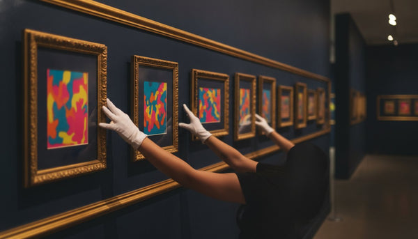
When you compose a gallery wall above a console that holds a figure, treat the figure as the three-dimensional anchor and let the framed works orbit it. Keep a color or a graphic language consistent between wall and object so the grouping reads as one composition. A run of graphic screenprints , the bold, propaganda-red register of Shepard Fairey, or the stark black-white-and-red of Cleon Peterson , provides exactly the flat graphic energy that flatters a sculptural figure standing in front of it. The stencil-and-street vocabulary of Mr Brainwash works the same way, giving the wall a subversive edge that the figure answers in three dimensions.
Contrast as a Strategy
Integration does not always mean harmony. A deliberately unexpected pairing , a playful vinyl figure against a wall of serious, restrained fine art, or a stark monochrome figure against a riot of color on the wall , creates tension that keeps a room from feeling decorated-by-numbers. The pixelated mosaic language of Invader, the mash-up wit of Death NYC, or the broader canon of modern masters can all be recruited into this game. The principle is that the figure and the wall should have a reason to be near each other , shared palette, shared attitude, shared lineage, or deliberate, considered contrast , never mere proximity.
Frequently Asked Questions
What size KAWS or BE@RBRICK figure should I buy for a living room?
For a standard living room where you want a genuine focal object, a mid-size figure in the 400% range , roughly a foot to sixteen inches tall , is the reliable choice. It has enough mass to hold a console or mantel on its own without overwhelming a normally proportioned space. Reserve monumental 1000% floor pieces for rooms with high ceilings and open floor area, and use small 100% figures for close-range spots like desks and bookshelves. Browse the range of scales in the figurines collection and decide on placement before size.
How do I display a designer toy without it looking like clutter?
The single biggest lever is negative space. Give one figure a clean, empty surface or an otherwise bare floating shelf, rather than surrounding it with books, candles, and other objects. Elevate it on a plinth or dedicate a shelf to it, light it directionally from above and to one side, and keep the background uncluttered. Treating the piece as one deliberate sculpture rather than one item in a busy still life is what separates a curated look from clutter , an approach that suits the graphic weight of the KAWS collection especially well.
What is the best way to clean and protect a vinyl figure?
How do I know a KAWS or BE@RBRICK figure is authentic?
Modern authentication for these figures pairs physical verification — packaging, hologram sticker, foot stamp markings, and documented release records — with a blockchain certificate of authenticity, which is far harder to fake than paper alone. Buy from a source that authenticates and documents provenance before listing, and that benchmarks pricing against a large body of comparable sales. Every piece in the BE@RBRICK and KAWS collections is verified before it goes live, so the figure you style is one you can later sell as genuine.
Can designer toys work in a sophisticated, grown-up interior?
Absolutely , and the ones that fail usually fail on styling, not on the object. A single black figure on a walnut plinth, lit like sculpture and staged in front of a considered wall of graphic art, reads as confident and collected, not childish. The trick is to treat the figure with the same seriousness you would give any sculpture: proper base, proper light, proper isolation, and a wall that rhymes with it. Pieces from the broader figurines collection, paired with graphic pop art, sit comfortably in the most elevated rooms.
Let the collection change the room over time
The most convincing interiors are revised, not completed in a single shopping trip. Rotate a small print into the entry when the living-room wall needs a rest. Move a sculptural object to a shelf with a different background. Remove something when a composition starts feeling full. Those small revisions keep the room attentive to the work rather than locked into a single photograph-ready arrangement.
When you add something new, ask one question before you ask whether you like it: what job will it do here that nothing else can do? If the answer is clear, the work has a place. If the answer is only that it matches something you already own, leave a little wall empty and wait for the right piece. Browse the current Shepard Fairey, Mr Brainwash, Death NYC, and designer-object collections with that rule in mind.