Bringing high-energy pop street art, with its saturated colors, layered imagery, and often playful defiance, into a carefully considered interior requires a nuanced approach. Many collectors initially assume that such bold statements demand an equally bold, maximalist environment. However, the most successful integrations often involve a surprising amount of restraint and strategic editing. The goal is not to overwhelm a space, but rather to give the art, particularly works by artists like Mr Brainwash, the room it needs to breathe and make its intended impact without dominating the entire room's narrative.
The practical question for any design-literate collector furnishing a real home is: how do you prevent a dynamic piece from feeling like an uninvited guest, or worse, a visual shout in an otherwise composed conversation? The answer begins with treating the art as a focal point, not merely a decorative element. This means understanding its visual weight, anticipating its interaction with existing elements, and consciously designing around it. Rather than adding more, we often find ourselves subtracting, simplifying, and creating deliberate counterpoints to allow the art's energy to be celebrated, not diffused.
This article will guide you through practical strategies for integrating pop street art into your home. We'll explore how to manage saturated color, leverage visual density, and select appropriate settings. From social rooms to private studies, we’ll discuss how material contrasts, thoughtful lighting, and a clear design intent can transform a potentially chaotic display into a curated statement that reflects both your taste and the art's inherent vitality.
Understanding the energy of pop street art
Pop street art, particularly the work of artists such as Mr Brainwash, is characterized by an undeniable, often effervescent, energy. This vitality stems from several key visual components: a typically saturated color palette, often incorporating neon brights and bold primaries; a dense layering of imagery, text, and iconic symbols; and a graphic, often playful or rebellious, sensibility. These elements combine to create works that demand attention, drawing the eye with their immediate impact and detailed details.

Consider the visual weight of these pieces. Unlike a muted landscape or a minimalist abstract, pop street art is rarely subtle. It communicates with a directness that can be both exhilarating and, if not managed, overwhelming. The use of familiar cultural iconography, often recontextualized or subverted, adds another layer of engagement, inviting viewers to decode and interact with the artwork on multiple levels. This makes it particularly compelling for areas where conversation and engagement are desired.
The challenge, then, is not to diminish this energy, but to channel it effectively within your interior. Think of it as a powerful current: you wouldn't simply let it flood the room. Instead, you build a conduit, direct its flow, and allow it to illuminate specific areas. This involves a careful assessment of the artwork's scale, its dominant colors, and its thematic content, and then considering how these attributes will interact with the existing architecture, furniture, and lighting of your space.
For example, a large-format piece by Mr Brainwash, with its characteristic blend of graffiti, pop culture references, and saturated spray paint, can instantly become the gravitational center of a room. Its visual density means that surrounding elements need to be thoughtfully chosen to avoid competition. Simplicity in adjacent furnishings, a clear wall space, and perhaps a complementary but not identical color scheme will allow the artwork to command the stage without creating visual noise. The art's energy, when properly framed, enhances the room's dynamic rather than disrupting it.
The myth of more: Maximalism with restraint
When faced with high-energy art, there's a common misconception that one must either commit to full-blown maximalism or shy away entirely. The truth, however, lies in a more nuanced approach: maximalism with restraint. This isn't about filling every surface or creating a chaotic jumble; it's about curating a rich visual experience that prioritizes impact and intentionality over sheer volume. The goal is a layered, dynamic aesthetic that still feels considered and cohesive, allowing each significant piece, especially a saturated pop street art work, to contribute without being lost.
To achieve this, begin by identifying your focal points. If a Mr Brainwash print is your anchor, allow it to dictate the visual temperature of its immediate surroundings. This doesn't mean everything else must be bland, but rather that other elements should support, rather than compete with, the art. Consider a living room where a large, colorful piece hangs above a sofa. Instead of adding a multitude of small, busy decorative objects on adjacent shelves, opt for fewer, larger, and more sculptural items that offer a material or textural contrast without introducing additional visual patterns or competing narratives.
Think about visual breathing room. Even in a maximalist space, empty space is a valuable design tool. It allows the eye to rest and prevents the room from feeling claustrophobic. This could be a clear wall space adjacent to a gallery wall, or a simple, uncluttered surface near a visually dense artwork. The contrast between complexity and simplicity is what creates visual interest and sophistication. It's about a rhythm of visual information, not a constant crescendo.
Another aspect of restrained maximalism is the thoughtful integration of varied textures and materials. A highly graphic piece of art can be grounded by the warmth of natural wood, the coolness of polished stone, or the softness of a textured rug. These tactile elements provide a counterpoint to the art's visual intensity, adding depth and richness without increasing visual clutter. This approach ensures that while the room is visually rich, it remains inviting and comfortable, a true reflection of a curated home rather than an art storage facility. It’s about building a complex, intriguing narrative through deliberate choices, ensuring every element earns its place.
Strategic placement: Where to hang high-impact pieces
The location of a high-impact artwork is paramount to its success within an interior. Pop street art, with its inherent vibrancy and narrative depth, thrives in specific settings where its energy can be appreciated without overwhelming the space. Generally, social rooms are ideal candidates, as these are areas designed for interaction, conversation, and visual engagement. Think living rooms, dining rooms, and entryways.
In a living room, a large Mr Brainwash piece can serve as a powerful focal point above a sofa or fireplace. This placement immediately draws the eye upon entry and provides a natural conversation starter. Ensure that the wall is sufficiently large to accommodate the artwork without it feeling cramped. Adequate negative space around the piece allows it to command attention and prevents the wall from feeling too busy. Consider the sightlines from various seating arrangements; the art should be comfortably viewable without straining.
Dining rooms also present an excellent opportunity. A bold artwork can enliven a dining area, adding personality and stimulating discussion during meals. Here, the art might be placed on a prominent wall that is visible from the table, or even on a shorter wall that guests pass as they enter. The key is to ensure that the lighting is appropriate, allowing the colors and details to be fully appreciated without glare.
Entryways and hallways, often overlooked, can be transformed by a well-placed, high-energy artwork. An strong piece here sets the tone for the entire home, offering a glimpse into the collector's personality and design philosophy. In a hallway, particularly a long one, a series of related pieces or a single, elongated artwork can create a dynamic visual corridor. For a more intimate setting, such as a study or a bedroom, consider a slightly smaller, yet still strong, piece. The art can provide a personal touch, a source of inspiration or reflection, without dominating the room's more serene function.
When selecting a wall, also consider its relationship to natural light sources. While natural light is generally desirable for viewing art, direct, unfiltered sunlight can be detrimental over time, causing colors to fade. Position the art where it receives ample ambient light but is protected from harsh direct rays. Artificial lighting will be discussed later, but it is an equally critical consideration for optimal display.
Balancing act: Materiality and texture contrasts
The intense visual energy of pop street art, particularly the bold statements found in a Mr Brainwash print collection, benefits immensely from thoughtful material and texture contrasts within a room. Placing a saturated, graphic artwork against a backdrop of varied textures helps to ground the piece, preventing it from feeling detached or overwhelming. This interplay creates depth, sophistication, and a sense of balance that elevates the entire design scheme.
Consider the raw, urban edge often present in street art. This can be beautifully juxtaposed with natural, organic materials. A large, colorful canvas mounted on a wall painted in a soft, matte finish, or even a textured wallpaper, immediately creates a tactile dialogue. Imagine a polished concrete floor or a reclaimed wood table positioned beneath a dynamic artwork. The cool, industrial feel of concrete or the rustic warmth of wood provides a material anchor, allowing the art's vibrancy to pop without creating visual chaos.
Textiles also play a crucial role. A plush velvet sofa, a chunky knit throw, or a hand-woven rug can introduce softness and warmth that counteracts the often hard-edged aesthetic of graphic art. The contrast between the smooth, often slick surface of a print or canvas and the inviting tactility of fabric creates a compelling sensory experience. This is especially effective in living rooms or bedrooms where comfort is paramount. The interplay of smooth and rough, hard and soft, glossy and matte, adds layers of interest that invite closer inspection and prolonged appreciation.
Here's a brief table illustrating effective material pairings:
| Art Characteristic | Complementary Material/Texture | Design Effect |
|---|---|---|
| High saturation, graphic imagery | Natural wood, exposed brick | Adds warmth, organic grounding |
| Bold lines, urban aesthetic | Polished concrete, raw steel | Enhances industrial chic, modern edge |
| saturated, layered colors | Soft linen, plush velvet, wool rug | Introduces comfort, tactile balance |
| Energetic, busy composition | Matte paint, subtle wallpaper | Provides visual breathing room, depth |
Even small details matter. Accessorize with objects that echo these material contrasts: a ceramic vase with a rough glaze, a smooth metal sculpture, or a woven basket. These elements, though minor, contribute to the overall tactile richness of the room, creating a cohesive environment where the art feels integrated rather than simply hung. The goal is to build a dialogue between the art and its surroundings, ensuring that each element enhances the other, resulting in a space that is both visually stimulating and harmoniously balanced.
Color theory in practice: Harmonizing saturated tones
Working with the saturated tones prevalent in pop street art demands a considered approach to color theory. The saturated palettes used by artists like Mr Brainwash or even the more controlled yet still strong schemes of a Shepard Fairey collection, require careful harmonization within an interior. The aim is to allow the art's colors to sing without clashing with or being swallowed by the room's existing palette.
One effective strategy is to pull a dominant or accent color from the artwork and subtly echo it in other elements of the room. This doesn't mean painting an entire wall the same intense shade as a key color in the art. Instead, select a less prominent hue from the artwork, or a desaturated version of a dominant color, and incorporate it through cushions, a throw, a small decorative object, or even a book spine. This creates a visual thread that connects the art to the rest of the room, fostering a sense of cohesion without being overly matchy.
Alternatively, you can opt for a complementary color scheme. If your artwork features strong blues, introducing elements with warm oranges or corals can create a dynamic, yet balanced, contrast. This approach is bolder and requires a confident hand, but when executed well, it can make both the art and the room feel incredibly saturated and sophisticated. The key is to use the complementary color in smaller doses, allowing the art to remain the primary focus.
Another powerful technique is to surround highly saturated art with a largely neutral palette. Walls painted in soft grays, warm whites, or subtle beiges provide a calm backdrop that allows the artwork's colors to truly pop. This strategy emphasizes the art as the main color statement, letting its vibrancy be the star. Furniture in neutral tones, perhaps with varied textures, further supports this approach, creating a serene canvas for the art's energetic presence.
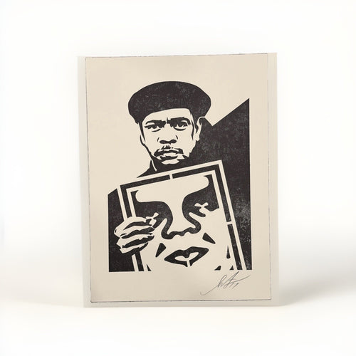
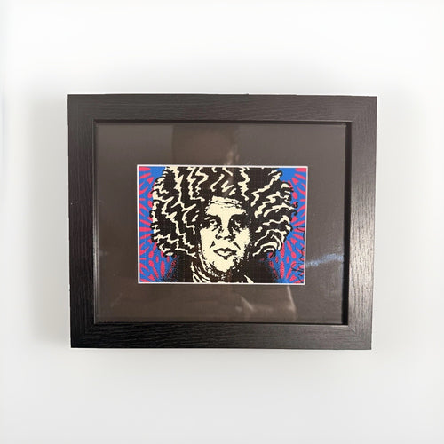
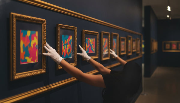
When considering multiple artworks, or a gallery wall, pay attention to the overall color conversation. While each piece may be individually saturated, ensure there’s a unifying element – perhaps a shared background color, a consistent frame choice, or a deliberate progression of tones. For instance, a collection of Death NYC prints might feature a consistent graphic style, but their individual color schemes could vary wildly. Grouping them thoughtfully, perhaps by intensity or by a shared underlying hue, helps to create a cohesive display rather than a riot of unrelated colors. The goal is a deliberate composition, not a random arrangement.
Single statement vs. gallery wall: Making the choice
Deciding whether to feature a single, commanding piece of pop street art or to curate a dynamic gallery wall is a key design choice that significantly impacts a room's aesthetic. Both approaches have distinct advantages and are best suited for different contexts and artistic expressions.
A single statement piece, particularly a large-format work by an artist like Mr Brainwash, offers undeniable impact. It immediately becomes the room's focal point, demanding attention and setting the tone for the entire space. This approach is ideal when you have one particularly strong, visually dense, or large artwork that you want to highlight. It allows the artwork to breathe, giving it ample negative space and preventing any visual competition. A single statement piece often reads as confident, minimalist in its presentation, and highly curated. It’s a powerful choice for a main living area, above a fireplace, or in a prominent entryway where you want to make an immediate and lasting impression. The simplicity of this approach also makes it easier to manage the color and material contrasts discussed earlier, as you're primarily designing around one central element.
Conversely, a gallery wall offers an opportunity for a richer, more layered narrative. This is where you can showcase a collection of smaller works, perhaps exploring a theme, a particular artist's evolution, or a range of styles. A gallery wall can be particularly effective for artists like Death NYC, whose diverse, iconographic prints often lend themselves to being grouped. When creating a gallery wall with high-energy art, careful curation is essential to avoid visual clutter.
Here are some considerations for a successful gallery wall:
- Cohesion: Find a unifying element. This could be consistent framing, a shared color palette across pieces, a common subject matter, or even just a consistent style of art (e.g., all pop street art).
- Layout: Plan your arrangement on the floor first. Experiment with different configurations to find a balanced composition. Aim for even spacing between frames, or a deliberate asymmetry that feels intentional.
- Breathing Room: Even with multiple pieces, ensure there's enough wall space around the entire grouping. Don't extend the gallery wall too close to corners or ceilings, as this can make it feel cramped.
- Variety within Unity: Mix different sizes and orientations (landscape, portrait) to create visual interest, but maintain a consistent aesthetic or thematic link.
The choice ultimately depends on the artwork itself, the size and function of the room, and your personal design aesthetic. A single, grand gesture can be incredibly powerful, while a thoughtfully assembled gallery wall can tell a more detailed story, inviting closer inspection and prolonged engagement.
Lighting your collection: Enhancing impact and preserving integrity
Effective lighting is as crucial as placement in showing high-energy pop street art. The right illumination can enhance the artwork's colors, reveal its textures, and dramatically elevate its presence within a room. Conversely, poor lighting can flatten its vibrancy, cast distracting shadows, or, worse, cause irreversible damage over time. When dealing with the bold palettes of artists like Mr Brainwash, thoughtful lighting is not just an aesthetic choice, but a practical necessity.
The primary goal is to provide even, glare-free illumination that highlights the artwork without causing hot spots or shadows. Track lighting with adjustable heads is a popular and versatile solution. These fixtures allow you to direct light precisely onto the canvas or print, and their position can be easily altered if you rearrange your art. For a more integrated look, recessed ceiling lights equipped with adjustable gimbal trims can achieve a similar effect, providing a clean, architectural finish.
When selecting bulbs, color temperature is key. LEDs are generally preferred for their energy efficiency, longevity, and low heat emission, which is vital for art preservation. Look for bulbs with a color rendering index (CRI) of 90 or higher, which accurately represent the artwork's true colors. A color temperature between 2700K and 3000K (warm white) typically provides a flattering light that enhances most artworks without making them appear yellow or overly cool. Avoid bulbs with a very high color temperature (e.g., 5000K or daylight white) unless specifically desired for a very cool, gallery-like effect, as these can sometimes make colors feel stark or artificial in a home setting.
Consider the angle of incidence. Light sources should generally be positioned at an angle that minimizes glare, typically from the ceiling or a wall-mounted picture light, aiming down at about a 30-degree angle to the artwork. This angle helps to illuminate the piece evenly while avoiding reflections from glass or glossy surfaces. If using picture lights mounted directly above the frame, ensure they extend far enough to cast light across the entire surface of the art, not just the top portion.
Finally, always protect your art from direct, unfiltered sunlight. UV rays are the primary cause of fading and degradation for most artworks, especially prints. While a certain amount of ambient natural light is desirable, avoid hanging valuable pieces on walls that receive direct sun for extended periods. If unavoidable, consider using UV-filtering glass or acrylic for framed pieces, or installing UV-blocking window films. Thoughtful lighting not only makes your pop street art look its best but also ensures its longevity, allowing you to enjoy its saturated energy for years to come.
Integrating playfulness: Beyond the wall
The saturated and often irreverent spirit of pop street art doesn't have to be confined solely to the walls. Integrating playfulness into your interior extends beyond framed prints and canvases, allowing the art's character to permeate the space through complementary objects and thoughtful accents. This approach creates a more immersive and cohesive environment, where the art's energy feels like a natural component of the home's personality.
One effective way to do this is through sculptural objects and artist figurines. Many contemporary artists, including those influenced by street art culture, create three-dimensional works that echo the themes, colors, and graphic styles of their two-dimensional art. Placing a sculptural piece on a coffee table, a bookshelf, or a console can serve as a smaller, tactile extension of the wall art. These objects provide a different point of interaction, inviting closer inspection and adding another layer of visual interest to the room. For example, a stylized figurine with bold lines or a pop of color can playfully mirror the energy of a large graphic print nearby.
Consider the use of decorative objects that share a similar aesthetic. This doesn't mean purchasing cheap replicas, but rather selecting items that resonate with the art's spirit. A brightly colored vintage toy, a uniquely shaped ceramic vase, or even a stack of art books with striking covers can contribute to the playful, contemporary vibe. These elements should be chosen for their aesthetic merit and their ability to complement, not compete with, the primary artworks. The key is thoughtful curation: select a few strong items rather than cluttering surfaces with many small, unrelated pieces.
Textiles and soft furnishings also offer an avenue for integrating playfulness. Cushions with graphic patterns, a throw blanket in a bold, unexpected color, or a rug with an abstract design can echo the visual language of pop street art. These elements soften the hard lines often associated with graphic art and add comfort, making the space more inviting. For example, a cushion featuring a simplified, graphic motif could subtly reference the layered imagery of a Mr Brainwash piece, creating a harmonious connection.
Even functional items can be part of this playful integration. A contemporary lamp with an unusual form, a saturated piece of glassware, or a set of colorful coasters can all contribute to the overall aesthetic. The aim is to create a dialogue between all the elements in the room, ensuring that the art's energy is reflected in various forms and textures, making the entire space feel curated, engaging, and authentically reflective of your taste. It’s about building a coherent visual story where every piece contributes to the overarching narrative of a saturated, modern home.
Frequently asked questions
How do I choose the right size of pop street art for my room?
Measure your wall space carefully. A good rule of thumb for a single piece above furniture (like a sofa) is for the art to be roughly two-thirds to three-quarters the width of the furniture. For an empty wall, the art should ideally occupy a significant portion of the wall's horizontal and vertical space, typically leaving adequate breathing room around the edges. Avoid art that is too small, as it will look lost, or too large, as it will overwhelm.
Can I mix pop street art with traditional or classical decor?
Absolutely, and often with striking results. The juxtaposition of high-energy pop street art with traditional elements can create a dynamic tension and a sophisticated, eclectic look. The key is intentionality: use the traditional elements to ground the saturated art, creating a deliberate contrast. For example, a bold Mr Brainwash piece can look stunning above a classic antique console table, or a Death NYC print can add a contemporary edge to a room with ornate moldings. The contrast highlights both styles.
What's the best way to clean and maintain pop street art prints?
For framed prints, simply dust the frame and glass with a soft, dry cloth. Avoid abrasive cleaners. For unframed canvases or prints that are not under glass, use a very soft, clean, dry brush or a microfiber cloth to gently remove dust. Never use water, chemical cleaners, or harsh rubbing, as this can damage the surface and pigments. Always handle prints with clean hands, preferably wearing cotton gloves, to avoid transferring oils and dirt.
Should all my art in a room be from the same style or artist?
Not at all. A curated mix of styles and artists often creates a more interesting and personal interior. While a cohesive collection of works by a single artist like Shepard Fairey can be powerful, integrating diverse pieces, perhaps from different periods or movements, adds depth. The unifying factor should be your personal taste and how the pieces collectively contribute to the room's overall mood and aesthetic. Focus on how colors, themes, and forms interact rather than strictly adhering to one style.
How can I make a pop street art piece feel less temporary or 'trendy' in my home?
Integrate it thoughtfully into your home's enduring design elements. Choose high-quality framing that complements your decor, not just the art. Pair it with timeless furniture and classic materials like wood, stone, or natural fibers, which provide a stable backdrop. Focus on pieces that genuinely resonate with you, rather than fleeting trends. By giving it a considered place within a well-designed, personal space, the art transcends its immediate context and becomes a lasting part of your home's story. Explore our pop art collection for more inspiration.