There is a particular kind of contemporary artist whose work seems to leak out of the gallery and into the wider culture, appearing on a screenprint one week and a ceramic vase the next, then a skateboard deck, a towel, a book jacket, a bronze on a plinth. Cleon Peterson is unmistakably one of these artists. Born in Seattle in 1973 and based in Los Angeles, Peterson has built a visual language so compressed, so instantly legible, that it travels almost frictionlessly across formats and industries. A single silhouetted figure raising a weapon over another; a field of stark black and white broken only by a stab of fluorescent red; a frieze of interlocked bodies caught in the act of dominating or being dominated. You do not need a wall label to know you are looking at a Peterson.
That legibility is not an accident, and it is not merely a stylistic tic. It is the product of a career built on two foundations at once: fine art and graphic design. Peterson earned a BFA in Graphic Design from ArtCenter College of Design in Pasadena in 2004, graduating with honors, then an MFA from Cranbrook Academy of Art in Michigan in 2006. He has worked as a professional graphic designer with clients ranging from Saks and Coca-Cola to Paramount, Bacardi, Mozilla and MOCA, and he spent time inside Shepard Fairey's Studio Number One, the design engine behind one of the most reproduced political images of the twenty-first century. This is an artist who understands, at a cellular level, how an image is supposed to work when it has to compete for attention in the street, on a screen, on a product shelf.
For collectors, Peterson's fluency across media is both an opportunity and a puzzle. The opportunity is obvious: there are many ways into the work, at many price points, from a hand-pulled screenprint to a cast bronze to a designed object made with a specialist manufacturer. The puzzle is knowing which of those crossovers actually deepen a collection and which are simply merchandise. This guide walks through Peterson's verified collaborations and cultural crossovers with an eye toward that question — what his graphic language is, why it travels, and how a serious collector should read the signal in the noise.
Why His Graphic Language Travels

Begin with the most obvious thing about a Cleon Peterson image and you begin with its economy. The work is flat and clean, built from silhouetted figures rendered without modelling or perspective, arranged across a shallow pictorial space that owes more to signage and heraldry than to Renaissance illusionism. Peterson has described this directly as a designer's instinct carried into painting. "Flat and clean is the design training in me," he has said, "always looking for the most direct mark to make." That sentence is a key to everything that follows. An image built for the most direct mark is, by definition, an image that can survive translation — onto a wall four storeys high, onto a page in a magazine, onto the deck of a skateboard, onto the belly of a ceramic vase.
Then there is the palette, which is arguably the most portable element of the whole enterprise. Peterson works most iconically in a triad of black, white and fluorescent red, though he also deploys blue, pink and gold as the accent. He has been explicit about why. "Just using three colours — black, fluorescent red, and white — is the quickest way to communicate that," he has said of the urgency his subjects demand. And elsewhere, more pointedly: "Red, black, and white feels violent and references the authoritarian colours used in propaganda, uniforms and symbols from the past." The palette is not decorative. It is doing argumentative work, borrowing the visual grammar of the poster, the flag and the uniform to say something about power. But a byproduct of that borrowing is that the palette reads correctly in almost any medium. Three high-contrast colours will hold their meaning whether they are printed with archival ink on rag paper or glazed onto porcelain.
The third portable element is subject. Peterson's work is not about a hundred different things; it is about one thing, examined relentlessly. "The subject of power is always central," he has said. The recurring drama is power versus submission — a figure with the upper hand and a figure without it — staged as a kind of timeless, faceless allegory. Crucially, Peterson insists this is a mirror and not an endorsement. "I'm not an advocate for violence," he has said, "but I am an advocate for people being un-apathetic." The carnage in his work, in other words, is meant to make a viewer feel something about the world rather than to celebrate brutality. The curator Adam Lerner, who organised Peterson's museum solo exhibition in Denver, put the point well when he observed that the violence is "clearly archetypal, not real," coexisting with what he called an "incredible, cool, graphic, decorative quality."
"Flat and clean is the design training in me, always looking for the most direct mark to make." — Cleon Peterson
That combination — archetypal subject, authoritarian palette, poster-flat execution — is why the work travels. An image that is legible, iconographically consistent and morally serious is exactly the kind of image a manufacturer, a publisher or a muralist wants to work with, because it will not dissolve into visual mush when it changes scale or substrate. Critics have reached for a long lineage to describe the effect: the compressed friezes of Greco-Roman vases, the political fury of Goya and Delacroix, the flattened social violence of Leon Golub, and the street-level directness of Keith Haring. Those comparisons belong to the critics, not to Peterson himself; he has not claimed them as personal sources. But they point to something real about why his visual language is so transferable. It sits at the intersection of ancient public art and modern advertising, and both of those traditions were designed, from the beginning, to be read at a glance by everyone.
Design DNA as a Collecting Consideration
For a collector, the design DNA has a practical consequence. Because Peterson's images are conceived to survive reproduction, the distinction between an original artwork and a produced object is unusually sharp in his practice, and unusually important. A painting is a singular, hand-made statement. A hand-pulled screenprint is a deliberately editioned artwork, made in collaboration with a printer but authored and signed by Peterson. A licensed product — a towel, a deck, a book cover — is something else again: a legitimate cultural extension of the work, often genuinely collectible, but not an artwork in the same sense. Keeping those categories distinct is the single most useful habit a Peterson collector can develop, and the rest of this guide is organised to reinforce it.
Shepard Fairey and OBEY: The Foundational Collaboration

No account of Peterson's crossovers can begin anywhere but with Shepard Fairey. The two have been friends since the late 1990s, when they moved in the same San Diego skateboarding circles, and that friendship long predates either man's art-world standing. Peterson later worked at Fairey's Studio Number One, the Los Angeles design studio that produced the graphic work behind the OBEY empire and Fairey's own political imagery. The exact role and years are not documented, and it would be a mistake to overstate them, but the association matters because it places Peterson inside one of the most influential graphic-design operations in contemporary art at a formative moment. If you want to understand where Peterson's poster instincts were sharpened, Studio Number One is part of the answer.
The friendship became a body of collaborative work. In 2014, the two artists created Power & Glory, a four-wall mural produced for Wynwood Walls during Art Basel Miami. Wynwood Walls is one of the most visible outdoor exhibition platforms in the world during Basel week, and a four-wall collaboration there is a significant public statement — two artists whose independent visual languages, Fairey's dense propaganda-poster ornamentation and Peterson's stark figurative violence, are compatible enough to share a surface without either one disappearing. It is worth dwelling on that compatibility. Fairey and Peterson both draw on the graphic vocabulary of authority — the emblem, the banner, the uniform — but they use it toward related ends, interrogating power rather than glorifying it. A mural collaboration works precisely because their sensibilities rhyme.
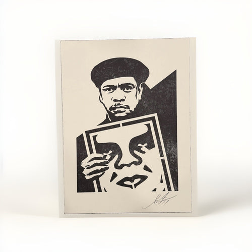
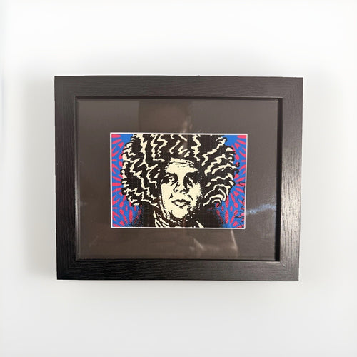
On paper, the collaboration has produced editioned prints that are among the most sought-after crossover objects in Peterson's catalogue. Scales of Injustice, released in 2016, is a letterpress edition of 300 signed by both artists — a genuinely joint object, carrying two signatures, and therefore doubly desirable to collectors of either artist. An earlier collaborative print, Pattern of Corruption, dates to 2015. A print signed by both Fairey and Peterson occupies a special category in the market: it is not simply a Peterson work or a Fairey work but a document of a relationship, and works that sit at the intersection of two collectible names tend to draw interest from both collector bases at once.
The OBEY Artist Series
Beyond the one-to-one collaborations, Peterson has produced work through OBEY Clothing's artist series, including the print Practice of Masters in 2013 — a screenprint edition of 125 at 18 by 18 inches. The OBEY artist series is a recurring platform through which Fairey's brand releases editioned prints by artists in his orbit, and Peterson's participation is both a product of the friendship and an early instance of his willingness to work through a branded, semi-commercial channel while retaining the integrity of a signed, numbered edition. It is a useful example of the category distinction raised earlier: an OBEY-published Peterson print is still a Peterson print — hand-pulled, editioned, signed — even though it reaches collectors through a clothing brand's release calendar rather than a traditional gallery.
"The subject of power is always central." — Cleon Peterson
For collectors, the Fairey axis offers a clear lesson about how to read Peterson's collaborations. The most valuable crossovers are the ones where Peterson's authorship remains intact and, ideally, is compounded by a second serious artist's authorship. A dual-signed letterpress edition is a collectible artwork in its own right. A mural is an event and a public record. Both deepen an understanding of the work. Neither is merchandise. As we move outward from Fairey into design, objects and lifestyle products, that spectrum — from authored artwork to licensed extension — becomes the essential map.
Design and Objects: Modernica, Case Studyo, Joyride

If the Fairey collaborations show Peterson working artist-to-artist, his design and object collaborations show him working artist-to-manufacturer — and this is where his graphic economy proves most adaptable. The most substantial of these relationships is with Modernica, the Los Angeles furniture maker known for its faithful reissues of mid-century modern designs. Peterson has worked with Modernica across several projects: a Case Study Daybed in 2016, a project titled Land of Shadows in 2019, and The Divide Collection in 2025, the last of which was produced in connection with wildfire relief. The wildfire dimension carries a personal weight; Peterson lost his Altadena home in the 2025 Eaton Fire, and a relief-oriented collection in that context is something more than a commercial exercise.
The Modernica partnership is instructive because furniture is an unforgiving medium for a graphic artist. A daybed is a functional object with a strong existing design identity, and applying an artist's imagery to it risks reducing serious work to upholstery pattern. That Peterson's language survives the transfer — that a field of struggling silhouettes can sit on the frame of a Case Study daybed and still read as a Peterson statement rather than a decorative motif — is a testament to the density and clarity of the imagery. It is exactly the portability discussed at the outset: the flat, high-contrast, archetypal image holds its meaning even on a piece of furniture.
Case Studyo and the Sculpture Editions
The most important object collaborator in Peterson's practice, from a collecting standpoint, is Case Studyo, the specialist publisher behind much of his three-dimensional work. Through Case Studyo, Peterson has produced a body of sculpture and editioned objects that translate his two-dimensional allegories into physical form. The Light Bearer (2017) is a bronze with a black patina, roughly 31 centimetres tall, in an edition of 8 plus 4 artist's proofs. Balance of Power (2016) is a glazed white porcelain edition of 25. The Judgement (2016) is a unique fibreglass work — a one-of-one — at a monumental 240 by 174 by 206 centimetres. The range within a single publisher's output, from an intimate patinated bronze to a room-scale unique sculpture, shows how seriously the sculptural side of the practice is taken.
Peterson has connected the sculptural work explicitly to the classical tradition, and his reasoning is worth quoting because it clarifies the intent behind translating his figures into three dimensions. "My sculptures intentionally reference the classical," he has said, "because it enforces the idea that the issues we're dealing with today also existed in the past." A bronze or a marble-white porcelain figure invokes the antiquities gallery, and in doing so it collapses the distance between contemporary violence and ancient violence. The medium becomes part of the argument.
Case Studyo matters to collectors for a second, entirely practical reason: documentation. Case Studyo sculptures ship in a screen-printed wood box accompanied by a certificate signed and numbered by Cleon Peterson. This is the clearest documented certificate-of-authenticity practice anywhere in Peterson's output. It applies to the sculptures and objects, not to the paper prints, and it is a genuinely valuable feature. A signed, numbered certificate travelling with a boxed edition gives a collector a robust provenance anchor — something to preserve, verify and pass on with the work. Any collector acquiring a Case Studyo Peterson on the secondary market should expect that box and that certificate to be present and should treat their absence as a question to be answered rather than a detail to be waved away.
Joyride Pendants
At the smaller, more wearable end of the object spectrum, Peterson collaborated with Joyride and Case Studyo on a series of pendants in 2024, in an edition of 50. Jewellery is the most intimate scale at which the work appears, and an edition of 50 is small enough to keep the pendants firmly in collectible-object territory rather than mass merchandise. It is a reminder that Peterson's crossovers are not limited to the wall and the plinth; the imagery has been miniaturised into something you can wear, without abandoning the discipline of a numbered edition.
Lifestyle and Accessibility: Slowtide, The Skateroom, Multiples

The next ring outward from authored artworks and editioned objects is the lifestyle collaboration — products that carry Peterson's imagery into everyday use and, in doing so, dramatically widen access to the work. In 2025, Peterson collaborated with Slowtide, the towel and textile brand, bringing his graphic language onto a soft, functional, warm-weather object. He has also worked with The Skateroom, the platform that produces artist-designed skateboard decks, frequently with a philanthropic component. A skateboard deck is a resonant surface for Peterson specifically because of his own roots in skate culture — the same San Diego skate scene where he met Shepard Fairey. There is a genuine circularity in an artist who came up through skateboarding returning to the deck as a canvas.
These lifestyle products should be understood clearly for what they are: legitimate, often desirable cultural extensions of the work, but not artworks in the sense that a signed screenprint or a numbered bronze is an artwork. A towel or a deck bearing Peterson's imagery is a licensed multiple, typically produced in larger quantities and without the individual signing and numbering that defines a fine-art edition. This is not a criticism. Accessibility is part of the point of Peterson's whole project — a body of work concerned with power and apathy is, at some level, meant to be seen widely, and a $50-to-a-few-hundred-dollar product does democratic work that a five-figure painting cannot. The collector's task is simply not to confuse the categories.
Reading the Spectrum of Multiples
Peterson's output includes multiples that sit at various points along the spectrum, and it helps to have a mental hierarchy:
- Hand-pulled screenprints — the core of the collectible print market. These are authored, editioned artworks, pencil-signed and numbered, printed on heavy rag paper. This is where most serious print collecting happens.
- Editioned sculptures and objects — bronzes, porcelain, ceramics and pendants from publishers like Case Studyo and Avant Arte, typically boxed and certificated. Fully collectible; often the clearest documentation.
- Licensed products — towels, decks, furniture and similar. Culturally legitimate, sometimes produced in relatively controlled quantities, but functional goods rather than fine-art editions.
One object worth singling out sits interestingly between the second and third categories: the Live to Kill Hand vase from 2021, a glazed ceramic produced in an edition of 500 with Beyond the Streets and NTWRK. At an edition of 500 it is far larger than the tight Case Studyo sculpture editions, which places it closer to a designed collectible than to a rare sculpture — but it is still a glazed ceramic object made through an art-world channel, not a mass-market consumer good. The vase is a good test case for the collector's category discipline: the medium and the maker say "art object," while the edition size says "accessible multiple." Both readings are correct, and the price and long-term significance will reflect that middle position.
"I'm not an advocate for violence, but I am an advocate for people being un-apathetic." — Cleon Peterson
The broad principle for lifestyle crossovers is this: buy them because you want to live with the imagery, because you value the collaboration, or because you support the cause a given release benefits — not because you expect a towel to behave like a signed screenprint in the market. Held to that standard, the lifestyle collaborations are among the most genuinely enjoyable ways to engage with Peterson's world, and their very accessibility is part of what makes the artist's project coherent.
Editorial and Publishing: The New Yorker, The Times, Penguin Classics

Peterson's crossovers into editorial and publishing represent a different kind of cultural validation. Where a furniture or towel collaboration extends the imagery into objects, an editorial commission places the work inside the institutions that shape public conversation — magazines, newspapers and the literary canon. These are not licensing deals; they are commissions, in which an art director or editor decides that Peterson's specific visual intelligence is the right vehicle for a piece of writing or a book.
Peterson has produced illustration for The New Yorker, notably in connection with fiction by George Saunders. Pairing Peterson with Saunders is telling. Saunders is a writer preoccupied with power, cruelty, empathy and the moral texture of contemporary American life — exactly the terrain Peterson's images map in visual form. A magazine editor reaching for Peterson to accompany Saunders is recognising a kinship of subject, not just a striking style. Peterson has also worked with The New York Times, another platform where a graphic artist's imagery must carry editorial weight and be legible to a mass readership at small scale. Both commissions confirm the point made at the beginning: the work survives translation into print at any size because it was built for directness.
Penguin Classics and Philip K. Dick
The most resonant of Peterson's publishing crossovers is his cover for Penguin Classics' edition of Philip K. Dick's The Man in the High Castle. A Penguin Classics cover is a particular kind of honour: it means an artist's work has been chosen to become the permanent visual identity of a canonical text, the image that thousands of readers will associate with the book for years. And the match of artist to material is almost uncannily apt. The Man in the High Castle is an alternate-history novel that imagines an Axis victory in the Second World War — a story steeped in authoritarianism, occupation and the machinery of totalitarian power. Peterson's palette, by his own account, "references the authoritarian colours used in propaganda, uniforms and symbols from the past." An artist whose entire visual argument is built from the grammar of authority, commissioned to give a face to a novel about authoritarian triumph: the commission and the work are speaking the same language.
For collectors, editorial and publishing crossovers occupy an unusual position. A mass-market book cover or a magazine illustration is not, in the ordinary case, a collectible edition. But these commissions are enormously important as validation and as biography. They demonstrate that Peterson's work is trusted by serious cultural institutions to do serious interpretive work, and they enrich the story that surrounds every object a collector might own. A collector who understands that Peterson gave The Man in the High Castle its Penguin Classics face understands something real about why the artist's imagery carries the weight it does. The commissions are part of the provenance of the whole practice, even when they are not, individually, things one buys and hangs.
What Crossovers Mean for a Collection

Step back from the individual collaborations and a pattern emerges that has real consequences for how a Peterson collection should be built. The crossovers are not a distraction from the "real" work; they are evidence of the work's cultural reach, and cultural reach is one of the things that sustains an artist's market over time. An artist whose imagery appears in The New Yorker, on Penguin Classics, in Wynwood murals, on Modernica furniture and in Case Studyo bronzes is an artist embedded in the culture at many levels simultaneously. That breadth is a form of durability. It means the work is being encountered constantly, by many audiences, which keeps the artist visible and relevant in a way that a purely gallery-bound practice would not.
But breadth also demands discrimination. The single most important thing a collector can do with a body of work this varied is to keep the categories straight and to build deliberately within them. Consider how the pieces relate to one another in terms of value drivers. Broadly, and Peterson's own market bears this out, the hierarchy of medium runs painting first, then sculpture, then print — with scale, edition size, condition, provenance and subject all modulating value within each tier. The auction record makes the top of that hierarchy concrete: Peterson's 2015 oil-on-canvas painting The Nightcrawler, a large work at 213.4 by 213.4 centimetres, sold at Phillips Hong Kong on 9 July 2020 for HK$350,000, roughly US$45,161. That is the ceiling of the market as currently recorded, and it is a painting — singular, hand-made, large.
Building With Intention
Most collectors will not begin at the painting tier, and they do not need to. The prints and objects offer an intelligent way into the work, provided the buying is deliberate. A few principles follow from everything above:
- Prioritise authorship. A pencil-signed, numbered screenprint or a certificated Case Studyo sculpture carries Peterson's direct authorship. A licensed towel or deck does not, in the same sense. Both can belong in a collection, but the authored works are the spine of it.
- Value dual authorship where it exists. The Fairey collaborations — a dual-signed letterpress edition like Scales of Injustice, for instance — sit at the intersection of two collectible names and draw interest from both markets. That intersection is a real, and relatively rare, source of desirability.
- Respect edition size and documentation. A bronze in an edition of 8 is a fundamentally different object from a ceramic in an edition of 500, which is different again from an unlimited licensed product. Know which you are buying, and insist on the documentation that belongs to it — most concretely, the signed, numbered certificate and screen-printed box that accompany a Case Studyo sculpture.
- Let the crossovers tell the story. The editorial and mural work may not be things you buy, but they are the context that makes the objects you do buy meaningful. A collection is richer for understanding the whole ecosystem.
"Red, black, and white feels violent and references the authoritarian colours used in propaganda, uniforms and symbols from the past." — Cleon Peterson
There is also a coherence argument to be made. Because Peterson's imagery is so consistent across media, a thoughtfully assembled group of works — a screenprint, a small bronze, a dual-signed collaboration — can read as a single sustained meditation on power rather than a scattering of unrelated purchases. The very portability that lets the work move across formats is what allows a collection to feel unified even when it spans paper, bronze and porcelain. That is an unusual gift, and collectors who understand it tend to build more satisfying groupings than those who chase individual objects in isolation.
Signal Versus Noise for Collectors

An artist with a large and varied output, a devoted following and a brisk market for editions is, inevitably, an artist around whom noise accumulates. The final and most practical task of this guide is to help a collector separate the signal — the verifiable, meaningful facts that should drive a decision — from the noise of hearsay, hopeful attribution and market chatter. The discipline here is the same discipline that runs through the whole of Peterson's practice: precision.
Start with what can actually be verified about the prints, because prints are where most collectors will spend most of their attention. Peterson's screenprints share a recognisable set of physical traits. They are hand-pulled screenprints, typically on Coventry Rag paper in the 290-to-320gsm range, often with deckled edges. The documented signing convention is a pencil signature and date at the lower right on the front of the sheet, with the edition number in pencil at the lower left, also on the front. The signature itself takes a characteristic form: Peterson's first name plus a two-digit year — "Cleon 15," for example. Editions commonly run to 125 or 150 impressions, though sizes of 50, 75, 90, 100 and 175 appear as well, alongside artist's proofs. Primary-release prices have historically clustered in the region of $150 to $175, rising to the $300-to-$750 range for sets and gallery editions.
Those specifics are the signal. A prospective print should be checked against them: Is it a hand-pulled screenprint on heavy rag paper? Is it pencil-signed and dated at the lower right and numbered at the lower left, on the front of the sheet? Does the signature read as a first name and a two-digit year? A work that answers those questions cleanly is behaving the way a genuine Peterson print should behave. Just as important is knowing what is not part of the documented picture. There is no documented practice of verso signatures, blindstamps, embossing or chops on Peterson's prints; the documented mark is the recto pencil signature and edition number. A dealer citing an exotic authentication feature that does not appear in the record is, at minimum, a prompt for harder questions.
Where Noise Tends to Enter
Noise enters a market like this in predictable ways, and a few cautions are worth stating plainly. Be wary of confident specifics that cannot be sourced — invented edition sizes, unrecorded auction results, precise prices attached to works whose sales are not on record. The market for Peterson prints at auction has, on a trailing basis, tended to average in the low hundreds of dollars, and the primary-release band sits around $150 to $175; anyone quoting figures wildly outside those ranges as fact should be able to show where the number comes from. Be wary, too, of biographical embellishment. Peterson has spoken publicly about having struggled with heroin addiction and having faced felony possession charges in the 1990s before turning his life around, but that is his account of his own life, offered in his own words, and it should be treated with dignity and attributed to him — not repeated as though it were an independently documented fact, and not used as a marketing hook.
Attribution errors are another source of noise. Peterson's collaborations are numerous and well-documented enough that there is no need to reach for unverified ones; the verified list — Fairey and OBEY, Modernica, Case Studyo, Joyride, Slowtide, The Skateroom, and the editorial commissions for The New Yorker, The New York Times and Penguin Classics — is rich on its own terms. When a claimed collaboration cannot be corroborated, the responsible move is to leave it out rather than let it inflate a work's story. The same goes for institutional claims: Peterson has exhibited widely, including a museum solo exhibition at MCA Denver, and has been shown by serious galleries and on major public platforms, but a claim that a specific museum holds a work in its permanent collection is a different and heavier assertion that should not be made without confirmation.
"My sculptures intentionally reference the classical because it enforces the idea that the issues we're dealing with today also existed in the past." — Cleon Peterson
Condition and provenance are the last, and quietest, sources of signal. For prints, condition is the ordinary vocabulary of works on paper: the state of the deckled edges, the flatness of the sheet, any handling or light exposure, the presence or absence of the original documentation. For the Case Studyo sculptures, provenance is unusually easy to anchor because of the signed, numbered certificate and the screen-printed wood box; a boxed, certificated example is a stronger proposition than a loose one, and the difference is worth caring about. Across every category, an unbroken chain of provenance — where a work came from, who has owned it, how it was acquired — is the collector's best defence against the noise, because it replaces hearsay with a record.
The Collector's Takeaway
Cleon Peterson is, in the end, an artist whose crossovers are a feature, not a footnote. The graphic language he built from design discipline and a single sustained subject — power and its abuses — is so legible and so portable that it has found its way onto walls, into bronzes, across furniture and towels and skateboard decks, and onto the covers of magazines and canonical books. For a collector, that reach is a gift, because it means there are many honest ways into the work at many levels of commitment. But the gift comes with a responsibility to keep the categories clear: to know the difference between an authored, signed edition and a licensed multiple; to value dual-signed collaborations and well-documented sculptures for what they are; to check a print against its verified physical traits; and to insist on provenance and documentation rather than accept a good story at face value.
That insistence on verification is, not incidentally, the principle Gauntlet Gallery brings to every work it handles. The most valuable thing a collector of an artist like Peterson can have is not a hot tip or an optimistic price; it is confidence that a given screenprint is what it claims to be, that its signature and numbering conform to the documented practice, and that its provenance holds up. A great collection of a widely-crossed-over artist is built one verified object at a time — authorship confirmed, documentation intact, the story told only as far as the facts allow. Do that, and the breadth of Peterson's cultural reach becomes exactly what it should be: not a source of confusion, but a deep and durable foundation for a collection that will hold its meaning for as long as the images themselves.