

Featured image: AI-generated interior concept using product reference photography. Scale, setting, framing, and placement are illustrative.
Balancing visual complexity: introducing a patterned object into a patterned room
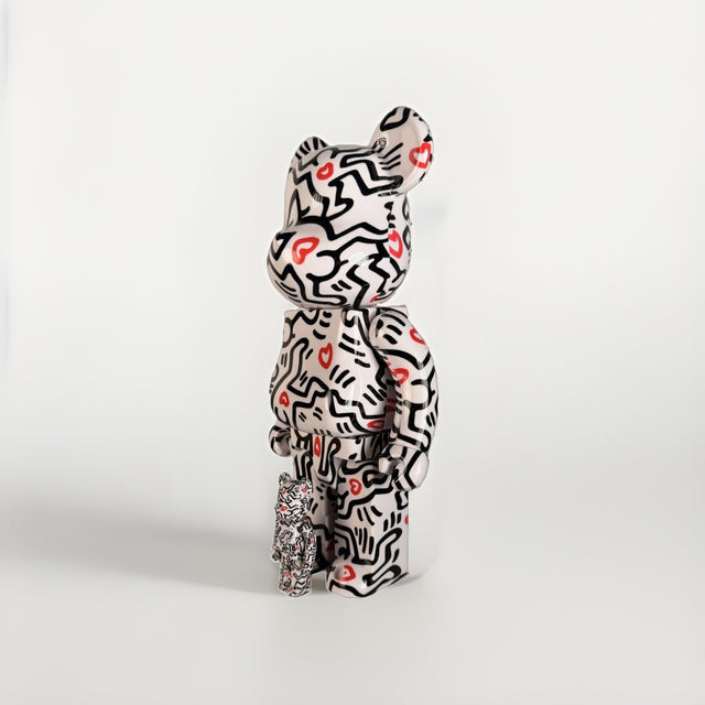
The decision to introduce a highly patterned object into an already textured interior often presents a fascinating design challenge. Consider a living room, for instance, where a client has fallen for a vibrant floral wallpaper, a geometric rug, and perhaps even a subtly striped upholstered sofa. Each element, on its own, possesses a distinct visual rhythm. Now, imagine introducing a Keith Haring BE@RBRICK 400% + 100% Set Medicom Toy Bearbrick Foundation Art. This particular set, with its iconic black-line figures and red hearts against a crisp white ground, is a concentrated burst of pattern. Its surface is entirely covered in Haring’s energetic iconography, making it a powerful visual statement. The question then becomes: how do we place this dynamic object so it truly shines, rather than getting lost in the visual noise, or worse, creating an overwhelming sense of discord? The answer lies not in avoiding pattern, but in understanding its various scales, densities, and how different patterns interact from varying distances. It requires an audit of existing patterns and a strategic approach to introducing new ones, ensuring each element contributes to a cohesive, engaging aesthetic without sacrificing individual impact. The goal is to create a dialogue between patterns, allowing some to recede and others to come forward, much like a well-composed musical piece.
Understanding pattern scale: near versus distant reading
Patterns are not monolithic; they operate on different scales, which dictates how they are perceived from various distances. A large-scale pattern on a wallpaper, for example, might be discernible across a room, its motifs clearly readable from a distance. Think of a bold damask or a large-format botanical print. As you approach it, the individual details become clearer, but its overall impression remains consistent. Conversely, a fine, intricate pattern on an upholstery fabric might only reveal its complexity upon closer inspection. From afar, it might read as a solid texture or a subtle tonal variation. This distinction between near and distant reading is crucial when integrating new patterned elements. The Keith Haring BE@RBRICK, with its dense, all-over application of figures and hearts, presents a unique challenge and opportunity. From a distance, its black and white forms with pops of red create a distinct visual texture, an energetic blur. Up close, the individual dancing figures and hearts become clear, inviting closer inspection and appreciation of Haring’s signature style. This duality means the BE@RBRICK can function as both a textural accent from afar and a detailed artwork up close.
When assessing a room, begin by cataloging the existing patterns and their predominant scales. Is the wallpaper a large, open pattern, or a tightly repeating motif? Does the rug feature bold, graphic shapes, or a more subtle, woven texture? The goal is to avoid direct competition in scale. For instance, if a room features a large-scale, open floral wallpaper, introducing a small-scale, intricate pattern on a throw pillow might provide a welcome contrast without clashing. If the existing patterns are all of a similar, mid-range scale, the Haring BE@RBRICK, with its dense, almost frenetic pattern, can offer a deliberate counterpoint. Its concentrated energy can act as a focal point, drawing the eye and providing a moment of intense visual interest. The contrast in scale allows both the BE@RBRICK and the surrounding patterns to breathe, rather than merging into an indistinguishable visual field. This strategic interplay of scales ensures that each patterned element retains its identity and contributes to the overall visual richness of the space. Consider the visual weight: a large, sparse pattern offers more white space, while a dense, small pattern creates a continuous field. The Haring BE@RBRICK falls into the latter category, demanding a counterpoint of visual calm.
The importance of visual rest: creating breathing room for patterns
Even in a maximalist interior, visual rest is not merely desirable; it is essential. Without areas where the eye can pause, a room risks becoming overwhelming, chaotic, and ultimately, exhausting. Visual rest allows the brain to process the complexity of patterns and appreciate individual elements. This does not mean stripping a room bare; rather, it means strategically incorporating solid colors, smooth textures, and clear, uncluttered surfaces. For a room already rich in pattern, introducing a patterned collectible like the Keith Haring BE@RBRICK necessitates careful planning of these resting zones. A solid-colored wall, a plain linen curtain, or a simple, unadorned console table can provide the necessary visual respite. These areas act as neutral backdrops, allowing the patterns to pop and preventing them from canceling each other out.
When planning for visual rest, consider the primary viewing angles of the room. Where will the BE@RBRICK be placed? What is immediately behind it, and what is adjacent? If the immediate background is a busy wallpaper, the BE@RBRICK's own dense pattern will struggle to assert itself. Instead, aim for a solid, complementary color. This solid surface doesn't have to be stark or boring. It could be a richly painted wall, a velvet panel, or a simple, well-chosen cabinet door. The key is its uninterrupted surface. This principle extends beyond the immediate backdrop. If the room features multiple patterned textiles, ensure there's at least one piece of solid-colored upholstery, perhaps a sofa or an armchair, that can anchor the space. This creates a moment of calm that allows the patterned elements, including the BE@RBRICK, to truly sing. Without these intentional moments of visual rest, even the most thoughtfully chosen patterns can devolve into a cacophony. The Haring BE@RBRICK, with its bold, graphic nature, benefits immensely from a clear, uncluttered stage. Think of it as a soloist requiring a quiet accompaniment to truly shine.
Pattern audit: assessing existing visual rhythms
Before introducing any new patterned object, a thorough pattern audit of the existing interior is indispensable. This isn't about rigid rules, but about understanding the current visual ecosystem and identifying opportunities for harmony or deliberate contrast. Begin by identifying the dominant patterns: wallpaper, large rugs, and primary upholstery. Note their scale (large, medium, small), their density (sparse, moderate, dense), and their color palette. Are they geometric, organic, abstract, or figurative? What is the repeat size of each pattern? A large repeat offers more negative space within the pattern itself, while a small, tight repeat creates a continuous, almost textural field.
For instance, if a room already features a wallpaper with a large-scale, organic floral pattern, and a rug with a medium-scale, abstract geometric design, these two patterns likely provide distinct visual interest without overwhelming each other, especially if their color palettes are harmonious. The Keith Haring BE@RBRICK, with its dense, medium-to-small scale figurative pattern, introduces a new rhythm. Its black and white figures with red accents are bold and high-contrast. The audit should reveal whether there is a visual 'gap' that the BE@RBRICK can fill. Perhaps the existing patterns are all relatively soft in their contrast, and the Haring figure can inject a much-needed graphic punch. Or, if the room is already very high-contrast, the BE@RBRICK might need an even more subdued backdrop to prevent overstimulation.
Consider the interplay of lines and shapes. The Haring BE@RBRICK features dynamic, flowing lines and abstract human figures. If the room is dominated by rigid geometrics, the BE@RBRICK can introduce a playful, organic counterpoint. Conversely, if the room is already very fluid and organic, the BE@RBRICK's graphic intensity can provide structure. The audit is not about finding patterns that match, but about finding patterns that complement or provide thoughtful contrast. A successful audit allows for informed decisions, ensuring the new addition feels intentional rather than accidental. It’s about creating a layered visual experience where each pattern has its moment to be seen and appreciated.
Hypothetical project: the urban loft living room
Let's consider a hypothetical project: an urban loft living room, approximately 20 feet by 15 feet, with 12-foot ceilings. The client, a young professional with an appreciation for contemporary design, has already made several pattern-rich selections. The dominant wall features a large-scale, abstract geometric wallpaper in shades of charcoal, dove gray, and muted gold, with a planning assumption repeat size of roughly 30 inches. The area rug, a hand-knotted wool, introduces a more organic, undulating stripe pattern in deep blues and creams, with a planning assumption medium repeat of about 18 inches. The sofa is upholstered in a textured linen blend, reading as a solid dark gray from a distance, but revealing a subtle, tight basketweave pattern up close. The client now wishes to incorporate the Keith Haring BE@RBRICK 400% + 100% Set as a focal point.
Our pattern audit reveals three distinct patterns: the large-scale geometric wallpaper, the medium-scale organic striped rug, and the subtle, small-scale texture of the sofa. The color palette is sophisticated but leans towards cooler tones. The Haring BE@RBRICK, with its dense, high-contrast black-and-white figures and vibrant red hearts, introduces a new scale and a much-needed pop of warmth and playful energy. Its pattern is dense and relatively small-scale on the form itself, offering a counterpoint to the more open patterns in the room.
Placement strategy: We identify a key area for visual rest. A custom-built, low-profile media console, approximately 70 inches long and 18 inches deep (planning assumptions), finished in a matte black lacquer, is positioned against a solid, painted wall (a warm off-white, echoing the Haring's ground). This console serves as an uncluttered stage. The 400% Haring BE@RBRICK is placed centrally on the console, flanked by two simple, sculptural ceramic vases in a matte red, picking up the accent color from the figure. The smaller 100% BE@RBRICK is placed on a stack of art books on an adjacent side table, allowing for a more intimate viewing experience. The solid wall behind the console provides the necessary visual calm for the BE@RBRICK's intricate pattern to truly stand out. The matte finish of the console and the solid wall prevents any reflective surfaces from competing with the figure's graphic lines. The varying scales of the room’s patterns now work in concert: the large-scale wallpaper provides a grand backdrop, the medium-scale rug grounds the seating area, and the dense, small-scale Haring BE@RBRICK draws the eye to a specific, curated moment, injecting personality without chaos. The red hearts on the BE@RBRICK are amplified by the red vases, creating a deliberate echo that ties the vignette together. This thoughtful layering ensures that each pattern, including the concentrated energy of the BE@RBRICK, contributes to a cohesive and dynamic space.
The role of cabinet backdrops and display choices
When integrating a patterned collectible, the choice of its immediate backdrop is paramount. A simple cabinet interior, a minimalist shelf, or even a strategically painted wall niche can provide the necessary visual simplicity to allow the collectible to truly sing. The goal is to create a 'frame' of visual quiet around the patterned object, preventing it from being absorbed by a busy background. For the Keith Haring BE@RBRICK, with its high-contrast, all-over pattern, a solid, neutral backdrop is often the most effective choice. Consider a built-in display cabinet with a painted interior. If the room’s overall palette is warm, a deep cream or a soft taupe within the cabinet can create a welcoming contrast. If the room leans cool, a charcoal gray or a muted blue can provide a sophisticated setting.
Materiality also plays a role. A smooth, matte finish on the cabinet interior will absorb light and reduce glare, allowing the details of the BE@RBRICK’s pattern to be seen clearly. Conversely, a highly reflective surface might compete with the figure, creating distracting reflections. When working with open shelving, the wall behind the shelf becomes the de facto backdrop. Painting this section of the wall a solid color, even if the rest of the room is wallpapered, can create a deliberate zone of visual rest. This approach allows for a patterned object to be introduced without requiring a complete overhaul of the existing wall treatment.
Think about the overall display composition. If the BE@RBRICK is part of a larger collection on a shelf, ensure there are enough solid objects or clear spaces around it to give it breathing room. A stack of solid-colored books, a simple ceramic dish, or a piece of clear acrylic can serve this purpose. The aim is to prevent a visual pile-up where every item competes for attention. For a piece as graphically strong as the Haring BE@RBRICK, less is often more in its immediate surroundings. Its pattern carries enough visual weight to stand on its own, provided it has the proper stage.
Contrasting patterns: the Andy Warhol "Brillo" BE@RBRICK as an alternative
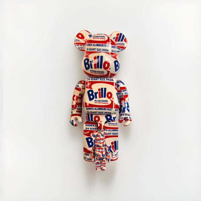
While the Keith Haring BE@RBRICK offers a vibrant, hand-drawn aesthetic, considering other patterned collectibles can further illuminate the principles of pattern integration. Take, for example, the BE@RBRICK Andy Warhol "Brillo" 400% + 100% Set Original 2020 Medicom New. This set features the iconic Brillo Soap Pads commercial packaging, a literal subject of Warhol's 1964 sculpture series, wrapped around the BE@RBRICK form. The Brillo pattern is inherently different from Haring's. It's a precise, commercial graphic, a reproduction of a mass-produced label, characterized by bold primary colors (red, white, blue) and crisp typography. Its repetition is exact and mechanical, in stark contrast to the fluid, almost improvisational lines of Haring's figures.
When integrating the Brillo BE@RBRICK into a patterned room, the design considerations shift. If a room features organic, flowing patterns, the rigid, grid-like quality of the Brillo pattern could provide a powerful, almost jarring, but intentional contrast. Its commercial aesthetic could be a sharp counterpoint to softer, more traditional patterns. Conversely, if a room is already dominated by strong geometric patterns or a minimalist, industrial aesthetic, the Brillo BE@RBRICK might blend in more seamlessly, reinforcing the existing visual language. The hydro-dipping technique used for the Brillo pattern means each figure has a slightly unique wrap, introducing a subtle variation within the strict graphic. This detail, while minor, speaks to Warhol's themes of mass production and individuality, and adds a layer of interest upon close inspection.
The choice between a Haring and a Warhol Brillo BE@RBRICK, when placed in a patterned room, boils down to the desired effect. Do you want to introduce a burst of organic, expressive energy (Haring) or a cool, conceptual, industrial graphic (Warhol Brillo)? The Haring demands attention with its playful chaos; the Brillo commands attention with its iconic, almost confrontational commercialism. Both are patterned, but their visual rhythms and cultural connotations are distinct, requiring different strategic placements to maximize their impact within an existing patterned environment. This exercise in contrasting two patterned collectibles highlights the nuance required in pattern integration – it’s not just about the presence of pattern, but the specific qualities and character of that pattern.
Practical tradeoffs and considerations
Integrating patterned objects into patterned rooms involves a series of practical tradeoffs. The first is the balance between visual stimulation and visual fatigue. While a maximalist aesthetic can be incredibly rich and personal, there's a fine line between curated complexity and overwhelming clutter. A room that assaults the eyes from every angle can be exhausting to inhabit. Therefore, the strategic placement of visual rest areas, as discussed, is not just an aesthetic choice but a functional one, contributing to the room's livability.
Another tradeoff involves the longevity of trends versus timeless appeal. While bold patterns can be incredibly stylish, some are more fleeting than others. A highly specific, trendy pattern might feel dated quickly. Incorporating a classic, artist-driven pattern like Keith Haring's, however, often transcends immediate trends due to its enduring cultural significance and artistic merit. The Haring BE@RBRICK offers a piece of art history in a collectible form, making its patterned surface a statement that holds its own over time.
Consider also the impact on perceived room size. Large, open patterns can make a small room feel larger, while dense, small patterns can make a large room feel more intimate. The Haring BE@RBRICK, being a relatively compact object, won't drastically alter the perception of room size, but its high-density pattern will draw attention and create a focal point, effectively compressing the visual field around it. This is why a simple backdrop is so effective: it allows the BE@RBRICK to command attention without making the surrounding space feel smaller or more cluttered.
Finally, the practicalities of cleaning and maintenance should not be overlooked. While patterns can be forgiving of minor imperfections, some materials and intricate patterns can be harder to keep pristine. Collectibles like BE@RBRICK figures are generally easy to maintain with a soft cloth, but their surroundings should also be considered. Choosing durable, easy-to-clean fabrics for upholstery, even if patterned, can reduce long-term stress. Ultimately, the goal is to create a space that is not only visually engaging but also comfortable, functional, and sustainable for the client. These tradeoffs are not limitations but rather opportunities for informed design decisions that lead to a truly successful outcome.
The art of intentional pattern layering
Successfully integrating a patterned object like the Keith Haring BE@RBRICK into an already patterned room is an exercise in intentional layering. It moves beyond simply choosing patterns that 'go together' and delves into a deeper understanding of visual psychology and spatial dynamics. Designers must act as orchestrators, guiding the eye through a composition of varied rhythms, textures, and scales. The objective is not to eliminate pattern, but to manage its interplay, ensuring that each element – from a grand wallpaper to a small collectible – contributes meaningfully to the overall narrative of the room. The Haring BE@RBRICK, with its concentrated burst of iconic imagery, represents a powerful design tool. Its dense, high-contrast pattern can act as a focal point, a playful accent, or a vibrant counterpoint, depending on its strategic placement and the surrounding visual context. The key is to provide it with the right stage, allowing its unique character to shine without overwhelming the existing aesthetic.
This means cultivating an eye for subtle shifts in pattern density, recognizing the visual 'breathing room' created by solid surfaces, and appreciating how different scales interact from varying distances. It requires a thoughtful audit of existing patterns, identifying their dominant characteristics in terms of scale, repeat, color, and mood. Once these elements are understood, the introduction of a new patterned object becomes a deliberate act of enhancement, rather than a haphazard addition. The contrast offered by the Haring BE@RBRICK, whether against a large-scale floral or a subtle geometric, should be celebrated. Its graphic intensity, combined with its cultural resonance, makes it more than just a decorative item; it's a conversation starter, a piece of art history rendered in a playful, accessible form. When placed with intention, it can elevate a room from merely decorated to truly designed, imbuing it with personality and depth.
Consider, for a moment, the emotional impact. A room rich in varied, yet harmoniously integrated, patterns can evoke a sense of warmth, curiosity, and lived-in comfort. It speaks to a confident aesthetic, unafraid of complexity but always grounded in thoughtful composition. The Haring BE@RBRICK, with its joyful, dancing figures, can amplify this sense of playful sophistication. Its presence can inject an unexpected burst of energy, a reminder that design, even at its most refined, can still be fun and expressive. The challenge, then, is not to shy away from pattern, but to embrace its potential, understanding that a well-composed patterned interior is a testament to a designer's skill in balancing visual information. Each pattern, including the concentrated energy of a collectible, becomes a brushstroke in a larger, more intricate painting. To achieve this, always confirm current availability and condition before specifying. Explore the possibilities and discover how a carefully chosen, distinctively patterned object can transform your next project. We invite you to browse the Keith Haring BE@RBRICK 400% + 100% Set and other unique collectibles for your design vision.
Shop BE@RBRICK
Explore current pieces available from the gallery.
-

BE@RBRICK NASA Space Shuttle 40th Anniversary 1000% Medicom Toy Bearbrick
$600.00 USD
-
BE@RBRICK Brandalism Sync Banksy Medicom Toy Art Figure du-al.io Authenticated
$199.00 USD
-
BE@RBRICK Keith Haring 400% + 100% Set Medicom Toy Bearbrick Foundation Art New
$199.00 USD
-

Bearbrick BE@RBRICK Mercury Astronaut 400% 100% Set NASA Medicom Toy Sealed New
$225.00 USD
-
Bearbrick BE@RBRICK Andy Warhol Brillo 400% 100% Set Original 2020 Medicom New
$275.00 USD
Browse the collection for current listings.