

Featured image: AI-generated interior concept using product reference photography. Scale, setting, framing, and placement are illustrative.
The allure of a white room is undeniable for many designers and homeowners. It promises serenity, spaciousness, and a pristine backdrop that theoretically allows anything to shine. Yet, the reality can often be starker: a sterile, uninviting void that feels more like a waiting room than a sanctuary. The common pitfall is to treat white as an absence of color, rather than a color in itself, with its own complex undertones and interactions. When faced with a predominantly white interior, the temptation might be to sprinkle in muted tones or safe pastels, hoping to gently coax warmth into the space. This approach, however, often leads to a room that feels hesitant, lacking in personality and visual anchor points. Instead, the most effective strategy for animating a white room is often counter-intuitive: embrace bold, saturated color through art. Let the contrast do the work. A vibrant piece of art, especially one with a strong graphic presence and a thoughtful interplay of hues, can instantly inject life, depth, and a much-needed focal point into an otherwise monochromatic environment. It transforms the white walls from a neutral default into a deliberate, clean canvas designed to amplify the artwork's impact. The key is to select art that not only introduces color but does so with conviction, establishing a dialogue between the artwork and its surroundings that feels both dynamic and intentional.
This essay explores how a strategic approach to color, particularly through a piece like Shepard Fairey’s Marilyn Sunset screen print, can solve the white-room problem. We will delve into the nuances of white itself, the power of high contrast, and the subtle ways color can be echoed without overwhelming the space. We will consider how to prioritize art within a design scheme, making it the central figure around which other elements revolve, rather than an afterthought. By focusing on a few key, impactful elements, especially a commanding piece of art, we can achieve a sophisticated and vibrant white interior that feels anything but bland.
Understanding the nuances of white and its interaction with color
Before introducing color, it is crucial to recognize that white is not a monolithic entity. There are countless shades of white, each with its own subtle undertones that can dramatically affect how other colors, particularly those in artwork, are perceived. A pure, cool white with blue or gray undertones will react differently to a vibrant print than a creamy, warm white with yellow or pink hints. For instance, a cool white wall might intensify the blues and purples in an artwork, making them pop with crisp clarity. Conversely, a warm white might soften these cooler tones, pulling them towards a more muted feel, while simultaneously enhancing any reds or oranges present in the art. This interaction is not merely academic; it is a fundamental consideration for any designer aiming to create a cohesive and impactful space. The choice of white paint, therefore, becomes the first layer of the color story, setting the stage for the artwork to follow. The goal is not to match the white to the art, but to understand how the white will serve as a foil, either sharpening or mellowing the artwork's palette. Consider the effect of natural light as well; a room flooded with north-facing light will cast cooler tones, while south-facing light brings warmth, altering the perceived color of both the walls and the art throughout the day. This dynamic interplay means that the 'white room' is never truly static, but a living canvas responding to its environment, ready to be activated by the right piece of art.
When selecting a colorful print for a white room, the paper tone of the artwork itself also plays a role. Shepard Fairey’s Marilyn Sunset, for example, is printed on 80# cream Speckletone paper. This warm, textured base provides an immediate counterpoint to a pure white wall. The cream tone introduces a subtle warmth that can bridge the gap between cooler whites and the vibrant, often saturated colors of the print, such as the deep purples, rich reds, and golden yellows in Marilyn Monroe’s portrait. This deliberate choice of paper stock by the artist is not incidental; it contributes to the overall aesthetic and emotional impact of the piece. Against a stark white wall, the cream paper acts as a soft halo, framing the intense colors and preventing them from feeling too harsh or disconnected. It grounds the image, giving it a subtle vintage quality that complements the iconic subject matter. This interaction between the artwork's paper and the wall's white becomes a nuanced layer of contrast that enhances the visual experience, adding depth without requiring additional decorative elements.
Embracing high contrast as a design principle
In a white room, high contrast is not a risk; it is a powerful design principle. The absence of competing colors on the walls allows a single, vibrant artwork to command attention and define the room's personality. When everything else is muted, the eye is naturally drawn to the most dynamic element. This is where a piece like Shepard Fairey’s Marilyn Sunset truly shines. The screen print features a striking, stylized portrait of Marilyn Monroe rendered in bold, flat blocks of color: deep purples, vivid reds, warm yellows, and cool mint greens. Against a crisp white wall, these colors achieve maximum impact, creating a focal point that is both immediate and enduring. The contrast is not just in hue but also in value and saturation. The bright, almost neon quality of some colors against the deeper, shadowy tones within the portrait itself, all set against a neutral background, creates a visual energy that electrifies the space. This approach avoids the common trap of a white room feeling empty or unfinished. Instead, it transforms the white into a deliberate, gallery-like setting, emphasizing the artwork as the undisputed star.
The power of high contrast extends beyond the primary artwork. It can also inform the selection of minimal accompanying elements. For instance, a single piece of furniture in a contrasting material or color, like a black leather armchair or a polished chrome side table, can reinforce the modern, graphic quality introduced by the art without detracting from it. The goal is to create a sense of visual drama through deliberate choices, rather than relying on a multitude of elements. The white walls provide the necessary breathing room, preventing the bold colors from feeling overwhelming. This restraint in the surrounding decor allows the artwork's narrative and aesthetic to unfold without interruption. It is a confident design statement that understands the value of negative space and the impact of a singular, powerful visual. By embracing high contrast, the white room moves beyond mere neutrality to become a sophisticated stage for artistic expression, demonstrating how less can indeed be more when executed with precision and a clear vision.
Hypothetical Project 1: The Contemporary Living Room
Consider a contemporary living room, approximately 18 feet by 12 feet, with large windows providing ample natural light. The walls are painted in a cool, crisp gallery white, a popular choice for its clean aesthetic. The flooring is light oak, and the primary seating is a large, low-slung sectional sofa in a light gray linen. There's a minimalist coffee table in black metal and glass. The challenge here is to prevent the room from feeling sterile or impersonal. Our objective is to inject personality and warmth without cluttering the clean lines or sacrificing the airy feel.
The solution begins with the placement of Shepard Fairey’s Marilyn Sunset. This print, with its 24 x 18 inch dimensions (unframed), offers a substantial presence. Assuming a conservative frame and matting add 4-6 inches to each side, the final framed dimensions might be around 30 x 24 inches. We will place this piece centrally above the longest section of the gray sectional sofa, ensuring it is at eye level for a seated person. The vibrant, almost electric palette of purples, reds, and yellows in the print will immediately break the cool monotony of the white walls and gray upholstery. The cream Speckletone paper of the print will introduce a subtle warmth, a counterpoint to the cool white, preventing the transition from feeling too abrupt.
To subtly echo the artwork's colors without competing, we introduce very limited, carefully chosen accessories. Two throw pillows on the sectional could feature a deep plum or a muted gold, drawing directly from the print's palette but in a softer, textural fabric like velvet or a raw silk. On the coffee table, a single sculptural vase in a deep amber glass or a small, vibrant red ceramic bowl could pick up on the warmer tones of Marilyn’s lips and hair. A large, abstract area rug with a subtle geometric pattern in varying shades of gray, perhaps with a whisper of pale lavender, would anchor the seating area without pulling focus from the art. The rug's texture would add softness, and its muted tones would allow the artwork to remain the primary splash of color. This scheme prioritizes the art as the main color source, with other elements acting as quiet supporters, creating a sophisticated and inviting space that leverages contrast for maximum impact.
Subtle color echoes: When less is truly more
One of the most common mistakes in decorating a white room with colorful art is the impulse to repeat every color from the artwork throughout the space. This often leads to a disjointed, over-decorated look where no single element truly stands out. Instead, the most effective strategy is to employ subtle color echoes. This means selecting one or two accent colors from the artwork's palette and introducing them sparingly, in unexpected ways, or in diluted forms. The goal is to create a sense of cohesion and intention without overwhelming the eye or detracting from the primary focal point. For example, with Shepard Fairey’s Marilyn Sunset, the dominant colors are strong purples, vibrant reds, and warm yellows, set against cooler greens and blues. Instead of bringing in a purple sofa and red curtains, one might choose to echo the deep purple in a single, textured throw blanket draped over an armchair, or in the subtle veining of a marble side table. The rich red could appear in a small, sculptural object or a single book cover on a shelf. These are not direct matches but rather tonal suggestions that hint at the artwork's complexity.
The power of a subtle echo lies in its ability to create a visual whisper rather than a shout. It allows the eye to appreciate the artwork's full spectrum of color while providing just enough connection to the surrounding space to make it feel deliberate. This approach also prevents the room from feeling too 'themed' or predictable. Think about the way shadows play in a white room; they introduce subtle shifts in tone and depth without adding explicit color. Similarly, a carefully chosen color echo adds a layer of sophistication and visual interest that enhances the overall design. It's about creating a dialogue between the art and the room, where the art speaks boldly, and the room responds with quiet affirmation. This restraint is particularly effective in maintaining the clean, expansive feel that is often the initial draw of a white interior, proving that color can be introduced with impact and elegance without sacrificing the room's core identity.
Art-versus-rug priority: Establishing the hierarchy of color
In designing a white room, a crucial decision often arises: where does the primary color statement reside? Should it be in a bold area rug, or in the artwork? While both can introduce significant color, attempting to have two equally dominant color anchors often results in visual competition and a diluted impact. For a white room, where the goal is often to create a serene yet impactful space, prioritizing the artwork as the main source of saturated color is usually the more effective strategy. A large, vibrant area rug, while beautiful in its own right, can easily overpower a room, drawing the eye down and potentially making the space feel smaller or busier. Its expansive surface area often demands a more subdued approach to wall art, or risks creating a chaotic environment.
Conversely, when a striking piece of art like Shepard Fairey’s Marilyn Sunset is given pride of place, its contained burst of color acts as a focused anchor. The white walls then serve to amplify its impact, creating a gallery-like presentation. In this scenario, the rug should play a supporting role. Opt for a rug in a neutral tone – perhaps a textured cream, a soft gray, or even a natural fiber like jute or sisal. These choices provide warmth, define zones, and add textural interest without competing with the art. The rug’s neutrality allows the eye to travel directly to the artwork, appreciating its full chromatic range without distraction. This hierarchy ensures that the room maintains its expansive, airy feel while still benefiting from a powerful injection of color and personality. It's a deliberate choice to let the art be the primary storyteller, with other elements providing the supportive narrative framework. This approach is particularly successful in smaller white rooms, where every design decision needs to be highly impactful and intentional to avoid clutter or visual noise.
Hypothetical Project 2: The Eclectic Dining Nook
Imagine a compact dining nook, roughly 10 feet by 8 feet, adjacent to a kitchen in a loft apartment. The walls are a slightly warmer off-white, perhaps with a hint of beige, to soften the industrial edge of exposed concrete ceilings. The flooring is polished concrete. The dining table is a simple, round pedestal design in light wood, surrounded by four mid-century modern-inspired chairs in a muted olive green fabric. The challenge is to infuse this small, functional space with character and a sense of curated eclecticism, without making it feel cramped or visually overwhelming. Our goal is to create an inviting atmosphere that feels both artistic and comfortable, using art as the primary driver of personality.
For this space, we will consider a different approach to art, one that still brings color but perhaps with a more organic or pattern-driven sensibility. Shepard Fairey’s Deco Floral Pattern screen print, with its intricate design and rich color palette, would be an excellent choice. While the exact colors can vary by edition, typical Fairey floral patterns often feature deep blues, greens, golds, and reds, all rendered with a graphic, almost tapestry-like quality. The unframed dimensions of this print are similar to the Marilyn Sunset, making it a substantial focal point. We will hang this piece on the largest uninterrupted wall in the dining nook, perhaps opposite the window, ensuring it catches natural light without direct sun exposure.
The 'Deco Floral Pattern' introduces a complex array of colors and shapes that immediately draws the eye. The graphic nature of the print, juxtaposed against the warm off-white wall, creates a sophisticated contrast. To echo the art without overwhelming the small space, we will select specific elements. The olive green of the dining chairs already harmonizes with some of the potential green tones in the print. For additional accents, a single, small ceramic planter on the windowsill could hold a vibrant, living plant, its natural green connecting to the artwork's organic motifs. On the dining table, a simple, low-profile centerpiece – perhaps a clear glass bowl filled with polished river stones, or a single stem in a minimalist vase – would maintain visual calm. A small, round jute rug under the dining table would add texture and define the area without introducing competing patterns or colors. The key here is to let the intricate pattern and rich colors of the floral print be the dominant visual statement, with the surrounding elements offering subtle textural variety and a quiet appreciation for the artwork's complexity. This creates an eclectic yet harmonious dining nook that feels thoughtfully composed and full of character.
Framing for impact: Enhancing the artwork's presence
The choice of framing for a vibrant print in a white room is not merely a protective measure; it is an integral part of the overall design strategy. The frame acts as a bridge between the artwork and the wall, influencing how the piece is perceived and how it interacts with its surroundings. For a colorful print like Shepard Fairey’s Marilyn Sunset, the framing decision can either amplify its impact or diminish it. While there are many options, a few approaches are particularly effective in a white room setting.
One classic choice is a simple, clean-lined frame in a neutral tone – white, black, or natural wood. A crisp white frame can create a seamless extension of the white wall, making the artwork appear to float and allowing its colors to pop with even greater intensity. This minimalist approach maintains the clean aesthetic of the room while providing a defined border for the art. A sleek black frame, on the other hand, introduces another layer of high contrast, creating a bold, graphic edge that can enhance the modern feel of the print and the room. Natural wood frames, particularly those with a light, warm tone, can introduce an organic element that softens the starkness of white walls and complements the cream Speckletone paper of the Fairey print, adding a subtle warmth without competing with the vibrant colors within the artwork.
The decision to include a mat board is also significant. A wide, white mat can create additional breathing room around the artwork, further emphasizing its presence and drawing the eye inward. It acts as a visual buffer, separating the intense colors of the print from the wall and enhancing the sense of a 'gallery presentation.' This is especially effective for prints with busy compositions or strong colors, as it provides a moment of visual pause. Alternatively, for a more contemporary, edge-to-edge look, the print can be float-mounted without a mat, allowing the full extent of the paper to be visible within the frame. This can be particularly striking for works where the paper's texture or deckled edges are part of the artistic statement. Regardless of the specific choice, the goal is to select a framing solution that enhances the artwork's visual weight and presence, allowing it to command attention while harmonizing with the clean, expansive qualities of the white room. Always confirm final framed dimensions with your framer, as they will impact the ideal hanging location and overall balance of the wall.
{"body_html":"Closing thoughts: The art of deliberate contrast
In a white room, wall undertones and ambient shadow dictate how paper stock interacts with the space. Shepard Fairey's Marilyn Sunset screen print uses 80# cream Speckletone paper, which provides a natural thermal bridge between intense graphic inks and crisp walls. To execute high-contrast schemes without visual clutter, establish the artwork's paper tone as your base before selecting soft goods.
A successful layout depends on art-versus-rug priority. When positioning a saturated piece or a graphic alternative like Fairey's Deco Floral Pattern, keep floor coverings neutral and limit saturated accessories to two subtle color echoes. In a hypothetical 12-by-16-foot space, concentrated pigments on the wall draw the eye upward, letting white perimeter walls maximize natural light while the print remains the primary focal point.
"}Available at Gauntlet Gallery
Explore current pieces available from the gallery.
-

1963 Farquhar Earth in Space Transparent Celestial Globe 16" Compass VTG
$699.00 USD
-

1967 Beatles Richard Avedon STERN Original Posters Set of 4 Linen Backed Copy
$999.00 USD
-
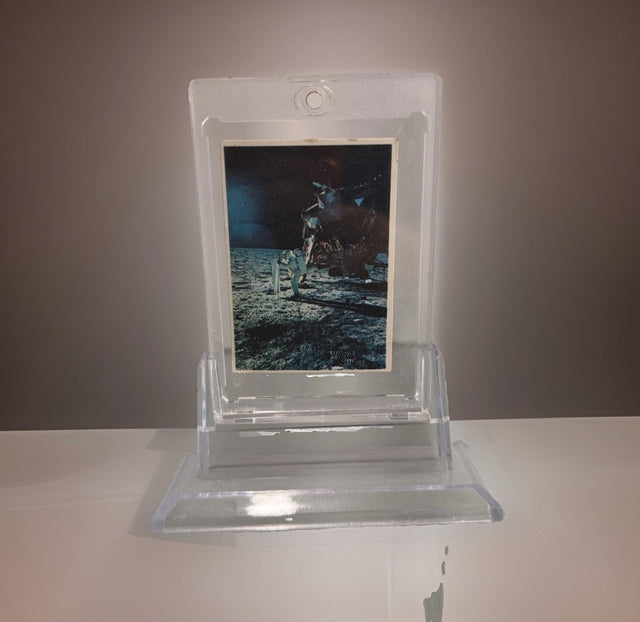
1969 Space Candy Buzz Aldrin Apollo 11 On The Moon Card #19 Taylor-Reed Display
$59.00 USD
-

1980 Polo Player Green Pink Chalk Pastel Bears Andy Warhol Signature AS-IS
$399.00 USD
-

After Andy Warhol Moon Landing Line Drawing 5/50 w/ Astronaut Autographs As-Is
$175.00 USD
-

After John Lennon "I Do" Framed Print, Marked A/P Unverified
$99.00 USD


Browse the collection for current listings.