

Featured image: AI-generated interior concept using product reference photography. Scale, setting, framing, and placement are illustrative.
When a collection reaches a critical density, a residential interior often undergoes a subtle and unwanted metamorphosis. What began as a curated personal space gradually shifts into a visual warehouse. Shelves become crowded with row upon row of vinyl figures, walls disappear behind closely hung prints, and floor space gives way to pedestal bases and acrylic display cases. The result is what designers call the display-case effect: an environment where the architecture of the room is totally subordinated to storage, and every surface demands equal visual attention. Rather than feeling lived-in, warm, and intentional, the home assumes the cold, transactional atmosphere of a trade booth or an overstocked secondary-market showroom.
Resolving this tension does not require a collector to stop acquiring pieces or to relegate their passion to a dark closet. Instead, it calls for a clear distinction between the active collection on display and the stored collection held in reserve. By framing contemporary art objects through the lens of interior architecture, treating them as visual anchors, volumetric accents, or graphic counterpoints, you can preserve domestic comfort while honoring the strength of individual works. Objects like the BE@RBRICK Andy Warhol Brillo set and the KAWS Companion Flayed Open Edition in brown provide excellent case studies in how graphic history and complex silhouette can inhabit a home gracefully when given room to breathe.
The Anatomy of Visual Overload in Domestic Spaces
Visual overload rarely happens overnight. It begins with the purchase of a single iconic work, followed by another, until the spatial balance of the home is overwhelmed. In high-density living spaces, the temptation to utilize every available square inch of vertical and horizontal real estate is powerful. When collectors treat every wall shelf, mantle, and credenza as an essential display surface, the eye has nowhere to rest. The primary purpose of a living room, relaxation, conversation, and quiet contemplation, is undermined by an unrelenting sequence of graphic stimuli. Each piece competes with its neighbor for attention, neutralizing the unique qualities that made each object compelling in the first place.
From a spatial perspective, the display-case effect flattens depth. When three-dimensional works are lined up end-to-end inside shallow glass cabinets or against backlights, they lose their volumetric impact. They cease to interact with the natural light of the room, the grain of timber joinery, or the soft textures of upholstery. Instead, they read as an unorganized grid of plastic, metal, and glass. The room begins to reflect the architecture of storage rather than the architecture of dwelling. To break this pattern, a designer must reassess how objects consume space, recognizing that empty room around an artwork is not wasted square footage; it is an active design component that allows the work to function visually.
Furthermore, an overstuffed room creates physical friction. Navigating a living area around delicate pedestals or glass towers induces subtle anxiety for guests and residents alike. Domestic comfort relies on intuitive circulation paths, unencumbered lighting, and tactile warmth. When a space prioritizes the housing of objects over the human body, it ceases to function as a home. The challenge for contemporary art consultants and residential interior designers is to introduce rigorous editing protocols that turn a chaotic collection into a dynamic, evolving domestic display.
Active Collection versus Stored Collection: Establishing a Rhythmic Rotation
The most effective strategy for preventing visual overload is establishing a formal boundary between the active collection and the stored collection. A museum rarely displays more than a fraction of its permanent holdings at any given time, relying on climate-controlled archives and systematic rotations to maintain freshness and narrative focus. Applying a similar discipline to a private home changes the relationship between the owner and their possessions. Rather than living with every acquired piece simultaneously, the collector experiences a rotating salon where works are brought forward, contextualized, and later retired to archival storage.
Implementing an active rotation system requires dedicated, closed storage solutions within the home design. Custom millwork with integrated archival drawers, concealed pantry-style art closets, or deep, opaque cabinetry allow a significant inventory to exist on-site without cluttering the visual plane. When an artwork is retired to closed storage, it is protected from prolonged exposure to daylight, ambient dust, and incidental contact. More importantly, its absence creates an opportunity to recalibrate the surrounding room. Bringing a stored object back into the living space six months later restores the initial sense of discovery and delight that prompted its acquisition.
A successful rotation schedule does not need to be overly rigid or complex. It can follow seasonal shifts, changes in room layout, or thematic ideas. For instance, winter lighting might call for rich, grounded tones and warm textures, whereas summer daylight might favor vibrant pop graphics and clean white surfaces. By curating a tight selection of four or five primary focus objects per room, you allow each piece to command its surrounding space. The remaining collection rests safely behind closed doors, waiting for its next presentation in the spatial cycle.
Editing Sightlines and Preserving Visual Solitude
Sightlines dictate how a person perceives a space as they move through it. In a thoughtfully designed interior, a sightline guides the eye toward a specific architectural feature, a framed view of the outdoors, or a single masterwork. When a room is crowded with art objects, sightlines become fractured and chaotic. Entering a hallway or sitting down on a sofa exposes the viewer to dozens of competing focal points, causing mental fatigue. Preserving visual solitude means intentionally clearing secondary sightlines so that key artworks can establish a direct, unhindered dialogue with the viewer.
To edit sightlines effectively, map the natural movement through each room. Identify primary focal points, such as the view from an entry vestibule, the wall opposite a main seating group, or the termination of a central corridor. Place your strongest, most visually resonant objects at these specific destinations. Keep the surrounding secondary zones deliberately sparse. A clean expanses of plaster wall, a unadorned walnut panel, or a simple low credenza provides the necessary contrast that allows a complex sculpture or graphic figure to stand out without competing with adjacent elements.
Negative space should be treated as a tangible material in domestic design. Just as a piece of music relies on silence between notes to create rhythm, an interior relies on empty space to give weight to its furnishings and art. When you give a figure several feet of open wall or place it on a low bench with ample breathing room, you elevate its presence. The object stops being background noise and becomes an intentional spatial anchor, drawing the viewer in through clarity rather than volume.
The Graphic Counterpoint: Analyzing the Warhol Brillo BE@RBRICK
Integrating pop art references into a sophisticated residential interior requires a balance between graphic intensity and spatial restraint. The BE@RBRICK Andy Warhol Brillo set, released by Medicom Toy in May 2020, offers a clear example of how commercial iconography can serve as a potent design accent. Covering the familiar ursine silhouette in Warhol’s iconic 1964 Brillo Soap Pads commercial packaging design, this set carries a dense art-historical dialogue. The red, white, and blue graphic text wraps across the complex curves of the figure through a hydro-dipping water-transfer process, ensuring that the pattern distribution on every individual release is unique.

Because the Brillo graphics feature high-contrast primary colors and dense typography, displaying this set requires careful atmospheric balancing. Placed inside a crowded cabinet with dozens of other printed toys, the nuanced hydro-dipped detail is swallowed by surrounding noise. However, when placed as a standalone graphic counterpoint on a matte stone shelf, a clean concrete mantle, or within a minimalist architectural niche, the 400% figure (standing approximately 11 inches or 280 mm tall) acts as an energetic focal point. The smaller 100% companion figure (standing approximately 2.75 inches or 70 mm tall) can be paired directly alongside it to play with scale, or placed elsewhere in the room to create a subtle echo of the master pattern.
The brilliance of using a piece like the Brillo BE@RBRICK lies in its dual nature. It is both a modern designer toy and a direct reference to Arthur Danto’s famous philosophical critique of Warhol’s 1964 Stable Gallery exhibition, which posited that art could no longer be distinguished from everyday commercial items by sight alone. In a contemporary domestic room filled with organic textures, such as linen drapery, low-sheen oak, and lime-wash walls, the slick ABS plastic and high-vibrancy commercial graphics of the Brillo set provide a sharp, modern punch. It disrupts potential monotony without cluttering the physical floor plan.
Sculptural Form and Tactile Depth: The Brown KAWS Flayed Companion
Where pop-graphics like the Brillo print rely on bold typography and primary colors, figurative sculptures like the KAWS Companion Flayed Open Edition in brown operate through form, shadow, and anatomical contrast. Standing approximately 11 inches (27.9 cm) tall, this vinyl figure splits the iconic Companion silhouette down the middle. One half presents the smooth, cartoonish exterior with signature cross-out eyes, while the other half exposes an intricate internal anatomy of muscle tissue, organs, and skull structure. The warm brown colorway grounds these complex anatomical details in an earthy, neutral palette.
From an interior design perspective, the brown Flayed Companion introduces both tactile warmth and complex shadow play. The dissected side of the figure features exposed forms that react dynamically to directional lighting. When placed near an adjustable architectural spotlight or bathed in low angled daylight, the carved internal musculature casts subtle cast shadows that highlight its depth. Unlike high-gloss graphics that reflect ambient room glare, the matte vinyl surface and subterranean tones of the brown edition sit comfortably alongside natural materials like walnut joinery, raw travertine, or blackened steel fixtures.
To display this piece without falling into display-case tropes, avoid lining it up on a long glass shelf with identical vinyl figures. Instead, give the Flayed Companion isolated placement on a deep bookshelf, an asymmetric side table, or a low-profile media console. Its dual nature, half smooth cartoon, half complex anatomical model, allows it to bridge the gap between playful pop culture and serious sculptural study. Placing it adjacent to textured ceramic vases or monochromatic art books reinforces its organic tonal palette while highlighting its distinctive graphic profile.
Material Comparison and Spatial Placement
Understanding how different art objects interact with light, surface finish, and room architecture is essential when curating a domestic space. Below is a structural comparison of how the Warhol Brillo BE@RBRICK set and the Brown KAWS Flayed Companion function across key interior dimensions:
| Design Dimension | Andy Warhol Brillo BE@RBRICK Set | KAWS Companion Flayed (Brown) |
|---|---|---|
| Primary Visual Language | High-contrast typography, primary pop palette, commercial graphic repeating print | Figurative sculpture, complex dissected anatomical detail, tonal earth shades |
| Material & Surface Finish | ABS/PVC plastic, smooth hydro-dipping water-transfer finish, semi-gloss sheen | Molded vinyl, mixed matte and soft-gloss anatomical accents, subterranean earth tones |
| Ideal Architectural Context | Monochromatic surfaces, minimalist niches, matte plaster, raw concrete, cold-toned stone | Rich wood millwork, walnut cabinetry, natural linen backgrounds, warm travertine, stone mantles |
| Lighting Strategy | Diffused, even ambient light to reduce harsh specular glare across high-contrast typography | Directional, warm accent lighting (2700K–3000K) to emphasize anatomical relief shadows |
| Spatial Function | Energetic pop counterpoint, graphic focal anchor, high-intensity color spot | Volumetric sculpture, tactile grounding element, complex shadow-generating object |
By contrasting these two distinct approaches, the pure graphic energy of the BE@RBRICK versus the complex volumetric form of the KAWS Companion, a designer can create visual rhythm across different rooms. Rather than repeating the same display technique throughout the house, alternate between high-contrast graphic statements and muted, sculptural interventions.
Practical Inventory-to-Display Exercise for Homeowners
To eliminate visual clutter and transition from an overstuffed home to a curated residence, execute this practical five-step inventory-to-display exercise. This process helps establish clear boundaries between displayed art and stored holdings while revitalizing the interior architecture.
- Conduct a Full Spatial Audit: Walk through the home with a notepad and record every single display surface currently hosting an object. Note which areas feel overcrowded and identify primary sightlines from seating areas and doorways. Label these surfaces as either Primary Focal Points, Secondary Accent Zones, or Utility/Circulation Spaces.
- Perform a Complete Room Cleandown: Remove every collectible, sculpture, and small framed work from the primary living areas. Place them all on a large central dining table or staging area. Seeing the entire collection out of its normal context strips away habitual visual comfort and exposes the sheer volume of material.
- Categorize into Display Tiers: Divide the staged collection into three distinct groups: Tier A (Anchor Objects, high-impact, high-quality masterworks like the Brillo BE@RBRICK or KAWS Flayed Companion), Tier B (Supporting Accents, complementary art books, small ceramics, neutral frames), and Tier C (Archive/Rotation Candidates, duplicate figures, seasonal pieces, low-priority items).
- Assign Anchor Objects to Primary Points: Reintroduce Tier A objects into the living space one by one. Limit each primary focal point to a single anchor object or a carefully considered pair. Ensure there is at least two to three feet of clear negative space surrounding each piece. If a surface feels crowded, remove secondary items until the hero work regains its visual sovereignty.
- Box and Archive Remaining Inventory: Place all Tier C items into archival storage boxes, dedicated millwork drawers, or an art closet. Label each box by category or rotation theme. Schedule a date four to six months on the calendar to perform your first curated rotation, swapping select Tier A items with rested pieces from storage.
Worked Project Example: The Pacific Heights Living Room
To illustrate how these principles apply in a real-world scenario, consider a hypothetical residential redesign of a contemporary living room in Pacific Heights, San Francisco. The client, a seasoned tech executive, had accumulated over eighty designer vinyl figures, multiple print portfolios, and small sculptures over a decade of collecting. The existing living room was overwhelmed by three floor-to-ceiling glass display towers that dominated the main wall, casting harsh glare from internal LED strip lighting and making the room feel like a retail storefront. Circulation paths around the sofa were cramped, and the architectural character of the oak floors and marble fireplace was entirely obscured.
The design team established a strict spatial protocol based on editing sightlines and integrating custom concealed storage. Planning assumptions for this 22-foot by 16-foot living space called for removing all three glass display towers entirely. In their place, the team designed a low-profile, floating walnut credenza measuring 10 feet in length and 18 inches in depth, mounted along the main wall. The interior of the credenza was fitted with felt-lined drawers and adjustable shelves designed specifically to house closed storage boxes for sixty-five vinyl figures. This reduced the active visual inventory in the room by over eighty percent in a single step.
For the active display, the designer selected only two primary anchor points. On the far left end of the walnut credenza, set against an unadorned plaster wall finished in a warm, low-sheen lime wash, the team placed the KAWS Companion Flayed Open Edition in brown. The warm brown tones of the vinyl echoed the grain of the walnut credenza below it, while a single ceiling-recessed narrow-beam spot (set at a warm 2700K color temperature) cast subtle shadows across the dissected anatomy. The remaining nine feet of the credenza top were left completely clear, save for a low stack of hardbound monographs on contemporary architecture.
On the opposite side of the room, an architectural recess adjacent to the entry threshold was transformed into a dedicated gallery niche. Painted a deep charcoal matte finish, the niche provided a stark contrast to the rest of the living space. Centered inside this niche on a single cantilevered white shelf, the team placed the 400% figure from the BE@RBRICK Andy Warhol Brillo set, with the smaller 100% companion figure positioned slightly forward and to the right. The high-contrast red, white, and blue commercial graphics popped dramatically against the dark background, transforming an underutilized pass-through space into an intentional visual destination upon entering the residence.
By limiting the active display to these two isolated, high-impact installations, the living room instantly regained its spatial elegance. The natural light from the bay windows reflected softly off the plaster walls and open oak flooring without creating chaotic reflections on glass cabinets. The owner retained their entire collection on-site inside the customized walnut credenza drawers, ready to be rotated out every four months, but the room itself was restored to a serene, comfortable domestic sanctuary.
Conservation, Lighting, and Material Placement
Creating a refined domestic environment for art collectibles also requires addressing environmental longevity. Contemporary collectibles utilize a wide variety of materials, including ABS plastic, molded vinyl, water-transfer printed films, and painted finishes, each reacting uniquely to ambient environmental factors like UV light, thermal fluctuations, and surface dust. Integrating these objects into a liveable home requires taking practical measures to protect their condition without turning the living room into a sterile laboratory.
Ultraviolet radiation from direct daylight is the single greatest threat to vinyl figures and hydro-dipped finishes. Prolonged exposure to direct sunlight breaks down chemical bonds in plastics, causing yellowing, pigment fading, and surface embrittlement. While installing UV-filtering window films or specification-grade architectural glass significantly reduces these risks, light filtering does not make sensitive materials entirely immune to degradation over time. Position delicate collectibles away from direct solar rays coming through unshaded windows. Avoid placing vinyl or painted figures near heat registers, fireplaces, or areas prone to steam and high humidity, such as bath adjacent corridors, as thermal stress can soften vinyl and warp internal joint pegs.
Lighting selection should balance aesthetic accenting with conservative care. Low-heat LED fixtures with high Color Rendering Index (CRI 95+) and warm color temperatures (2700K to 3000K) bring out rich color accuracy without throwing off radiant heat that could damage nearby surfaces. Dust accumulation should be managed using soft, static-free micro-fiber brushes rather than harsh chemical cleaners or abrasive clothes, which can scratch delicate hydro-dipped water-transfer prints or leave residue on matte vinyl finishes. Before specifying any high-value collectible for a built-in niche or custom shelf, designers should always confirm final framed dimensions, mounting clearances, current availability, and physical condition with the source gallery or framer.
Rethinking Domestic Curation
A home should never feel like a warehouse for your acquisitions. The true art of domestic curation lies not in how much you can fit onto a wall or shelf, but in how skillfully you manage the relationship between object, light, and empty space. When you break free from the display-case effect, you give your collection room to speak with clarity and intent. By establishing a thoughtful balance between active display and closed storage, editing sightlines, and placing complex works like BE@RBRICKs and KAWS figures in dialog with residential architecture, you elevate both the art and the room it inhabits.
If you are ready to refine your residential display or begin building a curated rotation of authenticated contemporary works, we invite you to explore our carefully documented inventory of designer figures and pop art collectibles at Gauntlet Gallery. Discover iconic works that add dynamic graphic texture and sculptural weight to your home.
Shop BE@RBRICK
Explore current pieces available from the gallery.
-
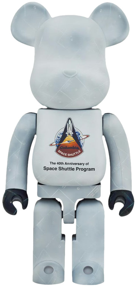
BE@RBRICK NASA Space Shuttle 40th Anniversary 1000% Medicom Toy Bearbrick
$600.00 USD
-
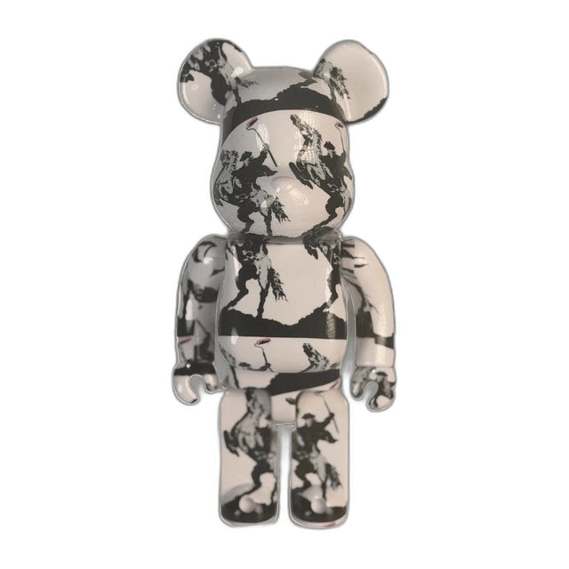
BE@RBRICK Brandalism Sync Banksy Medicom Toy Art Figure du-al.io Authenticated
$199.00 USD
-
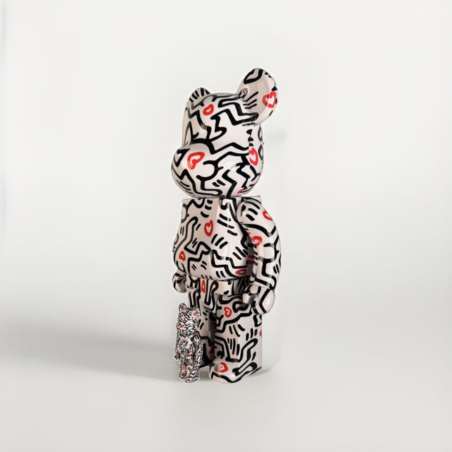
BE@RBRICK Keith Haring 400% + 100% Set Medicom Toy Bearbrick Foundation Art New
$199.00 USD
-

Bearbrick BE@RBRICK Mercury Astronaut 400% 100% Set NASA Medicom Toy Sealed New
$225.00 USD
-
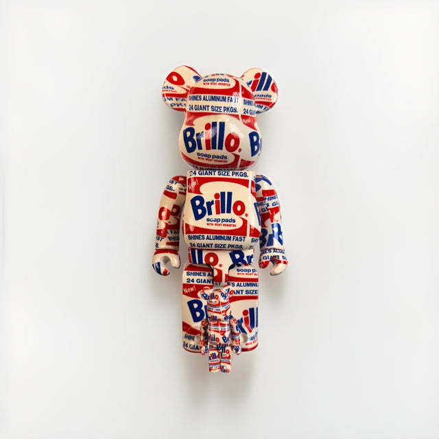
Bearbrick BE@RBRICK Andy Warhol Brillo 400% 100% Set Original 2020 Medicom New
$275.00 USD
Browse the collection for current listings.