

Featured image: AI-generated interior concept using product reference photography. Scale, setting, framing, and placement are illustrative.
The allure of textured walls, whether limewash, Venetian plaster, grasscloth, or even exposed brick, is undeniable. They introduce a tactile dimension, a subtle movement that flat paint cannot replicate. This character, however, can become a formidable opponent when it comes to displaying art. The very qualities that make these surfaces appealing can diminish the impact of a carefully chosen piece, creating visual noise or casting unflattering shadows. The challenge is to integrate art not just onto, but with, these dynamic backdrops, ensuring each element enhances the other without competing. It's a delicate balance, requiring a thoughtful approach to color, contrast, framing, and even the physical mechanics of installation. Ignoring these considerations risks a disjointed aesthetic, where the art feels tacked on rather than intrinsic to the space. Our goal is to avoid that outcome, to make the art sing against its textured stage, rather than be swallowed by it.
Consider the immediate visual tension a highly textured wall creates. A limewash finish, for instance, has a soft, mottled appearance that shifts with the light. Plaster can range from subtly undulating to aggressively uneven. These surfaces are inherently active. When you introduce art, especially a piece with strong graphic elements or delicate detail, the wall's texture can either complement or clash. The key lies in understanding how light interacts with both the art and the wall, and how the art's intrinsic qualities – its palette, its lines, its depth – can either be absorbed by the texture or stand in sharp relief against it.
Where Texture Should Stop: Defining the Visual Plane for Art
A wall finish like limewash or hand-applied plaster invites the eye to scan its physical variations, which can obscure intricate art. To preserve legibility, you must establish a clear visual plane. Heavy graphic prints, such as Cleon Peterson A Perfect Trade White Screen Print Signed Numbered /125, rely on direct black-and-white contrast to break free from mottled backgrounds, while detailed works like the Shepard Fairey AK-47 Lotus Letterpress AP Signed 2021 10x13 Obey Giant Print require deep frames or float mounts to push the paper forward and cast a shadow boundary over rough substrate.
Review materials on a sample board under both ambient and low-angle grazing light before mounting. Grazing light exaggerates uneven walls, throwing unpredictable shadows across glass. Because plaster depth varies, a professional installer must assess hardware and fixings on site rather than relying on standard wall anchors. For delicate works, a smooth drywall reveal provides a safer alternative.
The Power of Black and White Contrast on Dynamic Surfaces
When dealing with textured walls, the inherent movement and tonal variation of the surface can easily muddy an artwork's clarity. This is where the stark simplicity of black and white art truly shines. A monochrome palette, particularly one with strong graphic elements, possesses an intrinsic ability to cut through visual noise. The high contrast between black and white creates an immediate, undeniable focal point that can stand up to the most active of backdrops, whether it's the granular subtlety of limewash or the more pronounced undulations of plaster. The eye is drawn directly to the imagery, unburdened by color interference, allowing the form and narrative of the piece to dominate.
Consider the Cleon Peterson A Perfect Trade White screen print. This piece is a masterclass in high-contrast monochrome. Its bold, graphic figures and stark black shapes against a white background demand attention. Placed against a limewash wall, which often presents a soft, diffused color field, the print's sharp lines and powerful imagery would immediately pop. The limewash, with its subtle variations, would provide an interesting, organic counterpoint to Peterson's precise, almost brutalist forms, without competing with them. The texture would add depth to the overall composition, rather than detracting from the art's impact. The print's visual weight ensures it holds its own, asserting its presence against the wall's inherent movement.
This principle extends beyond just graphic prints. Black and white photography, charcoal drawings, or even minimalist abstract pieces that rely on form and negative space can all thrive on textured walls. The absence of color simplifies the visual equation, allowing the interplay of light and shadow on the wall to enhance the art, rather than creating a distracting competition of hues. It allows the texture of the wall to become a subtle, living frame for the art, rather than a busy background. When selecting art for such a wall, ask yourself if the piece can command attention through form and contrast alone. If the answer is yes, then a monochrome piece is likely an excellent choice. The visual impact of such a piece is not diminished by the wall's texture, but rather amplified by the deliberate tension between the two.
Frame Depth and Shadow Play: Creating Physical and Visual Separation
The physical separation between artwork and a textured wall is as crucial as the visual. A deep frame serves multiple purposes: it creates a buffer, casts a defining shadow, and can even help mitigate the appearance of an uneven wall surface. When an artwork is framed shallowly or, worse, unframed and mounted directly, it risks being visually flattened against the texture. The wall's undulations can create distracting shadows that fall across the art or its immediate edges, blurring the boundary between the piece and its environment. A deeper frame, however, pushes the artwork forward, establishing a clear, distinct plane for viewing.
A frame with a significant rabbet depth, the recess that holds the artwork, mat, and glazing, allows the piece to sit further away from the wall. This creates a natural shadow gap, even without specific spacers. This shadow acts as a deliberate visual break, preventing the wall's texture from bleeding into the art's presentation. It gives the artwork its own defined space, making it feel intentional and considered. For a piece like the Cleon Peterson A Perfect Trade White screen print, with its deckled edges and raw aesthetic, a float frame within a deep, simple profile would be ideal. This would allow the deckled edge to be visible, celebrating the print's tactile quality, while the depth of the frame would ensure the entire presentation stands proud of a textured wall. The shadow created by the float would further emphasize its separation.
The choice of frame material and finish also plays a role. A smooth, matte black or white frame can provide a strong, clean edge against a textured, often softer, wall. This contrast in surface texture, smooth frame against rough wall, enhances the sense of separation. Conversely, a highly reflective frame might pick up and distort the wall's texture, creating unwanted visual noise. The goal is to create a clear visual break, a deliberate pause between the wall and the art, allowing each to be appreciated for its individual qualities without one overpowering the other. This thoughtful framing approach is a practical investment in the art's presentation, ensuring its impact is maximized on even the most challenging surfaces. A well-chosen frame not only protects the artwork but also acts as a critical intermediary between the art and its textured environment.
Addressing Uneven Walls and Installation Challenges
Textured walls, particularly those finished with plaster or limewash, are rarely perfectly flat. This unevenness presents a unique set of challenges for art installation that go beyond mere aesthetics. A frame hung directly on an undulating wall can tilt, appear crooked, or even have gaps between the frame and the wall surface. These issues are not just visually distracting; they can also compromise the stability of the hanging system. It is crucial to anticipate these irregularities and plan for them during the installation phase. A professional art installer is invaluable here, as they possess the tools and experience to assess wall conditions and implement appropriate solutions.
Before hanging, a thorough assessment of the wall's flatness is necessary. This can be done with a long level or a straightedge. Areas where the wall recedes or protrudes will become evident. For minor unevenness, shims can be strategically placed behind the frame to ensure it hangs plumb and flush. These shims, often made of wood or plastic, are discreetly inserted behind the lower corners or sides of the frame to compensate for any gaps. For more significant undulations, a standoff hanging system might be considered, where the artwork is mounted on hardware that keeps it a consistent distance from the wall, regardless of minor imperfections. However, this approach is typically reserved for unframed pieces or specific display needs, as it changes the visual presentation.
Another critical consideration is the type of fixing used. Textured walls, especially older plaster, can be brittle or have inconsistent structural integrity. Standard picture hooks might not be sufficient or secure. An installer will evaluate the wall material and recommend appropriate anchors, such as toggle bolts for hollow walls or specialized plaster anchors. The weight of the framed artwork also dictates the type and number of fixings required. Never assume a wall finish is universally safe for every hanging system; always consult with an installer to ensure the chosen method is secure and appropriate for both the artwork's weight and the wall's composition. Proper installation not only protects the art but also ensures its presentation is flawless, even on a challenging surface.
The Problem of Light Grazing and How to Mitigate It
Light is a powerful tool in interior design, capable of highlighting architectural features and bringing artwork to life. However, on textured walls, light can also become a detrimental factor, creating unintended visual disturbances. This phenomenon, known as 'light grazing,' occurs when light hits a textured surface at a shallow angle, causing every bump, ripple, and imperfection to cast a distinct shadow. While this effect can sometimes be desirable for emphasizing architectural texture in specific contexts, it is almost universally detrimental when trying to display framed art.
When light grazes a wall behind an artwork, the shadows cast by the wall's texture can create a busy, distracting backdrop that competes directly with the art. It can make the wall appear rougher than intended and draw the eye away from the artwork itself. This is particularly problematic with pieces that rely on subtlety or fine detail, as the wall's exaggerated texture can overwhelm them. The solution lies in careful lighting design, specifically avoiding light sources that are too close to the wall or angled too sharply. Recessed lighting, track lighting, or picture lights positioned too close to the wall will often produce this grazing effect.
To mitigate light grazing, consider these strategies: First, position light sources further away from the wall, allowing the light to spread more evenly and reduce harsh shadows. Second, use fixtures with a wider beam angle, which diffuses the light more broadly rather than focusing it acutely. Third, employ adjustable fixtures that allow you to fine-tune the angle of incidence. The goal is to illuminate the artwork without intensely highlighting every imperfection of the wall behind it. If a picture light is essential, choose one that extends sufficiently far from the wall to cast light primarily on the artwork, with minimal spill onto the textured surface at a grazing angle. This mindful approach to lighting ensures the art, not the wall's texture, remains the star of the show, allowing the wall to recede into a supportive role.
Hypothetical Project: Designing a Dining Room with Limewash Walls
Imagine a dining room in a contemporary home, featuring limewash walls in a soft, muted grey. The client desires a sophisticated yet inviting atmosphere, and has expressed an interest in art that provides a strong visual anchor without clashing with the subtle movement of the walls. The room is approximately 14 feet by 16 feet, with a large window on one wall and a built-in credenza on another. The primary wall for art display is 10 feet wide, opposite the window, and receives indirect natural light for most of the day, with a ceiling fixture providing ambient light in the evenings.
Our design challenge is to select and display art that complements the limewash without being absorbed by its texture. Given the goal of a strong visual anchor and the inherent activity of the limewash, a high-contrast, graphic piece in black and white is an ideal choice. We propose the Cleon Peterson A Perfect Trade White screen print. Its powerful imagery and monochrome palette will provide the necessary contrast to stand out against the soft grey limewash. The print, with its approximate dimensions of 39 x 25 inches (planning assumption for unframed print, always confirm final framed dimensions), offers a substantial presence without overwhelming the wall.
For framing, we specify a deep, matte black float frame. This choice serves several purposes: the matte finish will not reflect the wall's texture, and the depth of the frame (approximately 2 inches from the wall) will create a distinct shadow line, physically separating the art from the limewash. The float mounting will allow the print's hand-deckled edges to be visible, adding to its tactile quality while maintaining a clean presentation. This combination ensures the artwork appears to float in its own defined space, commanding attention without competing with the wall's texture.
Installation will involve a professional art installer. They will first assess the wall's flatness using a straightedge to identify any significant undulations. For areas where the limewash might recede slightly, discreet shims will be used behind the lower corners of the frame to ensure it hangs perfectly plumb and flush. Given the weight of a large framed print, specialized plaster anchors will be employed to provide secure fixing points into the wall, ensuring long-term stability. Lighting will be addressed by ensuring the existing ceiling fixture's throw is broad and diffused, avoiding any direct, grazing light that would highlight the limewash texture too aggressively around the frame. This comprehensive approach ensures the art is not just hung, but thoughtfully integrated into the textured environment, enhancing the dining room's sophisticated aesthetic.
Reviewing Sample Boards: A Practical Approach to Material Harmony
Before committing to a wall finish and artwork combination, especially with textured surfaces, a practical step often overlooked is the creation and review of sample boards. This iterative process allows designers and clients to visualize and feel the interplay of materials and art in a tangible way, minimizing costly surprises down the line. It moves beyond abstract concepts and digital renderings, bringing the physical reality of the textures and colors into the decision-making process.
Here's a suggested sequence for reviewing sample boards:
- Wall Finish Sample: Begin with a generously sized sample board of the intended textured wall finish – limewash, plaster, grasscloth, etc. The larger the sample, the better it will convey the finish's true character and how light interacts with it. Observe it under various lighting conditions: natural daylight, evening ambient light, and any proposed accent lighting.
- Artwork Reproduction and Frame Swatch: Next, obtain a high-quality print reproduction of the chosen artwork, ideally to scale, or at least a representative crop. Place this alongside swatches of potential frame materials and finishes. For a piece like the Shepard Fairey AK-47 Lotus Letterpress AP, a detailed printout would allow for evaluation of its fine lines and color against various backgrounds.
- Combined Assessment: Place the artwork reproduction and frame swatches directly on or adjacent to the wall finish sample. Step back and evaluate the combination. Does the artwork stand out clearly? Does the frame provide sufficient separation? Does the texture of the wall enhance or detract from the art? Pay close attention to how shadows are cast by the frame onto the textured surface, and how the wall's variations appear around the art.
- Lighting Test: If possible, introduce a light source that mimics the proposed accent lighting for the artwork. Observe how the light interacts with the textured wall in the immediate vicinity of the framed art. Is there any undesirable light grazing? This is the point to adjust frame depth, lighting angles, or even reconsider the wall finish if the grazing effect is too pronounced and cannot be easily mitigated.
This hands-on approach allows for informed adjustments before any permanent decisions are made. It's a proactive measure that ensures the final installation achieves the desired harmony between art and architecture, especially when dealing with the unique challenges of textured walls.
The Smooth Wall Alternative: When Texture Should Recede
While this essay has focused on strategies for integrating art with textured walls, it is equally important to acknowledge when a smooth wall might be the superior choice. Not every artwork benefits from a dynamic backdrop, and sometimes, the most effective design decision is to allow the art to be the sole textural or visual focal point. This is not a concession, but a deliberate choice to prioritize the artwork's clarity and impact.
For certain types of art, particularly those with delicate details, subtle color shifts, or complex compositions, a perfectly smooth, uniformly painted wall provides an unblemished canvas. Think of a highly detailed botanical illustration, a nuanced watercolor, or a minimalist abstract piece where every brushstroke or line is critical. On a textured wall, these subtleties could easily be lost, or the wall's inherent movement might create visual interference, diminishing the art's intended effect. In such cases, the texture of the wall would compete with, rather than complement, the artwork.
Consider a large-scale, intricate drawing or a photographic print with fine tonal gradations. These pieces demand an uninterrupted visual field to be fully appreciated. A smooth wall, painted in a neutral, matte finish, allows the viewer's eye to focus entirely on the artwork's intricacies without distraction. The absence of texture means no unwanted shadows from grazing light, no visual noise to muddy delicate hues, and a consistent background that lets the art breathe. The wall effectively disappears, becoming an invisible support for the artwork.
Ultimately, the decision between a textured and a smooth wall for art display comes down to the specific artwork and the desired aesthetic. If the art is bold, graphic, and can hold its own against a dynamic background, then a textured wall can add an interesting layer. However, if the art is delicate, detailed, or relies on subtle effects, a smooth wall often provides the optimal environment for its appreciation. Designers should always consider the artwork's intrinsic qualities first, then select a wall finish that best serves its presentation, rather than forcing a texture where it doesn't belong. The goal is always to create a cohesive and impactful visual experience, whether through contrast or seamless integration.
Conclusion: Orchestrating Harmony Between Art and Texture
Integrating art with textured walls requires balancing visual separation and strategic lighting. Tactile finishes like limewash or plaster easily overwhelm subtle artwork. High-contrast works, such as the Cleon Peterson A Perfect Trade White screen print, cut through background noise to establish immediate visual relief. Deep float frames reinforce this separation by casting shadow lines that isolate the art from uneven surfaces. Because no wall finish is universally safe for every hanging system, an installer must assess the substrate and select appropriate fixings.
Manage light grazing carefully; severe angles exaggerate wall undulations and distract from the subject. Test the complete assembly during a sample board review sequence: evaluate the finish swatch, frame moulding, print, and targeted lighting together under natural and artificial light. In a hypothetical 14x20 dining room, this sequence prevents costly re-framing. If a detailed work remains compromised by heavy texture, opt for a smooth wall alternative. For bold installations, select graphic works like the Shepard Fairey AK-47 Lotus Letterpress AP that hold their ground against active surfaces.
Available at Gauntlet Gallery
Explore current pieces available from the gallery.
-

1963 Farquhar Earth in Space Transparent Celestial Globe 16" Compass VTG
$699.00 USD
-

1967 Beatles Richard Avedon STERN Original Posters Set of 4 Linen Backed Copy
$999.00 USD
-
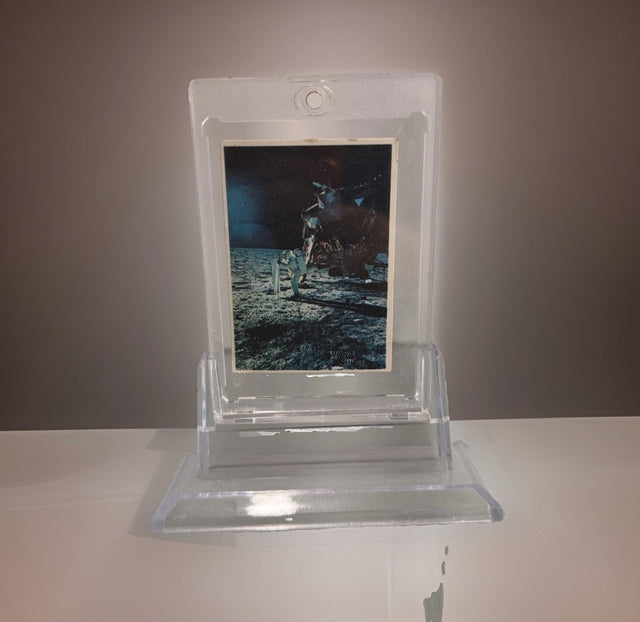
1969 Space Candy Buzz Aldrin Apollo 11 On The Moon Card #19 Taylor-Reed Display
$59.00 USD
-

1980 Polo Player Green Pink Chalk Pastel Bears Andy Warhol Signature AS-IS
$399.00 USD
-

After Andy Warhol Moon Landing Line Drawing 5/50 w/ Astronaut Autographs As-Is
$175.00 USD
-

After John Lennon "I Do" Framed Print, Marked A/P Unverified
$99.00 USD


Browse the collection for current listings.