Art Lighting: How to Light Art Like a Gallery at Home
Light your art with warm, high-quality LED fixtures aimed at roughly a 30-degree angle, using bulbs around 2700–3000K color temperature and a Color Rendering Index (CRI) of 90 or higher, kept dim enough to avoid glare and heat while protecting the work from ultraviolet exposure. That single sentence is the whole answer, and everything below is how to execute it well. Galleries and museums look the way they do not because of expensive fixtures, but because of a handful of disciplined choices: the right color of light, the right angle, the right intensity, and a fixation on protecting the object first. You can reproduce that at home with picture lights, track heads, or recessed cans — and you can do it without cooking, fading, or washing out a piece you paid real money to authenticate and own.
This guide walks through fixture types, LED color temperature and CRI, glare and reflection control, safe angles, the difference between lighting a flat framed print and a three-dimensional figure or a display case, dimming, and the conservation rules that keep an authenticated work looking — and appraising — like new.
Why Gallery Lighting Looks Different From Home Lighting
Walk into a well-run gallery and the art seems to glow while the room recedes. That effect is deliberate. Galleries light the object, not the room. They use a narrow, controlled beam that lands on the artwork and falls off quickly, so your eye is pulled to the piece and away from the walls, ceiling, and floor. Home lighting usually does the opposite — flat, even, overhead illumination that lights everything equally and makes nothing special.
The second difference is color quality. Cheap bulbs render color poorly, so reds go muddy, blues go gray, and the subtle tonal range an artist worked hard to achieve simply disappears. Gallery light is warm, consistent, and color-accurate, which is why the same print can look flat in your hallway and luminous in an exhibition.
The third difference is restraint. Museums keep light levels low — often far lower than a typical living room — because light is cumulative damage. Every hour of exposure is a small, permanent withdrawal from the object's condition. Reproducing the gallery look at home is mostly about adopting that same discipline.
The Four Levers You Control
Every lighting decision comes down to four variables: fixture type (how the light gets to the wall), color temperature and CRI (what the light looks like), intensity and angle (how much lands where), and duration and UV (how much damage accumulates). Get those four right and the rest is styling.
Fixture Types: Picture Lights vs. Track vs. Recessed
There is no single "best" fixture. Each solves a different problem, and serious collectors often mix all three across a home. Here is how they compare.
Picture Lights
A picture light is a slim fixture — traditionally brass or bronze — mounted directly above (or occasionally below) a single framed work, with an arm that projects the light source out over the piece. It is the most intimate, gallery-like option for a specific, permanent hang. Picture lights excel over a single important print or painting where you want a dedicated, jewel-box treatment. Modern LED picture lights run cool and can be hardwired or battery-operated, and the better ones are dimmable.
The trade-off: a picture light is sized and aimed for one frame. Because the source sits close to the surface, cheaper picture lights can create a hot band at the top of the work and a darker bottom. Choose a fixture whose arm is long enough to push the light out and down across the whole piece, and favor a wider, more even beam over a bright, narrow one.
Track Lighting
Track is the workhorse of galleries for a reason: flexibility. A ceiling- or wall-mounted track carries multiple adjustable heads you can aim independently, reposition along the track, and swap out. If you rotate your collection, rehang seasonally, or light a wall of several pieces, track is the most forgiving system. Use heads with interchangeable beam spreads — a tighter spot for a small work, a wider flood for a large canvas — and aim each head individually.
The trade-off is visual: the track and heads are visible hardware. In a minimalist room that is a feature; in a traditional one it can feel utilitarian. Recessed or low-profile track and small aperture heads minimize the intrusion.
Recessed (Adjustable) Lighting
Recessed cans sit flush in the ceiling for the cleanest look — no visible fixture, just light. For art, you want adjustable (gimbal or "eyeball") recessed fixtures that can be tilted toward the wall, not fixed downlights, which drop light straight down and create glare and unflattering top-lighting. Recessed is ideal in new construction or a renovation where you can place cans at the correct distance from the wall to hit the standard 30-degree angle.
The trade-off: recessed placement is essentially permanent. If the can is in the wrong spot, you cannot nudge it, and a fixed can too close to the wall will wash the surface and blow out any glossy or glazed work. Plan placement around where art will actually hang.
Comparison at a Glance
| Fixture | Best for | Flexibility | Visibility of hardware | Main risk |
|---|---|---|---|---|
| Picture light | A single important framed work | Low (fixed to one piece) | Visible, decorative | Uneven top-to-bottom wash |
| Track | Multiple works, rotating collections | High (aim, move, swap heads) | Visible hardware | Can look utilitarian |
| Recessed adjustable | Clean permanent installs | Low once installed | Nearly invisible | Wrong placement = glare |
LED Color Temperature and CRI: Getting the Color Right
The single biggest upgrade most homes can make is switching to good LED lighting and paying attention to two numbers on the box: color temperature and CRI. LED is now the default choice for art because it emits virtually no ultraviolet light and very little heat compared with halogen or incandescent — both of which are actively harmful to artwork over time.
Color Temperature (Kelvin)
Color temperature, measured in Kelvin (K), describes whether light looks warm or cool. Lower numbers are warmer and more golden; higher numbers are cooler and bluer.
- 2700K — warm, close to traditional incandescent; flattering to warm-toned works, wood frames, and cozy rooms.
- 3000K — soft warm-white; a versatile gallery-friendly middle ground.
- 3500K–4000K — neutral white; can suit stark contemporary or black-and-white work but risks feeling clinical.
- 5000K+ — cool daylight; generally too blue for a home art display and unflattering to most palettes.
For the overwhelming majority of collections in a home, aim for 2700K to 3000K. It reads as warm and inviting, matches the incandescent light most art was historically viewed under, and flatters skin tones, reds, and earth colors. Keep the temperature consistent across every fixture in a room — mixing 2700K and 4000K bulbs on the same wall makes the whole display look mismatched.
CRI (Color Rendering Index)
CRI is a 0–100 score of how faithfully a light source reveals colors compared with natural daylight. A low-CRI bulb can be the "right" color temperature and still make art look dull because it renders individual colors poorly. For artwork, insist on CRI 90 or higher; 95+ is better still and worth the small premium. High-CRI light is what lets a print's full tonal range — the deep saturated reds, the clean whites, the subtle gradations — actually reach your eye. If a bulb's packaging does not state a CRI, treat that as a reason to choose a different bulb.
Why LED, Specifically
Beyond color control, LED wins on conservation. Halogen and incandescent sources throw significant heat and, in the case of halogen, meaningful UV — the two things most likely to damage a work. Quality LEDs run cool to the touch and emit negligible UV, so they let you light a piece brightly enough to enjoy without accelerating its aging. That combination — accurate color and low damage — is why galleries and museums have moved to LED almost universally.
Angles, Glare, and Reflections
Where you aim the light matters as much as what light you use. The museum standard is to position the fixture so the beam strikes the artwork at roughly a 30-degree angle measured from the vertical (the line straight down from the ceiling to the wall).
Why 30 Degrees
Thirty degrees is a deliberate compromise. Aim too steeply (closer to straight down, a small angle), and the light grazes the surface, exaggerating every ripple in paper, brushstroke, or frame texture, and casts a hard shadow from the frame onto the work. Aim too shallow (a large angle, light coming from far out in the room), and the beam bounces straight off the surface into the viewer's eyes as glare, and the frame's shadow lengthens across the piece. Thirty degrees threads the needle: even illumination, minimal surface-texture shadowing, and the reflected beam bounces down toward the floor rather than into your eyes.
A practical rule: for an 8-to-9-foot ceiling, placing the fixture roughly the same distance out from the wall as the center of the artwork is high on the wall gets you close to 30 degrees. Adjust by eye — stand where viewers stand and confirm you see no bright reflection on the surface.
Killing Glare and Reflections
Glass and glossy surfaces are the enemies of clean art lighting. Several tactics help:
- Anti-reflective / museum glazing. If a framed work is behind glass, anti-reflective or museum glass dramatically reduces mirror-like reflections and is the single best upgrade for glazed pieces. Many also carry UV filtering, a conservation bonus.
- Correct the angle first. Most glare is an aiming problem. Nudge the fixture until the reflection drops out of the viewer's sightline.
- Use softer, wider beams. A broad, even wash reflects less harshly than a tight, bright hotspot.
- Add louvers or snoots. Beam-shaping accessories on track and recessed heads cut spill light and keep the beam on the art instead of the wall around it.
- Control ambient light. Reflections from a bright window opposite a glazed work can be worse than the fixture itself; blinds or repositioning help.
Protecting Authenticated Art From Light Damage
Lighting a valuable piece is a balance between enjoying it and preserving it. The core conservation truth is simple: light damage is cumulative and irreversible. Faded pigment does not come back. Paper that has yellowed or embrittled from UV exposure cannot be un-yellowed. For a collector, that is not just an aesthetic issue — condition is a primary driver of value, and a faded or light-damaged print is worth materially less than a fresh one.
The Three Damage Vectors
- Ultraviolet (UV). The most destructive part of the spectrum for art. It breaks down pigments and organic materials. LEDs emit little to no UV — a major reason to use them — but the biggest UV source in most homes is daylight through a window. Never hang a valuable work in direct sunlight, and use UV-filtering glazing on important pieces.
- Heat. Halogen and incandescent bulbs placed close to art can warm the surface, drying and stressing materials and, in a display case, cooking the contents. LED's low heat output largely solves this, but keep any fixture at a sensible distance regardless.
- Visible light intensity and time. Even perfect UV-free, cool LED light causes slow fading if a work is over-lit for years. Museums cap light levels deliberately and rotate light-sensitive works out of display. At home, the equivalent is: keep levels moderate, dim when the piece is not being actively viewed, and turn lights off when the room is empty.
Condition, Authenticity, and Value
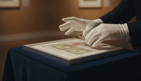
Preserving condition is inseparable from preserving authenticity and value. A Certificate of Authenticity establishes what a piece is; its physical condition determines what it is worth. Lighting that fades or embrittles a work quietly erodes the value that authentication is meant to protect. Treat conservation lighting as part of owning authenticated art, not an optional upgrade. For how authentication and condition intersect across categories, our authentication-first buyer's guides and market data on condition and value are useful companions to this guide.
Lighting Framed Works vs. Figures and Display Cases
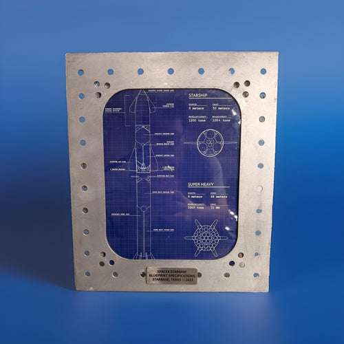
A flat framed print and a three-dimensional collectible are lit by different logic. Flat art wants even, glare-free coverage; a sculpture, designer figure, or object wants shaping that reveals form.
Flat Framed Works
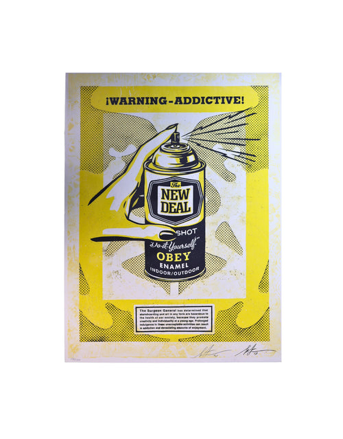
The goal is uniform illumination across the whole surface with no hotspots, no frame shadow, and no glare. Use the 30-degree rule, a beam wide enough to cover the piece evenly, and consistent color temperature. For a row of framed works, aim each fixture individually so every piece gets its own even wash rather than lighting the wall and hoping. Anti-reflective glazing is the finishing move for anything behind glass.
Figures, Sculptures, and Objects
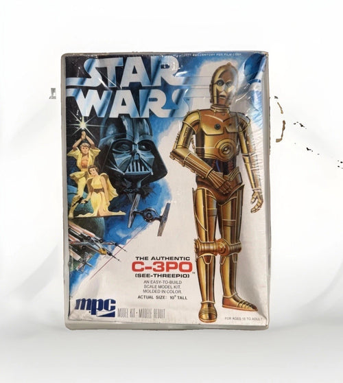
Three-dimensional pieces — a designer vinyl figure, a BE@RBRICK, a signed object — come alive with directional light that creates gentle shadows and reveals form. A single flat frontal light makes a figure look pasted-on and dimensionless. Instead, use a stronger key light from one side at roughly 30–45 degrees to model the form, and, if possible, a softer fill from the opposite side to keep the shadows from going pure black. A subtle top or back accent can separate the object from its background. Keep the same color temperature and CRI discipline you use for flat art.
Display Cases and Vitrines
Enclosed cases concentrate heat, which makes cool-running LED essential — halogen inside a sealed case can bake the contents. Integrated LED strips or small puck lights positioned at the top edges of the case, aimed to graze down over the object, work well and keep the light source out of the sightline. For collectibles that ship or store with their authentication materials — for example, categories that carry a TrueCOA record, or a certificate and gold-seal accompaniment — light the object without letting a hot fixture rest against the packaging, box, or paper documentation. Ventilation and low heat protect both the piece and its paperwork.
Dimming and Control: The Gallery Finishing Touch
Dimming is what separates a display that looks lit from one that looks curated. It gives you control over intensity — the fourth lever — so you can dial a piece up to a gallery glow when you are showing it and down to a low, protective level the rest of the time.
Get Dimming-Compatible Components
Not all LEDs dim gracefully. Use fixtures and bulbs explicitly rated as dimmable, paired with an LED-compatible dimmer (many older dimmers were built for incandescent loads and cause flicker or buzz with LEDs). The payoff is worth the care: smooth, flicker-free dimming down to low levels.
How to Use Dimming
- Set a viewing level and a resting level. Bright enough to appreciate the work when you are with it; low enough to reduce cumulative exposure when you are not.
- Balance against ambient light. The art should read as slightly brighter than the surrounding room — that contrast is the gallery effect. Dim the art relative to the room, not the other way around.
- Automate it. Timers or smart controls that lower or shut off art lighting when a room is unoccupied cut total exposure without any effort — the home version of a museum rotating works off display.
A Practical Room-by-Room Setup Checklist
Putting it together, here is a repeatable process for lighting any wall or object like a gallery:
- Choose the fixture to match the situation: picture light for one hero piece, track for a flexible wall, recessed adjustable for a clean permanent install.
- Buy the right light: LED, 2700–3000K, CRI 90+, dimmable. Keep color temperature identical across the room.
- Position for ~30 degrees from vertical. For a standard ceiling, place the fixture roughly as far out from the wall as the art's center is high.
- Aim and check for glare from the actual viewing position. Adjust until no reflection reaches your eye.
- Match the beam to the object: even wash for flat framed art; key-plus-fill modeling for figures and objects; grazing top light for cases.
- Protect the work: no direct sunlight, UV-filtering or anti-reflective glazing on glazed pieces, cool-running fixtures at a safe distance, especially inside cases.
- Add dimming and set a viewing level and a lower resting level; automate off-hours.
- Re-evaluate seasonally as daylight angles change and as you rotate the collection.
Do this consistently and an ordinary wall of prints starts to feel like a small private gallery — while the works themselves stay protected for the long haul. If you are still building the collection those lights will showcase, browse the Art Index and every authenticated piece in the gallery, and see the wider collector playbook in the Collector Library. For the display and framing side that pairs with good lighting, our companion piece on how to frame and display street art and designer toys covers the rest of the setup.
Frequently Asked Questions
What color temperature is best for lighting art at home?
For most home collections, aim for 2700K to 3000K — a warm to soft-warm white that flatters a wide range of palettes and matches the incandescent light much art was historically viewed under. Reserve neutral (3500–4000K) light for stark contemporary or black-and-white work, and avoid cool daylight bulbs (5000K and up), which read too blue. Keep every fixture in a room at the same color temperature so the display looks unified.
Why does CRI matter, and what number should I look for?
CRI (Color Rendering Index) scores how faithfully a light reveals colors compared with daylight, on a 0–100 scale. A bulb can be the right color temperature and still make art look dull if its CRI is low. For artwork, choose bulbs rated CRI 90 or higher — 95+ is better — so the full tonal range of a piece, from deep reds to clean whites, actually reaches your eye.
What angle should art lights be aimed at?
Aim fixtures so the beam hits the artwork at about a 30-degree angle from vertical. Steeper than that grazes the surface and exaggerates texture and frame shadows; shallower bounces the beam into viewers' eyes as glare. As a rough starting point on a standard ceiling, mount the fixture about as far out from the wall as the center of the artwork is high, then adjust by eye from the viewing position until glare disappears.
Can lighting damage or fade my art, and how do I prevent it?
Yes — light damage is cumulative and irreversible, and it lowers a work's condition and value. The main culprits are ultraviolet light (mostly from daylight through windows, plus halogen bulbs), heat, and prolonged high-intensity exposure. Prevent it by using low-UV, cool-running LED light, keeping art out of direct sunlight, adding UV-filtering or anti-reflective glazing to glazed pieces, keeping levels moderate, and dimming or switching lights off when the work is not being viewed.
Are LED lights safe for valuable and authenticated artwork?
Yes. Quality LEDs are the preferred choice for valuable art because they emit little to no ultraviolet light and very little heat — the two factors most likely to damage a piece — while offering accurate, dimmable, high-CRI illumination. That lets you light an authenticated work brightly enough to enjoy without accelerating fading or embrittlement, protecting the condition that underpins its value.
Which is better for art: picture lights, track, or recessed lighting?
It depends on the situation, and collectors often use all three. Picture lights give a single important framed work an intimate, gallery-like treatment. Track lighting is the most flexible for walls of several pieces or rotating collections, since heads can be aimed, moved, and swapped. Recessed adjustable fixtures give the cleanest, hardware-free look for permanent installs but must be placed correctly, because they cannot be repositioned later. Match the fixture to how often you rehang and how visible you want the hardware to be.