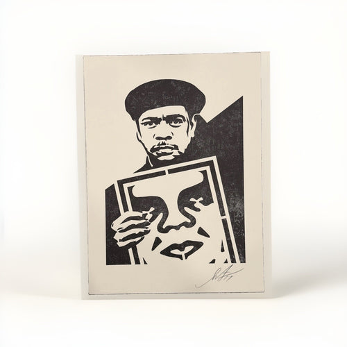
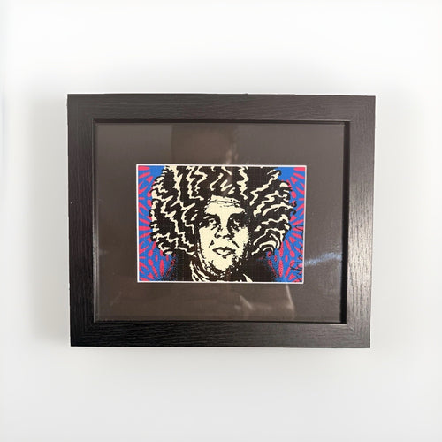
Creating a dynamic street art gallery wall that feels curated rather than chaotic is a common aspiration for many collectors. The challenge often lies in harmonizing prints from different artists, with varied styles, colors, and sizes, into a cohesive display that enhances a room. Instead of simply hanging every piece you acquire, a thoughtful strategy ensures your collection tells a story and contributes to the overall aesthetic of your home, making it a focal point that invites appreciation.
The secret to a successful gallery wall is intention. Every piece, every frame, and every inch of spacing should serve a purpose in the larger composition. This article will guide you through practical steps and design principles to arrange your street art prints, from graphic works by artists like Shepard Fairey to the pop art sensibilities of Mr Brainwash, ensuring your wall feels collected, balanced, and genuinely strong. We will cover everything from selecting an anchor piece to mastering layout, proportion, and the subtle art of framing, transforming a blank wall into a personal gallery.
Ultimately, a compelling street art gallery wall should reflect your individual journey as a collector and your personal style. It is about creating a visual dialogue between disparate works that, when brought together, form a powerful and engaging statement. By applying these methods, you can avoid the common pitfalls of overcrowding or visual dissonance, resulting in a display that speaks volumes about your taste and passion for contemporary art.
Starting with a strong anchor piece
Every compelling gallery wall benefits from a starting point, a central piece that draws the eye and helps establish the overall tone and scale for the surrounding artworks. This "anchor piece" does not necessarily have to be your largest or most valuable work, but it should be one that you feel strongly about, perhaps a print with significant visual weight or a particular emotional resonance. Its placement is crucial, typically at eye level for an average viewer, and often slightly off-center to introduce visual interest rather than rigid symmetry.

Once your anchor is in place, it becomes the gravitational center around which other pieces will orbit. Consider its dominant colors, its thematic elements, and its general mood. These characteristics will inform your choices for the surrounding prints, guiding you toward works that either complement or provide a thoughtful contrast. For instance, if your anchor is a bold, monochromatic piece by an artist known for strong graphic lines, you might choose to surround it with works that echo those lines or introduce a complementary splash of color to break the intensity. A lively, multi-color piece, on the other hand, might benefit from being flanked by more subdued prints that allow its vibrancy to shine.
Do not be afraid to experiment with the initial placement of your anchor. Use painter's tape to mark its intended position, or even better, create a paper template of the piece and tape it to the wall. Live with it for a day or two. Observe how it interacts with the light, the furniture, and the flow of the room. This initial step is foundational, setting the stage for the entire composition and ensuring your gallery wall begins with a confident, well-considered statement. It is the first step in building a display that feels deliberate and personal, rather than simply filling space.
The visual through-line: more than just a theme
While a thematic connection can certainly unify a gallery wall, a more powerful and often more subtle approach is to establish a "visual through-line." This is an underlying design element that connects the disparate pieces, even if their subjects or artists vary widely. It could be a recurring color palette, a consistent use of line or form, a shared textural quality in the prints, or even a similar level of graphic intensity. This through-line acts as an invisible thread, weaving together individual artworks into a cohesive narrative without forcing a rigid theme.
For example, if you are combining works by Death NYC with pieces that have a different aesthetic, you might look for shared elements like a particular shade of red, a stark black and white contrast, or a recurring motif such as urban imagery or stylized figures. The goal is to create a sense of harmony and rhythm across the wall, allowing the eye to move gracefully from one piece to the next without abrupt visual stops. This approach is particularly effective when dealing with the diverse and often eclectic nature of street art, where artists employ a wide range of techniques and subjects.
Consider the interplay of positive and negative space across your collection. Do some pieces feature dense, detailed details while others utilize expansive, open areas? How can you arrange them so that these elements balance each other, preventing any single area of the wall from feeling too heavy or too sparse? A strong visual through-line ensures that your collection, however varied, always feels like a deliberate arrangement rather than a random assortment. It elevates the display from a mere collection of prints to a considered installation.
Grid or salon: choosing your layout strategy
When approaching the arrangement of your street art gallery wall, two primary layout strategies present themselves: the precise, orderly grid and the dynamic, eclectic salon style. Each has its distinct advantages and disadvantages, and the best choice depends on your collection, your room's aesthetic, and the overall feeling you wish to convey.
The grid layout
A grid layout is characterized by its strict adherence to straight lines and consistent spacing. All frames are aligned horizontally and vertically, creating a clean, architectural look. This approach works exceptionally well for collections of similarly sized prints, or when you want to emphasize the uniformity and graphic strength of a series. It brings a sense of calm and order, allowing each individual piece to be appreciated within a structured framework. A grid is particularly effective in modern or minimalist interiors, where its precision complements the clean lines of the furniture and architecture.
However, a grid can feel rigid if not executed carefully. It demands meticulous planning and measurement to ensure perfect alignment. While it can highlight the individual beauty of each print, it may not be the best choice for a highly diverse collection of street art where varying sizes and orientations are common. The formality of a grid can sometimes diminish the raw, energetic spirit often associated with street art, making pieces feel overly constrained.
The salon style
The salon style, also known as a "cluster" or "organic" arrangement, is far more flexible and playful. It involves grouping prints of various sizes, orientations, and even media in a less formal, more organic fashion. The goal is to create a visually interesting cluster where pieces relate to each other through proximity and balance, rather than strict alignment. This style is ideal for showing a diverse collection, allowing you to incorporate everything from small, intimate prints to larger, more strong works. It lends itself well to the eclectic nature of street art, celebrating individuality while creating a saturated, collected feel.
A salon hang can feel wonderfully personal and inviting, suggesting a collection that has grown over time. It offers the freedom to add new pieces as your collection expands, smoothly integrating them into the existing arrangement. The challenge, however, lies in maintaining balance and avoiding visual clutter. Without the discipline of a grid, it is easy for a salon wall to appear haphazard or overwhelming. Careful attention to visual weight, color distribution, and overall shape of the cluster is essential to ensure it feels cohesive and intentional.
Here is a comparison:
| Feature | Grid Layout | Salon Layout |
|---|---|---|
| Best for | Uniformly sized prints, minimalist spaces | Diverse sizes and styles, eclectic spaces |
| Aesthetic | Orderly, modern, structured | Dynamic, personal, organic |
| Planning | Precise measurement, strict alignment | Visual balance, iterative adjustment |
| Flexibility | Less adaptable to new additions | Highly adaptable, easy to expand |
| Risk | Can feel rigid or sterile | Can feel cluttered or chaotic |
Ultimately, the choice between grid and salon often comes down to personal preference and the specific character of your art and your space. Sometimes, a hybrid approach, where a smaller cluster of salon-style prints is anchored within a larger, more structured arrangement, can offer the best of both worlds.
Proportion and scale: finding the right balance
Achieving the right proportion and scale is fundamental to a gallery wall that feels balanced and integrated into its environment. This involves considering not just the individual size of each artwork, but also its visual weight within the overall composition and its relationship to the wall itself, as well as the surrounding furniture and architectural features.
Start by assessing the wall space you intend to use. Is it a vast, expansive wall, or a more confined area between windows or doorways? A large wall can comfortably accommodate a more extensive gallery, perhaps even a mix of large and small pieces. A smaller wall might benefit from a tighter, more focused arrangement, perhaps featuring fewer, but more strong, works. The goal is to avoid making the wall feel either overwhelmed by too many small pieces or dwarfed by a single, disproportionately large one.
When arranging pieces, pay attention to the visual weight of each print. A dark, densely illustrated work will naturally feel heavier than a light, airy piece with ample white space, even if they are the same physical size. Balance these elements across your wall. If you have several visually heavy pieces, distribute them strategically to prevent one side of the wall from feeling too dense. Conversely, if you have many lighter pieces, group them in a way that creates a coherent visual mass rather than scattering them thinly.
Consider the scale of your furniture. If you are hanging above a sofa, ensure the bottom edge of your lowest frame is roughly 6 to 10 inches above the top of the sofa back. This creates a comfortable visual connection without feeling cramped. The overall width of your gallery wall above a furniture piece should ideally be between two-thirds and three-quarters the width of the furniture itself. This ratio helps to ground the art and create a harmonious relationship between the art and the objects in the room. Ignoring these proportional guidelines can result in a gallery wall that feels disconnected from the room's other elements, floating awkwardly or pressing too heavily on the space below.
Paper templates and planning: measure twice, hang once
The most effective way to plan a gallery wall and avoid unnecessary holes in your plaster is to use paper templates. This simple, yet invaluable, technique allows you to visualize your entire arrangement before committing to any permanent placement. It provides the flexibility to experiment with different layouts, adjust spacing, and refine your composition until it feels just right.
Here is a straightforward process for using paper templates:
- Trace and Cut: For each framed print you intend to hang, trace its exact outer dimensions onto a sheet of butcher paper, craft paper, or even newspaper. Cut out each template carefully.
- Mark Hanging Points: On the back of each framed print, measure the distance from the top of the frame to the hanging mechanism (wire, D-ring, sawtooth hanger). Transfer this measurement onto the corresponding paper template, marking precisely where the nail or hook will need to go.
- Tape to the Wall: Using painter's tape, which is gentle on paint, begin taping your templates to the wall. Start with your anchor piece, placing it according to your initial vision. Then, arrange the surrounding templates, experimenting with different configurations, spacing, and groupings.
- Refine and Adjust: Step back frequently to assess the overall composition. Move templates around. Overlap them slightly to visualize tight groupings, or spread them out to create more breathing room. Consider how the arrangement flows, how colors and forms interact, and whether the visual weight is balanced. This is your chance to play and iterate without consequence.
- Live with It: Leave the templates on the wall for a day or two. Observe them at different times of day, under various lighting conditions. Does the arrangement still feel right? Does it complement the room's furniture and existing decor? This period allows you to catch any potential issues before you start drilling or hammering.
- Mark and Hang: Once you are completely satisfied with the arrangement, take a pencil and lightly mark the hanging point directly onto the wall through your template. Remove the template, and you will have a precise guide for where to place your nail or screw. Double-check your measurements before making any holes.
This methodical approach takes the guesswork out of gallery wall installation, ensuring a professional and polished result. It empowers you to be confident in your design choices, leading to a display that truly reflects your vision.
Frame consistency: unifying diverse works
One of the most powerful tools for creating a cohesive street art gallery wall, especially when combining works from diverse artists like Shepard Fairey, Mr Brainwash, or Cleon Peterson, is consistent framing. While the art itself may vary wildly in style and subject, a thoughtful approach to frames can act as a unifying element, pulling together disparate pieces into a harmonious whole.
Consistency does not necessarily mean identical frames for every single piece, but rather a deliberate choice of frame style, material, or color that creates a visual through-line. Here are a few strategies:
- Matching Color, Varied Style: Choose a single frame color, such as matte black, natural wood, or crisp white, and apply it across all your pieces. Within that color palette, you can still vary the frame profile. Some might be thin and modern, others slightly thicker and more traditional. This allows for variety while maintaining a strong sense of unity.
- Identical Frames for a Series: If you have a series of prints that are meant to be displayed together, using identical frames for these specific pieces can emphasize their connection and create a powerful visual block within your larger gallery wall.
- Material Consistency: Opt for frames made from the same material, even if their finishes or profiles differ slightly. For instance, all wood frames, or all metal frames. The common material creates a subtle but effective link between the artworks.
- Mattes as Unifiers: The use of mattes (or mounts) can also provide consistency. Choosing a consistent matte color (e.g., all white, all off-white, or even all black) for prints that require them can create a clean, uniform border around each piece, regardless of the frame itself. This is particularly effective for prints of varying dimensions, as it can visually standardize their presentation.
Avoid a chaotic mix of highly ornate, minimalist, rustic, and brightly colored frames on a single wall. While an occasional outlier can add a touch of personality, too much variation in framing can make even the most carefully arranged collection appear disjointed and haphazard. A well-chosen, consistent framing strategy elevates your street art prints, presenting them as a thoughtful collection rather than a random assortment. It allows the eye to focus on the art itself, rather than being distracted by a cacophony of different borders.
Tonal punctuation: using color and contrast deliberately
Beyond the individual colors within each print, the overall tonal balance of your gallery wall plays a critical role in its visual impact. Tonal punctuation refers to the deliberate use of color and contrast to create rhythm, draw attention, and guide the viewer's eye across the composition. It is about understanding how colors interact when grouped and how to use them to create moments of drama or calm.
Consider the dominant color schemes of your chosen prints. Do you have a collection rich in saturated, saturated hues, or are you working primarily with more subdued, monochromatic pieces? A successful gallery wall often balances these elements. For example, a wall dominated by bold, graphic prints might benefit from the inclusion of one or two pieces with softer, more muted tones to provide a visual resting point. Conversely, a largely monochromatic collection can be punctuated by a single, strikingly colorful piece to add a burst of energy and focus.
Think about contrast. High-contrast pieces, such as black and white prints or those with strong complementary colors, naturally draw the eye. Use these strategically to create focal points or to lead the viewer through the arrangement. Low-contrast pieces, with subtle variations in tone, can provide a quieter backdrop or bridge between more energetic works. The arrangement of pop art prints, for instance, often leverages strong color contrasts to achieve its energetic effect. You might place a high-contrast piece next to one with lower contrast to highlight both, or group similar contrasts together for a unified impact.
Do not underestimate the power of negative space in this context. The color of your wall itself acts as a background and can influence the perception of your prints. A light wall will make colors pop, while a darker wall can create a more dramatic, intimate feel. By deliberately placing prints with specific tonal qualities, you can create a dynamic visual experience that feels both balanced and exciting, ensuring your street art collection communicates its full expressive potential.
Spacing and breathing room: avoiding the crowded look
Perhaps the most common mistake in gallery wall design is overcrowding. While the temptation to display every beloved piece is strong, a wall crammed with art, without adequate spacing, quickly loses its impact and can feel visually overwhelming. Just as a well-composed musical piece includes pauses, a successful gallery wall needs breathing room to allow each artwork to be appreciated and to create a harmonious overall effect.
The ideal spacing between frames is not a fixed number, as it depends on the size of your prints, the overall scale of your wall, and the aesthetic you are aiming for. However, a general guideline is to maintain a consistent gap of at least 2 to 4 inches between the edges of your frames. For larger prints, you might increase this to 5 or 6 inches, giving them more room to command attention. Smaller prints can often be grouped more tightly, but still require a deliberate gap.
Here are some considerations for spacing:
- Consistency is Key: Whatever spacing you choose, strive for consistency. Uneven gaps are often more jarring than slightly too-tight or too-wide spacing. Use a measuring tape and a level to ensure your horizontal and vertical gaps are uniform.
- Visual Flow: Spacing helps create visual pathways for the eye. When pieces are too close, the eye struggles to differentiate individual works, leading to a jumbled impression. Adequate spacing allows the eye to move smoothly from one piece to the next, appreciating each in turn while also taking in the overall composition.
- Groupings: If you are creating distinct groupings within a larger salon-style wall, you might use tighter spacing within the group to signify their connection, and then a wider gap to separate that group from another. This creates a hierarchy and helps organize the wall visually.
- Wall Size: On a very large wall, too-tight spacing can make the entire arrangement look small and lost. Conversely, on a smaller wall, excessively wide spacing can make the wall feel sparse. Adjust your spacing proportionally to the size of your display area.
Remember that the wall itself is part of the composition. The empty space around and between your framed prints is as important as the art itself. This negative space provides a visual respite, allowing the eye to rest and the individual artworks to truly stand out. It is this deliberate use of space that transforms a collection of individual prints into a sophisticated and collected gallery wall.
Frequently asked questions
How high should I hang my street art gallery wall?
For a gallery wall that spans a large area without furniture below, the center of the entire arrangement should ideally be at eye level, which is typically around 57 to 60 inches from the floor. If hanging above a sofa, console, or bed, ensure the bottom edge of the lowest frame is approximately 6 to 10 inches above the top of the furniture. This creates a comfortable visual relationship between the art and the room's elements.
Can I mix different frame colors and materials?
While a consistent framing approach often unifies a diverse collection, you can successfully mix frame colors and materials with careful planning. Limit your variations to a specific palette, for example, combining black and white frames, or various shades of natural wood. The goal is to create a deliberate contrast or subtle progression, not a random assortment. A good strategy is to use one dominant frame style/color for most pieces, and then introduce one or two different frames as intentional accents.
What if I have very different sized prints?
Very different sized prints are ideal for a salon-style gallery wall. The key is to balance their visual weight. Place larger, heavier pieces strategically to anchor the composition, then fill in with smaller prints, ensuring even distribution of visual interest. Use paper templates to experiment with arrangements that prevent large gaps or overly dense clusters. Sometimes, using consistent matting can help standardize the visual size of disparate prints.
Should I consider the wall color?
Absolutely. The color of your wall acts as the backdrop for your street art and significantly influences how the pieces are perceived. Light walls tend to make colors pop and create a bright, airy feel. Darker walls can add drama and intimacy, making colors appear richer. Consider how your chosen wall color interacts with the dominant tones and contrasts within your street art collection. A neutral wall often provides the most versatile canvas, allowing the art itself to be the primary focus.
How do I make my gallery wall feel personal and unique?
To make your gallery wall truly personal, focus on collecting pieces that genuinely resonate with you. Do not chase trends. Include works that reflect your interests, travels, or significant moments. Mix in small personal mementos, photographs, or even objects (if not strictly a print-only wall) that complement the art. The way you arrange the pieces, the story you tell through their juxtaposition, and the specific artists you choose, such as Shepard Fairey or Mr Brainwash, all contribute to its unique character. It is an evolving display of your artistic journey.
Building a street art gallery wall that feels collected, not crowded, is an art form in itself. It requires patience, careful planning, and a keen eye for detail. By focusing on the principles of composition, balance, and intentionality, you can transform a simple wall into a dynamic expression of your unique taste. We invite you to explore our diverse collection of prints to find the next additions to your evolving home gallery.