The enduring appeal of mid-century modern furniture is undeniable, yet many collectors find themselves facing a common design dilemma: how to keep these iconic pieces feeling current and saturated, rather than like a museum display or a period film set. The solution, surprisingly simple yet profoundly effective, lies in a thoughtful integration of contemporary street art. This pairing is not merely a stylistic clash but a harmonious dialogue between two distinct eras that share an underlying graphic sensibility and a commitment to form.
Mid-century modern pieces, with their clean lines, organic shapes, and functional designs, provide an ideal backdrop for the often stark, graphic, and visually arresting qualities of street art. The strong silhouettes of a Danish credenza or an Eames lounge chair offer a grounded, architectural counterpoint to the dynamic energy of a bold print or a multi-layered stencil. This fusion injects an immediate sense of modernity and an unexpected edge, pulling the entire room forward in time and preventing the space from feeling static or overly nostalgic. It's about creating a living environment that is both comfortable and intellectually stimulating, where the past informs the present without dominating it.
To successfully marry these two aesthetics, you must approach the task with intention, understanding the visual weight of each element and how they interact. This isn't about haphazardly hanging a saturated print above a vintage sofa; it's about curating a dialogue where each piece enhances the other, creating a cohesive and compelling narrative within your home. The goal is a space that feels collected and considered, reflecting a refined taste that appreciates both timeless design and contemporary expression.
The graphic kinship: why it works
At first glance, the pairing of a classic walnut sideboard with a graphic print featuring bold typography or a striking figure might seem counterintuitive. However, the connection runs deeper than surface aesthetics. Mid-century modern design, particularly its furniture and architectural elements, is characterized by a clarity of form and an emphasis on clean lines. Designers of that era stripped away ornamentation, focusing on the essential shape and function, often resulting in pieces with strong, almost graphic, silhouettes. Think of the crisp angles of a Nelson bench or the elegant curve of an Arne Jacobsen chair; these are forms that command attention through their precision and simplicity.

Street art, despite its often raw and rebellious origins, frequently employs a similar graphic language. Whether it's the stark stencil work of a protest piece, the bold lines of a character study, or the layered typography of a tag, clarity of message and visual impact are paramount. Artists working in this medium often rely on strong contrasts, simplified forms, and a direct visual vocabulary to communicate quickly and effectively. This shared emphasis on graphic strength creates an unexpected but powerful kinship. The clean, unadorned surfaces of mid-century furniture become the perfect canvas or stage for the saturated, often narrative-driven, energy of street art. The furniture provides structure and calm; the art provides dynamism and conversation.
Consider the color palettes, too. While mid-century interiors often feature muted tones, natural woods, and occasional pops of saturated color, street art frequently explodes with a broader, more daring spectrum. This contrast is not a conflict but an opportunity. A neutral backdrop of teak and muted upholstery can absorb and elevate a piece of art rich in primary colors or complex gradients. The art doesn't overwhelm; it electrifies. The interplay of smooth, tactile wood grains with the often flat, matte, or sometimes glossy finishes of prints creates an engaging textural contrast that keeps the eye moving and the mind engaged. This isn't just about hanging art; it's about creating a curated environment where both furniture and art are given space to breathe and to speak.
Choosing your anchors: furniture and art
Successful interior design always begins with identifying your anchor pieces. In a mid-century modern and street art fusion, these anchors are typically your most substantial furniture items and your most strong artworks. Start with the furniture. Do you have a significant sofa, a large credenza, or a dining table that defines a particular area? These pieces establish the room's footprint and overall vibe. Their material, finish, and scale will dictate many subsequent decisions about the art you choose.
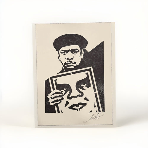
Once your furniture anchors are in place, turn your attention to the art. Think of your art collection as a protagonist in your design story. You don't need a massive collection; a few carefully selected pieces can have far greater impact than a multitude of lesser ones. When selecting street art, consider not just the imagery, but also the scale, color intensity, and overall mood. A large-format print by an artist like Shepard Fairey, known for his bold graphic statements and socio-political commentary, can serve as a powerful focal point above a long credenza or a substantial sofa. Its visual weight can balance the horizontal expanse of the furniture, creating a harmonious composition.
For smaller spaces or more intimate settings, a series of smaller prints or even a single, striking piece can be equally effective. Perhaps a collection of works with a consistent theme or color palette, arranged thoughtfully, can bring cohesion to a wall. The key is to select art that resonates with you personally, but also visually complements the furniture. Avoid pieces that are too busy or too small for the space, as they can get lost against the strong forms of mid-century design. Conversely, art that is too overwhelming can make the furniture feel secondary or insignificant. Aim for a balanced visual dialogue where both elements hold their own without competing for dominance.
Mastering color palettes for impact
Color is perhaps the most powerful tool in your design arsenal when mixing mid-century modern and street art. Mid-century interiors often lean on a palette of natural wood tones, muted greens, teals, oranges, and grays. Street art, in contrast, frequently employs saturated, even neon, hues, along with stark blacks and whites. The trick is to create a dialogue between these palettes, not a shouting match.
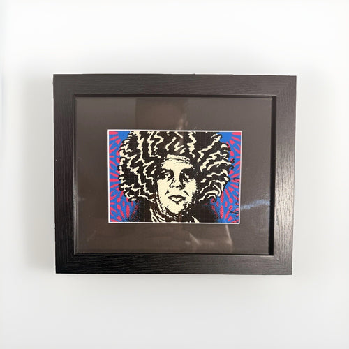
One effective strategy is to use your street art as the primary source of saturated color, allowing it to pop against a more subdued mid-century backdrop. Imagine a room with a warm walnut credenza, a charcoal gray sofa, and perhaps an olive green accent chair. Into this calm, sophisticated setting, introduce a piece of street art bursting with electric blues, fuchsia, or bright yellow. The art becomes the jolt of energy, the unexpected twist that elevates the entire space. The muted tones of the furniture provide a stable foundation, allowing the art's colors to truly sing without overwhelming the room.
Alternatively, you can extract a specific color from your chosen artwork and echo it subtly in your mid-century elements. If a print features a prominent shade of deep teal, consider incorporating that color into a throw pillow, a small ceramic vase, or even a book spine on your shelf. This creates a visual thread that connects the art to the rest of the room, making the pairing feel intentional and cohesive. However, exercise restraint; a mere whisper of the color is often more effective than a bold repetition. The goal is to create harmony, not matchy-matchy uniformity.
When working with street art that is predominantly black and white, or features a very limited color palette (like many pieces from the Cleon Peterson collection), you have even more freedom. These stark, graphic works can provide a powerful anchor in a colorful mid-century room, or they can reinforce a minimalist aesthetic. Their strength lies in their form and line, allowing them to integrate smoothly while still making a strong statement. The key is always to consider how the colors of your art interact with the existing colors of your furniture, walls, and textiles, ensuring a balanced and engaging visual experience.
Framing choices: enhancing, not competing
The frame you choose for your street art is not a mere afterthought; it's an integral part of how the piece interacts with its mid-century modern surroundings. A well-chosen frame can elevate the artwork, protect it, and bridge the gap between the art's aesthetic and the room's overall design. A poorly chosen frame, however, can detract from both the art and the furniture, creating a disjointed look.
For most street art prints, a simple, clean frame is often the best choice. Think minimalist profiles in black, white, or natural wood. These choices align perfectly with the unadorned aesthetic of mid-century modern design. A black frame provides a strong graphic edge, delineating the artwork and often enhancing its contrasts. It's a classic choice that works well with bold, colorful pieces as well as stark black-and-white prints. A white frame can offer a lighter, airier feel, particularly effective for brighter artworks or in rooms where you want to maintain a sense of openness.
Natural wood frames, especially those in walnut or teak tones, can create a beautiful visual connection to your mid-century furniture. This choice subtly ties the art to the room's dominant wood elements, fostering a sense of warmth and cohesion. Ensure the wood tone of the frame complements, rather than clashes with, the wood of your furniture. A slightly darker frame can provide a nice contrast, while a very close match can create a smooth, integrated look. Avoid overly ornate or heavily textured frames, as these can conflict with both the art's contemporary edge and the furniture's clean lines.
Consider the use of matting as well. A wide, neutral mat (white, off-white, or a very light gray) can give the artwork breathing room, drawing the eye inward and providing a sophisticated presentation. It also creates a visual buffer between the art and the frame, which can be particularly useful for highly graphic or colorful pieces. For very large prints, a float mount, where the art appears to float within the frame, can create a striking, contemporary effect that works exceptionally well with the minimalist tendencies of mid-century modern design.
Placement strategies for dynamic balance
How you arrange your art and furniture is just as critical as the pieces themselves. In a mid-century modern setting, the clean lines and open spaces demand thoughtful placement to maintain balance and flow. Street art, with its often energetic and unconventional vibe, can be used to disrupt or enhance this balance in intriguing ways.
One common approach is to create a strong focal point. A single, large piece of street art positioned centrally above a sofa or credenza immediately anchors the room. This works particularly well with bold, strong works, such as those by Mr Brainwash, whose playful and often large-scale pop art pieces can inject a powerful dose of personality. Ensure the art is proportionate to the furniture below it; a good rule of thumb is for the art to be roughly two-thirds to three-quarters the width of the furniture it hangs above, and hung at eye level.
Asymmetry can also be a powerful tool. Instead of perfectly centering everything, consider an off-center arrangement. For instance, a tall, narrow print placed to one side of a credenza, balanced by a table lamp or a small plant on the other side, can create a more dynamic and less formal composition. This approach feels more modern and less rigid, aligning with the often unconventional spirit of street art.
Grouping smaller artworks can create a gallery wall effect. When doing this, maintain visual cohesion. This might mean using consistent framing, a shared color palette among the prints, or a common theme. Arrange them in a way that feels organic but still structured. A grid layout offers a clean, architectural look that complements mid-century modernism, while a more free-form cluster can introduce a sense of playful chaos. Regardless of the layout, ensure there's enough white space around each piece and the overall grouping to prevent it from feeling cluttered.
Don't limit yourself to wall hangings. Small, framed prints or even art objects can be placed on credenzas, shelves, or side tables. These smaller touches allow you to introduce street art into unexpected corners, creating layered interest. Consider how the height and scale of these objects interact with the furniture. A small, saturated piece from the Death NYC collection, for example, could be propped casually against a wall on a bookshelf, adding a pop of graphic energy without dominating the space.
Mixing textures and materials
The tactile experience of a room is as important as its visual one. Mid-century modern furniture often features smooth, polished wood, sleek upholstery, and sometimes glass or metal. Street art prints, while typically flat, can convey a sense of texture through their imagery or the medium itself. The interplay of these textures adds depth and richness to your interior.
Think about contrasting materials. If your dominant furniture pieces are in dark, rich walnut, introduce art that has a lighter, perhaps matte finish. If your sofa is upholstered in a smooth, structured fabric, consider adding throw pillows in a contrasting texture, like a nubby wool or a soft velvet. These small additions can pick up on subtle textures or color nuances within your street art, creating a more cohesive and multi-sensory environment. For example, a print that features distressed textures or a layered collage effect can be echoed by a raw concrete planter or a woven rug, creating an interesting dialogue between the art and the decorative elements.
The materials of your decorative objects also play a role. Mid-century ceramics, glass, and metal pieces can provide a refined counterpoint to the edgier aesthetic of street art. A collection of sleek, minimalist vases on a credenza can ground a saturated, graphic print. Conversely, a more playful or sculptural object, such as a contemporary figurine, might echo the whimsical or narrative elements often found in street art, creating a bridge between the two styles. The goal is to create a dynamic interplay of smooth and rough, hard and soft, natural and man-made, all contributing to a layered and inviting space.
Avoiding the retro trap
The greatest danger when decorating with mid-century modern furniture is creating a space that feels trapped in the past. While appreciation for the era is key, your home should feel current and lived-in, not like a museum exhibit. Street art is your most potent weapon against this retro trap.
The inherent contemporary nature of street art immediately pulls the room into the present. Its often irreverent, thought-provoking, and visually bold qualities act as a powerful counterpoint to the more classic, sometimes staid, feel of vintage furniture. It signals that this is a home that appreciates history but lives firmly in the now. To reinforce this, avoid over-accessorizing with strictly period-specific items. While a few authentic mid-century accessories are charming, too many can quickly push the room into theme-park territory.
Instead, mix in contemporary elements beyond just the art. Modern lighting fixtures, current books, and personal photographs all contribute to a feeling of a lived-in, up-to-date home. The art should be the primary driver of this contemporary energy. Let a powerful print by Shepard Fairey, with its iconic imagery and strong messaging, assert a modern perspective. Allow the playful irony of a piece by Mr Brainwash to inject a sense of humor and pop culture relevance. These pieces, by their very nature, resist being relegated to a historical context, forcing the entire room to feel fresh and relevant.
Think about scale and proportion. Mid-century modern pieces often have a lower profile and a lighter visual weight than older, heavier furniture. Ensure your art choices respect this. A massive, overly ornate painting would look out of place. Instead, opt for art that, even when large, maintains a graphic clarity and a modern sensibility. This careful curation ensures that the art elevates the furniture, rather than clashing with it, creating a cohesive and forward-looking aesthetic.
Curating your collection over time
A truly compelling interior is rarely created overnight. It evolves, much like a personal story, reflecting your changing tastes and experiences. When combining mid-century modern furniture with street art, embrace the process of slow curation. This approach allows your collection to grow authentically and ensures that each piece holds meaning and purpose within your home.
Start with a few key pieces that you genuinely love, both in furniture and art. Live with them, observe how they interact, and let them inform your next choices. Perhaps a bold print inspires you to seek out a complementary textile, or a new mid-century acquisition prompts you to re-evaluate the scale of the art on an adjacent wall. This organic process prevents your home from feeling sterile or overly designed; instead, it feels personal and deeply considered.
As you collect, think about building a narrative. Do your pieces tell a story about your interests, your travels, or your aesthetic journey? Street art, with its often narrative or symbolic content, is particularly adept at contributing to this storytelling. A piece that captures a specific cultural moment, or one that uses bold iconography, can add layers of meaning to your space. Don't be afraid to mix artists or even different styles of street art, as long as there's an underlying thread of cohesion, whether it's color, theme, or graphic quality. The Pop Art collection, for instance, offers a wide range of works that can be thoughtfully integrated into a growing display.
Finally, remember that a collection is dynamic. Don't be afraid to rotate pieces, move them to different rooms, or even store them for a while if they no longer feel right. Your home is a living space, and its decor should reflect that fluidity. The beauty of combining mid-century modern with street art is its inherent adaptability. Both styles, when chosen well, possess a timeless quality that allows them to remain relevant and engaging through many iterations of your personal collection.
Frequently asked questions
Can I mix different wood tones with my street art?
Yes, mixing wood tones is not only acceptable but often encouraged to create a richer, more collected look. The key is to ensure there's a dominant wood tone that anchors the space, such as walnut or teak, then introduce one or two other complementary tones, like oak or rosewood, as accents. Your street art can help tie these varied tones together, especially if its frame matches one of the wood types or if the art itself features colors that complement the different wood hues. Avoid too many disparate wood tones, which can make a room feel chaotic. Stick to a maximum of three distinct wood types for a cohesive feel.
What if my street art is very colorful, and my mid-century furniture is also bright?
When both your art and furniture are saturated, the risk is visual overload. The solution is to create breathing room. Use neutral walls and flooring to provide a calm backdrop. Ensure your most colorful art is balanced by simpler, less visually busy furniture pieces, and vice versa. You can also group colorful items strategically, allowing one area to be a saturated focal point while other areas remain more subdued. For instance, if you have a bright orange mid-century sofa, pair it with street art that uses complementary or analogous colors, or even a black and white piece to provide a stark, grounding contrast. Use a compact table for easy reference:
| Furniture Color | Art Color Strategy | Effect |
|---|---|---|
| Muted/Neutral | Bold & Saturated | Art pops, saturated focal point |
| Bold/Saturated | Complementary/Analogous | Harmonious energy, rich layering |
| Bold/Saturated | Black & White/Limited Palette | Grounding contrast, sophisticated edge |
Should all my frames match?
Not necessarily. While a consistent framing style can create a cohesive gallery wall, mixing frame finishes can add depth and interest. For a mid-century modern setting, a mix of simple black, white, and natural wood frames often works beautifully. The key is consistency in style (e.g., all minimalist profiles) rather than exact material or color. For example, a black frame might suit a bold graphic print, while a natural oak frame could complement a more organic piece, both fitting within a clean, contemporary aesthetic.
How do I incorporate street art into a small mid-century space?
In smaller spaces, scale and strategic placement are crucial. Avoid overwhelming the room with one giant piece; instead, opt for a single strong medium-sized print as a focal point, or create a curated gallery wall with smaller pieces. Ensure the art doesn't block pathways or make the room feel cramped. Vertical arrangements can draw the eye upward, making the ceiling feel higher. Consider prints with lighter backgrounds or less dense imagery to maintain a sense of openness. Small, graphic pieces from collections like Death NYC can be propped on shelves or side tables to add character without taking up significant wall space.
What about three-dimensional art or sculptures?
Three-dimensional art, including sculptures or art objects, can be an excellent addition. Mid-century modern interiors often benefit from sculptural elements that echo their organic forms. A contemporary figurine, for example, can sit beautifully on a credenza or bookshelf, providing a tactile counterpoint to flat prints. When selecting three-dimensional pieces, consider their material, form, and scale in relation to your furniture. A sleek metal sculpture might complement the lines of a chrome-accented chair, while a ceramic piece could resonate with the natural warmth of a wooden table. These objects add another layer of interest and texture, enhancing the dialogue between eras.
Combining the timeless elegance of mid-century modern furniture with the dynamic energy of street art is a sophisticated design choice that elevates any home. It creates a space that feels both grounded in history and saturatedly contemporary, reflecting a discerning eye for design and a passion for art that truly speaks to the moment. Explore our collection of Shepard Fairey prints and discover pieces that can transform your mid-century modern interior into a truly unique expression of style.