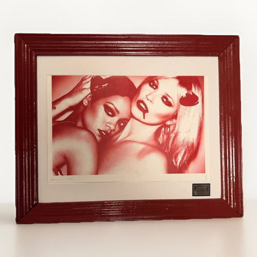
When considering a small-scale artwork, especially one that mimics the dimensions of a dollar bill, the immediate question is often: how do I make this feel significant? The answer lies in treating the artwork not as a miniature, but as a concentrated visual statement. Its small size, far from being a limitation, becomes a deliberate choice that can draw a viewer in, creating intimacy and demanding closer inspection. This is particularly true for works whose individual listings use dollar or bill language, where the familiar currency reference can add a layer of conceptual play. The challenge is to ensure this deliberate choice translates into a powerful presence within your interior, rather than allowing the piece to recede into the background. The solution involves a careful orchestration of placement, framing, lighting, and surrounding elements, all designed to amplify the artwork's inherent visual and conceptual weight.
Format note: “dollar-bill art” is used here as a reader-friendly description for works whose individual listings use dollar or bill language. It does not establish a common substrate, process, edition type, or source. Read the exact listing before drawing those conclusions.
The power of small scale in art
Small art, especially works that echo the dimensions of a dollar bill, possesses a unique power. Unlike large-format pieces that dominate a wall, small works invite a different kind of engagement. They demand proximity, drawing the viewer closer, fostering a more intimate and personal interaction. This scale shift can be particularly effective in contemporary interiors, where a carefully placed small artwork can act as a visual anchor, a point of focus that grounds a larger design scheme. The very act of leaning in to observe the details of a small piece creates a moment of discovery, a pause that can be more strong than a sweeping glance at a grander work. For a work described through a dollar or bill reference, that intimacy can be compounded by the familiarity of the format. The viewer is drawn in not just by the artwork itself, but by the recognition of the underlying structure, creating an immediate, almost subconscious connection.

This deliberate smallness also offers practical advantages. It allows for greater flexibility in placement, fitting into nooks, shelves, or smaller wall sections where a larger piece would overwhelm. It can be part of a curated vignette, a conversation starter on a desk, or a subtle accent in a minimalist space. The key is to avoid treating it as an incidental object. Instead, position it with intention, ensuring its scale feels purposeful rather than accidental. When a small work is given its own space, its own spotlight, it transforms from a minor detail into a significant focal point. This is the essence of making small art read as deliberate: it's about context and presentation, not just the object itself.
Why currency format creates productive tension
The use of a currency format in art, particularly the dollar bill, introduces a fascinating layer of conceptual tension. Money is inherently loaded with meaning: value, exchange, power, aspiration, and often, a sense of the mundane. When an artwork is presented through a currency format, the familiar structure can function as a symbol as well as a surface. This act immediately elevates the everyday into the realm of commentary, prompting viewers to reconsider their assumptions about both art and commerce.
This tension is productive because it engages the viewer on multiple levels. Visually, the familiar greenback structure provides an immediate point of recognition, a visual shorthand that allows the artist to subvert expectations. The artwork then plays against this recognition, introducing new imagery, colors, or messages that contrast sharply with the expected austerity of a banknote. This juxtaposition creates a cognitive dissonance that is both intriguing and thought-provoking. It forces a viewer to reconcile the perceived value of the currency with the artistic statement being made upon it.
In an interior, this tension translates into a dynamic presence. A compact work described through dollar-bill language can do more than sit on a wall; it can alter the room's visual rhythm. It can challenge a viewer's perception of luxury, question consumerism, or simply add an unexpected layer of wit and irony to a space. This makes it an ideal choice for collectors who appreciate art that sparks conversation and encourages deeper reflection, rather than simply serving as decorative filler. The currency format ensures the piece is never truly passive; it always carries with it the echoes of its original symbolic weight, even as it is transformed into something new.
Choosing the right wall for impact
Selecting the ideal wall for a dollar-bill sized artwork is crucial for maximizing its impact. Given its small scale, the piece needs a location where it can command attention without being dwarfed or overlooked. Avoid vast, empty walls where it will appear lost. Instead, seek out more intimate spaces or areas with existing visual anchors.
Consider these options:
- The gallery wall: A dollar-bill piece can be a powerful anchor or a surprising element within a larger gallery wall arrangement. Position it strategically among larger works, perhaps slightly off-center, to draw the eye in. Its small size can provide a welcome visual break and a point of concentrated detail amidst a collection of varying scales.
- Niches and alcoves: These recessed spaces are perfect for small artworks. They naturally frame the piece, creating a sense of importance and drawing the viewer's gaze. The contained nature of a niche prevents the artwork from feeling overwhelmed by the surrounding architecture.
- Above a console or side table: Placing the artwork directly above a piece of furniture creates a natural vignette. The furniture provides a visual base, and the artwork becomes the focal point of that arrangement. Ensure the furniture is not excessively large or ornate, which might compete with the small artwork.
- Between windows or doors: Narrow wall sections can be ideal. A dollar-bill piece can fill these spaces perfectly, providing a thoughtful detail in an otherwise overlooked area. This placement can also create a sense of discovery as one moves through the room.
- The unexpected spot: Sometimes, the most strong placement is the least obvious. Consider a small, well-lit wall section in a hallway, a powder room, or even a walk-in closet. These unexpected locations can elevate the artwork and create a delightful surprise for visitors.
Ultimately, the goal is to create a dedicated visual zone for the artwork. This might mean a small, clear section of wall, or a carefully composed arrangement that guides the eye directly to the piece. The wall itself should not be too busy with other elements, allowing the dollar-bill art to hold its own without undue competition.
Framing and matting for presence
The right framing and matting are perhaps the most critical elements in elevating a small, dollar-bill sized artwork. A well-chosen frame and mat can transform a modest print into a significant statement, providing it with the visual weight and presence it needs to hold its own in an interior. Think of the frame and mat as an extension of the artwork, a deliberate boundary that defines its space and enhances its impact.
For a compact graphic work, framing choices should complement the image rather than overpower it. Here are some considerations:
-
Matting: A generous mat is almost always advisable for small works. It creates breathing room around the artwork, separating it from the frame and drawing the eye inward. For a dollar-bill piece, a mat that is significantly wider than the artwork itself can make the overall presentation feel more substantial. Consider a crisp white or off-white mat for a classic, gallery-like look that allows the colors of the artwork to pop. Alternatively, a colored mat that picks up a subtle tone from the artwork can create a more integrated, bespoke feel. Avoid overly narrow mats, which can make the artwork feel cramped and diminish its importance.
-
Frame style: The frame style should align with both the artwork's aesthetic and your interior design. For a compact graphic work, a sleek, minimalist frame often gives the image enough room to register. Thin, clean lines in black, white, or a natural wood can provide a sophisticated edge without distracting from the artwork. Metallic frames (silver, gold, or even a muted brass) can add a touch of modern elegance, especially if they echo other metallic accents in the room. Avoid overly ornate or heavy frames, which can overwhelm the small scale of the dollar-bill art.
-
Glass: Opt for museum-quality or anti-reflective glass. This is a worthwhile investment for any artwork, but particularly for small pieces where glare can easily obscure details. Good glass will protect the artwork from UV damage and ensure it remains clearly visible from various angles, enhancing the viewing experience.
-
Depth: A deeper frame, even with a thin face, can add a sense of substance. This creates a shadow box effect, giving the artwork more dimension and making it feel more like an object to be admired rather than just a flat image. This is especially effective if the artwork itself has any subtle texture or relief.
When selecting a frame and mat, bring the artwork with you if possible, or at least have high-quality images. Experiment with different combinations to see what best enhances the piece and integrates it into your desired aesthetic. The goal is to create a presentation that feels deliberate, considered, and worthy of close attention.
Lighting for focus and drama
Effective lighting is paramount for any artwork, but it takes on particular significance for small pieces like Death NYC dollar-bill art. Proper illumination ensures the artwork is not only visible but also becomes a focal point, drawing the eye and highlighting its details. Without dedicated lighting, a small piece can easily recede into the background, losing its intended impact.
Consider these lighting strategies:
- Picture lights: These are classic for a reason. A small, well-proportioned picture light mounted directly above the frame can cast a soft, even glow over the artwork. Choose a light with an adjustable head to direct the beam precisely. LED picture lights are energy-efficient and emit minimal heat, protecting your artwork. The finish of the picture light (e.g., brass, bronze, black) should complement your frame and interior style.
- Track lighting: If you have a gallery wall or multiple artworks in a space, track lighting offers flexibility. Individual heads can be adjusted to spotlight specific pieces. For a dollar-bill artwork, ensure the beam is narrow enough to focus on the piece without spilling too much light onto the surrounding wall.
- Recessed spotlights: For a more integrated look, recessed ceiling spotlights can be angled to illuminate the artwork. This creates a clean, architectural effect. Again, precision is key; the light should fall directly on the artwork, not create distracting shadows or glare.
- Accent lamps: In more intimate settings, a well-placed table lamp or floor lamp can provide ambient light that indirectly illuminates the artwork. While not as direct as a picture light, the soft glow can create a warm, inviting atmosphere that encourages closer inspection. This works particularly well when the artwork is part of a larger vignette on a console or shelf.
When positioning lights, pay attention to potential glare on the glass. Adjust the angle until reflections are minimized and the artwork is clearly visible. The goal is to create a focused pool of light that makes the dollar-bill art stand out, transforming it from a mere object into a luminous point of interest within your room.
Curating neighboring objects
The objects surrounding your Death NYC dollar-bill art play a significant role in how the piece is perceived. Curating these neighboring elements thoughtfully can amplify the artwork's presence, create a cohesive narrative, and prevent it from feeling isolated or incidental. Think of the artwork as part of a larger composition, a carefully arranged vignette that tells a story.
Here's how to approach it:
Scale and proportion: When pairing a small artwork with other objects, consider their relative sizes. Avoid placing the dollar-bill art next to objects that are overwhelmingly large or visually heavy, as this will diminish its impact. Instead, opt for objects that are either similar in scale or provide a gentle contrast without competing. A small sculpture, a stack of art books, or a delicate vase can create a harmonious grouping.
Thematic connections: Look for opportunities to create thematic links between the artwork and its surroundings. If an individual listing uses a familiar cultural reference, consider pairing the work with an object that echoes its colour or tempo rather than repeating the reference, such as a Pop Art book or a contemporary figurine. This creates a sense of intentionality and depth in your display.
Color and texture: Use color and texture to create visual interest and cohesion. If the artwork features bold colors, you might choose neighboring objects in more subdued tones to allow the art to pop. Conversely, if the artwork is more monochromatic, introducing objects with interesting textures (e.g., a ceramic vase, a wooden box, a metallic sculpture) can add richness to the vignette. Ensure there's a balance; too many competing textures or colors can make the display feel cluttered.
Negative space: Don't underestimate the power of empty space. Just as a mat provides breathing room for the artwork, negative space around a vignette allows each object to be appreciated. Avoid overcrowding the area around your dollar-bill art. A minimalist approach often works best, allowing the artwork and a few carefully chosen companions to shine.
Examples of effective pairings:
- A Death NYC dollar-bill piece above a mid-century modern console, flanked by a small, sculptural lamp and a stack of design magazines.
- Within a gallery wall, positioned next to a slightly larger, abstract print and a small, framed photograph, creating a dialogue between different styles and scales.
- On a bookshelf, nestled between two bookends, with a small, intriguing figurine nearby that shares a conceptual link with the artwork.
By thoughtfully curating the objects around your Death NYC dollar-bill art, you transform it from a standalone piece into an integral part of a larger, more compelling design statement. This approach ensures the artwork is not just seen, but truly experienced within its environment.
Integrating into different interior styles
A compact work described through dollar-bill language can travel across interior styles because its scale allows it to be an accent or a focal point that allows it to integrate effectively into a range of interior styles. The key is to understand how its inherent characteristics can either complement or create a productive contrast within a given aesthetic. Its small scale and often saturated imagery mean it can act as either a subtle accent or a deliberate jolt, depending on the surrounding design.
Here's how it can work across different styles:
Modern minimalist: In a minimalist interior, characterized by clean lines, neutral palettes, and uncluttered spaces, a Death NYC dollar-bill piece can serve as a potent focal point. Its concentrated imagery and often bold colors provide a welcome pop of visual interest without disrupting the serene aesthetic. Frame it simply in black or white, with a wide mat, and give it ample negative space. It becomes a deliberate statement, a small burst of energy in an otherwise calm environment. The contrast between the art's edgy content and the room's understated elegance creates a sophisticated tension.
Industrial loft: The raw, urban aesthetic of an industrial loft provides a natural home for street art. Death NYC dollar-bill pieces can blend smoothly with exposed brick, concrete, and metal accents. Here, you might opt for a more rugged frame, perhaps a distressed wood or a raw metal, to complement the industrial textures. Group several pieces together on a reclaimed wood shelf or a metal grid for a cohesive, urban gallery feel. The art's street-inspired origins resonate perfectly with the loft's gritty charm.
Eclectic bohemian: An eclectic interior thrives on mixing patterns, textures, and global influences. Death NYC dollar-bill art can be a saturated addition to such a space, contributing to its layered and personalized feel. Integrate it into a gallery wall alongside travel souvenirs, vintage finds, and other artworks. A colorful mat or an antique-style frame could add to the bohemian vibe. The art's playful nature and diverse references fit well within a collection that celebrates individuality and storytelling.
Contemporary chic: In a contemporary chic setting, which balances modern design with luxurious touches, Death NYC dollar-bill art can add an unexpected, edgy element. Pair it with sleek furniture, rich textiles, and sophisticated lighting. A metallic frame (gold, silver, or rose gold) can elevate the piece, making it feel more refined. Place it in a prominent position, perhaps above a stylish bar cart or on a curated bookshelf, to demonstrate a discerning taste for art that bridges street culture and high design. It acts as a conversation starter, a subtle nod to urban cool within a polished environment.
Traditional with a twist: Even in a more traditional interior, a Death NYC dollar-bill piece can create an intriguing contrast. Imagine it hanging in a room with classic moldings, antique furniture, and rich fabrics. The unexpected juxtaposition of contemporary street art within a formal setting can be incredibly effective, injecting personality and a sense of irreverence. Choose a simple, elegant frame to bridge the gap between the artwork's modern sensibility and the room's classic bones. This approach demonstrates confidence in design, showing that art can transcend stylistic boundaries.
The key to successful integration is to view the dollar-bill art not as a standalone object, but as a component that contributes to the overall aesthetic conversation of the room. Its small size allows for subtle placement, while its potent imagery ensures it always makes a statement, regardless of the surrounding style.
Maintaining and protecting your artwork
Proper care and protection are essential for preserving the longevity and visual integrity of your Death NYC dollar-bill art. While these pieces are often reliable, they are still artworks and benefit from thoughtful handling and environmental considerations. A little preventative maintenance goes a long way in ensuring your piece remains a saturated part of your collection for years to come.
Here's a practical guide:
1. Environment control:
- Temperature and humidity: Avoid extreme fluctuations in temperature and humidity. High humidity can lead to warping or mold, while very dry conditions can cause brittleness. Aim for a stable environment, ideally between 68-72°F (20-22°C) and 45-55% relative humidity.
- Direct sunlight: Never hang your artwork in direct sunlight. UV rays are the primary cause of fading and degradation of colors and paper. Even indirect sunlight over time can cause damage. If a spot is unavoidable, ensure your frame uses UV-protective glass.
- Heat sources: Keep the artwork away from direct heat sources like radiators, fireplaces, or heating vents, which can cause drying and warping.
2. Handling:
- Clean hands: Always handle framed artwork with clean, dry hands, or preferably, wear cotton gloves to avoid transferring oils and dirt.
- Support: When moving a framed piece, support it from the bottom and sides. Avoid holding it by the top wire or a single side, which can strain the frame and hanging mechanism.
3. Cleaning:
- Frame and glass: Dust the frame regularly with a soft, dry cloth. For the glass, use a non-ammonia glass cleaner sprayed onto a cloth (not directly onto the glass) to avoid liquid seeping into the frame and damaging the artwork.
- Artwork itself: Never attempt to clean the artwork itself unless you are a trained conservator. Dust can be gently removed from the mat with a soft, clean brush, but avoid touching the artwork surface.
4. Hanging hardware:
- Secure installation: Ensure your artwork is hung securely using appropriate hardware for its weight and the wall type. Use two picture hooks or a sturdy wire system to distribute weight evenly. Regularly check the hanging wire and hooks for any signs of wear or loosening.
5. Professional framing:
- Archival materials: When framing, always insist on archival-quality, acid-free mats and backing boards. These materials prevent discoloration and damage to the artwork over time.
- Sealing: Ensure the back of the frame is properly sealed to prevent dust and insects from entering.
By following these guidelines, you can ensure your Death NYC dollar-bill art remains in excellent condition, preserving its visual impact as a considered part of your collection. For more details on shipping and handling, you can review our shipping policy.
Frequently asked questions
Here are some common questions about integrating dollar-bill sized art into your home:
| Question | Consideration |
|---|---|
| Can I hang multiple dollar-bill pieces together? | Yes, creating a grid or a small cluster of Death NYC dollar-bill art can amplify their collective impact. Ensure consistent framing for a cohesive look. |
| What if my room is very large? | In a large room, a single dollar-bill piece might feel lost. Consider placing it in a smaller, more intimate zone, or as part of a larger gallery wall where it contributes to a broader visual narrative. |
| Should I match the frame to my existing furniture? | Not necessarily. The frame should complement the artwork first, then the room. A contrasting frame can sometimes create a more dynamic and interesting look than a perfectly matched one. |
| Is it okay to lean a framed dollar-bill piece on a shelf? | Yes, leaning can create a casual, contemporary feel, especially on a bookshelf or console. Ensure it is stable and won't easily tip over. This works well for a relaxed, curated aesthetic. |
| How often should I clean the glass on my framed art? | Dust the glass regularly with a soft, dry cloth. For a deeper clean, use a non-ammonia glass cleaner on a cloth (not directly on the glass) every few months, or as needed if smudges appear. |
A dollar-bill format can create a strong visual tension between a familiar financial reference and an artwork. It transforms a familiar object of commerce into a canvas for commentary, wit, and artistic expression. Integrating these pieces into your interior is an opportunity to engage with art on a more intimate level, to create focal points that spark conversation, and to infuse your space with a unique blend of urban edge and conceptual depth. By carefully considering placement, framing, lighting, and surrounding objects, you can ensure that these small, potent artworks command the attention they deserve, becoming cherished elements within your home.
For those ready to explore this intriguing format further, we invite you to browse our curated selection of Death NYC art. Discover pieces that resonate with your aesthetic and conceptual interests, and find the perfect addition to your collection.