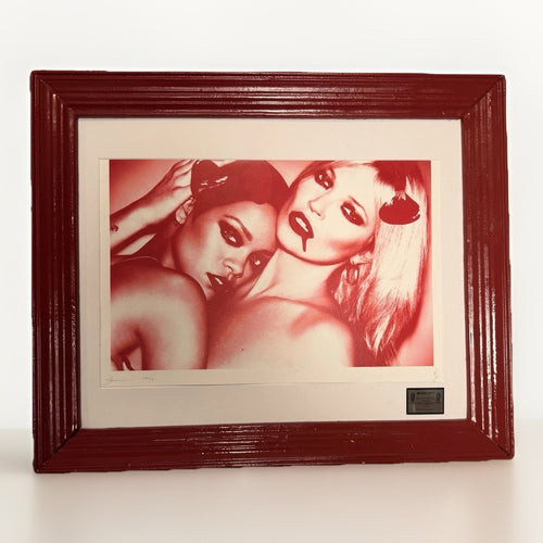
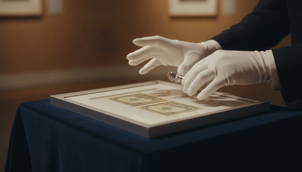
You have acquired a Death NYC dollar-bill artwork, and now you are wondering how to display it effectively. The most common question is whether a single piece can hold its own or if it needs companions. The answer is clear: a single dollar-bill artwork can be a powerful focal point if presented with intention. However, when grouped thoughtfully, these pieces can create a dynamic visual narrative. The key is to understand the grammar of display, ensuring each artwork contributes to a cohesive and engaging environment.
Many collectors start with one piece, perhaps a design that particularly resonates with them. This initial purchase often leads to more, as the aesthetic and conceptual appeal of Death NYC's work becomes apparent. The challenge then shifts from acquiring to arranging. How do you transition from a solitary statement to a curated collection without making your space feel cluttered or disjointed? This article will guide you through the principles of display, from framing choices to strategic grouping, helping you create a sophisticated presentation that enhances both the art and your home.
Format note: “dollar-bill art” is used here as a reader-friendly description for works whose individual listings use dollar or bill language. It does not establish a common substrate, process, edition type, or source. Read the exact listing before drawing those conclusions.
The solitary statement: When one is enough
A single Death NYC dollar-bill artwork, with its compact size and often intricate detail, can make a significant impact when displayed correctly. The small scale demands attention, inviting viewers to lean in and observe the nuances. To maximize its presence, consider its placement carefully. A solitary piece benefits from being in a location where it can be appreciated without competition. This might be a quiet corner, a narrow wall section, or a space above a small console table. The goal is to give it room to breathe, allowing its unique character to emerge.

Framing plays a crucial role in elevating a single dollar-bill artwork. A well-chosen frame acts as a visual boundary, drawing the eye inward and distinguishing the artwork from its surroundings. For a minimalist approach, a simple black or white frame with a generous mat can create a clean, contemporary look. If your interior style leans more traditional or eclectic, a more ornate frame might be appropriate, but ensure it complements rather than overwhelms the artwork. The mat board is particularly important for dollar-bill art; it provides necessary breathing room, preventing the small image from feeling lost within the frame. A wide, neutral mat, such as off-white or light grey, is often the most effective choice, as it highlights the artwork without distracting from it. For more detailed advice on framing, consult our Death NYC framing guide.
Lighting is another element that can transform a solitary display. A small, focused spotlight can dramatically enhance the artwork's visibility and draw attention to its details. Position the light source to avoid glare on the glass, ensuring the artwork is illuminated evenly. Even in a well-lit room, a dedicated light source can make a single piece feel more significant and intentional.
Finally, consider the background. A plain, solid-colored wall often works best for a solitary piece, as it provides a neutral canvas that allows the artwork to stand out. Avoid busy wallpapers or highly textured surfaces that might compete for attention. The aim is to create a moment of visual pause, where the viewer's gaze is directed solely to the artwork.
Pairs and sequences: Building visual rhythm
When you have two or more Death NYC dollar-bill artworks, you have the opportunity to create more complex visual arrangements. Pairs, diptychs, and sequences can establish rhythm and narrative, transforming individual pieces into a cohesive statement. The key is to find commonalities or deliberate contrasts that bind the pieces together.
A diptych, or a pair of artworks, is a classic arrangement that offers balance and symmetry. When selecting pieces for a diptych, you might choose two artworks that share a similar color palette, theme, or stylistic approach. For example, two pieces featuring similar pop culture references or graphic styles can create a strong visual dialogue. Hang them side-by-side, with a consistent spacing between them, to emphasize their relationship. The gap between the frames should be narrower than the width of the mat board, typically 2 to 4 inches, to maintain a sense of connection without merging them into one. This creates a powerful, unified statement that is more strong than two separate pieces hung far apart.
For sequences of three or more, the arrangement can become more dynamic. You can hang them in a horizontal line, a vertical stack, or even a grid. A horizontal line works well above a sofa or a long console table, creating a panoramic effect. A vertical stack can emphasize height in a room or fill a narrow wall section. When creating a sequence, consistency in framing is paramount. Using identical frames and matting for all pieces will unify the display, even if the artworks themselves have different subjects. This visual coherence is what makes a sequence feel intentional and curated.
Consider the narrative potential. Do the artworks tell a story when placed in a particular order? Do they represent a progression of ideas or a series of variations on a theme? Arranging them to reflect this narrative can add depth to your display. For instance, if you have several pieces that explore different facets of a single concept, arranging them in a logical sequence can enhance their collective meaning. The viewer's eye will naturally move from one piece to the next, absorbing the story you have created.
Eye level and placement: The golden rules
Proper placement is fundamental to any art display, and dollar-bill art is no exception. The general rule of thumb for hanging art is to place the center of the artwork at eye level. For most people, this means approximately 57 to 60 inches (145 to 152 cm) from the floor. This height allows viewers to comfortably engage with the artwork without craning their necks up or down.
However, this rule needs adjustment when dealing with groups of artworks or when placing art above furniture. When hanging a diptych or a sequence, consider the collective center of the arrangement. For example, if you have a horizontal line of three pieces, the center of the middle piece should be at eye level. If you are hanging art above a sofa or a console, ensure there is enough space between the bottom of the frame and the top of the furniture. A gap of 6 to 8 inches (15 to 20 cm) is generally appropriate, preventing the art from feeling disconnected or crammed. The artwork should relate to the furniture it is above, becoming part of a cohesive vignette.
Think about the flow of the room and how people move through it. Art should be placed where it can be seen and appreciated, not hidden behind doors or in awkward corners. Consider sightlines from different seating areas. Can you see the artwork clearly from your favorite armchair? Does it create an interesting focal point when you enter the room?
For smaller pieces like dollar-bill art, sometimes a slightly lower placement can invite a closer look, especially if it is part of a desk vignette or a bookshelf display. In such cases, the eye level rule becomes less rigid, replaced by the need for the artwork to feel integrated with its immediate surroundings. The goal is always to make the artwork accessible and engaging, encouraging interaction rather than passive observation.
Frame continuity: Unifying your collection
Consistency in framing is one of the most powerful tools for creating a cohesive and sophisticated art display, especially when dealing with multiple pieces of dollar-bill art. While individual artworks may vary in subject and color, uniform framing provides a visual anchor that ties everything together. This doesn't mean every frame must be identical, but there should be a clear relationship between them.
The simplest approach is to use the same frame style, color, and matting for all your dollar-bill artworks. For example, all black frames with white mats, or all natural wood frames with off-white mats. This creates a clean, gallery-like aesthetic that allows the artworks themselves to be the stars. The repetition of the frame creates a visual rhythm that is pleasing to the eye and makes even disparate pieces feel like part of a unified collection.
If you prefer more variety, you can introduce subtle differences while maintaining overall continuity. For instance, you might use frames of the same material (e.g., all wood) but vary the finish (e.g., natural wood, dark stain, painted white). Or you could use frames of the same color but vary the profile (e.g., a thin modern profile next to a slightly wider traditional profile). The key is to ensure that the variations are deliberate and harmonious, not haphazard. The matting, however, should ideally remain consistent in color and width, as it provides the immediate border for the artwork.
Consider the context of your home decor. If your interior style is minimalist and contemporary, sleek, simple frames will be most appropriate. If your home is more traditional or eclectic, you might opt for frames with a bit more detail, but still ensure they don't overpower the delicate scale of the dollar-bill art. The frame should enhance the artwork and integrate it into your home, not compete with it. For detailed guidance on selecting the right frame, our Death NYC framing guide offers practical advice.
Grouping with books and objects: Creating vignettes
Death NYC dollar-bill art, due to its scale, lends itself beautifully to being incorporated into vignettes with books and decorative objects. This approach can make the art feel more integrated into your living space, rather than just an isolated piece on a wall. The challenge is to group items in a way that enhances the artwork without diluting its impact.
When creating a vignette, think of it as a small, curated display that tells a story. The dollar-bill artwork can be the focal point, or it can be a key element within a larger arrangement. Here are some strategies:
- On a bookshelf: Lean a framed dollar-bill artwork against the back of a bookshelf, nestled between stacks of books or next to a sculptural object. Vary the heights of the items around it to create visual interest. A small plant, a ceramic vase, or a unique bookend can complement the artwork without overshadowing it. The artwork should be at a height where it is easily visible and not obscured by other items.
- On a console or side table: Place a framed dollar-bill artwork on a small easel or lean it against the wall behind a collection of objects. These objects might include a stack of art books, a small figurine (perhaps from our figurines collection), or a decorative tray. Ensure the objects are related in some way, either by color, material, or theme, to create a cohesive look. The artwork should be positioned to draw the eye, perhaps slightly elevated or centered within the arrangement.
- As part of a desk display: For a home office or study, a dollar-bill artwork can add a touch of personality to a desk. Place it near a lamp, a pen holder, or a small plant. The intimate scale of the artwork makes it perfect for personal viewing in a workspace.
The key to success is balance and proportion. Avoid overcrowding the space around the artwork. Each item in the vignette should have a reason for being there and contribute to the overall aesthetic. Use varying heights, textures, and forms to create a dynamic yet harmonious display. The artwork should feel like an integral part of the arrangement, not an afterthought. For example, a Death NYC piece with a pop art sensibility might pair well with a bright, graphic art book or a playful ceramic object, echoing themes found in our Pop Art collection.
Creating a collected feel: Beyond the gallery wall
A truly collected home feels personal and layered, reflecting the owner's tastes and experiences over time. Displaying Death NYC dollar-bill art in a way that achieves this collected feel goes beyond simply hanging pieces on a wall. It involves thoughtful curation, mixing and matching, and creating a sense of history and discovery.
One way to achieve a collected feel is to integrate your dollar-bill art into a larger gallery wall that includes other types of art. This could be a mix of prints, photographs, paintings, and even small mirrors. The small scale of the dollar-bill art makes it an excellent accent piece within a larger composition. When creating a gallery wall, vary the sizes and shapes of the frames, but maintain some consistency in frame color or material to prevent it from looking chaotic. The dollar-bill art can be strategically placed to break up larger pieces or to fill smaller gaps, adding an element of surprise and intimacy.
Another approach is to display dollar-bill art in unexpected places. Instead of just walls, consider placing framed pieces on shelves, mantelpieces, or even propped up on a dresser. This casual, less formal presentation contributes to a collected aesthetic, suggesting that the art is a natural part of your everyday environment rather than something to be admired from a distance. This approach works particularly well in an eclectic interior where objects are intentionally mixed and matched.
Consider the narrative of your collection. Do certain pieces evoke memories or represent specific interests? Grouping artworks that share a thematic connection, even if they are by different artists or in different styles, can create a powerful collected feel. For example, you might group a Death NYC piece with a Shepard Fairey print and a Mr. Brainwash work if they all speak to similar themes of street art or social commentary. This shows a discerning eye and a personal connection to the art.
Finally, don't be afraid to experiment. A collected home evolves over time. Move pieces around, try new groupings, and see what feels right. The goal is to create a display that feels authentic to you and your home, a reflection of your journey as a collector. The more personal and intentional your display, the more it will convey a truly collected feel.
Considerations for different rooms
The best way to display Death NYC dollar-bill art can vary depending on the room. Each space in your home has a different function and atmosphere, and your art display should complement these characteristics.
Living room: This is often the most public space in your home, making it ideal for more prominent displays. A diptych or a sequence of dollar-bill artworks can create a strong focal point above a sofa or a console table. Integrating them into a larger gallery wall is also effective here, allowing them to contribute to a broader artistic statement. Consider placing a single, particularly striking piece in a prominent spot where it can spark conversation.
Bedroom: In a bedroom, the display can be more intimate and personal. A single dollar-bill artwork on a bedside table or a small grouping above a dresser can add a touch of personality without overwhelming the serene atmosphere. Choose pieces that evoke calm or personal reflection. The smaller scale of the art is perfect for creating a cozy, curated feel.
Home office/study: This is a great place for dollar-bill art that is thought-provoking or inspiring. A piece leaned against a bookshelf or placed on a desk can provide a moment of visual interest during your workday. Consider a series of pieces that relate to a particular theme or interest, creating a mini-collection that stimulates creativity. The scale works well in a more confined space, adding character without clutter.
Hallways and entryways: These transitional spaces are excellent for creating visual pathways. A horizontal sequence of dollar-bill artworks can guide the eye along a hallway, while a single piece in an entryway can offer a welcoming artistic statement. These areas often benefit from art that is easily viewed in passing, making the compact nature of dollar-bill art ideal.
Kitchen/Dining area: While less common, dollar-bill art can add an unexpected touch to these spaces. Perhaps a small piece on a kitchen shelf or as part of a dining room vignette. Ensure the environment is suitable for art, avoiding areas prone to excessive moisture or grease. A playful or food-related theme might be particularly apt here.
The key is to match the artwork's presence to the room's function. A bold, graphic piece might be perfect for a living room, while a more subtle or contemplative design could be better suited for a bedroom. Always consider how the artwork contributes to the overall mood and aesthetic of the space.
Maintaining and protecting your art
Once your Death NYC dollar-bill art is beautifully displayed, it is important to ensure its longevity. Proper care and protection will preserve its condition and aesthetic appeal for years to come.
Environmental factors: Avoid hanging your art in direct sunlight, as prolonged exposure can cause fading and discoloration, even with UV-protective glass. Keep art away from areas with extreme temperature fluctuations or high humidity, such as bathrooms or directly above heat sources. Stable room temperature and moderate humidity are ideal for preserving paper-based artworks.
Cleaning: Dust your framed art regularly with a soft, dry cloth. If the glass needs cleaning, spray a small amount of ammonia-free glass cleaner onto a cloth, not directly onto the frame or glass, and then gently wipe the glass. This prevents liquid from seeping into the frame and potentially damaging the artwork or matting.
Handling: When moving or repositioning framed art, always hold it by the sides of the frame, not by the hanging wire. Avoid touching the artwork itself. If you need to remove the artwork from the wall, do so carefully to prevent accidental drops or damage to the frame or glass.
Professional framing: As discussed in our framing guide, professional framing with archival materials is the best way to protect your dollar-bill art. This includes acid-free mat board, backing, and UV-protective glass or acrylic. These materials prevent the artwork from degrading over time due to contact with acidic components or harmful light rays. While an initial investment, it is crucial for long-term preservation.
By following these simple care guidelines, you can ensure that your Death NYC dollar-bill art remains a saturated and cherished part of your home collection for many years.
| Decision | Practical check | Why it matters in a room |
|---|---|---|
| Scale | View the work from the doorway and from the seat where it will be seen most. | A small work gains authority when its viewing distance is intentional. |
| Frame | Choose the mount and profile around the paper and the wall, not only the furniture. | The framing creates a visual boundary and keeps the display from feeling improvised. |
| Context | Give the work one quiet neighbour rather than several competing accents. | Negative space lets a graphic image register before the room asks the eye to move on. |
Frequently asked questions
How high should I hang a single dollar-bill artwork?
For a single dollar-bill artwork, the center of the piece should generally be at eye level, which is typically 57 to 60 inches (145 to 152 cm) from the floor. This allows for comfortable viewing. When hanging above furniture, ensure a gap of 6 to 8 inches (15 to 20 cm) between the bottom of the frame and the top of the furniture.
Can I mix different frame styles for dollar-bill art?
While using consistent frames creates a cohesive look, you can mix different frame styles if done thoughtfully. Opt for frames that share a common element, such as material (e.g., all wood) or color (e.g., all black), while varying the profile. Maintaining consistent matting in terms of color and width is crucial for unifying the display.
What is the best way to group multiple dollar-bill artworks?
Multiple dollar-bill artworks can be grouped in pairs, horizontal sequences, vertical stacks, or as part of a larger gallery wall. The key is to maintain consistent spacing between frames and to use uniform framing (same frame style, color, and matting) to create a cohesive visual rhythm. Consider thematic connections between the artworks to enhance their collective impact.
How do I prevent glare on the glass of my framed art?
To prevent glare, position your artwork away from direct light sources like windows or bright overhead lights. If using a spotlight, angle it carefully to illuminate the artwork without reflecting off the glass. Using museum-quality or anti-reflective glass during framing can also significantly reduce glare and improve visibility.
Should I display dollar-bill art in every room?
While dollar-bill art can be displayed in various rooms, it is best to be selective. Consider the function and atmosphere of each room. A living room might suit a prominent diptych, while a bedroom could benefit from a single, intimate piece. Avoid over-saturating your home with too much art, as this can diminish the impact of individual pieces. Thoughtful placement ensures each artwork makes its intended statement.
The journey of collecting and displaying art is a personal one, and Death NYC dollar-bill art offers a unique opportunity to express your individual style. By applying these principles of display, you can transform your collection from individual pieces into a curated statement that enhances your home. Whether you are starting with a single striking piece or building a dynamic gallery wall, thoughtful presentation will ensure your art is seen and appreciated. We invite you to explore the diverse range of Death NYC artworks available and discover the next addition to your collection.