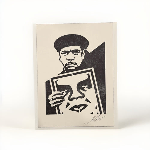
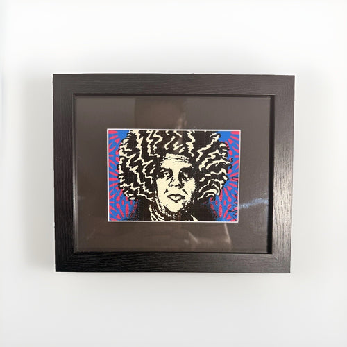
A Shepard Fairey print, with its unmistakable graphic punch and often potent message, is a statement piece. It demands attention, and rightly so. But for a design-conscious collector furnishing a real home, the question often isn't whether to acquire one, but how to integrate it thoughtfully into an existing aesthetic. The saturated reds, stark blacks, creamy off-whites, and cool blues that define much of Fairey's work are powerful elements. Handled carelessly, they can dominate a room, making it feel less like a curated sanctuary and more like a protest poster display. The goal is to make the print feel intentional, a natural extension of your personal style, rather than an outlier.
The solution lies in deliberate planning. Instead of letting the art dictate every other choice, consider how it can complement and enhance your space. Think about the interplay of color, the choice of frame, the surrounding textures, and the overall rhythm of the room. A well-placed Fairey print doesn't just hang on a wall; it actively participates in the room's narrative, adding depth, personality, and a touch of contemporary edge. This guide will walk you through the practical steps to achieve that balance, ensuring your cherished artwork finds its perfect home.
Understanding the Fairey Aesthetic: Color and Composition
Shepard Fairey's visual language is characterized by a compressed, yet strong, color palette. The frequent use of deep reds, stark blacks, creamy off-whites, and often a muted or saturated blue creates a distinctive visual signature. This combination isn't accidental; it's a deliberate choice that gives his work its immediate recognition and powerful resonance. The reds convey urgency and passion, the blacks provide grounding and contrast, the creams offer a necessary visual breath, and the blues introduce a cooler, often contemplative counterpoint.

The strength of this palette lies in its high contrast and graphic simplicity. It's designed to be seen and understood quickly, much like propaganda posters or protest art, which are clear influences. This means when you bring a Fairey print into your home, you're not just adding a picture; you're introducing a dynamic visual force. Understanding this inherent power is the first step in styling. You're working with a piece that is already visually complete and strong, so your surrounding decor needs to support it rather than compete with it.
Color Palette Harmony: Beyond the Red Accent
The most common mistake when styling a room with a prominent red artwork is to repeat that red everywhere. This can quickly lead to a visually jarring, overstimulated space. Instead, think of the red in a Fairey print as a focal point, a burst of energy that needs careful containment. The goal is to echo its intensity subtly, or to provide a calming counterpoint, rather than amplify it.
Consider the other colors present in the print: the blacks, creams, and blues. These offer excellent starting points for your room's broader palette. For instance, a neutral backdrop of warm grays, soft beiges, or even a muted olive green can provide a sophisticated canvas that allows the Fairey print to pop without overwhelming the space. If your print features blue, consider incorporating subtle touches of that shade in textiles or decorative objects to create a cohesive flow. A deep navy sofa or a scattering of cushions in a dusty blue can pick up on these nuances without feeling matchy-matchy.
Alternatively, you can introduce complementary colors in a thoughtful way. Greens, as the complement to red, can create a saturated, yet balanced, scheme. Think about incorporating plants, or even a single piece of furniture in a deep forest green, to add life and visual interest. The key is moderation and strategic placement. Allow the red in the artwork to be the dominant red in the room, with other colors playing supporting roles.
Framing for Impact and Protection
The right frame is not merely a protective barrier; it is an integral part of how a print is perceived within a space. For Shepard Fairey's graphic works, framing choices can dramatically alter their impact, moving them from a casual poster to a refined piece of art.
Choosing the right frame style
A minimalist frame, often a slim black or white profile, works exceptionally well with Fairey's aesthetic. It provides a clean boundary that contains the graphic energy without adding visual clutter. This approach allows the artwork to speak for itself. For a more contemporary industrial feel, a brushed aluminum or raw wood frame can also be effective, especially if it complements other elements in the room, such as exposed metal or natural wood furniture.
For a richer, more traditional setting where you want the print to feel more integrated into a classic decor, a slightly wider, perhaps even ornate, frame in a dark wood or a muted metallic finish can work. This creates an interesting tension between the modern subject matter and the classic presentation, a pairing that can be surprisingly sophisticated. Avoid overly distracting or brightly colored frames that compete with the art itself.
Matting considerations
Matting is crucial for separating the artwork from the frame and providing visual breathing room. A wide, white, or off-white mat is almost always a safe and elegant choice for Fairey prints. It emphasizes the artwork's graphic qualities and helps to brighten the overall presentation. If the print features a specific cream or off-white tone, matching the mat to that color can create a smooth, integrated look. Black mats can also be effective, particularly for prints with strong black elements, but they tend to create a more dramatic, somber effect and can sometimes make the artwork feel smaller.
Glass and acrylic options
Investing in museum-quality glass or acrylic is essential for protecting your print from UV damage and glare. While standard glass offers basic protection, options like anti-reflective or UV-filtering glass will preserve the vibrancy of the colors over time and ensure the artwork is clearly visible from various angles. This is especially important for prints displayed in brightly lit rooms or near windows.
Here is a brief comparison of common framing materials:
| Material | Pros | Cons |
|---|---|---|
| Wood | Versatile, warm, classic, many finishes | Can be heavy, prone to warping if not well-made |
| Metal (e.g., aluminum) | Sleek, modern, durable, lightweight | Can look cold, limited finish options |
| Polystyrene/MDF | Affordable, lightweight, many styles | Less durable, can look less premium |
Placement Power: Where Graphic Work Shines
The placement of a Shepard Fairey print is as critical as its framing. Graphic work, by its nature, commands attention. It performs best in locations where its visual impact can be fully appreciated without overwhelming the space or competing with too many other elements.
The focal point wall
Often, the most effective placement is on a dedicated focal point wall. This could be the wall above a sofa, a console table in an entryway, or a prominent wall in a dining area. When placed as a central feature, the print becomes a conversation starter and anchors the room. Ensure the wall is large enough to comfortably accommodate the print, with sufficient negative space around it to allow it to breathe. Avoid placing it directly opposite a window where glare might obscure the image.
Entryways and hallways
Entryways and hallways are excellent locations for introducing a bold statement piece. A Fairey print here can set the tone for your home, offering a glimpse into your aesthetic from the moment someone steps inside. In a hallway, consider a series of smaller prints or a single large piece, mindful of the visual flow and the width of the corridor. The graphic nature works well in transitional spaces, providing visual interest without requiring extended contemplation.
Unexpected corners and vignettes
Don't limit yourself to obvious wall space. A well-chosen Fairey print can add an unexpected layer of cool to a more intimate setting, such as a reading nook or a home office. Placed above a desk or nestled between bookshelves, it can act as a personal touch that reflects your interests. When creating a vignette, ensure the print is balanced by other objects in terms of scale and texture. A small figurine or a stack of art books can ground the artwork and create a cohesive display.
Furniture and Texture: Complement, Don't Compete
Integrating a powerful graphic print requires thoughtful consideration of the surrounding furniture and textures. The goal is to create a harmonious environment where the artwork stands out, but not in isolation. Clean lines, natural materials, and varied textures are your allies here.
Clean lines and minimalist forms
Furniture with clean, uncluttered lines often works best with graphic art. A mid-century modern aesthetic, for example, with its emphasis on functionality and simplicity, provides an ideal backdrop. Sofas with low profiles, sleek wooden side tables, and minimalist shelving units allow the eye to focus on the art without distraction. Avoid overly ornate or heavily patterned furniture that might clash with the print's visual intensity.
Natural materials and varied textures
To soften the graphic edge of a Fairey print, introduce natural materials and varied textures. A raw wood coffee table, a linen sofa, a wool rug, or even a woven basket can add warmth and organic appeal to the space. These elements provide a tactile contrast to the print's smooth, two-dimensional surface, creating a more inviting and layered room. Consider a plush velvet armchair in a muted tone to add a touch of luxury and softness, or a concrete console table for an urban, contemporary feel.
The interplay of texture is key. For example, if your Fairey print has strong reds and blacks, pair it with a charcoal gray sofa in a textured fabric, perhaps a tweed or a bouclé, and introduce a few throw pillows in a cream-colored linen or a subtle blue geometric pattern. This creates depth and visual interest without directly mimicking the print's colors.
Lighting Your Collection
Proper lighting is paramount for showing any artwork, and Shepard Fairey prints are no exception. The right lighting can enhance colors, reveal details, and create the desired mood within a room.
Accent lighting
Dedicated accent lighting, such as track lighting or picture lights, is ideal for highlighting your Fairey print. These fixtures direct a focused beam of light onto the artwork, making it stand out. When selecting a picture light, consider its finish and style to ensure it complements your frame and overall decor. LED options are energy-efficient and emit very little heat, which is important for the long-term preservation of the artwork.
Ambient and natural light
While accent lighting is crucial, also consider the ambient light in the room. Natural light, when diffused, can be wonderful, but direct sunlight should be avoided as it can cause fading over time. Use sheer curtains or blinds to control harsh sunlight. For evening hours, a combination of ambient light (from ceiling fixtures or lamps) and accent lighting will create a balanced and inviting atmosphere, allowing your print to be appreciated at any time of day.
Mixing Styles: Eclectic and Intentional
A modern home doesn't mean a sterile, monochromatic space. Integrating a Shepard Fairey print into an eclectic collection of art and objects can create a dynamic and personal environment. The key is intentionality and finding common threads.
Pairing with other street art influences
Fairey's work often sits comfortably alongside other artists influenced by street art culture. Consider how his graphic realism might interact with the more pop-inflected works of Mr Brainwash, for example. The playful, often irreverent spirit of Mr Brainwash prints can offer a lighter counterpoint to Fairey's more pointed messages, creating a compelling dialogue between pieces. Similarly, the bold, often stark imagery of Cleon Peterson's work shares a graphic intensity that can resonate powerfully with Fairey's style, creating a cohesive visual narrative.
Beyond street art
Don't be afraid to mix and match. A Fairey print can look surprisingly sophisticated next to abstract expressionism, contemporary photography, or even more traditional pieces. The contrast itself can be a design choice. Imagine a Fairey print flanked by a pair of vintage botanical prints, or hanging above a classic credenza adorned with ceramic vases. The common thread might be color, scale, or simply a shared sense of strong visual presence. Consider the broader Pop Art movement for inspiration on how graphic elements can be integrated into diverse settings.
Curating a gallery wall
When creating a gallery wall that includes a Fairey print, think about balance and flow. The Fairey piece can be the anchor, around which other, perhaps smaller, works are arranged. Vary the sizes, frames, and even the mediums of the surrounding pieces to create visual interest. For instance, a Fairey print could be surrounded by abstract pieces, photographs, or even small, intriguing works from artists like Death NYC, whose distinctive style offers another layer of graphic appeal. The key is to ensure there's a visual connection, whether it's a shared color, a similar theme, or simply a harmonious overall composition.
When building a gallery wall:
- Start with your anchor piece, typically the largest or most strong, and place it slightly off-center at eye level.
- Arrange surrounding pieces, varying sizes and orientations, to create balance.
- Consider a consistent element, such as all black frames, or a shared color palette to unify the display.
Creating a Gallery Wall with Graphic Art
A gallery wall is an excellent way to display multiple pieces of art and personal objects, telling a visual story. When incorporating graphic works like Shepard Fairey prints, careful planning ensures a cohesive and strong display rather than a chaotic jumble.
Planning your layout
Before hanging anything, lay out your prints on the floor. This allows you to experiment with different arrangements until you find a composition that feels balanced and visually appealing. Consider the negative space around each piece and the overall shape the gallery wall will create. A common approach is to establish an invisible grid or a central axis around which pieces are arranged, maintaining a consistent spacing between frames.
Varying scale and texture
To keep a gallery wall dynamic, vary the scale of your art. A large Shepard Fairey print can be the anchor, surrounded by smaller prints, photographs, or even three-dimensional objects. Incorporate different textures through various framing materials, or by including elements like framed textiles or small mirrors. This adds depth and prevents the wall from feeling flat. If you have several graphic prints, consider interspersing them with more abstract pieces or photographs to break up the visual intensity.
Cohesion through color or theme
Even with varied pieces, a gallery wall needs a unifying element. This could be a consistent color palette, where all pieces share a dominant hue or a complementary set of colors. Alternatively, a shared theme, such as urban landscapes, portraiture, or specific artistic movements, can tie disparate works together. For a collection featuring multiple Fairey prints, the inherent visual language of the artist provides a strong unifying thread. You might then introduce pieces that echo his use of bold lines, typography, or social commentary.
Frequently asked questions
How do I choose a mat color for a red-heavy Fairey print?
For prints with dominant reds, a wide, crisp white or off-white mat is almost always the best choice. It provides visual relief, allows the red to pop, and prevents the artwork from feeling too heavy. If the print contains a specific cream or beige tone, matching the mat to that color can create a very sophisticated, integrated look. Avoid colored mats unless they are a very subtle, muted tone picked directly from the print's secondary colors.
Can I hang a Shepard Fairey print in a bedroom?
Absolutely. A bedroom is a personal space, and a Fairey print can add a significant layer of personality. Consider the overall mood you want to create. If the print is very bold, balance it with softer textures, subdued lighting, and a calming color palette in the rest of the room. Placement above a headboard or on a dedicated wall opposite the bed can make it a focal point without being overwhelming. Ensure the subject matter aligns with the restful atmosphere of a bedroom.
What kind of lighting is best for showing off graphic prints?
Dedicated accent lighting, such as a well-placed picture light or adjustable track lighting, is ideal for graphic prints. These lights can highlight the details and colors, making the artwork truly stand out. Opt for LED bulbs with a color temperature around 3000K (warm white) to 4000K (neutral white) for accurate color rendition. Avoid direct sunlight, which can fade colors over time, and ensure any artificial light source doesn't create distracting glare on the print's surface.
How can I prevent a Fairey print from looking too casual or like a dorm room poster?
The key is elevated presentation and thoughtful integration. Invest in high-quality framing with museum-grade glass and a substantial mat. Pair the print with sophisticated furniture, rich textures, and a curated selection of decorative objects. Avoid clutter, and ensure the surrounding decor is intentional and well-designed. The context you create around the print is what elevates it from a casual item to a significant piece of art within a refined home.
Should I match the print's colors to my room's existing decor?
You don't need to match colors exactly, but aim for harmony. Instead of directly repeating the print's dominant red, for instance, pick up on the secondary colors like the blacks, creams, or blues. Use these as cues for accent colors in throw pillows, ceramics, or smaller decorative items. Alternatively, use a neutral base palette for the room that allows the print's colors to stand out as a saturated accent. The goal is a balanced composition where the print feels integrated, not isolated or overwhelming.
Integrating a Shepard Fairey print into your modern home is an opportunity to inject personality, graphic strength, and a touch of contemporary edge. By approaching the task with an understanding of color, careful framing, strategic placement, and thoughtful furniture choices, you can create a space that feels both sophisticated and deeply personal. The bold visual language of Fairey's work can elevate an interior, turning a simple wall into a compelling narrative. Explore the full range of possibilities and find the perfect piece to complement your home by browsing our Shepard Fairey collection today.