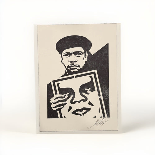
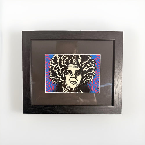
The conventional wisdom for furnishing small spaces often dictates miniaturization: small furniture, small accessories, and, by extension, small art. This approach, while seemingly logical, frequently leads to interiors that feel less like curated homes and more like overcrowded display cabinets. Particularly when it comes to art, a collection of small pieces can diminish the visual impact of each individual work, creating a busy, fragmented aesthetic that actually makes a room feel smaller and less intentional.
For those living in apartments, studios, or homes with compact rooms, the challenge is not to shrink your artistic ambitions, but to refine them. Instead of scattering numerous modest pieces across every available surface, consider the transformative power of a single, significant street art print. One well-chosen, expertly framed piece can anchor a room, draw the eye, and establish a clear focal point, imbuing the space with a sense of scale and purpose that a dozen smaller works might fail to achieve. This strategy is not about minimalism for its own sake, but about maximizing impact through thoughtful concentration.
This approach liberates you from the compulsion to fill every void. It allows a single artwork to breathe, to command attention, and to tell a complete visual story without competition. The right print, given the space to resonate, doesn't just decorate a wall; it defines a room, reflecting your taste and adding an immediate layer of sophistication and intrigue. Let's explore how to select, frame, and place such a piece to elevate your small space from merely functional to truly captivating.
Rethinking scale: The power of a singular statement
The instinct to match art size to room size is a persistent one, yet it often misguides. A small room does not inherently require small art. In fact, placing a single, larger print in a compact area can paradoxically make the room feel more expansive and considered. This is because a substantial piece commands attention, drawing the eye and creating a visual anchor that provides a sense of stability and depth. When a wall is broken up by many small frames, the eye jumps from one to another, making the space feel restless and cluttered. A single, dominant artwork, by contrast, offers a singular point of focus, allowing the viewer to absorb its details without distraction.

Consider the psychological effect. A large print can function like a window, offering a view into another world, or a portal that expands the perceived boundaries of the room. It becomes a statement, a clear declaration of style and personality, rather than a mere decorative accent. This is especially true for street art, which often possesses a bold graphic quality and a narrative depth that benefits from being viewed without visual competition. An strong piece from an artist like Shepard Fairey, with its strong lines and layered meanings, can easily carry a wall and, by extension, an entire room. The goal is to create a moment of visual pause, a deliberate design choice that speaks volumes without uttering a single word.
This strategy requires a shift from accumulation to concentration. Instead of thinking about how many pieces you can fit, think about which single piece can have the greatest effect. It is about quality of presence over quantity of objects. When you commit to a single, powerful print, you are not just hanging art; you are establishing a focal point that dictates the visual rhythm of the entire space. This choice can transform a cramped corner into a curated vignette, or a blank wall into a dynamic feature, demonstrating that thoughtful placement and appropriate scale are far more important than the physical dimensions of the room itself.
Choosing your focal point: Where to make a stand
Selecting the right wall for your singular street art print is as critical as choosing the print itself. This decision will dictate the flow and emphasis of your entire room. A focal wall is typically the first wall you see upon entering a room, or the wall that naturally draws the eye due to its architectural features or its relationship to key furniture pieces. Avoid walls that are overly fragmented by doors, windows, or detailed built-in shelving, as these will compete with your artwork for attention and diminish its impact.
Consider the primary function of the room. In a living room, the wall behind a sofa or across from the main seating area is often an ideal candidate. This placement ensures that the artwork is visible and enjoyable from the most frequently used vantage points, allowing it to serve as a constant source of visual interest and conversation. In a dining area, the wall opposite the dining table can create a striking backdrop for meals and gatherings. For a bedroom, the wall above the headboard is a classic choice, turning the bed into a curated centerpiece. The goal is to position the artwork where it can be appreciated without requiring an awkward viewing angle or forcing the viewer to crane their neck.
The chosen wall should also have enough uninterrupted space to accommodate the print and its frame comfortably, with ample breathing room around it. This negative space is crucial; it allows the artwork to stand out and prevents the wall from feeling cramped. Even if your room is small, aim for a wall that offers a generous expanse. Sometimes, a wall that seems too large for a single print is precisely the right canvas, as the print's presence will then define the scale of the wall, rather than being dwarfed by it. Remember, the objective is to make a statement, not to fill every void. A well-chosen focal wall empowers your art to truly shine.
Framing as an extension: Crafting the visual boundary
Framing is not merely a protective measure; it is an integral part of the artwork's presentation, especially when a single print is intended to carry an entire room. The right frame and mat can dramatically enhance a street art print, giving it the presence and gravitas it needs to command attention. For smaller spaces, where every visual element contributes significantly to the overall feel, thoughtful framing becomes even more critical.
One of the most effective techniques for elevating a print and making it feel more substantial is the use of a wide mat. A wide mat creates a generous border of negative space around the artwork, pushing the eye inward and creating a sense of depth and importance. This white space acts as a visual buffer, separating the art from the wall and allowing it to float, almost like a piece in a gallery. For a print that might otherwise feel modest in size, a mat that is disproportionately wide can transform it into a significant focal point. A mat width of 4 to 6 inches, or even more for larger prints, can be surprisingly effective in a small room, making the overall framed piece much larger and more strong than the print itself.
The frame style and color also play a crucial role. A simple, clean-lined frame often works best for street art, as it complements the contemporary aesthetic without competing with the artwork's visual energy. Black, white, or natural wood frames are versatile choices that allow the print to be the star. Avoid overly ornate or heavy frames that can feel cumbersome in a small space. The aim is to create a cohesive unit where the frame and mat serve to enhance, rather than detract from, the artwork. The choice of glazing,whether standard glass, museum glass, or acrylic,also merits consideration, as glare can significantly diminish the impact of an artwork, especially in rooms with varying light sources. Museum glass, while an investment, offers superior clarity and UV protection, making the artwork appear almost unframed and allowing its colors to truly pop.
Here's a simple guide to mat and frame combinations:
| Print Size (approx.) | Recommended Mat Width | Frame Style | Effect |
|---|---|---|---|
| 8" x 10" | 3" - 4" | Thin black, white, or light wood | Elevates a small print to a more significant object. |
| 12" x 16" | 4" - 5" | Medium-width black or white box frame | Provides ample breathing room, adds gallery presence. |
| 18" x 24" | 5" - 6" | Medium-width natural wood or metallic frame | Creates a grander presentation, commanding attention. |
| 24" x 36"+ | 6" - 8"+ | Substantial but simple frame (e.g., gallery float) | Maximizes visual scale, making the art a dominant feature. |
For more framing insights, consider consulting a professional framer. Their expertise can be invaluable in achieving the desired effect, especially for a piece intended to be a room's centerpiece. For inspiration, explore framed street art that demonstrates how a carefully chosen frame can transform a print. You can see examples of different framing styles on various Shepard Fairey prints, where the framing often complements the strong graphic nature of the work.
Vertical appeal: Drawing the eye upward
In smaller rooms, where horizontal space is limited, leveraging vertical sightlines becomes a powerful design tool. Placing a substantial street art print higher on a wall, or choosing a vertically oriented piece, can draw the eye upward, creating an illusion of height and expanding the perceived volume of the room. This strategy counters the natural human tendency to focus on eye-level objects, encouraging a more expansive visual journey.
When hanging your print, consider its relationship to the ceiling. While the traditional rule of thumb places the center of art at eye level (around 57-60 inches from the floor), in a small room with a single, strong piece, you might break this rule intentionally. Hanging the artwork slightly higher than usual can lift the entire visual plane of the room. This doesn't mean hanging it so high that it feels disconnected, but rather positioning it to encourage an upward gaze, making the walls feel taller and the room less confined. This technique is particularly effective when the artwork is positioned above a piece of furniture, like a console table or a low bookshelf, creating a clear visual pathway from the furniture up to the art.
Another way to emphasize verticality is through the choice of the artwork itself. A tall, narrow print naturally guides the eye from bottom to top, accentuating the height of the wall. This can be particularly striking with certain graphic street art pieces that feature elongated figures, architectural elements, or a strong directional flow within their composition. Even a square or horizontally oriented print can contribute to vertical appeal if it is positioned strategically within a larger vertical expanse of wall, with ample negative space above and below it. The key is to think of the wall as a canvas that extends from floor to ceiling, and to use your artwork to activate that entire vertical dimension, making the small room feel grander and more open.
Furniture and art: A harmonious partnership
The relationship between your chosen street art print and the surrounding furniture is paramount in a small space. These elements must work in harmony to create a cohesive and balanced composition, rather than competing for attention. The goal is to integrate the artwork smoothly into the room's design, making it feel like an essential component rather than an afterthought.
When placing a large print above furniture, such as a sofa, console, or bed, consider the width of the furniture as a guide. A good rule of thumb is for the artwork (including its frame) to be approximately two-thirds to three-quarters the width of the furniture piece below it. This ratio creates a sense of balance and prevents the art from looking either dwarfed by or overwhelming the furniture. If your chosen print is significantly narrower than the furniture, a wide mat can help bridge that gap, expanding the visual footprint of the framed piece to achieve a more harmonious proportion.
The height at which the artwork is hung in relation to the furniture is also crucial. Typically, there should be about 6 to 12 inches of space between the bottom of the frame and the top of the furniture. This allows for a clear visual connection without making the art feel like it's resting directly on the furniture. This slight separation gives both the art and the furniture their own space to breathe while still forming a unified arrangement. For a strong visual statement, one strong print can be paired with a simple, understated console table or a floating shelf. This allows the art to be the undisputed star, with the furniture serving as a supportive base rather than a competing element. Explore how artists like Mr Brainwash, known for their bold and often playful imagery, create pieces that can stand alone with minimal surrounding elements, making them ideal for this kind of strategic placement. You can find many examples of these strong works by exploring Mr Brainwash prints.
Consider the color palette and style of both the art and the furniture. While contrast can be exciting, in a small space, a degree of visual cohesion is often beneficial. If your street art print features saturated colors, perhaps pair it with furniture in more neutral tones to allow the art to pop. Conversely, if your furniture is bold, a more monochromatic or subtle print might offer a pleasing counterpoint. The interaction between art and furniture defines the character of the space, turning a simple wall into a curated display that feels both intentional and inviting.
Intimate zones: Small works in unexpected places
While the focus of this discussion is on the power of a single large print, there are still strategic ways to incorporate smaller artworks into a compact home without creating clutter. The key is to assign these smaller pieces to intimate zones, areas where they can be appreciated up close and personal, rather than attempting to make them carry an entire wall from a distance. These are spaces where a viewer naturally pauses, leans in, or sits for an extended period.
Consider the following intimate zones:
- Reading nooks: A small print hung at eye level next to a comfortable armchair and a floor lamp creates a personal gallery experience. The confined nature of the nook makes a small piece feel perfectly scaled.
- Desk areas: Above a workspace, a smaller print can provide a focused point of inspiration without overwhelming the functional area. It's a personal touch that enhances productivity and aesthetic pleasure.
- Entryway vignettes: On a narrow wall in an entryway, a small, strong print paired with a small console table and a curated object or two can create a welcoming and intriguing first impression. This is a moment of focused attention, not a broad sweep.
- Bathroom walls: Often overlooked, a bathroom can be an excellent place for a small, unexpected piece of art. Hung near a mirror or above a towel rack, it adds a touch of sophistication to a utilitarian space.
- Shelving displays: Rather than hanging, a small framed print can be leaned against the back of a bookshelf or integrated into a display of objects on a deeper shelf. This creates a layered, collected look without requiring additional wall space.
The success of placing smaller works in these zones lies in their deliberate placement for close viewing. These are not areas where art needs to shout; it needs to whisper. A smaller print from the Death NYC collection, for instance, with its often detailed details and playful pop culture references, might be perfectly suited for a desk or a small, intimate wall. The viewer can then engage with the nuances of the artwork in a way that wouldn't be possible if it were lost on a large, open wall. This approach allows you to expand your collection and enjoy a variety of pieces without sacrificing the clean, focused aesthetic of your small living area.
The art of rotation: Keeping a collection fresh
Even with a commitment to a singular, strong piece as the room's focal point, a collector's desire to live with multiple artworks is natural. For those in small spaces, rotation is an elegant solution to the dilemma of limited wall space and a growing collection. Instead of crowding every available surface with art, which can quickly lead to visual fatigue and a cluttered appearance, a rotational strategy allows you to display different pieces over time, keeping your interiors fresh and your collection dynamic.
Think of your home as a curated gallery with rotating exhibitions. You might have one or two primary focal points that remain constant, but the smaller, more intimate pieces can be swapped out periodically. This not only prevents your walls from becoming overwhelmed but also allows you to rediscover artworks you already own. Bringing a piece out of storage after a few months or a year can make it feel new again, offering a fresh perspective on its details and themes. This also allows you to adjust the mood or color palette of a room to suit seasons, personal preferences, or new furniture arrangements without making permanent changes.
To implement a rotation strategy effectively, consider a few practical steps:
- Invest in consistent framing: If your smaller prints are framed with similar styles or colors, they will be easier to swap out and maintain a cohesive look.
- Dedicated storage: Ensure you have appropriate, climate-controlled storage for the artworks not currently on display. Flat files or archival boxes can protect prints from dust, light, and damage.
- Document your collection: Keep a simple inventory of your pieces, including their dimensions and framing details, to help you plan future rotations.
- Plan for seasonal changes: You might have certain pieces that feel more saturated for summer and others that lend themselves to a cozier winter aesthetic.
Rotation is not just a practical solution; it's an enriching way to engage with your collection more deeply. It encourages thoughtful selection and placement, ensuring that every piece displayed has its moment to shine, rather than being one among many vying for attention. This approach ensures your small space remains a dynamic, evolving reflection of your collecting journey.
Curating your street art collection: Practical considerations
Building a street art collection for a small space requires thoughtful curation beyond just choosing what you like. It involves considering how each piece will live within your home, how it interacts with light, and how it contributes to the overall atmosphere. For collectors focused on prints, this means paying attention to the material qualities of the art and its presentation.
When selecting prints, consider the texture and finish of the paper. Some street art prints are on thick, textured fine art paper, while others might have a smoother, more matte finish. These subtle differences can affect how light interacts with the artwork and how it feels in a room. A print with a rich, tactile surface can add depth and interest, especially when viewed up close in an intimate zone.
The color palette of your chosen prints should also be considered. While a single, bold piece can introduce a saturated splash of color, too many competing hues in a small space can feel overwhelming. If your focal print is particularly colorful, you might opt for more subdued tones in any smaller, rotating pieces, or select works that share a common underlying color temperature to maintain harmony. For example, a piece by Cleon Peterson, known for his stark black, white, and red palettes, would make a strong focal point and could be complemented by other works that echo its graphic intensity without adding new, clashing colors.
Lighting is another crucial element. Natural light is ideal, but avoid direct sunlight, which can fade prints over time. If your chosen wall receives significant direct light, consider UV-protective glazing for your frame. For artificial lighting, a well-placed picture light can dramatically enhance your focal print, highlighting its details and making it stand out, especially in the evenings. However, ensure the light source is appropriate for art and doesn't generate excessive heat or glare.
Finally, remember that your home is a personal sanctuary. While design principles offer valuable guidance, your personal connection to the art is paramount. Choose pieces that resonate with you, that spark joy, or that provoke thought. A single print, whether it's a powerful graphic from Shepard Fairey, a witty statement from Mr Brainwash, or a distinctive image from the Death NYC collection, should ultimately reflect your taste and contribute to a living environment that feels authentic and inspiring. The best design, especially in small spaces, is one that feels deeply personal and thoughtfully curated.
Frequently asked questions
How high should I hang a large print in a small room?
Generally, the center of the artwork should be at eye level, around 57-60 inches from the floor, for comfortable viewing. However, in a small room, hanging a large print slightly higher can create an illusion of height and draw the eye upward, making the room feel more expansive. Ensure there's still a comfortable relationship between the art and any furniture below it, typically 6-12 inches of space.
Can I use a gallery wall in a small space?
While this article advocates for a singular statement, a carefully curated small gallery wall can work in certain intimate zones, like a reading nook or a narrow entryway. The key is concentration: keep the individual pieces relatively small, use consistent framing, and ensure the overall arrangement occupies a defined, contained area rather than spreading across a large wall. Avoid overcrowding and aim for a cohesive visual theme.
What type of frame is best for street art in a small apartment?
For street art, simple, clean-lined frames in black, white, or natural wood are often best. They complement the contemporary aesthetic without adding visual clutter. The most important element is often a wide, neutral mat, which creates breathing room around the print and makes the overall framed piece feel more substantial and gallery-like, enhancing its impact in a small room.
How do I protect my prints from damage in a small space?
Protection begins with proper framing, including archival-quality mats and backing, and UV-protective glazing. Avoid hanging prints in direct sunlight or in areas with extreme temperature or humidity fluctuations, such as directly above a radiator or in a poorly ventilated bathroom. If you rotate your collection, store un-displayed prints flat in archival boxes or sleeves in a stable environment, away from dust and light.
Where can I find strong street art prints suitable for a focal point?
Specialist galleries and online platforms offer a wide selection. Consider exploring collections from artists known for their strong graphic presence and unique styles. For example, you can browse the Death NYC collection for prints that often feature bold imagery and pop culture references, perfectly suited to making a significant statement in a compact space.